
react-grid-panzoom
v1.14.0
Published
React grid component for pan and zoom with possibility to moving and selecting elements inside

Maintainers
 sasza
saszaReadme
react-grid-panzoom



A React grid layout with built-in pan and zoom, drag-and-drop, and resizing. Think of it as a canvas-style grid - position elements on rows/columns, then let users pan, zoom, drag, and resize them.
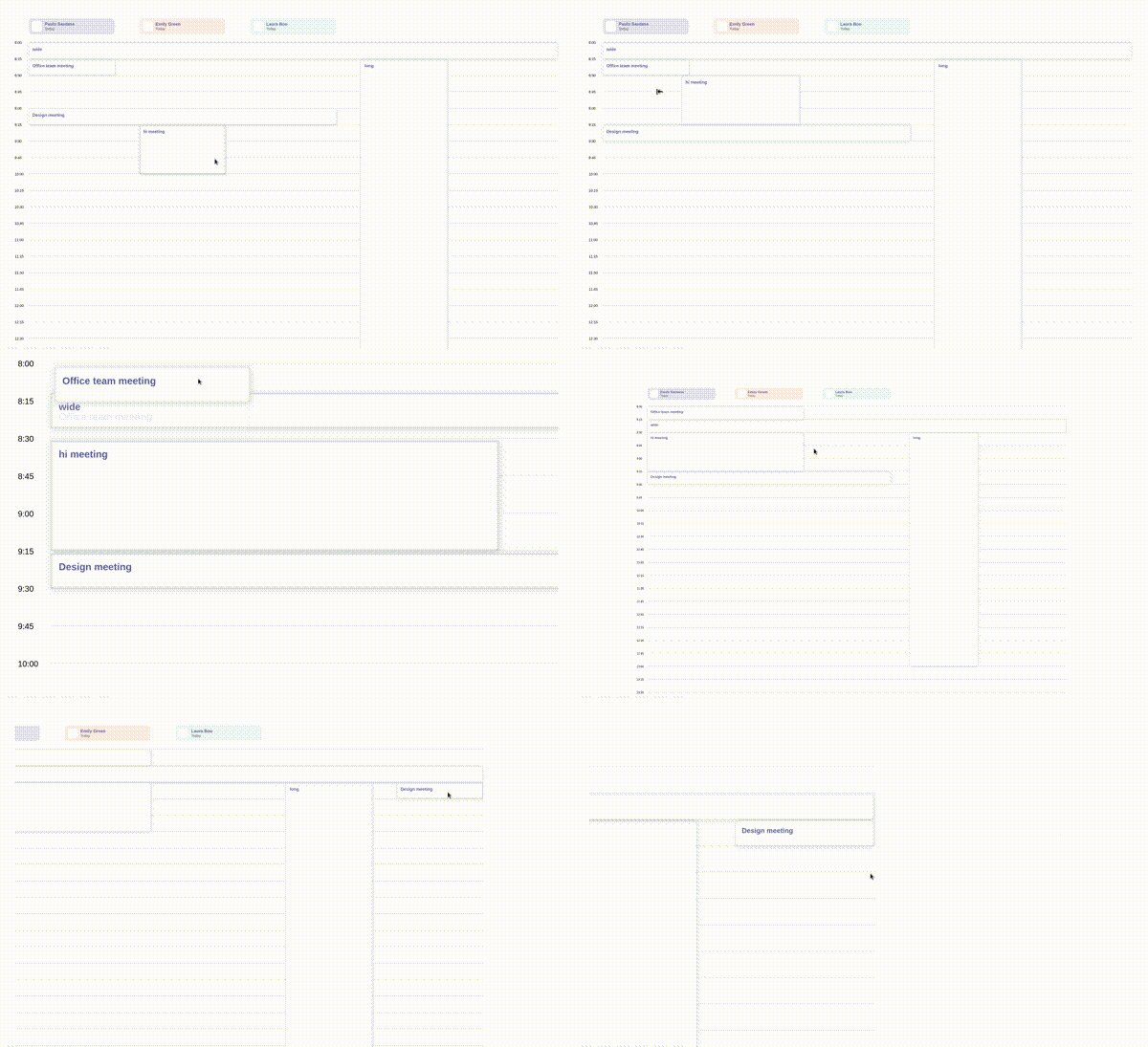
Demo
- https://codesandbox.io/p/sandbox/hardcore-leavitt-mv3wrg
- https://codesandbox.io/p/sandbox/xenodochial-ride-l2jc5h
- https://codesandbox.io/p/sandbox/stupefied-euclid-xwkjl8
Installation
npm install react-grid-panzoomQuick start
import Grid, { GridElement } from 'react-grid-panzoom';

const initialElements: GridElement[] = [
  { id: 1, x: 0, y: 0, w: 2, h: 1, render: () => <div>Element 1</div> },
  { id: 2, x: 2, y: 0, w: 1, h: 1, render: () => <div>Element 2</div> },
];

const Example = () => {
  const [elements, setElements] = useState(initialElements);

  return (
    <Grid
      cols={4}
      rows="auto"
      rowHeight={80}
      elements={elements}
      setElements={setElements}
    />
  );
};
Table of contents
Grid props
| Name | Type | Default | Description |
| --- | --- | --- | --- |
| autoOrganizeElements | boolean | false | Automatically re-run organizeGridElements (collision resolution / compacting) whenever elements change. |
| boundary | boolean | false | Allow moving the grid outside its container. |
| cols | number | | Number of columns in the grid. |
| disabledMove | boolean | false | Disable moving (panning) the grid. |
| disabledScrollHorizontal | boolean | false | Disable horizontal scrolling of the grid. |
| disabledScrollVertical | boolean | false | Disable vertical scrolling of the grid. |
| disabledZoom | boolean | false | Disable zooming the grid. |
| elements | GridElement[] | [] | Grid elements. See Element props. |
| elementResizerWidth | number | 15 | Width (in pixels) of the resizer handle on resizable elements. |
| gapHorizontal | number | | Horizontal gap between columns. |
| gapVertical | number | | Vertical gap between rows. |
| helpLines | boolean | false | Display grid guide lines - useful with multiple columns/rows. |
| onContainerChange | func | | Called when the grid is moved or zoomed. |
| onContainerClick | func | | Called when the grid container is clicked (fires on mousedown/touchstart, same as onContainerPressStart). |
| onContainerPressStart | func | | Called when the mouse/touch is pressed down on the grid container. |
| onContainerPressEnd | func | | Called when the mouse/touch is released after being pressed on the grid container. |
| onContainerContextMenu | func | | Called when the grid container's context menu is opened. |
| onElementClick | func | | Called when an element is clicked: (element, { e, stop }) => void. |
| onElementContextMenu | func | | Called when an element's context menu is opened (right click). |
| onElementsMeasureUpdate | func | | Called when elements' heights are recalculated. Useful for elements with h: 'auto'. |
| onElementStartResizing | func | | Called when an element starts resizing. |
| organizeGridElements | func | | Custom function to organize/compact elements in the grid. |
| paddingLeft | number | | Grid left padding. |
| paddingRight | number | | Grid right padding. |
| ref | React.MutableRefObject<GridAPI> | | Attach the Grid API to a ref. |
| rowHeight | number | | Height of each row. |
| rows | number \| 'auto' | | Number of rows in the grid. Use 'auto' to let the grid expand automatically. |
| scrollSpeed | number | | Scroll speed multiplier. |
| setElements | func | | (elements, { type }) => void - called to update elements in the grid. type is 'programmatic' or 'user' depending on the source of the change. |
| width | number | | Grid width. |
| zoomInitial | number | | Initial zoom level. |
| zoomMax | number | | Maximum zoom level. |
| zoomMin | number | | Minimum zoom level. |
| zoomPosition | { x?: number \| 'center', y?: number \| 'center' } \| null | | Position to zoom towards. |
| zoomSpeed | number | | Zoom speed multiplier. |
Element props
Each entry in elements supports:
| Name | Type | Default | Description |
| --- | --- | --- | --- |
| id | string \| number | | Element id. |
| family | string | | Id of the elements family this element belongs to. |
| followers | Array<string \| number> | | Ids of other elements that should move together with this one when it's dragged. |
| fullHeight | boolean | true | Expand the element to the full height of its container. |
| x | number | | X position in the grid. |
| y | number | | Y position in the grid. |
| w | number | 1 | Width in grid columns. |
| h | number \| 'auto' | 1 | Height in grid rows. Use 'auto' to have it calculated automatically from content (rounded up). |
| render | func | | Render function for the element: (element?) => JSX.Element. |
| resizable | boolean | true | Whether the element can be resized horizontally. |
| resizableVertical | boolean | false | Whether the element can be resized vertically. |
| disabled | boolean | false | Disable the element (no drag, no resize). |
| disabledMove | boolean | false | Disable moving the element in any direction. |
| disabledMoveHorizontal | boolean | false | Disable moving the element horizontally. |
| disabledMoveVertical | boolean | false | Disable moving the element vertically. |
| draggableSelector | string | | Restrict dragging to clicks inside a matching selector (e.g. a drag handle). |
Grid API (ref)
Attach a ref to Grid to access the imperative API:
const gridRef = useRef<GridAPI>(null);

<Grid ref={gridRef} ... />;
| Method | Description |
| --- | --- |
| calculateCellPositionByPixels(x, y) | Converts a pixel position into a grid cell { x, y } position. |
| getLowestElementBottomInPixels() | Returns the bottom position (in pixels) of the lowest element in the grid. |
| getPanZoom() | Returns the underlying react-panzoom API instance. |
| grabElement(elementId, position?) | Programmatically grabs an element, optionally at a given position. |
| measureElementHeight(elementId) | Measures the current height (in rows) of a single element. |
| measureElementsHeight() | Measures the current heights (in rows) of all elements. |
| getElementsPaddingBottom() | Returns bottom padding per element, keyed by element id. |
| organizeElements(selectedElements?, options?) | Runs the organize/compact algorithm and returns the resulting elements. |
Types
The package ships its own TypeScript types, exported from the package root:
import type {
  GridProps,
  GridElement,
  GridAPI,
  SetElements,
  OrganizeGridElements,
  OrganizeGridElementsProps,
  Position,
} from 'react-grid-panzoom';
License
MIT