
react-grid-resizable
v1.0.0
Published
React Grid Resizable Component

Readme
React Grid Resizable
Install
npm install --save netcell/react-grid-resizableDevelopment
npm install
npm start
Navigate to the url displayed in the terminal. (Normally http://localhost:1234)
Usage
import { Col, ColsWrapper, Row, RowsWrapper } from '../src';Put multiple Row tags inside a RowsWrapper tag for a grid of rows and multiple Col tags inside a ColsWrapper tag for a grid of columns.
// Grid of rows
<RowsWrapper>
    <Row initialHeight={100} />
    <Row initialHeight={100} />
    <Row />
</RowsWrapper>
// Grid of columns
<ColsWrapper>
    <Col initialHeight={100} />
    <Col initialHeight={100} />
    <Col />
</ColsWrapper>
These tags can also be nested :
// Columns inside a row
<RowsWrapper>
    <Row>
        <ColsWrapper>
            <Col />
            <Col />
        </ColsWrapper>
    </Row>
    <Row />
</RowsWrapper>
// Rows inside a column
<ColsWrapper>
    <Col>
        <RowsWrapper>
            <Row />
            <Row />
        </RowsWrapper>
    </Col>
    <Col />
</ColsWrapper>
Wrappers
RowWrapper and CellWrapper tags accept an object props separatorProps that allows you to pass children, style and className props to the separators of the grid.
interface SeparatorDivProps {
    style?     : CSSProperties;
    className? : string;
    children?  : ReactElement | ReactElement[];
}
For example:
<RowsWrapper separatorProps={{
    style: {
        backgroundColor: 'red',
    }
}}>

</RowsWrapper>
Rows & Cols
Row and Col tags accept style and className props for customizing the rows and columns.
Initial Size
Row and Col tags accept initialHeight for Row tag and initialWidth for Col tag to set the initial size of the rendered elements. If these props are omitted, the rendered element will be assigned css property flex: 1.
<Row initialHeight={100} />
<Col initialHeight={120} />
Disable Separator
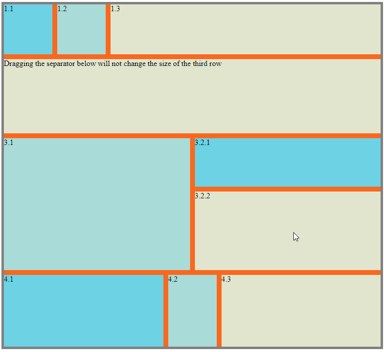
Row and Col tags accept a set of resize options to disable specific separators from resizing it.
interface ResizeDirectionOptions {
    /**
     * Default `true`
     * Set to `false` to disable resizing by separator above
     */
    top?       : boolean;
    /**
     * Default `true`
     * Set to `false` to disable resizing by separator below
     */
    bottom?    : boolean;
    /**
     * Default `true`
     * Set to `false` to disable resizing by separator on the left
     */
    left?      : boolean;
    /**
     * Default `true`
     * Set to `false` to disable resizing by separator on the right
     */
    right?     : boolean;
    /**
     * Default `false`
     * Set to `true` to disable resizing
     */
    disabled?  : boolean;
}
For example:
// This row won't be resized by the separator above it
<Row top={false} />
// This column won't be resized by the separator after it
<Col right={false} />
// This column won't be resized at all
<Col disabled={true} />
Setting props top and bottom doesn't have any effect on Col tags and setting props left and right doesn't have any effect on Row tags.