
react-hover-live
v1.0.0
Published
React Hover Live is a simple yet powerful Hovering component ready to drop in your React projects. Using this component you can 3d hover anything your like.

Readme
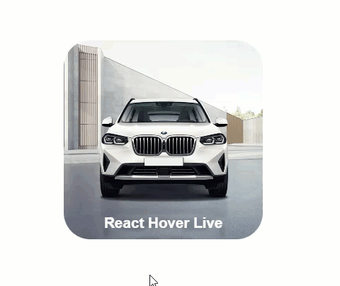
React Hover Live
React Hover Live is a simple yet powerful Hovering component ready to drop in your React projects. Using this component you can 3d hover anything your like.
Demo
Demo
Installation
This is a Node.js module available through the npm registry. Before installing, download and install Node.js.
Installation is done using the npm install command:
npm install --save react-hover-liveUsage
Here's a sample implementation that initializes the component by using all of its props . For further customization details, see options.
import { Hover } from "react-hover-live";
function App() {
const handleMouseOver = (el) => {
// overiding default settings
el.style.boxShadow = '0px 0px 30px red'
el.style.cursor = 'grab'
}
const handleMouseOut = (el) => {
// overiding default settings
return el.style.boxShadow = '0px 0px 30px white'
}
return (
<div>
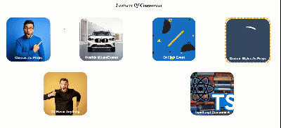
<h1>Features Of Component</h1>
<div className="cards-list">
<Hover heightInPx={"300px"} widthInPx={"300px"} classes={'card 1'} >
<div className="card_image"> <img src="https://media.istockphoto.com/photos/young-handsome-man-with-beard-wearing-casual-sweater-and-glasses-over-picture-id1212960962?b=1&k=20&m=1212960962&s=612x612&w=0&h=einUwH9o_OpLZchX6404GkiCZ19TaowAlvXYFTog8f4=" /> </div>
<div className="card_title title-white">
<p>Classes As Props</p>
</div>
</Hover>
<Hover heightInPx={"300px"} widthInPx={"300px"} classes={'card 2'} onMouseOver={handleMouseOver} onMouseOut={handleMouseOut} >
<div className="card_image">
<img src="https://stimg.cardekho.com/images/carexteriorimages/930x620/BMW/X3/8712/1643014589234/front-view-118.jpg?tr=w-420" />
</div>
<div className="card_title title-white">
<p>Overide MouseEvents</p>
</div>
</Hover>
<Hover heightInPx={"300px"} widthInPx={"300px"} classes={'card 3'} onClick={(e) => { alert('I am clicked') }}>
<div className="card_image">
<img src="https://media.giphy.com/media/10SvWCbt1ytWCc/giphy.gif" />
</div>
<div className="card_title title-white">
<p>OnClick Event</p>
</div>
</Hover>
<Hover heightInPx={"300px"} widthInPx={"300px"} classes={'card 4'} customStyles={{ border: "8px orange dashed" }} >
<div className="card_image">
<img src="https://media.giphy.com/media/LwIyvaNcnzsD6/giphy.gif" />
</div>
<div className="card_title title-white">
<p>Custom Styles As Props</p>
</div>
</Hover>
</div>
<div className="cards-list">
<Hover heightInPx={"300px"} widthInPx={"300px"} classes={'card 5'} >
<div className="card_image"> <img src="https://media.istockphoto.com/photos/portrait-of-young-man-with-shocked-facial-expression-picture-id626204558?k=20&m=626204558&s=170667a&w=0&h=3GZ6--kkKdt9JQj7h-WG0VlJsfypoo8K6SGcTh2UhGY=" /> </div>
<div className="card_title title-white">
<p>3D Hover Anything</p>
</div>
</Hover>
<Hover heightInPx={"300px"} widthInPx={"300px"} classes={'card 6'} >
<div className="card_image">
<img src="https://blog.logrocket.com/wp-content/uploads/2021/12/Build-component-library-React-TypeScript.png" />
<div className="card_title title-white" >
<p>TypeScript Component</p>
</div>
</div>
</Hover>
</div>
</div>
);
}Options
children
Pass the Element that need to be hover between the enclosing brackers of <Hover>Your Element</Hover>.
heightInPx (required)
Pass heightInPx props to define the height of hover area.
<Hover heightInPx={"300px"} widthInPx={"300px"} >widthInPx (required)
Pass widthInPx props to define the width of hover area.
<Hover heightInPx={"300px"} widthInPx={"300px"} >classes (optional)
You can add your custom css classes to <Hover> component.
<Hover heightInPx={"300px"} widthInPx={"300px"} classes={'card bg-blue'} >customStyles (optional)
You can add your custom inline styles to <Hover> component.
<Hover heightInPx={"300px"} widthInPx={"300px"} classes={'card bg-blue'} customStyles={{ border: "8px orange dashed" }} >onClick (optional)
You can append your onClick event to <Hover> component.
<Hover heightInPx={"300px"} widthInPx={"300px"} onClick={(e) => { alert('I am clicked') }} >onMouseOut (optional)
You can append your onMouseOut event to <Hover> component.
The onMouseOut receives current element as its argument
  const handleMouseOut = (el) => {
    // overiding default settings
    return el.style.boxShadow = '0px 0px 30px white'
  }

  <Hover heightInPx={"300px"} widthInPx={"300px"}  onMouseOut={handleMouseOut} >
onMouseOver (optional)
You can append your onMouseOver event to <Hover> component.
The onMouseOver receives current element as its argument
  const handleMouseOver = (el) => {
    // overiding default settings
    el.style.boxShadow = '0px 0px 30px red'
    el.style.cursor = 'grab'

  }

  <Hover heightInPx={"300px"} widthInPx={"300px"} onMouseOver={handleMouseOver}  >
Contributing
Pull requests are welcome. For major changes, please open an issue first to discuss what you would like to change.
Please make sure to update tests as appropriate.