
react-icon-sidebar
v3.7.1
Published
A responsive iconographic side-menu component for React apps


Readme
React Icon Sidebar


A responsive, iconographic sidebar menu for React apps.
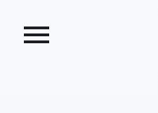
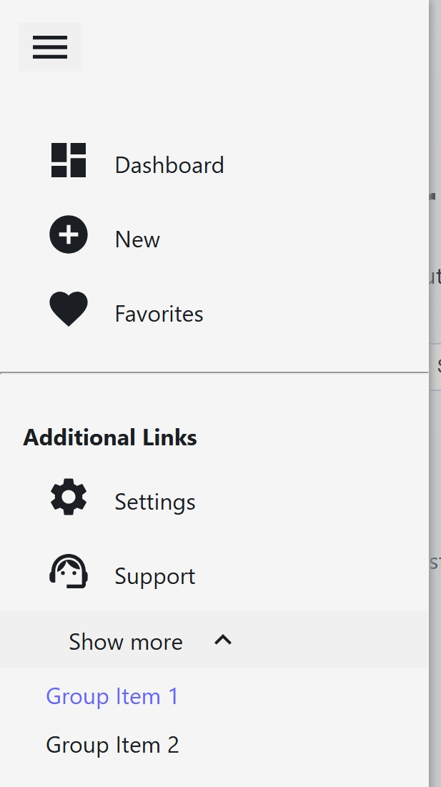
The menu supports three rendered modes, from smallest to largest: mobile, compact, and full.
The rendered mode normally follows the viewport, but it can also be controlled with props:
forcelocks the menu to a single mode:mobile,compact, orfull.minsets the minimum rendered mode.maxsets the maximum rendered mode.showToggleforces the hamburger toggle to remain visible at every size.aligncontrols which side of the viewport the menu and toggle render on (leftby default,rightoptional).
Full (width 1360px+):
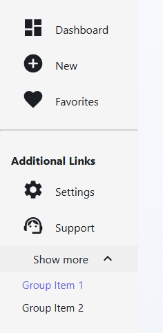
Compact (width 768px - 1359px)

Mobile (width less than 768px)
Usage
- Install the package and its peer dependencies:
npm install react-icon-sidebar react react-icons- Import your icon components and
SideMenu:
import SideMenu from "react-icon-sidebar";
import { MdAddCircle, MdStar, MdPerson } from "react-icons/md";

const customIcon = (
    <span style={{ fontSize: "1.6rem", lineHeight: 1 }} aria-hidden="true">
        ✨
    </span>
);

const menuIconOpen = <span aria-hidden="true">☰</span>;
const menuIconClose = <span aria-hidden="true">✕</span>;
react-icon-sidebar no longer ships a standalone CSS build file. Component styles are applied by the component itself, so no CSS import is required.
- Build a
menuarray.
Note: an object with hr: true renders a horizontal separator.
Note: an object with isTitleItem: true renders the contents of text as a non-clickable title
Note: href can be used anywhere link is expected.
const menu = [
    {
        icon: MdAddCircle,
        text: "New",
        link: "/new",
    },
    {
        icon: MdStar,
        text: "Favorites",
        link: "/favorites",
    },
    {
        icon: customIcon,
        text: "Custom",
        link: "/custom",
    },
    {
        hr: true,
    },
    {
        isTitleItem: true,
        text: "Additional Links",
    },
    {
        icon: <MdPerson size="2em" />,
        text: "Agent",
        link: "/agent",
    },
    {
        groupTitle: "Show more",
        groupItems: [
            {
                text: "Group link 1",
                link: "/group-link-1",
            },
            {
                text: "Group link 2",
                href: "/group-link-2",
            }
        ]
    },
];- Pass the
menuarray to the component:
<SideMenu menu={menu} />You can also override the rendered mode or keep the toggle visible at all sizes:
<SideMenu menu={menu} force="compact" />
<SideMenu menu={menu} min="compact" max="full" />
<SideMenu menu={menu} showToggle />
<SideMenu menu={menu} align="right" />
<SideMenu menu={menu} menuIcon={<span aria-hidden="true">☰</span>} />
<SideMenu
    menu={menu}
    menuIconOpen={menuIconOpen}
    menuIconClose={menuIconClose}
/>
Props
| Property | Type | Description |
| --- | --- | --- |
| menu | Array of objects | Array of menu item objects (see below). |
| force | mobile | compact | full | "" | Forces the menu into one rendered mode. |
| min | mobile | compact | full | "" | Prevents the menu from shrinking below the given mode. |
| max | mobile | compact | full | "" | Prevents the menu from growing above the given mode. |
| showToggle | boolean | Keeps the hamburger button visible at all sizes. |
| align | left | right | Sets which side of the viewport the menu and toggle button render on. |
| menuIcon | JSX element | Custom toggle icon used when menuIconOpen and menuIconClose are not both provided. |
| menuIconOpen | JSX element | Toggle icon shown while the menu is hidden. If provided alone, it is used in both states. |
| menuIconClose | JSX element | Toggle icon shown while the menu is visible. If provided alone, it is used in both states. |
Menu Item Shape
Each object in the menu array must be one of the following:
- Navigable menu item
| Property | Type | Description |
| --- | --- | --- |
| icon | React component | JSX element | Icon shown beside the label. Can be a component (for example from react-icons) or arbitrary JSX. Optional |
| text | string | Visible menu label. Must be non-empty. |
| link | string | Destination URL/path. Must be non-empty. |
| href | string | Alias for link. Either link or href must be provided. |
OR
- Group item (expand/collapse)
| Property | Type | Description | | --- | --- | --- | | icon | React component | Icon component shown next to the group title. Optional | | groupTitle | string | Visible group label. Must be non-empty. | | groupItems | array | Non-empty list of group links (see below). | | expanded | boolean | Optional initial expanded state for the group. |
Group item link shape:
| Property | Type | Description |
| --- | --- | --- |
| text | string | Visible child label. Must be non-empty. |
| link | string | Destination URL/path. |
| href | string | Alias for link. Either link or href must be provided. |
OR
- Separator item
| Property | Type | Description |
| --- | --- | --- |
| hr | boolean | If true, renders a horizontal separator line. |
OR
- Title item
| Property | Type | Description|
| isTitleItem | boolean | If true renders the value of the text property as a title. |
| text | string | Visible title text. Must be non-empty. |
Runtime Validation
SideMenu includes development-time runtime validation for menu.
Validation rules for menu:
menumust be an array.- Every entry must be an object.
- If
groupTitleis present, it must be a non-empty string andgroupItemsmust be a non-empty array. - Each
groupItemsentry must include non-emptytextand either non-emptylinkor non-emptyhref. - If
hr !== trueandgroupTitleis not present, the entry must includeicon, non-emptytext, and either non-emptylinkor non-emptyhref.
Behavior
- Mode selection: the menu renders as
mobileat widths<= 768px,compactfrom768pxto1359px, andfullat1360px+unlessforce,min, ormaxoverride it. - Mobile: the menu starts hidden, opens with the toggle button, and closes when clicking the dimmer overlay behind the opened menu (i.e. "clicking out") or when clicking the toggle button again.
- Compact and full: the menu stays visible by default.
showToggle: when enabled, the hamburger button stays visible at every size and can hide or show the menu.align: defaults toleft. Setalign="right"to render both the sidebar and hamburger toggle on the right.- Toggle icons: by default the component renders
MdMenu. PassmenuIconto replace it with a single custom icon, or pass bothmenuIconOpenandmenuIconCloseto swap icons as the menu opens and closes. When both state-specific props are present, they take precedence overmenuIcon. - Active item: when
window.location.pathnamematches a menu item'slink, that item receives active styling andaria-current="page". - Groups: when
groupItemsare present, the group title toggles expand/collapse and child links render underneath it when expanded. - Titles: when
isTitleItemis set totrue, the stringtextrenders as a non-clickable title.
Accessibility
- The menu toggle uses a semantic
<button>witharia-label,aria-controls, andaria-expanded. - Menu items render as semantic
<a>links. - In mobile mode, the overlay sits above the menu so click-out behavior closes the drawer.
Testing
Current tests cover:
- Basic rendering.
- Mobile toggle open/close behavior.
- Active route rendering.
force,min,max, andshowTogglebehavior.- Custom toggle icon precedence and open/close state rendering.
Run tests:
npm test -- --runInBandVisual Test Run (Demo App)
To preview how the component renders in a live React app:
npm install
npm run demo
This starts a local Vite demo and opens it in your browser.
Demo helpers:
- Use the route buttons to switch paths and verify active-item styling.
- Resize below
768pxto verify mobile toggle and overlay behavior. - Try
force,min,max, andshowTogglein code to confirm the rendered mode stays within the requested bounds.
Optional demo commands:
npm run demo:build
npm run demo:preview
Build Output
Running npm run build emits the library JavaScript module in dist/.
There is no separate CSS build artifact in dist/.
CONTRIBUTING
See CONTRIBUTING or see issues for a roadmap.