
react-insta-collage
v1.1.0
Published
A React library to create Instagram Story style collages.

Maintainers
 macroxw
Readme
react-insta-collage
A React component for building Instagram Stories-style collages with a focused center story, side previews, video support, story elements, navigation callbacks, and smooth View Transitions.
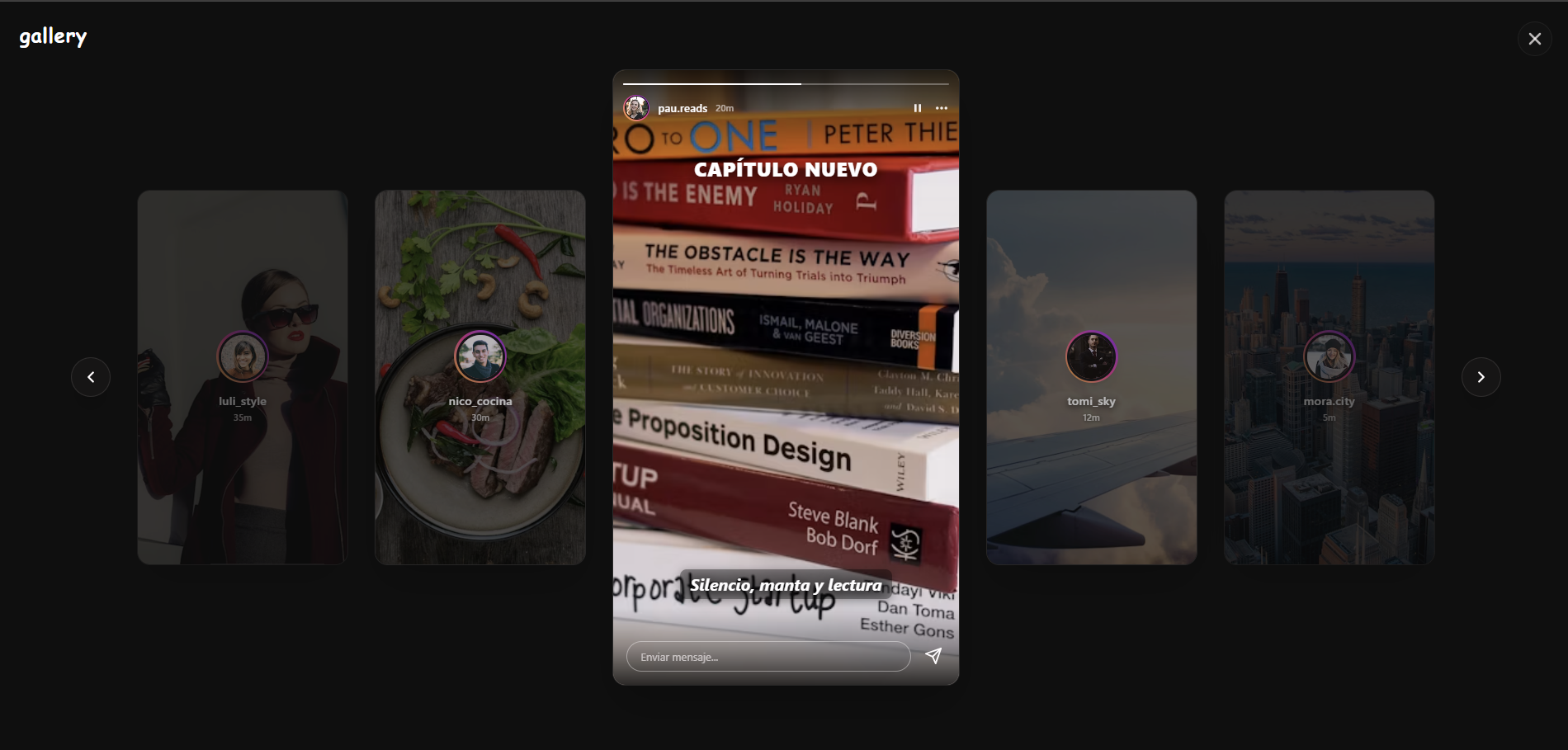
Features
- Story-style collage layout with a prominent center card and side previews.
- API-friendly story model: each slide has
createdAt, abackground, and positionedelements. - Supports image and video backgrounds.
- Renders story elements like text, mentions, hashtags, locations, links, music, polls, emoji sliders, question boxes, images, and GIFs.
- Supports custom story elements through
type: 'custom'andrenderElement. useInstaCollageStorieshook for navigation, active slide state, and side-card derivation.- Optional previous/next controls and side-card selection callbacks.
- Built-in progress bars for multi-slide stories.
- Responsive layout for desktop and mobile.
- TypeScript types included.
Installation
pnpm add react-insta-collagenpm install react-insta-collageBasic Usage
import {
  InstaCollage,
  useInstaCollageStories,
  type UserStoryData,
} from 'react-insta-collage';

const userStories: UserStoryData[] = [
  {
    username: 'ava_stone',
    profileImage: 'https://example.com/avatar.jpg',
    slides: [
      {
        id: 'story-1',
        createdAt: '2026-05-26T14:20:00Z',
        background: {
          type: 'image',
          url: 'https://example.com/background.jpg',
        },
        elements: [
          {
            type: 'text',
            text: 'Hello Instagram',
            x: 0.5,
            y: 0.3,
            style: {
              font: 'strong',
              size: 42,
              color: '#FFFFFF',
              align: 'center',
            },
          },
          {
            type: 'mention',
            username: 'noah_brooks',
            x: 0.3,
            y: 0.7,
          },
          {
            type: 'hashtag',
            tag: '#travel',
            x: 0.7,
            y: 0.7,
          },
          {
            type: 'link',
            url: 'https://example.com',
            label: 'Learn more',
            x: 0.5,
            y: 0.9,
          },
          {
            type: 'custom',
            name: 'voting',
            x: 0.5,
            y: 0.78,
            props: {
              question: 'Pick an option',
              options: [
                { id: 'option-a', label: 'Option A', votes: 124 },
                { id: 'option-b', label: 'Option B', votes: 48 },
              ],
              selectedOptionId: 'option-a',
            },
          },
        ],
      },
    ],
  },
];

export function Example() {
  const stories = useInstaCollageStories(userStories, {
    initialUserIndex: 0,
    maxSlides: 10,
  });

  return (
    <InstaCollage
      {...stories.collageProps}
      renderElement={(element) => {
        if (element.type === 'custom' && element.name === 'voting') {
          return <VotingSticker {...element.props} />;
        }

        return null;
      }}
    />
  );
}
API
useInstaCollageStories(stories, options)
Use this hook when your API returns users with multiple slides and you want the library to handle navigation, active slide state, side cards, and View Transition direction classes.
const stories = useInstaCollageStories(userStories, {
  initialUserIndex: 0,
  maxSlides: 10,
  enableViewTransitions: true,
});

<InstaCollage {...stories.collageProps} />;
Options
| Option | Type | Description |
| :--- | :--- | :--- |
| initialUserIndex | number | Initial active user index. Defaults to 0. |
| maxSlides | number | Maximum slides used per user. Defaults to 10. |
| enableViewTransitions | boolean | Enables View Transitions when supported. Defaults to true. |
Return
| Field | Type | Description |
| :--- | :--- | :--- |
| isOpen | boolean | Useful when rendering your own modal around the collage. |
| currentUserIndex | number | Active user index. |
| currentSlideIndex | number | Active slide index for the active user. |
| left | StoryData[] | Derived side stories to the left. |
| center | MainStoryData | Derived active center slide. |
| right | StoryData[] | Derived side stories to the right. |
| hasPrev | boolean | Whether previous navigation is available. |
| hasNext | boolean | Whether next navigation is available. |
| openAt | (userIndex?: number) => void | Opens the viewer at a user index. |
| close | () => void | Closes the viewer state. |
| next | () => void | Advances slide or user. |
| prev | () => void | Moves back slide or user. |
| selectLeft | (index: number) => void | Selects a visible left side card. |
| selectRight | (index: number) => void | Selects a visible right side card. |
| collageProps | InstaCollageProps | Ready-to-spread props for <InstaCollage />. |
InstaCollage
Low-level controlled component. Use it directly if you want to manage all story state yourself.
| Prop | Type | Description |
| :--- | :--- | :--- |
| left | StoryData[] | Stories shown to the left of the center card. Usually 0-2 items. |
| center | MainStoryData | Active center slide with background, elements, progress metadata, and user metadata. |
| right | StoryData[] | Stories shown to the right of the center card. Usually 0-2 items. |
| renderElement | (element, index) => ReactNode | Optional renderer for custom story elements. |
| onPrev | () => void | Optional previous callback. If omitted, the previous arrow is hidden. |
| onNext | () => void | Optional next callback. Used by the arrow and center story advance. |
| onSelectLeft | (index: number) => void | Called when a visible left story is selected. |
| onSelectRight | (index: number) => void | Called when a visible right story is selected. |
| onSendReply | (text, context) => void | Called when the reply input is submitted. Use context.username and context.story to open a chat or send a message. |
| storyActions | StoryActionItem[] | Custom items for the three-dot menu in the main story card. Defaults to Dejar de seguir and Denunciar. |
| onStoryAction | (action, context) => void | Called when a three-dot menu action is selected. |
| onUserClick | (username: string) => void | Called when the story author header is selected. |
| replyPlaceholder | string | Placeholder for the story reply input. |
| showReply | boolean | Shows or hides the story reply input. Defaults to visible. |
| className | string | Optional class name for the collage grid. |
<InstaCollage
  {...stories.collageProps}
  storyActions={[
    { id: 'unfollow', label: 'Dejar de seguir' },
    { id: 'report', label: 'Denunciar', variant: 'danger' },
  ]}
  onStoryAction={(action, context) => {
    console.log(action.id, context.username, context.story.id);
  }}
  onSendReply={(text, context) => {
    window.location.href = `/chat?to=${context.username}&text=${encodeURIComponent(text)}`;
  }}
/>;
Data Model
UserStoryData
interface UserStoryData {
  username: string;
  profileImage: string;
  slides: StorySlideData[];
  isLoading?: boolean;
}
StorySlideData
interface StorySlideData {
  id: string;
  createdAt: string;
  expiresAt?: string;
  background: StoryBackground;
  elements?: StoryElement[];
}

interface StoryBackground {
  type: 'image' | 'video';
  url: string;
}
StoryElement
All element positions use normalized coordinates: x: 0 is left, x: 1 is right, y: 0 is top, and y: 1 is bottom.
type StoryElement =
  | { type: 'text'; text: string; x: number; y: number; rotation?: number; style?: TextStyle }
  | { type: 'image' | 'gif'; url: string; x: number; y: number; width?: number; height?: number; rotation?: number }
  | { type: 'mention'; username: string; x: number; y: number; rotation?: number }
  | { type: 'hashtag'; tag: string; x: number; y: number; rotation?: number }
  | { type: 'location'; name: string; x: number; y: number; rotation?: number }
  | { type: 'link'; url: string; label: string; x: number; y: number; rotation?: number }
  | { type: 'music'; track: string; artist: string; start_ms?: number; x: number; y: number; rotation?: number }
  | { type: 'poll'; question: string; options: string[]; x: number; y: number; rotation?: number }
  | { type: 'emoji_slider'; emoji: string; question: string; x: number; y: number; rotation?: number }
  | { type: 'question_box'; question: string; x: number; y: number; rotation?: number }
  | { type: 'custom'; name: string; props?: unknown; x: number; y: number; rotation?: number };
Local Example
pnpm install
pnpm --dir example install
pnpm --dir example dev
License
MIT