
react-intl-phone-username-input
v1.1.1
Published
React identity input for international phone numbers, usernames, and email-like values with country selection and RTL support
Downloads
221
Maintainers
 usl-dev
Keywords
Readme
react-intl-phone-username-input
A React component for international phone numbers and usernames (e.g. email) in one field. Supports 240+ countries, optional country selector, phone formatting, RTL, and is built for performance with lazy loading and code-splitting.
Features
- Dual purpose – Single input for phone or username/email; mode can be fixed or hybrid (auto-detect).
- Multi-country support – 240+ countries with flags and dial codes; optional dropdown to choose country.
- Phone-only or hybrid –
mode: "phone"for numbers only;mode: "hybrid"accepts text or phone and formats when it looks like a number. - Country selector – Custom dropdown (search + keyboard) or native
<select>; auto choice on mobile vs desktop. - Formatting – Optional as-you-type formatting via
libphonenumber-js. - RTL –
direction: "rtl"for right-to-left layout and text. - Customizable – Root
className,options.classesfor per-part styling, and pass-through input props. - Performance – Lazy-loaded country list and dynamically imported selector components; memoized components; small initial bundle.
- TypeScript – Typed props and options.
- Accessibility – ARIA attributes, keyboard navigation in custom dropdown, semantic markup.
When to use it
Use this component when you want one reusable field that can:
- Collect phone numbers with country-aware formatting
- Switch between a custom country dropdown and a native mobile-friendly select
- Accept either phone numbers or username/email-like text in the same controlled input
- Fit into forms without having to rebuild flag, dial code, and country selection logic in every project
Installation
Install the package. React 17+ and React DOM 17+ are required as peer dependencies in the consuming app. libphonenumber-js is installed automatically with this package and will not appear in your package.json.
# npm
npm install react-intl-phone-username-input

# yarn
yarn add react-intl-phone-username-input

# pnpm
pnpm add react-intl-phone-username-input

# bun
bun add react-intl-phone-username-input
Peer dependencies: react (17+) and react-dom (17+). Your app must have both installed.
Live demo
Try the component in the interactive playground:
- Interactive demo: https://usl-dev.github.io/react-intl-phone-username-input/
More detailed specs, usage scenarios, and option behavior are documented at:
- Full feature docs: https://upscalesoftwarelabs.vercel.app/package/react-intl-phone-username-input/
You can use the live sandbox to test phone-only, hybrid, multi-country, and RTL configurations without cloning the repo.
Flags are loaded from https://flagcdn.com by default. If your app needs self-hosted assets or has a strict CSP, set options.flagBaseUrl to your own flag path.
TypeScript and JavaScript support
This package works in both TypeScript and JavaScript React projects.
- TypeScript – Ships declaration files, typed props, typed options, and typed utility re-exports.
- JavaScript – Ships compiled ESM and CommonJS builds, so you can use it from regular React
.js/.jsxapps too.
If you are using JavaScript, you still get editor IntelliSense in most IDEs because the package publishes .d.ts files alongside the runtime build.
Quick start
import { IntlPhoneUsernameInput } from "react-intl-phone-username-input";
import "react-intl-phone-username-input/style.css";
import { useState } from "react";

export default function App() {
  const [value, setValue] = useState("");

  return (
    <IntlPhoneUsernameInput
      value={value}
      onChange={setValue}
      options={{
        mode: "phone",
        defaultCountry: "IN",
        multiCountry: true,
        enableFlag: true,
      }}
      placeholder="Enter phone number"
    />
  );
}
How it works
- Controlled input – You control
valueand update it viaonChange(value). The component does not hold the value internally. - Options – All behavior is driven by the
optionsprop (mode, default country, multi-country, formatting, etc.). Memoizingoptions(e.g.useMemo) avoids unnecessary re-renders. - Lazy loading – The full country list (240+ entries) is loaded asynchronously after mount. Until then, a minimal list (default country + fallback) is used so the input works immediately. The country selector and its UI (CustomSelect / HtmlSelect) are loaded only when
multiCountryis true (dynamic import). - Form-friendly country selection – Native select uses
selectFieldNamedirectly. Custom select renders a hidden input with the same name so form posts stay consistent. - Flags are configurable – By default flags load from
https://flagcdn.com; setflagBaseUrlto self-host them. - Bundle size – Initial script load is small; country list and selector UI load on demand. See Build size analysis for details.
Usage examples
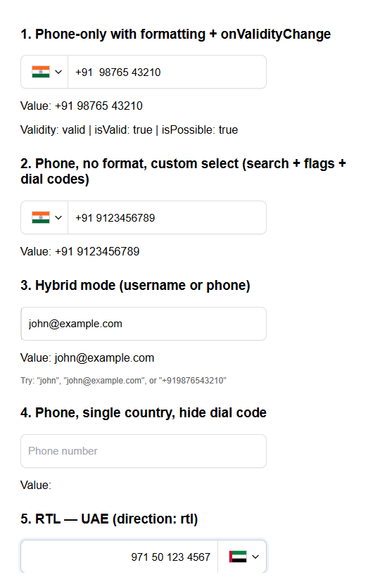
Phone-only with country selector
<IntlPhoneUsernameInput
  value={value}
  onChange={setValue}
  options={{
    mode: "phone",
    multiCountry: true,
    defaultCountry: "IN",
  }}
  placeholder="Enter phone number"
/>
Additional options (format hideDialCode, enableFlag, preferredCountries, etc.) are available in the feature docs.
Custom dropdown (search + keyboard)
<IntlPhoneUsernameInput
  value={value}
  onChange={setValue}
  options={{
    mode: "phone",
    defaultCountry: "US",
    multiCountry: true,
    enforceCustomSelect: true,
    customSelect: {
      showFlag: true,
      showDialCode: true,
      enableSearch: true,
      searchPlaceholder: "Search countries...",
    },
  }}
  placeholder="Use ↑↓ and Enter in the dropdown"
/>
Hybrid (username, email, or phone)
<IntlPhoneUsernameInput
  value={value}
  onChange={setValue}
  options={{
    mode: "hybrid",
    defaultCountry: "US",
    enableFlag: true,
  }}
  placeholder="Enter username, email, or phone"
/>
RTL
<IntlPhoneUsernameInput
  value={value}
  onChange={setValue}
  options={{
    mode: "phone",
    direction: "rtl",
    defaultCountry: "AE",
    multiCountry: true,
  }}
  placeholder="أدخل رقم الهاتف"
/>
Hide dial code in input
<IntlPhoneUsernameInput
  value={value}
  onChange={setValue}
  options={{
    mode: "phone",
    defaultCountry: "IN",
    multiCountry: true,
    hideDialCode: true,
  }}
  placeholder="Phone number only"
/>
Preferred and highlighted countries
<IntlPhoneUsernameInput
  value={value}
  onChange={setValue}
  options={{
    mode: "phone",
    multiCountry: true,
    defaultCountry: "US",
    highlightCountries: ["AE"],
    preferredCountries: ["GB", "IN"],
  }}
/>
highlightCountries always appears first, then preferredCountries, then the rest of the country list.
Self-host flag assets
<IntlPhoneUsernameInput
  value={value}
  onChange={setValue}
  options={{
    mode: "phone",
    defaultCountry: "US",
    multiCountry: true,
    flagBaseUrl: "/flags",
  }}
/>
When flagBaseUrl is set to "/flags", the component requests flags like "/flags/us.svg" and "/flags/in.svg".
Form integration
<IntlPhoneUsernameInput
  value={value}
  onChange={setValue}
  selectFieldName="country_code"
  onChangeSelect={(change) => {
    console.log(change.countryCode);
    console.log(change.dialCode);
    console.log(change.source);
  }}
  options={{
    mode: "phone",
    multiCountry: true,
    defaultCountry: "US",
  }}
/>
With native select, selectFieldName becomes the real <select name>. With custom select, the component renders a hidden input using the same name.
Ref access
const inputRef = useRef<HTMLInputElement>(null);

<IntlPhoneUsernameInput
  ref={inputRef}
  value={value}
  onChange={setValue}
  placeholder="Phone"
/>;
Props
Main props
| Prop | Type | Required | Description |
| ----------------- | ------------------------- | -------- | --------------------------------------------------------------------------------------------------------------------------------------------------------------------------------------------------- |
| value | string | Yes | Current input value (controlled). |
| onChange | (value: string) => void | Yes | Called when the value changes. |
| onChangeSelect | (change) => void | No | Called with { countryCode, dialCode, label, name, source } when the selected country changes. |
| onValidityChange | (state) => void | No | Called when phone validity changes. Emits { status, isValid, isPossible }. Only fires in phone mode or when the hybrid value looks like a phone number. See Validation. |
| options | object | No | Configuration; see Options below. Memoize for best performance. |
| className | string | No | Class name for the root wrapper (e.g. layout or global overrides). |
| selectFieldName | string | No | Field name used for the country selector. Native select uses it directly; custom select renders a hidden input with this name. |
| placeholder | string | No | Input placeholder. |
| Other input props | — | No | Standard input attributes and handlers such as disabled, required, name, autoComplete, onBlur, onFocus, onKeyDown, aria-*, and data-* are passed through to the underlying input. |
Options object
| Option | Type | Default | Description |
| -------------------------------- | ----------------------- | ----------------------- | ------------------------------------------------------------------------------------------------------------------------------------------------------------- |
| Core | | | |
| mode | "phone" | "hybrid" | "hybrid" | "phone": strictly phone input (numbers only, always format). "hybrid": accepts username/email/text and formats only when input looks like a phone number. |
| defaultCountry | string | "IN" | Default country (ISO 3166-1 alpha-2, e.g. "US", "IN"). Must be supported by libphonenumber-js. |
| multiCountry | boolean | false | Show country selector (dropdown). When true, selector chunks load dynamically. enableFlag is ignored in this mode; selection UI controls flags. |
| format | boolean | true | Format phone number as you type. |
| enableFlag | boolean | true | Show country flag in single-country mode. When multiCountry: true, this option has no effect (flags are always shown in the selector). |
| hideDialCode | boolean | false | If true, dial code is not shown in the input (still used internally). |
| Country selector | | | |
| enforceCustomSelect | boolean | false | Always use custom dropdown (search + keyboard). |
| enforceHtmlSelect | boolean | false | Always use native <select>. |
| flagBaseUrl | string | "https://flagcdn.com" | Base URL used to resolve flag SVGs, for example "/flags" when self-hosting. |
| customSelect | object | see below | Options for the custom dropdown. |
| customSelect.showFlag | boolean | false | Show flags in dropdown options. |
| customSelect.showDialCode | boolean | false | Show dial codes in dropdown options. |
| customSelect.enableSearch | boolean | true | Enable search in dropdown. |
| customSelect.searchPlaceholder | string | "Search" | Placeholder for search input. |
| Country order | | | |
| preferredCountries | string[] | [] | Country codes to show first, e.g. ["US", "CA", "GB"]. |
| highlightCountries | string[] | [] | Country codes to pin above preferred countries at the top of the list. |
| Layout & styling | | | |
| direction | "ltr" | "rtl" | "ltr" | Text/layout direction. |
| classes | object | {} | CSS class overrides; see Styling. |
| customArrowIcon | ReactNode | — | Custom icon for the dropdown trigger. |
When neither enforceCustomSelect nor enforceHtmlSelect is set, the component picks native select on small screens (e.g. < 768px) and custom dropdown on larger screens.
onChangeSelect payload
onChangeSelect={(change) => {
  console.log(change.countryCode); // "IN"
  console.log(change.dialCode); // "+91"
  console.log(change.label); // "India"
  console.log(change.name); // "country_select"
  console.log(change.source); // "native-select" | "custom-select"
}}
Behavior notes
- In
phonemode, the input always behaves as a phone-number field. - In
hybridmode, text like usernames and email addresses is preserved as text, while phone-like input is formatted when appropriate. defaultCountryis optional. If omitted, the component falls back to"IN"unlesspreferredCountriesprovides the first valid country.highlightCountriesandpreferredCountriesare normalized to uppercase and invalid country codes are ignored.
Validation
onValidityChange callback
The component emits a PhoneValidityState object every time the phone validity changes. Use it to drive UI feedback without writing your own libphonenumber-js calls.
import { IntlPhoneUsernameInput, type PhoneValidityState } from "react-intl-phone-username-input";

function PhoneField() {
  const [value, setValue] = useState("");
  const [validity, setValidity] = useState<PhoneValidityState | null>(null);

  return (
    <>
      <IntlPhoneUsernameInput
        value={value}
        onChange={setValue}
        onValidityChange={setValidity}
        options={{ mode: "phone", multiCountry: true, defaultCountry: "US" }}
      />
      {validity && !validity.isValid && value && (
        <p style={{ color: "red" }}>
          {validity.status === "too_short" && "Number is too short."}
          {validity.status === "too_long"  && "Number is too long."}
          {validity.status === "invalid"   && "Invalid phone number."}
        </p>
      )}
    </>
  );
}
PhoneValidityState fields:
| Field | Type | Description |
| ------------ | ------------------------------------------------------------ | ------------------------------------------------------------ |
| status | "valid" | "too_short" | "too_long" | "invalid" | "unknown" | Granular status string. |
| isValid | boolean | true only for fully valid numbers. |
| isPossible | boolean | true if the number could become valid with more digits. |
validatePhone() utility
Use the standalone validator anywhere — outside a component, in custom hooks, schema libraries, or server-side code.
import { validatePhone } from "react-intl-phone-username-input";

const result = validatePhone("+1 650 253 0000");
// { status: "valid", isValid: true, isPossible: true }

const short = validatePhone("+1 650");
// { status: "too_short", isValid: false, isPossible: true }

// Optional country code hint (useful for numbers without "+" prefix)
validatePhone("09876543210", "IN");
Framework integration
react-hook-form
import { useForm, Controller } from "react-hook-form";
import { IntlPhoneUsernameInput, validatePhone } from "react-intl-phone-username-input";
import "react-intl-phone-username-input/style.css";

function SignupForm() {
  const { control, handleSubmit } = useForm({ defaultValues: { phone: "" } });

  return (
    <form onSubmit={handleSubmit(console.log)}>
      <Controller
        name="phone"
        control={control}
        rules={{
          validate: (v) => validatePhone(v).isValid || "Enter a valid phone number",
        }}
        render={({ field, fieldState }) => (
          <>
            <IntlPhoneUsernameInput
              value={field.value}
              onChange={field.onChange}
              onBlur={field.onBlur}
              options={{ mode: "phone", multiCountry: true, defaultCountry: "US" }}
              placeholder="Phone number"
            />
            {fieldState.error && <p>{fieldState.error.message}</p>}
          </>
        )}
      />
      <button type="submit">Submit</button>
    </form>
  );
}
Zod + react-hook-form
import { z } from "zod";
import { validatePhone } from "react-intl-phone-username-input";

const schema = z.object({
  phone: z
    .string()
    .min(1, "Phone is required")
    .refine((v) => validatePhone(v).isValid, "Enter a valid international phone number"),
});
Formik
import { useFormik } from "formik";
import { validatePhone } from "react-intl-phone-username-input";

const formik = useFormik({
  initialValues: { phone: "" },
  validate: (values) => {
    const errors: Record<string, string> = {};
    if (!validatePhone(values.phone).isValid) {
      errors.phone = "Enter a valid phone number";
    }
    return errors;
  },
  onSubmit: console.log,
});
Styling with className and classes
Root className – Pass a single class for the wrapper (layout, spacing, or CSS that targets inner elements):
<IntlPhoneUsernameInput
  className="my-form-field"
  value={value}
  onChange={setValue}
/>
Per-part overrides – Use options.classes to target specific elements (same pattern as MUI’s classes). Your classes are merged with the library’s defaults:
<IntlPhoneUsernameInput
  value={value}
  onChange={setValue}
  options={{
    defaultCountry: "IN",
    multiCountry: true,
    classes: {
      intlPhoneUsernameInputWrapper: "my-wrapper",
      input_box: "my-input",
      flag_container: "my-flag-container",
      custom_select: {
        select_container: "my-dropdown",
        country_option: "my-option",
        search_input: "my-search",
      },
      html_select: {
        html_select_container: "my-native-select",
        select_overlay: "my-overlay",
      },
    },
  }}
/>
Class keys
| Key | Description |
| ----------------------------------- | ------------------------------------- |
| Main | |
| intlPhoneUsernameInputWrapper | Root wrapper. |
| input_box | Text input. |
| flag_container | Flag container (single-country mode). |
| flag | Flag image. |
| Custom select | |
| custom_select.select_container | Dropdown container. |
| custom_select.select_overlay_btn | Trigger button. |
| custom_select.dropdown_container | Dropdown panel. |
| custom_select.search_input | Search field. |
| custom_select.country_list | List container. |
| custom_select.country_list_item | List item wrapper. |
| custom_select.country_option | Country button. |
| custom_select.flag | Flag on trigger. |
| custom_select.list_flag | Flag in list options. |
| custom_select.arrow | Arrow icon. |
| Native select | |
| html_select.html_select_container | Native select container. |
| html_select.select_wrapper | Wrapper. |
| html_select.select_overlay | Styled overlay. |
| html_select.flag | Flag. |
| html_select.arrow | Arrow. |
For the full pattern and recommendations, see docs/STYLING.md.
CSS custom properties
The component exposes CSS custom properties (variables) for the most common visual customizations. Set them on your wrapper class — they cascade into the component without fighting module specificity.
.my-phone-field {
  --ripu-bg:              #0f172a;      /* container background */
  --ripu-border-color:    #334155;      /* container border */
  --ripu-border-radius:   4px;          /* corner radius */
  --ripu-height:          44px;         /* container height */
  --ripu-max-width:       420px;        /* container max-width */
  --ripu-accent:          rgba(139, 92, 246, 0.3); /* focus ring + search underline */
  --ripu-hover-border:    #475569;      /* border color on hover */
  --ripu-font-size:       14px;
  --ripu-font-weight:     400;
  --ripu-text-color:      #f8fafc;
  --ripu-placeholder:     #64748b;
  --ripu-divider:         #334155;      /* separator between flag/select and input */
  --ripu-dropdown-bg:     #1e293b;      /* dropdown panel background */
  --ripu-dropdown-border: #334155;
  --ripu-dropdown-max-height: 200px;
  --ripu-option-selected-bg:    #312e81;
  --ripu-option-selected-color: #c7d2fe;
}
<IntlPhoneUsernameInput
className="my-phone-field"
value={value}
onChange={setValue}
/>Re-exported utilities (libphonenumber-js)
You can use the same validation/formatting helpers the component uses:
import {
  isValidPhoneNumber,
  isPossiblePhoneNumber,
  parsePhoneNumber,
  parsePhoneNumberWithError,
  formatIncompletePhoneNumber,
  AsYouType,
  getExampleNumber,
  examples,
} from "react-intl-phone-username-input";
These are re-exports from libphonenumber-js (included as a dependency of this package).
Bundle and performance
- Initial load: Only a small entry script is loaded; country list and selector UI are in separate chunks.
- Lazy country list: Full list loads after mount; a minimal list is used until then.
- Lazy selector: CustomSelect and HtmlSelect are loaded only when
multiCountryis true. - Flags: SVGs are fetched from the configured
flagBaseUrlinstead of being bundled into the npm package. - Memoization: Components are memoized; keep
optionsand callbacks stable (e.g.useMemo/useCallback) for best performance.
See docs/BUILD_SIZE_ANALYSIS.md for build output and size notes.
Development
# Install
npm install

# Build library
npm run build

# Example app
npm run dev
# or
cd example && npm install && npm start
Publishing to npm
To publish this package so users can install it with npm, yarn, pnpm, or bun, see docs/PUBLISHING.md for step-by-step configuration and commands.
License
MIT. See the LICENSE file in the repository.
Support
- Issues: GitHub Issues
- Discussions: GitHub Discussions
Support This Project
If this package saves you time, consider sponsoring:
