
react-keyboard3d-dkhandelwal
v0.1.21
Published
A stunning, interactive 3D keyboard component for React. Features real-time sound synthesis, haptic vibration feedback, multiple layouts (QWERTY, A–Z, Numeric), and a mobile-first premium design.

Maintainers
 d_khandelwal
Readme
⌨️ React KeyBoard-3D
A stunning, interactive 3D keyboard component for React. Features real-time sound synthesis, haptic vibration feedback, multiple layouts (QWERTY, A–Z, Numeric), and a mobile-first premium design.
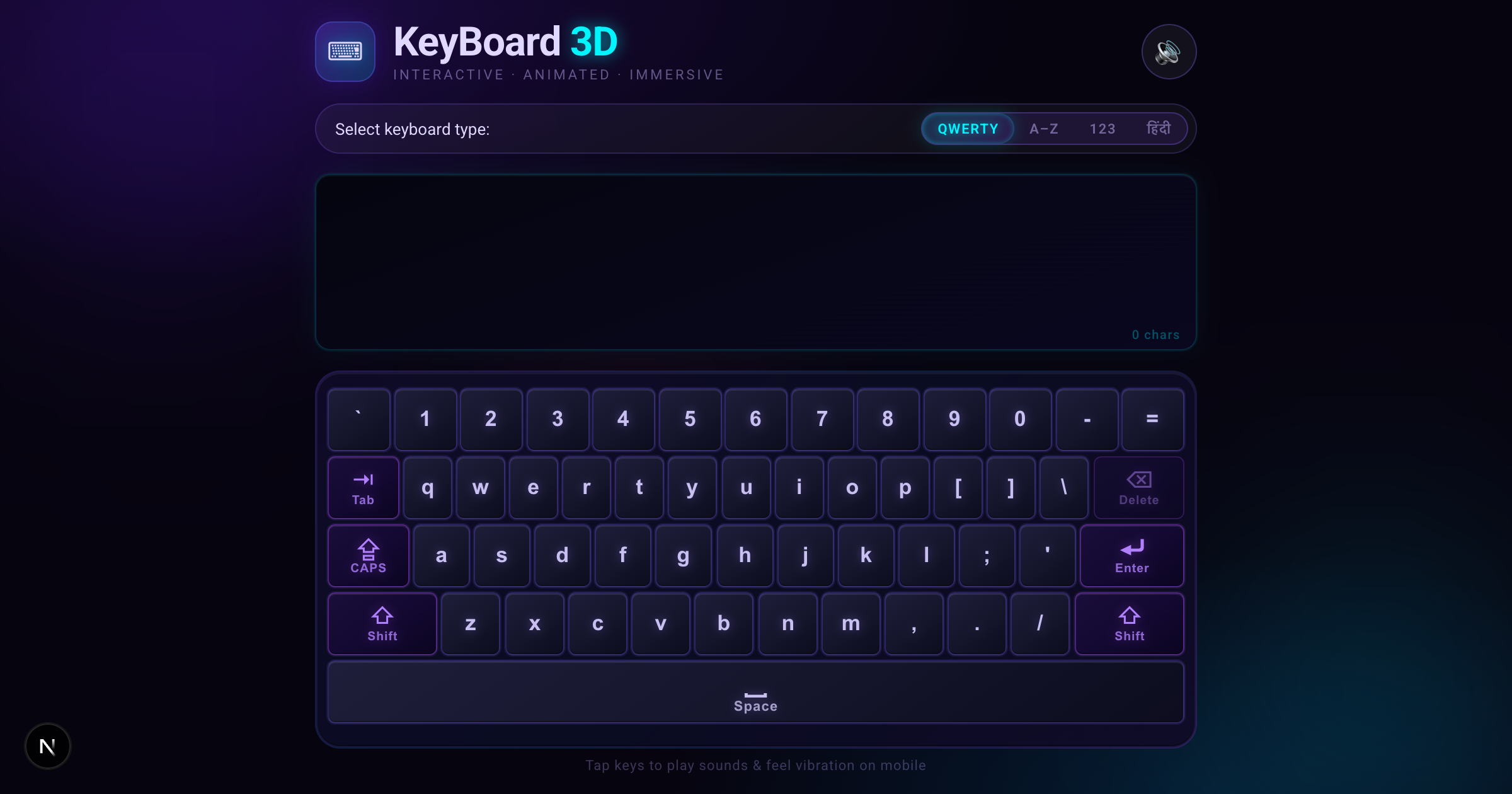
🟢 Live Demo
Try it out in your browser instantly!

📥 Installation
Install the package via npm:
npm install react-keyboard3d-dkhandelwalNote: Since it's a React component, you'll need react and react-dom installed in your project.
🚀 Quick Start
Import the component and its CSS file into your React/Next.js application.
import { useState } from 'react';
import { Keyboard3D } from 'react-keyboard3d-dkhandelwal';
import 'react-keyboard3d-dkhandelwal/dist/index.css'; // Important: Import the styles!

export default function MyKeyboardApp() {
  const [text, setText] = useState('');

  return (
    <div style={{ height: '100vh', background: '#0a0814' }}>
      <Keyboard3D
        value={text}
        onChange={(newText) => setText(newText)}
        defaultLayout="qwerty"
      />
    </div>
  );
}
🏷️ Props Reference
Keyboard3D supports both controlled and uncontrolled state management.
| Prop | Type | Default | Description |
| :--- | :--- | :--- | :--- |
| className | string | undefined | Optional custom CSS class for the outermost container. |
| value | string | undefined | The current value of the typed text. If provided, the component acts as a controlled component. |
| defaultValue | string | "" | Initial text value for uncontrolled usage. |
| onChange | (value: string) => void | undefined | Callback fired whenever the text value changes. |
| onKeyPress | (key: string) => void | undefined | Callback fired for every individual key press (including modifiers). |
| layout | LayoutType | undefined | The current keyboard layout ('qwerty', 'abcd', 'numeric', 'hindi', 'phonetic-hindi', 'emoji'). If provided, layout state is controlled. |
| defaultLayout | LayoutType | 'qwerty' | Initial layout for uncontrolled usage. |
| onLayoutChange | (layout: LayoutType) => void| undefined | Callback fired when the user switches the layout via the toggle buttons. |
| showDisplayScreen | boolean | true | Whether to show the top display screen showing the typed text. |
| showLayoutToggle | boolean | true | Whether to show the layout toggle buttons. |
| showHeader | boolean | true | Whether to show the header section with title and sound toggle. |
| showFooter | boolean | true | Whether to show the footer section. |
| headerTitle | ReactNode | "KeyBoard" | Custom header title content. |
| headerTitleAccent | ReactNode | " 3D" | Custom accented text appended to the title. |
| headerSubtitle | ReactNode | "Interactive · Animated · Immersive" | Custom header subtitle content. |
| footerText | ReactNode | "Made with ❤️ in India." | Custom footer text content. |
| enableSound | boolean | undefined | Whether to play sound on key press. If provided, sound state is controlled. |
| defaultEnableSound| boolean | true | Initial sound state for uncontrolled usage. |
| onSoundToggle | (enabled: boolean) => void| undefined | Callback fired when the sound toggle button is clicked. |
🔢 Layout Types
The LayoutType is exported from the package and supports the following literal strings:
'qwerty'- A standard QWERTY layout.'abcd'- A standard A-Z alphabetical layout.'hindi'- A native Hindi (Devanagari) layout.'phonetic-hindi'- A phonetic English-to-Hindi transliteration layout powered by Google Input Tools.'numeric'- A number pad layout.'emoji'- A full emoji keyboard with categories and search functionality.
🎛 Features
- Controlled/Uncontrolled: Use it as a drop-in uncontrolled component or hook it up to your own state.
- Haptic & Sound: Automatically handles sound and vibration on mobile devices.
- Modifiers: Supports Shift and Caps-Lock with intelligent auto-reverting shift behavior.
- Phonetic Transliteration: Type in English and automatically convert to Hindi in real-time (
phonetic-hindilayout). - Emoji Picker: Fully integrated emoji keyboard with skin-tone deduplication, categorized tabs, and a fast search bar.
- Beautiful UI: Glassmorphism, 3D shadows, fluid dropdowns, and CSS animations built-in.
📖 Documentation
For installation guide, and usage examples, visit the Documentation
🤝 Contributing
Contributions are always welcome! If you have a great idea or spot a bug, feel free to open an issue or submit a pull request:
https://github.com/dkhandelwal2/custom-keyboard/issues
📄 License
MIT