
react-liquid-glass-component
v0.2.1
Published
Liquid glass effect for React using SVG filters with chromatic aberration and frosted blur.
Downloads
716

Maintainers
 sahajohn
Readme
LiquidGlass


A React component that wraps any children in a liquid glass surface — frosted blur, real-time SVG distortion, and chromatic aberration. Zero runtime dependencies beyond React and styled-components.
Table of Contents
- Demo
- Screenshots
- Install
- Quick Start
- Features
- Props
- Examples
- CSS Custom Properties
- SSR Note
- How It Works
- Browser Support
- Local Development
- License
Demo
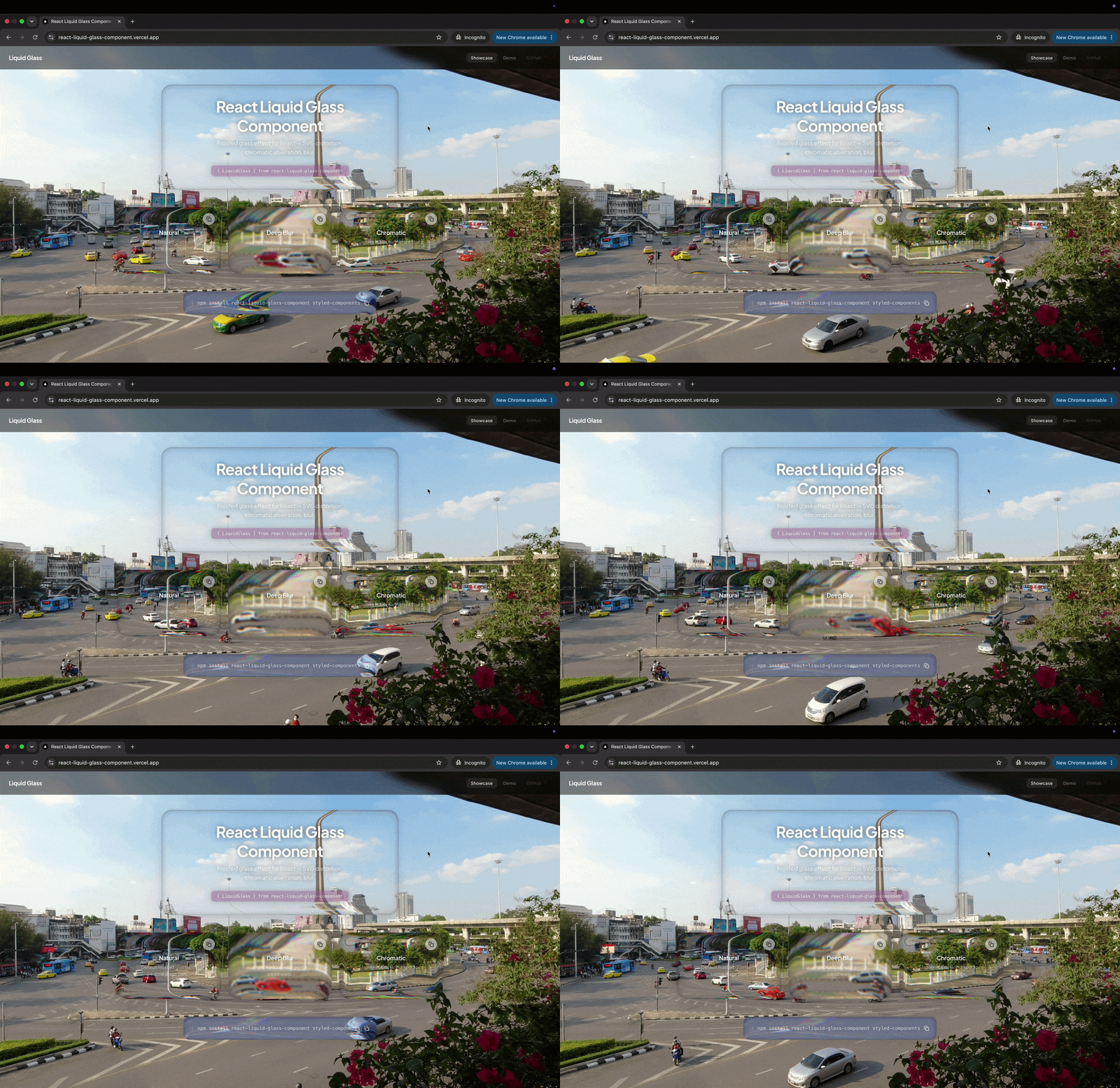
👉 Try the interactive demo at react-liquid-glass-component.vercel.app
Screenshots
| Showcase | Interactive Demo |
|---|---|
| 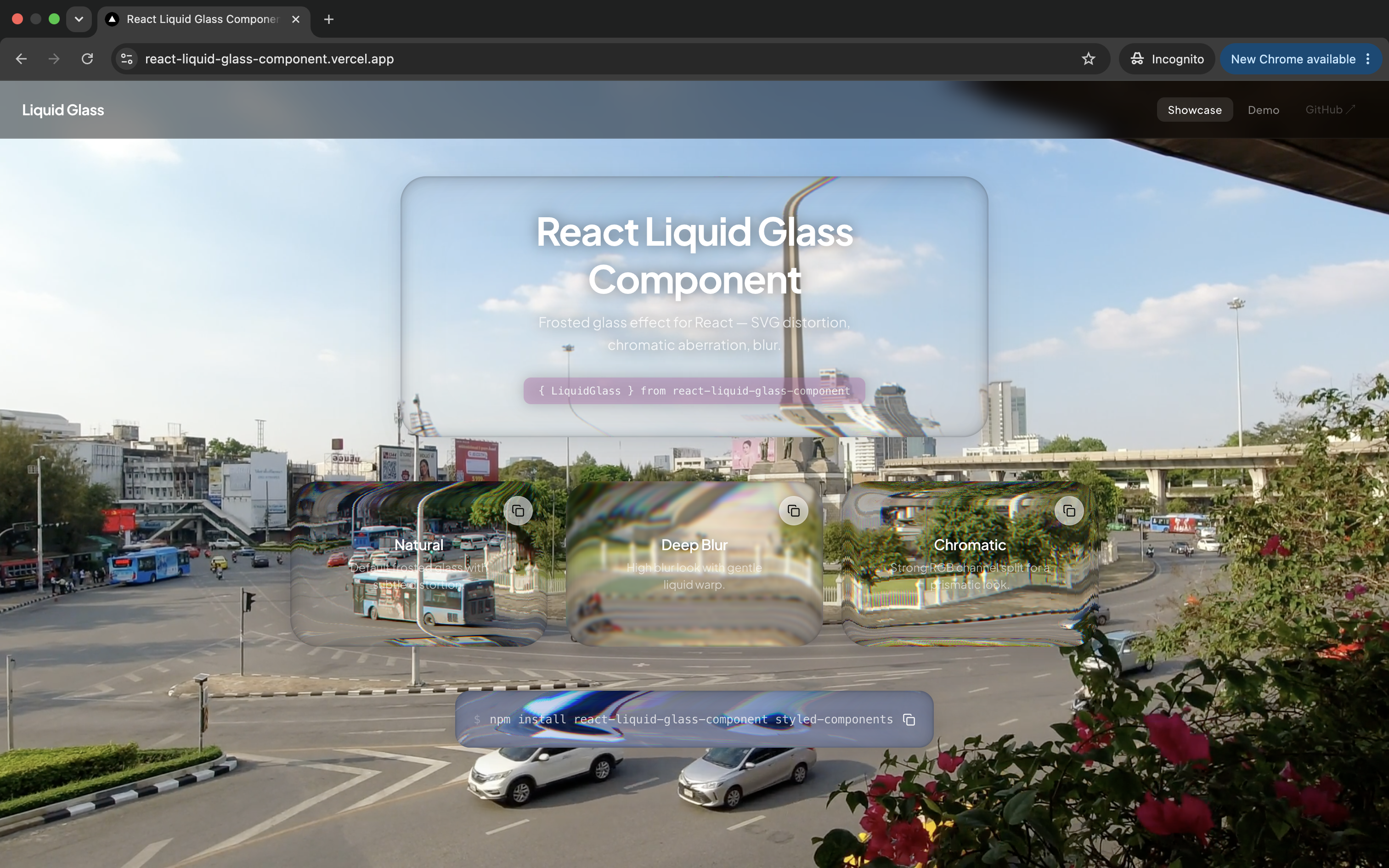 |
| 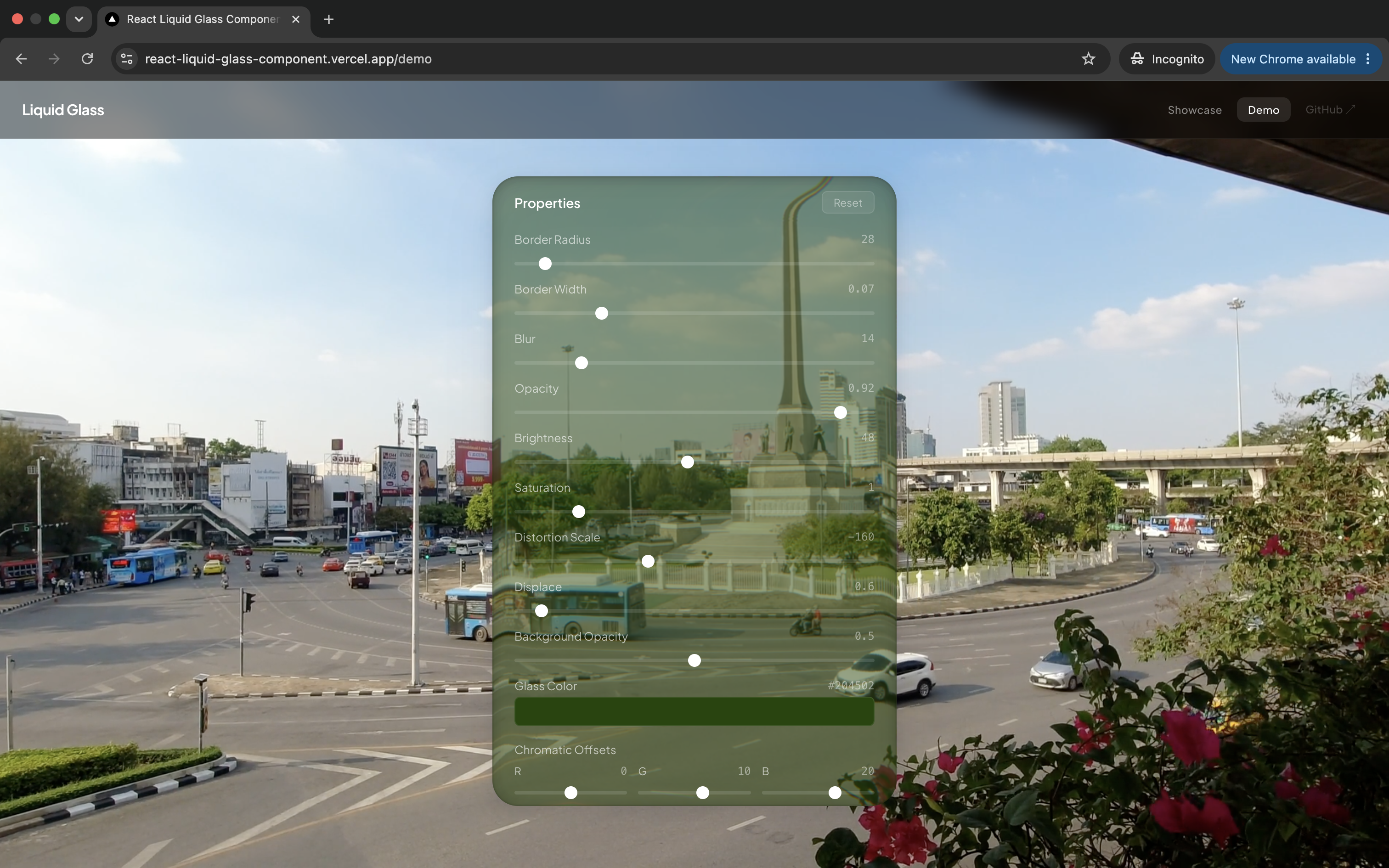 |
|
Install
npm install react-liquid-glass-component styled-components
styled-componentsis a peer dependency and must be installed separately.
Quick Start
import { LiquidGlass } from 'react-liquid-glass-component'

function App() {
  return (
    <LiquidGlass borderRadius={24} blur={12}>
      <h1>Hello, world</h1>
      <p>Behind the glass.</p>
    </LiquidGlass>
  )
}
width and height default to 'auto' — omit them to let CSS or the style prop control sizing.
Features
- 🧊 Liquid Distortion — Real-time SVG displacement map that morphs the background behind the glass
- 🌈 Chromatic Aberration — Per-channel RGB offset for a prismatic glass effect
- 🌀 Auto-sizing — Displacement map regenerates on resize via
ResizeObserver - 🪶 Lightweight — ~8 KB minified, only two peer dependencies
- 🧩 TypeScript — Full type definitions with strict mode support
- ♿ Accessible — Extends
HTMLAttributes, passes native props, supports keyboard focus - 📉 Fallback Chain — SVG filter →
backdrop-filter→ plain background, degrading gracefully - 🎨 15+ Configurable Props — Blur, brightness, opacity, saturation, displacement, channel offsets, and more
Props
| Prop | Type | Default | Description |
|---|---|---|---|
| children | ReactNode | null | Content inside the glass pane |
| width | number \| string | 'auto' | Width (number = px, string = CSS unit; omit for CSS control) |
| height | number \| string | 'auto' | Height (number = px, string = CSS unit; omit for CSS control) |
| borderRadius | number | 20 | Corner radius in px |
| borderWidth | number | 0.07 | Edge inset ratio for the inner glass border |
| brightness | number | 50 | Brightness of the glass fill (0–100) |
| opacity | number | 0.93 | Opacity of the glass fill |
| blur | number | 11 | Frosted blur amount in px |
| displace | number | 0 | Post-filter Gaussian blur on the output |
| backgroundOpacity | number | 0 | Frost background opacity (--glass-frost) |
| glassColor | string | light-dark(white, black) | Glass tint color — any CSS color value |
| saturation | number | 1 | Saturation multiplier (--glass-saturation) |
| distortionScale | number | -180 | Intensity of the liquid distortion (negative inverts the warp) |
| redOffset | number | 0 | Extra displacement offset for the red channel |
| greenOffset | number | 10 | Extra displacement offset for the green channel |
| blueOffset | number | 20 | Extra displacement offset for the blue channel |
| xChannel | 'R' \| 'G' \| 'B' | 'R' | Source channel for red displacement |
| yChannel | 'R' \| 'G' \| 'B' | 'G' | Source channel for green/blue displacement |
| mixBlendMode | CSSBlendMode | 'difference' | Blend mode for the RGB gradient layers |
| ref | Ref<HTMLDivElement> | — | Forwarded ref to the root element |
| HTML attributes | — | — | className, style, tabIndex, aria-*, data-*, onClick, etc. |
The component extends
React.HTMLAttributes<HTMLDivElement>. Any native HTML attribute is forwarded to the root element via...rest.
Examples
Basic Usage
import { LiquidGlass } from 'react-liquid-glass-component'

<LiquidGlass borderRadius={24} blur={12}>
  <h1>Hello</h1>
  <p>Behind the glass.</p>
</LiquidGlass>
Chromatic Aberration
<LiquidGlass
  borderRadius={16}
  redOffset={18}
  greenOffset={0}
  blueOffset={-18}
  distortionScale={-300}
>
  <h2>Prismatic</h2>
</LiquidGlass>
Circular Glass
<LiquidGlass borderRadius={50} width={100} height={100} blur={8}>
  <span>LG</span>
</LiquidGlass>
With Ref
import { useRef } from 'react'
import { LiquidGlass } from 'react-liquid-glass-component'

function Component() {
  const ref = useRef<HTMLDivElement>(null)

  return (
    <LiquidGlass ref={ref} borderRadius={24} blur={12}>
      Content
    </LiquidGlass>
  )
}
Full-width with CSS
Because width defaults to 'auto', you can control sizing entirely through CSS:
<LiquidGlass
  className="my-glass"
  borderRadius={16}
  blur={10}
  style={{ width: '100%', maxWidth: 600 }}
>
  <h1>Full-width glass</h1>
</LiquidGlass>
CSS Custom Properties
The root element exposes these custom properties for CSS-level customization:
| Property | Source Prop | Description |
|---|---|---|
| --glass-color | glassColor | Glass tint color |
| --glass-frost | backgroundOpacity | Background opacity of the glass |
| --glass-saturation | saturation | Backdrop saturation multiplier |
| --filter-id | (internal) | SVG filter reference url(#...) |
SSR Note
The component uses useId() for stable filter IDs and initializes svgSupported as false, so the server and client first paint are always consistent. Feature detection runs client-side only via useEffect, so no hydration issues.
If you're using Next.js App Router or any SSR framework, LiquidGlass works without any 'use client' wrapper — just import and use it directly.
How It Works
LiquidGlass uses a two-layer rendering approach to create the glass effect.
On supported browsers, the component generates a hidden SVG filter at render time and applies it to the root element via backdrop-filter: url(#filter-id). The SVG filter combines displacement mapping, per-channel color matrices, and blending to produce a realistic liquid glass distortion with chromatic aberration.
On browsers that don't support SVG backdrop filters, the component falls back to a CSS-only path using standard backdrop-filter: blur() combined with saturate, brightness, and layered box-shadows to simulate the glass look.
The displacement map SVG is regenerated dynamically on every resize via ResizeObserver, so the distortion always matches the element's current dimensions.
SVG Filter Pipeline
feImage— loads a dynamically generated SVG with red/blue gradients and a blurred inset rectanglefeDisplacementMap× 3 — displaces red, green, and blue channels independently usingdistortionScale + channelOffsetfeColorMatrix× 3 — isolates each channelfeBlend× 2 — composites the channels withscreenmodefeGaussianBlur— final polish
Fallback Chain
| Tier | Condition | Effect |
|---|---|---|
| 1 | SVG backdrop-filter supported | Full liquid glass with SVG displacement |
| 2 | CSS backdrop-filter supported | blur() + saturate() + box-shadows |
| 3 | @supports not (backdrop-filter) | Semi-transparent background |
Browser Support
| Chrome | Firefox | Safari | Edge | |--------|---------|--------|------| | ✅ 60+ | ✅ 60+ | ✅ 12+ | ✅ 79+ |
Modern browsers get the full SVG filter effect. Older browsers degrade gracefully to backdrop-filter and then to a plain semi-transparent background.
Local Development
# Watch mode — rebuild library on src/ changes
npm run dev

# Run tests
npm test

# TypeScript check
npm run typecheck

# Build library for production
npm run build

# Run the Next.js demo site
cd web
yarn install
yarn dev
The demo site at web/ imports the library from the npm package (after npm run build in the root).
License
MIT © sahajohn