
react-lite-month-picker
v1.2.19
Published
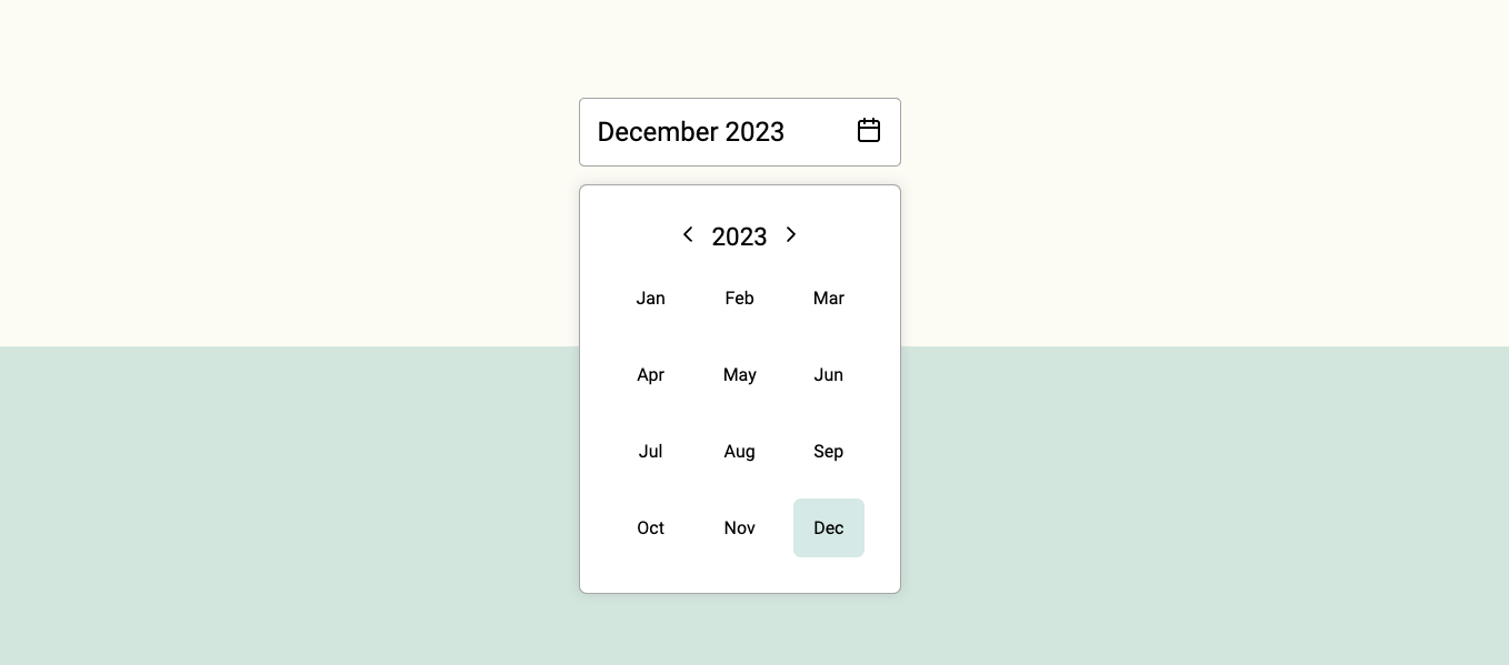
Simple, modern and customizable month picker component for ReactJS.
Maintainers
 henripar
Readme
React Lite Month Picker


Simple, modern and customizable month picker component for ReactJS.
Features
Simple and easy to use.
Tiny: Minzipped size less than 1kB.
療 Highly customizable: Easily make it fit to your designs.
Accessible: Fully accessible with keyboard navigation. Developed according the WCAG 2.1 accesibility guidelines.
🇫🇮 41 languages supported.
0 Dependencies: No surprise dependencies included.
Installation
Using npm:
npm install react-lite-month-picker --saveUsing yarn:
yarn add react-lite-month-pickerUsing bun:
bun install react-lite-month-pickerUsage
import { useState } from 'react';
import { MonthPicker, MonthInput } from 'react-lite-month-picker';

function Example() {
  const [selectedMonthData, setSelectedMonthData] = useState({
    month: 9,
    year: 2023,
  });
  const [isPickerOpen, setIsPickerOpen] = useState(false);

  return (
    <>
      <div>
        <MonthInput
          selected={selectedMonthData}
          setShowMonthPicker={setIsPickerOpen}
          showMonthPicker={isPickerOpen}
        />
        {isPickerOpen ? (
          <MonthPicker
            setIsOpen={setIsPickerOpen}
            selected={selectedMonthData}
            onChange={setSelectedMonthData}
          />
        ) : null}
      </div>
    </>
  );
}

export default Example;
Selected month data
Currently selected month data is an object with the following structure:
{
  month: 9,
  year: 2023,
  monthName: 'September',
  monthShort: 'Sep'
}
It will get saved on set parent component state with onChange event.
Customization
You can customize the MonthPicker component styles by passing props to it.
| Prop name | Description | Default value |
| -------------------- | -------------------------------------------------- | ------------- |
| bgColorMonthActive | Background color of the active month. | #4ea3983e |
| bgColorMonthHover | Background color of the month on mouse hover. | #f4f4f4 |
| borderRadiusMonth | Border radius of the moth element. | 7px |
| bgColorPicker | Background color of the picker element. | #fff |
| textColor | Color of the text. | #000 |
| size | Size of the component. Accepts 'small' or 'large'. | large |
| lang | Language. Accepts ISO 639-1 language code. | en |
You can customize the MonthInput component styles by passing props to it.
| Prop name | Description | Default value |
| -------------- | ----------------------------------------------------- | ------------- |
| bgColor | Background color of the input element. | #fff |
| bgColorHover | Background color of the input element on mouse hover. | #fff |
| textColor | Color of the text. | #000 |
| size | Size of the component. Accepts 'small' or 'large'. | large |
| lang | Language. Accepts ISO 639-1 language code. | en |
See full list of supported languages on the website.
License
MIT © henripar