
react-magic-ui
v1.0.9
Published
A React component library for building magical user interfaces with liquid glass effect
Downloads
283
Maintainers
 tweeedlex
Readme
react-magic-ui


A React component library for creating stunning liquid glass effect UI components.
🚀 Live demo
Here you can mess with the components. Enjoy!
Installation
- Install the library using npm:
npm install react-magic-ui- Import styles in your main application file (e.g.,
index.tsxorApp.tsx):
import 'react-magic-ui/dist/react-magic-ui.css'Documentation
📚 Live Component Examples in Storybook
Explore all components with interactive examples, props documentation, and live code previews in our Storybook.
Usage
Import the components you need:
import { Button, Card } from 'react-magic-ui';

function App() {
  return (
    <section>
      <Button>
        Click me
      </Button>
      <Card>
        <h2>Beautiful Card</h2>
        <p>With liquid glass effect</p>
      </Card>
    </section>
  );
}
Available Components
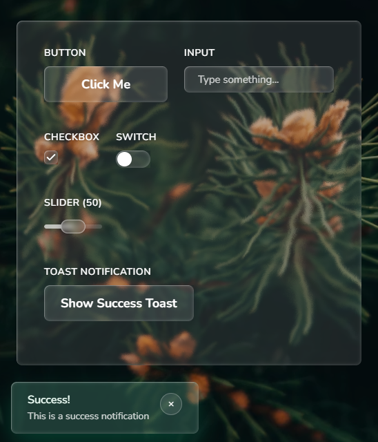
- Button - Customizable button with liquid glass effect
- Card - Container with glassmorphism styling
- Input - Styled input field
- Switch - Toggle switch component
- Toast - Notification toast messages
- Modal - Modal dialog component
- Tabs - Tabbed interface component
- Badge - Label and badge component
- Sidebar - Navigation sidebar
- Topbar - Top navigation bar
- Checkbox - Checkbox component
- Select - Select component
- Slider - Slider component
- Glass - Base glass effect wrapper (used for creating custom components)
Features
- 📱 14 components for your basic needs
- 🎨 Beautiful liquid glass effect
- 🌈 Liquid-like glassmorphism animations
- 🔧 Customizable with props
- 📦 Create your own custom components with Glass component
⚠️ NOTE: Safari and Firefox only partially support the effect (displacement will not be visible)
Featured In
Development
# Install dependencies
npm install

# Run Storybook
npm run storybook

# Build library
npm run build

# Run tests
npm test
Contributing
Please read the contributing guide.
License
MIT © @tweeedlex