
react-magneto
v0.3.2
Published
Drag-and-drop sticker board for React — a draggable fridge-magnet canvas with render-free dragging, layout export/import, and per-magnet layer, rotation and size.

Maintainers
 guitarwag
Readme
react-magneto


Drag-and-drop sticker board for React. Headless, no runtime dependencies, and built so dragging one magnet never re-renders the others or the board.
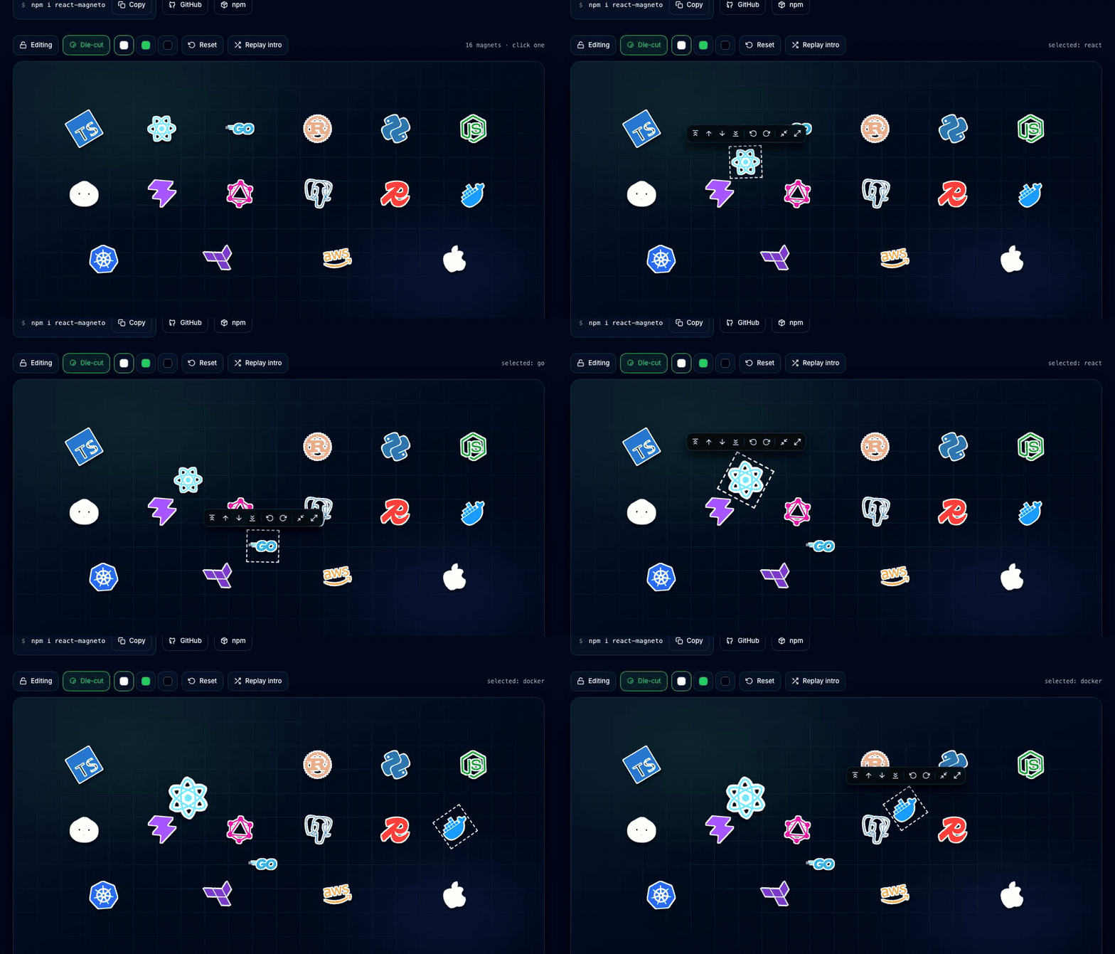
▸ Try the playground — drag the stickers, restack and rotate them, and watch the exported layout update live.
- Drop in an array of image urls and you have a board.
- Drag, restack, rotate and resize magnets, then export the arrangement as JSON and feed it back in as the starting state.
- You own the look: the board background is whatever you render behind the magnets.
Handy for a sticker wall, a fridge-magnet board, a logo/tech-stack showcase, a moodboard or
pinboard, an about page, a slide deck, or anywhere you want free-form draggable positioning
rather than a grid. If you need a sortable grid or list instead, reach for dnd-kit — this
library deliberately does not snap.
Install
npm i react-magnetoreact and react-dom (>=18) are peer dependencies.
Usage
import { MagnetBoard } from 'react-magneto';

// Simplest: an array of image urls.
<MagnetBoard items={['/react.png', '/go.png', '/docker.png']} editable />
// Custom magnets, a dynamic background, and layout export/import.
import { MagnetBoard, type MagnetBoardHandle } from 'react-magneto';
import { useRef } from 'react';
import savedLayout from './layout.json';
function Board() {
const board = useRef<MagnetBoardHandle>(null);
return (
<>
<button type="button" onClick={() => console.log(board.current?.getLayout())}>
Export
</button>
<MagnetBoard
ref={board}
items={[{ id: 'react', label: 'React' }, { id: 'go', label: 'Go' }]}
initialLayout={savedLayout} // feed an exported layout back in
editable
onLayoutChange={(l) => save(l)} // fired on every change
renderMagnet={(item) => <MyLogo {...item} />}
style={{ aspectRatio: '16 / 8', borderRadius: 24, overflow: 'hidden' }}
>
{/* background layer — anything, rendered behind the magnets */}
<div style={{ position: 'absolute', inset: 0, background: '…' }} />
</MagnetBoard>
</>
);
}The edit → export → import loop
- Render with
editableand arrange the magnets. - Read the layout with
ref.getLayout()(or catch every change viaonLayoutChange). - Save that JSON and pass it back as
initialLayout— the board starts exactly there.
x/y are the center of each magnet as a percentage of the board (0–100), so a saved
layout is resolution-independent. r (degrees), z (layer) and s (scale) are written
once you rotate, restack or resize a magnet; omitted, a magnet uses its deterministic tilt,
the base layer, and its natural size.
Selecting, layering, rotating, resizing
Pressing a magnet selects it; pressing the background deselects. A menu appears beside the selected magnet and follows it as it moves, rotates and scales, with three groups of controls:
| group | controls | | --- | --- | | layer | to front, forward one, backward one, to back | | rotate | left 15°, right 15° | | size | smaller, bigger |
Each button is an icon with a hover (and keyboard-focus) tip naming what it does. Pass
menu={false} to hide the whole thing and drive everything from the ref instead:
board.current?.bringToFront();   // straight to the top — or bringToFront('react')
board.current?.sendToBack();     // straight to the bottom
board.current?.bringForward();   // up exactly one layer
board.current?.sendBackward();   // down exactly one layer
board.current?.rotateBy(15);     // relative — good for buttons
board.current?.rotate(0);        // absolute — good for a slider or "straighten"
board.current?.resizeBy(0.15);   // relative scale
board.current?.resize(1.5);      // absolute scale (clamped to 0.4–3)
Every command targets the selection unless you pass an id, and each one changes only the magnets it has to, so it survives export → import.
Stepping and jumping are separate on purpose. bringForward swaps a magnet with the one
directly above it, so a magnet four layers down needs four presses to clear the one above it;
bringToFront goes to the top in a single call while keeping the relative order of everything
it passes. The stack is renumbered densely (1..n) either way, which keeps a step to a
two-magnet change.
The die-cut outline
dieCut draws a sticker contour with a soft lift shadow around every magnet — raster or vector,
default artwork or your own renderMagnet:
<MagnetBoard items={items} dieCut />                            // 2px white
<MagnetBoard items={items} dieCut={4} />                        // heavier, still white
<MagnetBoard items={items} dieCut={{ color: '#22C55E' }} />     // any CSS colour
<MagnetBoard items={items} dieCut={{ color: '#0B1120', radius: 3 }} />
color takes any CSS colour (#22C55E, tomato, rgb(0 0 0 / 60%)). Each radius/colour pair
gets its own filter id, so boards using different outlines on one page don't collide. A dark
outline needs light artwork to read as an edge.
The filter is applied to a wrapper element rather than your artwork, so the outline is the same
weight whatever viewBox an inline <svg> icon happens to use — mixing 24-unit icon sets with
512-unit ones gives a consistent edge.
The menu's icons are exported too, if you are building your own controls:
import { IconToFront, IconForward, IconRotateLeft, IconBigger } from 'react-magneto';Performance
The board renders the magnet list once and holds no per-frame state. While you drag, the
position is written straight to the dragged element's transform on its own compositor layer,
so React does not re-render and any filter on the magnet rasterizes once instead of every
frame. Each magnet subscribes to the board for its own updates, so a drop, rotation, resize
or restack re-renders only the magnets that actually changed — never the board or its
siblings. Pass a memoized renderMagnet to keep this guarantee when the parent re-renders.
Props
| prop | type | notes |
| --- | --- | --- |
| items | string[] \| MagnetItem[] | strings render as <img src>, url as id |
| initialLayout | Record<id, {x,y,r?,z?,s?}> | exported layout to start from |
| renderMagnet | (item, index) => ReactNode | defaults to <img> |
| editable | boolean | enable dragging and selection |
| dieCut | boolean \| number \| {radius?,color?} | sticker outline on every magnet; number sets px radius, object sets colour too |
| menu | boolean | show the layer/rotate/size menu beside the selection (default true) |
| onLayoutChange | (layout) => void | called on every layout change |
| onSelectionChange | (id \| null) => void | called when the selection changes |
| className / style / children | — | you own the board look; children is the background |
Ref handle: getLayout(), bringToFront(id?), sendToBack(id?), bringForward(id?),
sendBackward(id?), rotate(deg, id?), rotateBy(delta, id?), resize(scale, id?),
resizeBy(delta, id?).
Develop
npm install
npm test           # vitest (happy-dom)
npm run test:watch # vitest in watch mode
npm run test:cov   # vitest with coverage thresholds
npm run lint       # biome
npm run typecheck  # tsc --noEmit
npm run build      # tsup -> dist
cd example && npm install && npm run dev   # the playground
The playground lives in example/ and consumes the library source directly, so a change shows
up without a build step. Every push to main deploys it to GitHub Pages via
.github/workflows/pages.yml; the build sets PAGES_BASE because a project site is served
from /<repo>/.
The suite covers the pure layout helpers plus the board itself driven through real pointer events: drag maths and clamping, selection, the menu's placement and controls, layer stepping, the export → import round trip, and render counts that hold the "no sibling re-renders" guarantee to account.
Releasing
CI runs lint, typecheck, checks and both builds on every push and PR. Publishing is driven by
GitHub Releases: bump version in package.json, then publish a release tagged v<version>
(e.g. v0.2.0). The release workflow verifies the tag matches package.json and runs
npm publish with provenance, using an NPM_TOKEN repository secret.
License
MIT