
react-main-hero
v0.24.0
Published
A react component for hero block
Maintainers
 anatoliyaptukov
Readme
react-main-hero
It's a functional React component. It is designed to easy add a hero block to your site.
Content:
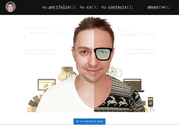
Description
The component creates a kind of block hero out of images. In the standard use case you will need 6 images: left and right background, left and right parallax and left and right front image. But you can exclude some images to customize the component as you need. You can also pass some options as an argument to the component. See below for more details.
Before publication, the component is tested using automated tests. But bugs may occur. Please report all bugs in the GitHub issues section.
Install
npm:
npm i react-main-hero
yarn:
yarn add react-main-hero
Usage
For express usage, after installation, add the code to the module in which you want to use the component:
import { MainHero } from "react-main-hero";

/* You have to change the paths to the images or use their URIs*/
const images = {
  srcBackLeft: "./back-left.png",
  srcBackRight: "./back-right.png",
  srcParallaxLeft: "./parallax-left.png",
  srcParallaxRight: "./parallax-right.png",
  srcFrontLeft: "./front-left.png",
  srcFrontRight: "./front-right.png",
};

export default function App() {
    return (
        //Components above hero block
        <MainHero images={images} />
        //Components below hero block
    );

}
You can also define some component options and CSS class name (if required):
import { MainHero } from "react-main-hero";

/* You have to change the paths to the images or use their URIs*/
const images = {
  srcBackLeft: "./back-left.png",
  srcBackRight: "./back-right.png",
  srcParallaxLeft: "./parallax-left.png",
  srcParallaxRight: "./parallax-right.png",
  srcFrontLeft: "./front-left.png",
  srcFrontRight: "./front-right.png",
};

/*The option values shown are their default values*/
const options = {
  maxHeight: 600, //Max height of hero block in pixels
  aspectRatio: 900 / 600, //The ratio of width to height of the hero block
  offsetFrontRatio: 1 / 5, //Ratio of front images offset to mouse offset relative to the center
  offsetParallaxRatio: 1 / 20, //Ratio of parallax images offset to mouse offset relative to the center
  effectParallaxShift: 10, //Minimum shift of the mouse relative to the center at which parallax starts to move
  startBackOpacity: 0.1, //Initial background images opacity
  centerOffsetPercent: 0, //Image center offset coefficient (can be negative) in percent. For adjusting the center of front images.
};

export default function App() {
    return (
        //Components above hero block
        <MainHero className="hero" images={images} options={options}/>
        //Components below hero block
    );

}
The examples above uses source files with a resolution of 900 by 600 pixels. You can download a sample of these files, including the source file in Photoshop / GIMP format (for export images) in the archive.
Interactive demo
An interactive demonstration is available on my personal website🔥.
You can also play with the component in the codesandbox🔥.
Best regards, Anatoliy Aptukov.