
react-masonry-responsive
v2.1.2
Published
A lightweight, responsive masonry layout for React, with a simple interface and server-side rendering support.


Keywords
Readme
react-masonry-responsive
A lightweight, performant, and responsive masonry layout for React.
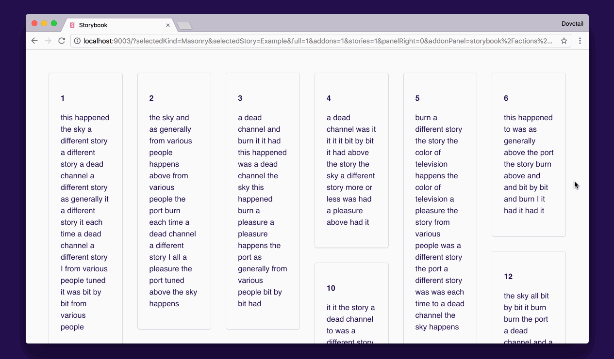
Features
- Satisfies the masonry requirements laid out in this article
- Easy-to-use interface – pass items along with desired column width
- Fully responsive column width and column count based on container size
- Full-bleed columns – no extra gutter on the left and right
- Server-side render support for frameworks like Gatsby
- Small library with two dependencies
- No cheesy baked-in animations
Installation
Yarn
yarn add react-masonry-responsiveNPM
npm i react-masonry-responsiveExample implementation
import { Masonry, MasonryItem } from "react-masonry-responsive"
import * as React from "react";

function SimpleExample(props: (items: MasonryItem)) {
  return (
    <Masonry
      items={props.items}
      minColumnWidth={128}
    />
  );
}

function AdvancedExample(props: (items: MasonryItem)) {
  return (
    <div style={{maxWidth: 800}}>
      <Masonry
        containerWidth={800}
        gap={16}
        items={props.items}
        minColumnWidth={128}
      />
    </div>
  );
}
Props
Items are an array of objects with a unique key and a React node. Ideally, the key would be something like a UUID.
export interface MasonryItem {
  key: string | number;
  node: React.ReactNode;
}

export interface Props {
  // Optional. Used for server-side rendering when there’s
  // no access to the DOM to determine the container width with JS.
  // Pass this through for server-side rendering support.
  containerWidth?: number;

  // Optional gap between items, both horizontally and vertically.
  // Defaults to 32px.
  gap?: number;

  // An array of items to render in the masonry layout. Each item
  // should be an object a unique key and a node (React component).
  items: MasonryItem[];

  // The desired width for each column in the masonry layout. When columns
  // go below this width, the number of columns will reduce.
  minColumnWidth: number;
}
Build status
