
react-modal-wh-maeum
v1.0.15
Published
Composant modal réutilisable en React avec Vite

Readme
react-modal-wh-maeum
Une librairie React légère pour créer des modales personnalisables, sans dépendance à jQuery. Compatible avec Vite + React.
🚀 Installation
Utilisez npm :
npm i react-modal-wh-maeumOu yarn :
yarn add react-modal-wh-maeum🧱 Dépendances
Aucune dépendance supplémentaire à installer. Prêt à l'emploi dans tous les projets React modernes.
✨ Fonctionnalités
- 100% React – pas de jQuery
- Facile à intégrer
- Composant léger et accessible
- Styles inclus dans le package
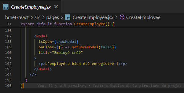
- Prise en charge des props essentielles (
isOpen,onClose,title,children)
💡 Exemple de base
Voici un exemple d’intégration :
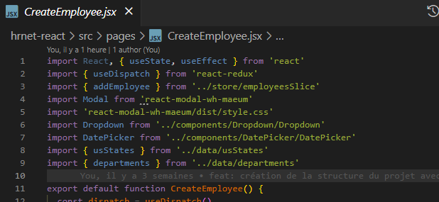
import React, { useState } from 'react'
import Modal from 'react-modal-wh-maeum'
import 'react-modal-wh-maeum/dist/style.css'

export default function App() {
  const [isOpen, setIsOpen] = useState(false)

  return (
    <>
      <button onClick={() => setIsOpen(true)}>Ouvrir la modal</button>
      <Modal
        isOpen={isOpen}
        onClose={() => setIsOpen(false)}
        title="Ma super modale"
      >
        <p>Voici un contenu personnalisé dans la modale !</p>
      </Modal>
    </>
  )
}
🔍 Capture d'écran du code :
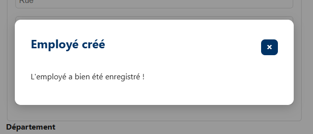
📸 Résultat visuel
⚙️ Props disponibles
| Prop | Type | Description |
| ---------- | -------- | --------------------------------------------------------- |
| isOpen | Boolean | Définit si la modale est visible |
| onClose | Function | Fonction appelée lors de la fermeture (clic overlay ou X) |
| title | String | Titre affiché dans l’en-tête |
| children | Node | Contenu personnalisé de la modale |
🧪 Astuces
- La modale est fermée si l’utilisateur clique à l’extérieur ou sur le bouton de fermeture (X).
- Vous pouvez facilement styler la modale en surchargeant les classes CSS de base.
🔧 Personnalisation CSS
Tu peux surcharger les styles via un fichier CSS personnalisé :
.modal-wh {
  background-color: white;
  padding: 2rem;
  border-radius: 12px;
}
📦 Licence
MIT
👨💻 Auteur
Ce package a été développé dans le cadre d'un projet de migration jQuery vers React (HRNet) chez WealthHealth.
🧠 Besoin d’aide ?
Ouvrez une issue sur le repo GitHub ou contactez-moi via le profil NPM.