
react-modern-charts
v0.1.5
Published
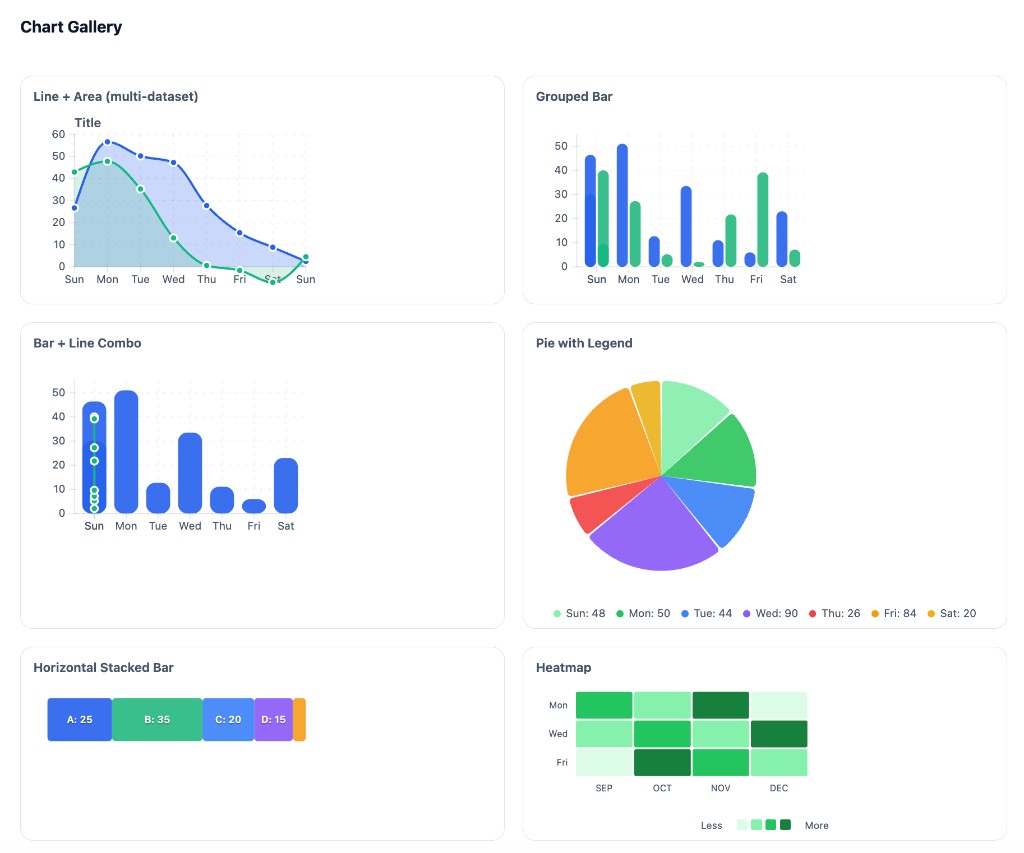
SVG-first React chart library with d3-scale. Line, area, bar, pie, heatmap, combo charts. Lightweight, themeable, React 18+
Maintainers
 giginkrishnan
Readme
react-modern-charts
A small, modern SVG-first React chart library using d3-scale and d3-shape for layout and path generation. Lightweight, themeable, and built for React 18+.
Install
npm i d3-array d3-scale d3-shape
npm i react-modern-charts
Import CSS once:
import "react-modern-charts/styles.css";Quick Start
import { scaleLinear } from "d3-scale";
import { ThemeProvider, Chart, LineSeries } from "react-modern-charts";
import "react-modern-charts/styles.css";

function App() {
  const data = [{ value: 10 }, { value: 25 }, { value: 15 }, { value: 40 }];
  const xScale = scaleLinear().domain([0, 3]).range([0, 360]);
  const yScale = scaleLinear().domain([0, 50]).range([160, 0]);

  return (
    <ThemeProvider mode="light" palette="default">
      <Chart width={400} height={200} margin={{ top: 16, right: 16, bottom: 28, left: 40 }}>
        <LineSeries data={data} x={(_, i) => i} y={(d) => d.value} xScale={xScale} yScale={yScale} />
      </Chart>
    </ThemeProvider>
  );
}
Chart Types
| Chart | Component | Description |
|-------|-----------|-------------|
| Vertical Bar | BarSeries | Vertical bars |
| Horizontal Bar | HorizontalBarSeries | Horizontal bars |
| Stacked Bar | StackedBarSeries | Horizontal or vertical stacked segments (selective corner rounding) |
| Grouped Bar | GroupedBarSeries | Side-by-side bars per category |
| Area | AreaSeries | Filled area under line |
| Line | LineSeries | Line with optional markers |
| Multiaxis Line | MultiaxisLineChart | Line chart with two Y axes |
| Pie | PieChart, PieSeries | Pie with optional legend |
| Doughnut | PieChart (innerRadius) | Donut chart |
| Polar Area | PolarAreaChart | Variable radius by value |
| Radar | RadarChart | Spider/radar chart |
| Scatter | ScatterSeries | Scatter plot |
| Bubble | BubbleSeries | Scatter with variable size |
| Multitype | ComboChart | Bar + line combo |
| Gradient | LinearGradient, RadialGradient | All charts support fill="url(#id)" or stroke="url(#id)" |
| Heatmap | HeatmapSeries | Grid with color intensity |
Full chart documentation → — Props, examples, and usage for each chart type.
Theming & Palettes
<ThemeProvider mode="light" palette="default" isGradientEnabled={true}>
  <YourCharts />
</ThemeProvider>
| Prop | Description |
|------|-------------|
| mode | "light" | "dark" — backgrounds, text, borders |
| palette | Chart series colors (--msc-s1 through --msc-s5) |
| isGradientEnabled | true (default) — use gradients; false — solid fills |
Predefined Palettes
| Palette | Colors | |---------|--------| | default | #118133, #343738, #78AE81, #64B66F, #5E656E (forest) | | forest | Same as default | | sage | #a4b494, #bec5ad, #3B5249, #519872, #34252F | | periwinkle | #EDFFEC, #61E786, #5A5766, #48435C, #9792E3 | | indigo | #30343F, #FAFAFF, #E4D9FF, #273469, #1E2749 | | ocean | #75DDDD, #508991, #172A3A, #004346, #09BC8A |
Use var(--msc-s1) through var(--msc-s5) in custom series to inherit palette colors. Access theme via useTheme().
Build
npm i
npm run build
Local Demo
Run the interactive playground:
cd .playground
npm i
npm run dev
Exports
Theme: ThemeProvider, useTheme
Primitives: Chart, Grid, AxisBottom, AxisLeft, AxisRight, ThresholdLine, ChartTitle, Legend
Series: LineSeries, AreaSeries, BarSeries, HorizontalBarSeries, GroupedBarSeries, StackedBarSeries, PieSeries, PolarAreaSeries, ScatterSeries, BubbleSeries, HeatmapSeries
Components: PieChart, PolarAreaChart, ComboChart, RadarChart, MultiaxisLineChart
Gradients: LinearGradient, RadialGradient
Tooltips: TooltipPortal, DefaultTooltip
Hooks: useChart, useNearestPoint