
react-modern-datetime
v1.0.3
Published
A modern, customizable datetime picker component for React applications using Day.js
Maintainers
 tankucukhas
Readme
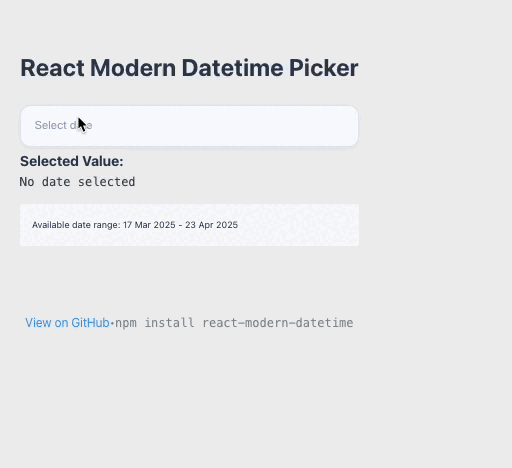
React Modern Datetime Picker
A modern, customizable datetime picker component for React applications.
Features
- 📅 Date picker
- 🕒 Time picker (12/24 hour format)
- 🎯 Combined datetime picker
- 🔒 Min/Max date restrictions
- ⚡ Customizable time steps
- 📱 Responsive design
- ⌨️ Keyboard navigation support
- 🎨 Modern UI with customizable themes
- 🌍 Day.js-based date handling with timezone support
- 💬 Customizable placeholder text
- 🔤 Flexible date/time formatting
Installation
npm install react-modern-datetime dayjsor
yarn add react-modern-datetime dayjsBasic Usage
import { ModernDateTime } from 'react-modern-datetime';
import 'react-modern-datetime/react-modern-datetime.css';
import dayjs from 'dayjs';

function DateTimePicker() {
  const [date, setDate] = useState(null);

  return (
    <ModernDateTime
      value={date}
      onChange={setDate}
      type="datetime"
      use12Hour={true}
    />
  );
}
Props
| Prop | Type | Default | Description | |------|------|---------|-------------| | value | string/Dayjs | dayjs() | Selected date value | | onChange | function | required | Callback when date changes | | disabled | boolean | false | Disable the input | | valueZone | string | "UTC" | Timezone for the value | | inputId | string | null | HTML id for the input element | | inputClass | string | "" | Additional CSS class for the input | | inputStyle | object | {} | Inline styles for the input | | hiddenName | string | undefined | Name for hidden input field | | zone | string | "local" | Timezone for display | | format | string | null | Custom date format | | type | string | "date" | Picker type: "date", "time", or "datetime" | | phrases | object | { cancel: "Cancel", ok: "Ok" } | Custom button labels | | use12Hour | boolean | false | Use 12-hour time format | | hourStep | number | 1 | Step interval for hour selection | | minuteStep | number | 1 | Step interval for minute selection | | minDatetime | string | null | Minimum selectable date/time | | maxDatetime | string | null | Maximum selectable date/time | | auto | boolean | false | Auto-close on selection | | weekStart | number | 1 | First day of week (1-7) | | flow | string[] | undefined | Custom flow direction | | title | string | undefined | Custom title for the picker | | hideBackdrop | boolean | false | Hide the backdrop overlay | | backdropClick | boolean | true | Close picker on backdrop click | | children | node | undefined | Custom children elements | | showHeader | boolean | true | Show/hide the header section | | placeholder | string | "Select date and time" | Placeholder text for the input field |
Examples
Date Only Picker
<ModernDateTime
  value={date}
  onChange={setDate}
  type="date"
/>
Time Only Picker
<ModernDateTime
  value={time}
  onChange={setTime}
  type="time"
  use12Hour={true}
/>
With Min/Max Dates
<ModernDateTime
  value={date}
  onChange={setDate}
  minDatetime="2024-01-01T00:00:00"
  maxDatetime="2024-12-31T23:59:59"
/>
Custom Flow (Time before Date)
<ModernDateTime
  value={date}
  onChange={setDate}
  type="datetime"
  flow={["time", "date"]}
/>
Custom Format and Labels
<ModernDateTime
  value={date}
  onChange={setDate}
  type="datetime"
  format="MMMM D, YYYY, hh:mm A"
  placeholder="Choose pickup date and time"
  phrases={{ok: 'Continue', cancel: 'Exit'}}
  use12Hour={true}
/>
Date Formatting
The ModernDateTime component supports flexible date formatting through the format prop.
When the format prop is not specified, the component uses these defaults based on the type prop:
- For "date": "YYYY-MM-DD"
- For "time": "HH:mm"
- For "datetime": "YYYY-MM-DD HH:mm"
To use custom formatting, pass a format string using Day.js tokens:
<ModernDateTime
  format="MMMM D, YYYY, hh:mm A" // May 16, 2025, 09:10 PM
/>
Common format tokens:
YYYY: Four-digit yearMM: Two-digit month (01-12)DD: Two-digit day (01-31)D: Day without leading zero (1-31)MMMM: Full month name (January-December)HH: Two-digit hours in 24-hour format (00-23)hh: Two-digit hours in 12-hour format (01-12)mm: Two-digit minutes (00-59)A: AM/PM
Important Note: Date Format
The ModernDateTime component can work with both string values and Day.js objects:
Using Day.js Objects:
import dayjs from "dayjs";
import { ModernDateTime } from "react-modern-datetime";

function DateTimePicker() {
  // Using Day.js object directly
  const [date, setDate] = useState(dayjs());

  return (
    <ModernDateTime
      value={date}
      onChange={setDate}
      type="datetime"
      use12Hour={true}
    />
  );
}
Using String Values:
import dayjs from "dayjs";
import { ModernDateTime } from "react-modern-datetime";

function DateTimePicker() {
  // Using string format: 'YYYY-MM-DD HH:mm:ss'
  const [date, setDate] = useState("2024-04-25 15:30:00");

  const handleChange = (newDate) => {
    // If you need the string value
    if (dayjs.isDayjs(newDate)) {
      setDate(newDate.format('YYYY-MM-DD HH:mm:ss'));
    } else {
      setDate(newDate);
    }
  };

  return (
    <ModernDateTime
      value={date}
      onChange={handleChange}
      type="datetime"
    />
  );
}
Setting Up Timezone Support
To use timezone features, make sure to set up Day.js plugins:
import dayjs from "dayjs";
import utc from "dayjs/plugin/utc";
import timezone from "dayjs/plugin/timezone";

// Extend Day.js with plugins
dayjs.extend(utc);
dayjs.extend(timezone);

// Now you can use timezone features
<ModernDateTime
  value={date}
  onChange={setDate}
  valueZone="UTC"
  zone="local"
/>
Contributing
Please read CONTRIBUTING.md for details on our code of conduct, and the process for submitting pull requests.
License
This project is licensed under the MIT License - see the LICENSE file for details.