
react-mui-menu-button
v1.0.5
Published
Menu recursivo con N niveles para React con Material-UI
Maintainers
 blackycoderx4
Readme
React Menu Button MUI
Recursive dropdown menu with support for multiple levels, navigation, smooth scrolling, and full customization. Built on Material UI and React Router.
Component for use in two themes
| Light Mode | Dark Mode |
| ------------------------------------------------------------------------------------------------- | ------------------------------------------------------------------------------------------------ |
| 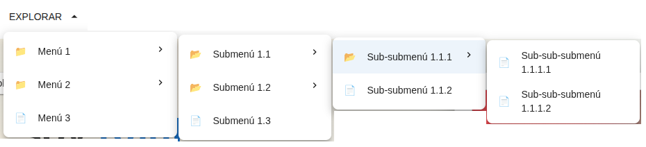 |
| 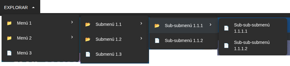 |
|
📦 Installation
npm install react-mui-menu-button
# or
yarn add react-mui-menu-button
# or
pnpm add react-mui-menu-button
Required dependencies (peer dependencies)
Make sure the following libraries are installed in your project:
react >= 17.0.0
react-dom >= 17.0.0
@mui/material >= 5.0.0
@mui/icons-material >= 5.0.0
@emotion/react >= 11.0.0
@emotion/styled >= 11.0.0
react-router-dom >= 6.0.0
🚀 Basic Usage
import { DropdownWithSubmenu } from "react-mui-menu-button";
import { menuItems } from "./menuData"; // your MenuItem array

function App() {
  return <DropdownWithSubmenu menuItems={menuItems} triggerText="Explore" />;
}
📘 Data Structure (MenuItem)
Each menu item follows the interface:
interface MenuItem {
  label: string;          // Visible text
  href?: string;          // Navigation route (React Router)
  hash?: string;          // Internal scroll anchor (without #)
  icon: React.ReactNode;  // Icon (JSX element)
  children?: MenuItem[];  // Nested sub-items
}- ✅ You can combine
hrefandhash. - ✅ If you only use
hash, the nearest ancestor'shrefwill be used as the base. - ✅ Items without
href/hashand without children → do nothing when clicked. - ✅ Items without
href/hashbut with children → expand/collapse the submenu.
🧱 Quick menuItems Structure Example
import type { MenuItem } from "react-mui-menu-button";
import {
  Code as CodeIcon,
  GitHub as GitHubIcon,
  Article as ArticleIcon,
  Business as BusinessIcon,
  Person as PersonIcon,
} from "@mui/icons-material";

export const menuItems: MenuItem[] = [
  {
    label: "Technical Portfolio",
    href: "/portfolio",
    icon: <CodeIcon />,
    children: [
      {
        label: "Open Source Projects",
        hash: "open-source",
        icon: <GitHubIcon />,
        children: [
          {
            label: "React Components",
            hash: "react-components",
            icon: <CodeIcon />,
            children: [
              {
                label: "Advanced Components",
                hash: "advanced-components",
                icon: <CodeIcon />,
              },
              {
                label: "Custom Hooks",
                hash: "custom-hooks",
                icon: <CodeIcon />,
              },
            ],
          },
          {
            label: "Node.js Libraries",
            hash: "node-libraries",
            icon: <CodeIcon />,
          },
          {
            label: "UI Kits",
            hash: "ui-kits",
            icon: <CodeIcon />,
          },
        ],
      },
      {
        label: "Interactive Demos",
        hash: "demos",
        icon: <CodeIcon />,
        children: [
          {
            label: "Web Animations",
            hash: "web-animations",
            icon: <CodeIcon />,
          },
          {
            label: "REST APIs",
            hash: "rest-apis",
            icon: <CodeIcon />,
          },
        ],
      },
      {
        label: "Case Studies",
        hash: "case-studies",
        icon: <ArticleIcon />,
      },
      {
        label: "GitHub Repositories",
        hash: "repositories",
        icon: <GitHubIcon />,
      },
    ],
  },
  {
    label: "Ventures",
    href: "/ventures",
    icon: <BusinessIcon />,
    children: [
      {
        label: "Doors & Gates",
        hash: "doors-gates",
        icon: <BusinessIcon />,
        children: [
          {
            label: "Standard Models",
            hash: "standard-models",
            icon: <BusinessIcon />,
          },
          {
            label: "Custom Sizes",
            hash: "custom-measures",
            icon: <BusinessIcon />,
          },
        ],
      },
      {
        label: "Product Catalog",
        hash: "catalog",
        icon: <BusinessIcon />,
      },
      {
        label: "Custom Designs",
        hash: "designs",
        icon: <BusinessIcon />,
      },
    ],
  },
  {
    label: "Blog",
    href: "/blog",
    icon: <ArticleIcon />,
  },
  {
    label: "Profile",
    href: "/",
    icon: <PersonIcon />,
    children: [
      {
        label: "Technology Stack",
        hash: "technology-stack",
        icon: <CodeIcon />,
      },
      {
        label: "Work Experience",
        hash: "experience",
        icon: <PersonIcon />,
      },
    ],
  },
];
🧩 Main Props
1. Data and Content
| Prop | Type | Default | Description | | ----------- | ------------------------- | ---------------- | ------------------------------------- | | menuItems | MenuItem[] | defaultMenuItems | Array of menu items | | loading | boolean | false | Shows loading state | | loadingText | string | "Loading..." | Spinner text | | emptyState | React.ReactNode | undefined | Component when there are no items | | triggerText | string | React.ReactNode | "EXPLORE" | Text or element of the trigger button | | triggerIcon | React.ReactNode | undefined | Icon accompanying the button text |
2. Behavior
| Prop | Type | Default | Description | | ------------------- | -------------------- | ------- | ----------------------------------- | | onItemClick | (item, path) => void | - | Callback when clicking an item | | onHoverItem | (item, path) => void | - | Callback when hovering over an item | | onOpen | () => void | - | When the menu opens | | onClose | () => void | - | When the menu closes | | maxDepth | number | 5 | Maximum depth | | openOnHover | boolean | true | Open on hover | | closeOnClickOutside | boolean | true | Close when clicking outside | | closeDelay | number (ms) | 300 | Delay before closing |
3. Styles and Design
| Prop | Type | Default | Description | | ------------ | ---------------------------------- | -------- | ---------------- | | sx | SxProps<Theme> | - | Container styles | | paperSx | SxProps<Theme> | - | Paper styles | | itemSx | SxProps<Theme> | - | Item styles | | submenuSx | SxProps<Theme> | - | Submenu styles | | density | compact | standard | comfortable | standard | Vertical density | | showDividers | boolean | false | Show dividers | | dividerColor | string | divider | Divider color |
4. Icons
| Prop | Type | Default | Description | | ------------ | -------------------- | --------------- | -------------- | | expandIcon | React.ReactNode | ChevronRight | Closed submenu | | collapseIcon | React.ReactNode | ArrowDropUpIcon | Open submenu | | submenuIcon | React.ReactNode | expandIcon | Submenu icon | | iconPosition | start | end | none | end | Icon position |
5. Advanced Behavior
| Prop | Type | Default | Description | | --------------- | -------------- | ------- | ---------------- | | open | boolean | - | External control | | defaultOpen | boolean | false | Initial state | | initialDepth | number | 0 | Initial depth | | autoExpandDepth | number | 0 | Auto expansion | | scrollIntoView | boolean | true | Scroll by hash | | scrollOffset | number | 80 | Offset | | scrollBehavior | auto | smooth | smooth | Scroll type | | disabled | boolean | false | Disabled | | readOnly | boolean | false | Read only |
6. Accessibility and SEO
| Prop | Type | Default | Description |
| ------------------ | ------- | ------------- | ------------------- |
| ariaLabel | string | Dropdown menu | aria-label |
| ariaLabelledBy | string | - | Label |
| ariaDescribedBy | string | - | Description |
| role | string | menu | ARIA role |
| keyboardNavigation | boolean | true | Keyboard navigation |
| focusOnOpen | boolean | true | Initial focus |
| useAnchorTags | boolean | true | Uses <a> |
| rel | string | - | rel attribute |
7. Internationalization
| Prop | Type | Default | Description | | ------------ | -------------------- | ------- | ----------- | | translations | DropdownTranslations | - | Texts | | direction | ltr | rtl | ltr | Direction |
8. Custom Rendering
| Prop | Type | Description | | ------------- | -------------------------- | -------------- | | renderTrigger | (props) => React.ReactNode | Custom trigger | | renderItem | (props) => React.ReactNode | Custom item | | renderSubmenu | (props) => React.ReactNode | Custom submenu |
9. Themes and Variants
| Prop | Type | Default | Description | | ----------- | ----------------------------------------------------------------- | ------- | -------------- | | variant | default | minimal | elevated | borderless | dark | gradient | default | Visual variant | | customTheme | CustomTheme | - | Custom theme |
🎨 Advanced Examples
Menu with click-to-open
<DropdownWithSubmenu
  menuItems={menuItems}
  openOnHover={false}
  closeOnClickOutside={true}
/>
Compact density
<DropdownWithSubmenu
  menuItems={menuItems}
  density="compact"
  iconPosition="none"
/>
Dark theme
<DropdownWithSubmenu
  menuItems={menuItems}
  variant="dark"
  customTheme={{
    colors: { background: "#1e1e2f", text: "#ffffff" },
    borderRadius: 8,
    spacing: 1,
  }}
/>
Custom trigger
<DropdownWithSubmenu
  menuItems={menuItems}
  renderTrigger={({ isOpen, toggle, ref }) => (
    <button ref={ref} onClick={toggle} className="my-button">
      {isOpen ? "Close" : "Open"} menu
    </button>
  )}
/>
Real links for SEO
<DropdownWithSubmenu
  menuItems={menuItems}
  useAnchorTags={true}
  rel="noopener noreferrer"
/>
♿ Accessibility
menu/menuitemroles- Keyboard navigation
- ARIA attributes
- Screen reader support
📐 TypeScript
import type {
  MenuItem,
  DropdownVariant,
  DropdownDensity,
  IconPosition,
  ScrollBehavior,
  CustomTheme,
  DropdownTranslations,
  DropdownWithSubmenuProps,
} from "recursive-dropdown-mui";
🛠️ Local Development
- Clone the repository
- Install dependencies:
pnpm install - Build:
pnpm build - Dev:
pnpm dev
📄 License
MIT © BlackyCoder