
react-mui-scaffold
v0.1.10
Published
react-mui-scaffold

Readme
react-mui-scaffold
Made with create-react-library

Install
yarn add react-mui-scaffold --save
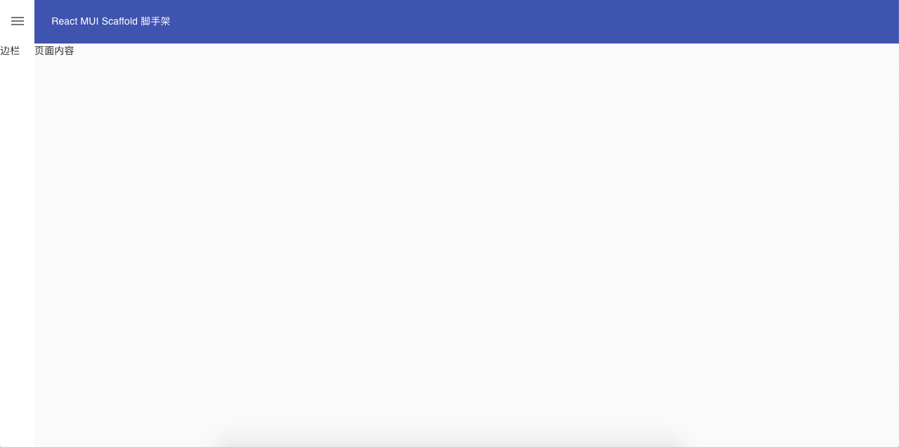
npm install --save react-mui-scaffoldUsage simple blank
import React from 'react';
import {Layout} from './Components'
import {TopBar,SideBar,Content} from './Components/Layouts'

function App() {
  return (
      <Layout>
        <SideBar  key="SideBar" labelname="SideBar">
          边栏
        </SideBar>
        <TopBar  key="TopBar" labelname="TopBar">
          React MUI Scaffold 脚手架
        </TopBar>
        <Content>页面内容</Content>
      </Layout>
  );
}

export default App;
Screenshot simple blank
Usage with theme
import React from 'react';
import clsx from 'clsx';
import { createMuiTheme, ThemeProvider, makeStyles } from '@material-ui/core/styles';
import {Layout,TopBar,SideBar,Content} from 'react-mui-scaffold'
import {
  Grid,
  Avatar,
  IconButton,
  Link,
  Typography,
  List,
  ListItem,
  ListItemText,
  ListItemIcon,
  Divider
} from '@material-ui/core';
import NotificationsIcon from '@material-ui/icons/Notifications';
import HomeIcon from '@material-ui/icons/Home';
import ListRoundedIcon from '@material-ui/icons/ListRounded';
import Filter1RoundedIcon from '@material-ui/icons/Filter1Rounded';
import Filter2RoundedIcon from '@material-ui/icons/Filter2Rounded';

let theme = createMuiTheme({
  palette: {
    primary: {
      main: '#009be5',
    },
  },
});
theme = {
  ...theme,
  overrides: {
    MuiAvatar: {
      root: {
        width: 32,
        height: 32,
      },
    },
  },
}

const lightColor = 'rgba(255, 255, 255, 0.7)';

const useStyles = makeStyles(theme => ({
  appbar:{
    height:60
  },
  sidebarDrawer:{
    backgroundColor: '#18202c',
    color:'#fafafa'
  },
  sidebarIconButton:{
    color:'inherit'
  },
  link: {
    textDecoration: 'none',
    color: lightColor,
    '&:hover': {
      color: theme.palette.common.white,
    },
  },
  iconButtonAvatar: {
    padding: 4,
  },
  item: {
    paddingTop: 1,
    paddingBottom: 1,
    color: 'rgba(255, 255, 255, 0.7)',
    '&:hover,&:focus': {
      backgroundColor: 'rgba(255, 255, 255, 0.08)',
    },
  },
  itemCategory: {
    backgroundColor: '#232f3e',
    boxShadow: '0 -1px 0 #404854 inset',
    paddingTop: theme.spacing(2),
    paddingBottom: theme.spacing(2),
  },
  itemIcon: {
    color:'inherit',
    minWidth: 'auto',
    marginRight: theme.spacing(2),
    '& svg': {
      fontSize: 20,
    },
  },
  itemActiveItem: {
    color: '#4fc3f7',
  },
  categoryHeader: {
    paddingTop: theme.spacing(2),
    paddingBottom: theme.spacing(2),
  },
  divider: {
    backgroundColor: '#404854',
    marginTop: theme.spacing(2),
  },
}));

function App() {
  const classes = useStyles()
  const menus = [
    {
      id: 'Menu One/菜单一',
      icon:<Filter1RoundedIcon/>,
      children: [
        { id: 'item 1/菜单项1', icon: <ListRoundedIcon />,active:true },
        { id: 'item 2/菜单项2', icon: <ListRoundedIcon />,active:false },
      ],
    },
    {
      id: 'Menu Two/菜单二',
      icon:<Filter2RoundedIcon />,
      children: [
        { id: 'item1/菜单项1', icon: <ListRoundedIcon />,active:false },
      ],
    },
  ];
  return (
    <ThemeProvider theme={theme}>
      <Layout>
        <SideBar key="SideBar" labelname="SideBar" DrawerClass={classes.sidebarDrawer} IconButtonClass={classes.sidebarIconButton}>
          <List disablePadding>
            <ListItem className={clsx(classes.item, classes.itemCategory)}>
              <ListItemIcon className={classes.itemIcon}>
                <HomeIcon />
              </ListItemIcon>
              <ListItemText>Dashboard/首页</ListItemText>
            </ListItem>
            {
              menus.map(({id,icon,children})=>(
                <React.Fragment key={id}>
                  <ListItem className={classes.categoryHeader}>
                  <ListItemIcon className={classes.itemIcon}>{icon}</ListItemIcon>
                    <ListItemText>{id}</ListItemText>
                  </ListItem>
                  {
                    children.map(item=>(
                      <ListItem key={item.id} button className={clsx(classes.item, item.active && classes.itemActiveItem)}>
                          <ListItemIcon className={classes.itemIcon}>{item.icon}</ListItemIcon>
                          <ListItemText>{item.id}</ListItemText>
                      </ListItem>
                    ))
                  }
                  <Divider className={classes.divider} />
                </React.Fragment>
              ))
            }
          </List>
        </SideBar>
        <TopBar key="TopBar" labelname="TopBar" color={"primary"} className={classes.appbar}>
          <Grid container spacing={1} direction="row" alignItems="center" justify="flex-end">
            <Grid item xs={true}>
              <Link className={classes.link} href="#" variant="body2">
              React MUI Scaffold 脚手架
              </Link>
            </Grid>
            <Grid item>
              <IconButton color="inherit">
                <NotificationsIcon />
              </IconButton>
            </Grid>
            <Grid item>
              woody
              <IconButton color="inherit" className={classes.iconButtonAvatar}>
                <Avatar src="/static/images/avatar/1.jpg" alt="My Avatar" />
              </IconButton>
            </Grid>
          </Grid>
        </TopBar>
        <Content>
          <Typography variant='h6'>页面内容</Typography>
        </Content>
      </Layout>
    </ThemeProvider>
  );
}

export default App;
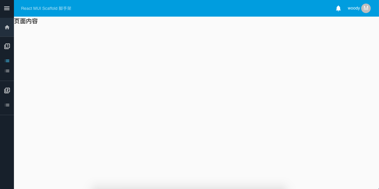
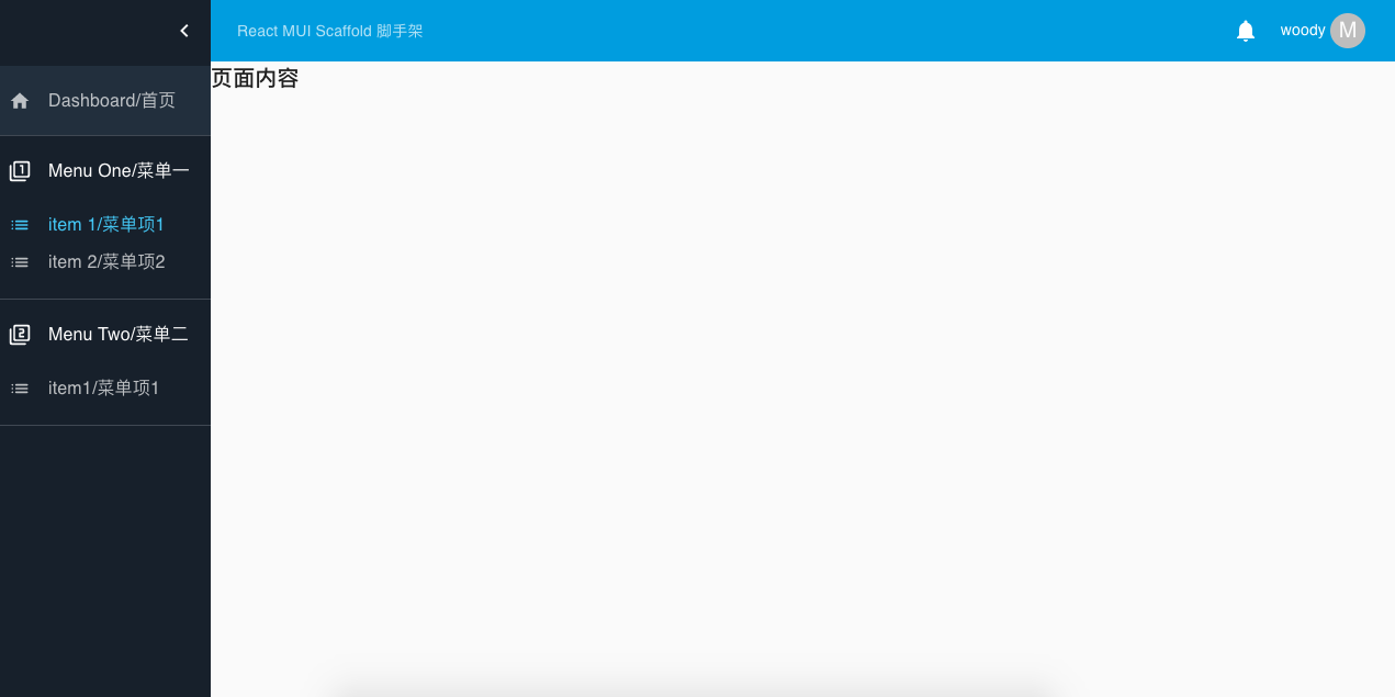
Screenshot with theme
License
MIT © woodyhello