
react-multis
v1.0.10
Published
react-multi-select
Maintainers
 saimundev
Readme
react-multis
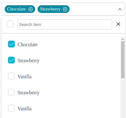
A lightweight, customizable multi-select component for web applications. Easy to integrate, responsive,Dark mood, and supports user interactions with customizable responses.
🎉🎉 Features
- Simple setup and usage.
- Customizable styles and behavior.
- Built-in support for user interactions and responses.
- Lightweight with minimal dependencies.
- Easily customizable via props.
- Typescript support
- Small bundle size
Example
1. Installation
npm install react-multis
yarn add react-multis
pnpm add react-multis
2. Live Demo
3. Simple usage
import React, { useState } from "react";
import { MultiSelect, Options } from "react-multis";

const App = () => {
  const options = [
    { value: "chocolate", label: "Chocolate" },
    { value: "strawberry", label: "Strawberry" },
    { value: "vanilla", label: "Vanilla" },
    { value: "strawberryss", label: "Strawberry" },
  ];
  const handleSelect = (selectedValue: Options[]) => {
    console.log(selectedValue);
  };

  return <MultiSelect options={options} onChange={handleSelect} />;
};

export default App;
3.1 With Props usage
import React, { useState } from "react";
import { MultiSelect, Options } from "react-multis";

const App = () => {
   const options = [
    { value: "chocolate", label: "Chocolate" },
    { value: "strawberry", label: "Strawberry" },
    { value: "vanilla", label: "Vanilla" },
    { value: "strawberryss", label: "Strawberry" },
  ];
   const handleSelect = (selectedValue: Options[]) => {
    console.log(selectedValue);
  };

  return (
    <MultiSelect
      isSearchable
      options={options}
      onChange={handleSelect}
      creatable
      placeholderText="Select an item"
      size="sm"
      maxLengthShow={2}
      width={400}
      maxHeight={300}
  );
};

export default App;
Read Documentation
Props
| Prop | Type | Default | Description |
| --------------------- | --------------------- | ----------- | -------------------------------------------------------------- |
| options | Options[] | [] | Array of options for the dropdown. |
| onChange | (Options[]) => void | undefined | Callback function triggered on option change. |
| isSearchable | boolean | true | Enables or disables the search functionality. |
| placeholderText | string | "" | Text displayed when no options are selected. |
| chip | boolean | true | Displays selected options as removable chips. |
| checked | boolean | true | Pre-checks options when set to true. |
| disabled | boolean | false | Disables the dropdown when set to true. |
| defaultValue | Options[] | [] | Array of pre-selected options. |
| creatable | boolean | false | Allows creation of new options dynamically. |
| emptyState | boolean | false | Displays a message when no options are available. |
| size | "sm","md","lg" | "md" | Adjusts the size of the dropdown (small, medium, large). |
| width | number | 400 | Sets the custom width of the dropdown. |
| maxHeight | number | 300 | Maximum height for the dropdown menu. |
| maxLengthShow | number | 10 | Maximum number of visible options before scrolling is enabled. |
This documentation helps developers understand the props they can use, along with their types and defaults, including how to apply custom styles through customClass.