
react-multiselect-button-dropdown
v2.0.1
Published
A Dropdown Button which toggle a Multiselect List. React component accessible (A11y).
Downloads
229

Readme
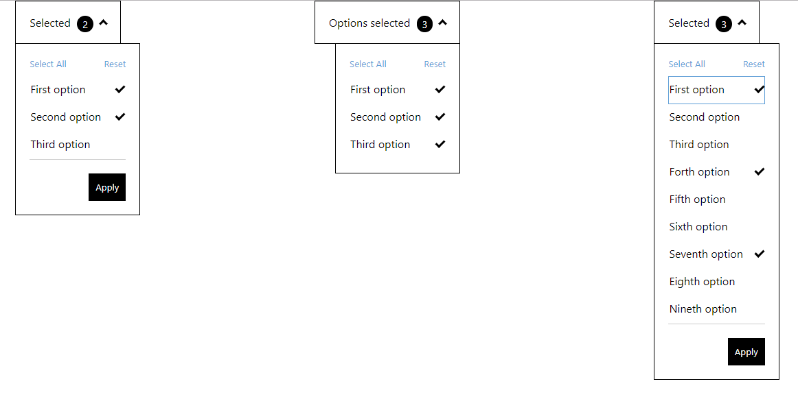
React MultiSelect Dropdown Button accessible (A11y).
A Dropdown Button which toggle a Multiselect List. React component accessible (A11y).
Finally, Typescript compatible
- Easy use with keyboard navigation (Tab, selection with Space, Arrows Up, Down, Home and End for the list) following A11y guide of https://developer.mozilla.org/en-US/docs/Web/Accessibility/ARIA/Roles/listbox_role
- Callback function provided, to give selected items applied
- Can be used multilanguage, as it receives text by props
- CSS classes provided in all tags, for you to style as you wish
Try it out in this Live Demo
A11y notes
- In order to keep it fully accessible, make sure:
- label does describe its associated input element: https://achecker.ca/checker/suggestion.php?id=189
- the labels of each checkbox describes the purpose or function of it. https://achecker.ca/checker/suggestion.php?id=219
How to use
npm i react-multiselect-button-dropdown
or
yarn add react-multiselect-button-dropdown
and import in your app
import MultiSelect from "react-multiselect-button-dropdown";
props
list:
Array<listItem>(required) listItem is:{ label: PropTypes.string.isRequired, id: PropTypes.string.isRequired, name: PropTypes.string, checked: PropTypes.bool.isRequired }Provides a list of checkboxes to the component
dropdownButtonText:
string(required)The text for the button dropdown
isRightAligned:
boolean(optional)Used in order to align dropdown to the right of the button. The default is left aligned
onOptionChanged
(optionState) => {}(optional)A callback function to get the state of options selected/unselected.
onSelectionApplied:
(list) => {}(optional)A callback function to get the state of checkbox list. If this property is added, it activates the footer of the component, containing the "Apply" and "Reset" buttons
selectAllButtonText:
string(optional)The text to the select all button default: "Select All"
resetButtonText:
string(optional)The text to the reset button default: "Reset"
applyButtonText:
string(optional)The text to the apply button default: "Apply"
closeDropdownOnApply:
boolean(optional)
Used in order to close the dropdown when user click on Apply button
Example
const props = {
    list: [
        {
            label: 'First option',
            name: 'first-option',
            id: 'first-option-1',
            checked: true
        },
        {
            label: 'Second option',
            name: 'second-option',
            id: 'second-option-2',
            checked: false
        },
        {
            label: 'Third option',
            name: 'third-option',
            id: 'third-option-3',
            checked: false
        }
    ],
    onSelectionApplied: selection => {
    console.log('Selected : ', selection);
    },
    dropdownButtonText: 'Selected',
    resetButtonText: 'Reset',
    applyButtonText: 'Apply'
    closeDropdownOnApply: true
};

<MultiSelect {...props} />