
react-nat-modal
v1.0.5
Published
A reusable and customizable React modal component


Readme
react-nat-modal
A clean, responsive, and animated modal dialog component for React. Built with smooth enter/exit transitions, flexible sizing, and full support for both Tailwind CSS utility classes and custom color values.



Preview
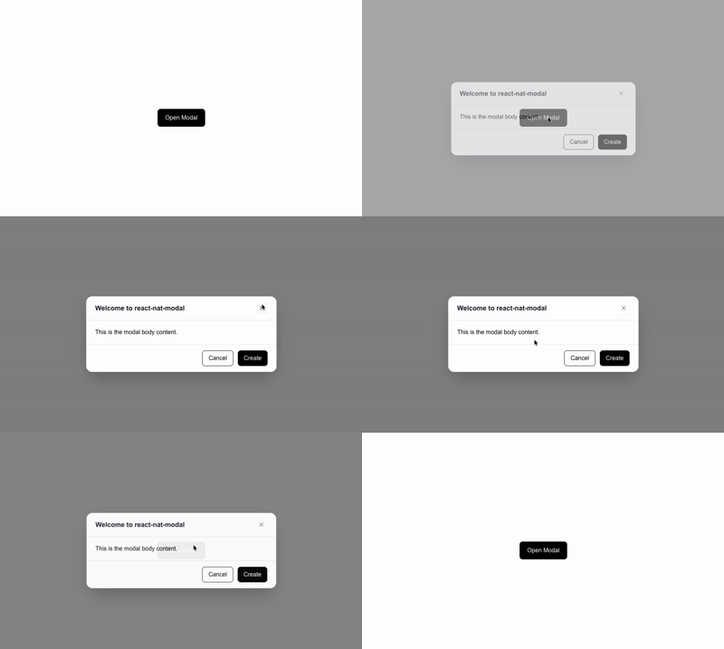
Installation
npm install react-nat-modal# bun
bun add react-nat-modal
# pnpm
pnpm add react-nat-modal
# yarn
yarn add react-nat-modalPeer Dependencies
Requires React 18 or higher:
npm install react react-domBasic Usage
import { useState } from "react";
import { Modal } from "react-nat-modal";

export default function App() {
  const [isOpen, setIsOpen] = useState(false);

  return (
    <div>
      <button onClick={() => setIsOpen(true)}>Open Modal</button>

      <Modal
        isOpen={isOpen}
        onClose={() => setIsOpen(false)}
        title="Settings"
      >
        <p>Manage your account settings and preferences.</p>
      </Modal>
    </div>
  );
}
Customizing Background & Overlay
react-nat-modal supports both Tailwind classes and direct CSS colors (Hex, RGB, HSL) for the modal card and the backdrop overlay.
Using Tailwind Classes
<Modal
  isOpen={isOpen}
  onClose={() => setIsOpen(false)}
  title="Dark Mode"
  bgColor="bg-zinc-900 text-white"
  overlayBg="bg-black/75"
>
  <p className="text-zinc-300">
    Styled with Tailwind utility classes.
  </p>
</Modal>
Using Custom CSS Colors
<Modal
  isOpen={isOpen}
  onClose={() => setIsOpen(false)}
  title="Custom Theme"
  bgColor="#1e293b"
  overlayBg="rgba(15, 23, 42, 0.8)"
>
  <p className="text-slate-100">
    Hex, RGB, and RGBA strings work out of the box without extra CSS.
  </p>
</Modal>
Sizes
Use the size prop to select a preset maximum width:
| Value | Max Width | Target Screen / Usage |
| :--- | :--- | :--- |
| "sm" | max-w-md (448px) | Alerts, confirmation dialogs |
| "md" | max-w-lg (512px) | Standard forms, small dialogs (default) |
| "lg" | max-w-2xl (672px) | Multi-step forms, medium content |
| "xl" | max-w-4xl (896px) | Tables, dashboards, previews |
| "xxl" | max-w-6xl (1152px) | Full-width document viewers, large grids |
<Modal isOpen={isOpen} onClose={() => setIsOpen(false)} size="lg" title="Large Dialog">
  <p>Expanded modal view.</p>
</Modal>
With Action Footer
Pass any action buttons or footer component via the footer prop:
<Modal
  isOpen={isOpen}
  onClose={() => setIsOpen(false)}
  title="Delete Account"
  footer={
    <div className="flex justify-end gap-3">
      <button
        type="button"
        onClick={() => setIsOpen(false)}
        className="px-4 py-2 text-sm text-gray-700 hover:bg-gray-100 rounded-lg"
      >
        Cancel
      </button>
      <button
        type="button"
        onClick={handleDelete}
        className="px-4 py-2 text-sm bg-red-600 text-white hover:bg-red-700 rounded-lg"
      >
        Delete
      </button>
    </div>
  }
>
  <p>Are you sure you want to delete this account? This action cannot be undone.</p>
</Modal>
Props
| Prop | Type | Default | Description |
| :--- | :--- | :--- | :--- |
| isOpen | boolean | required | Controls whether the modal is visible. |
| onClose | () => void | required | Callback fired when user clicks the close button. |
| children | ReactNode | required | Content rendered inside the dialog body. |
| title | string | "Modal" | Header title string, also used as the aria-label. |
| footer | ReactNode | undefined | Optional footer element (actions, buttons). |
| size | "sm" \| "md" \| "lg" \| "xl" \| "xxl" | "md" | Dialog max-width preset. |
| bgColor | string | "bg-white" | Modal card background. Accepts Tailwind class or raw CSS color (#hex, rgb, etc.). |
| overlayBg | string | "bg-black/50" | Backdrop overlay background. Accepts Tailwind class or raw CSS color. |
| className | string | "" | Extra CSS class names for the modal card container. |
| overlayClassName | string | "" | Extra CSS class names for the backdrop wrapper. |
TypeScript
TypeScript types are included with the package:
import type { ModalProps, ModalSize } from "react-nat-modal";License
MIT © Nafiz Al Turabi