
react-native-action-fab-button
v1.0.5
Published
A customizable Floating Action Button component for React Native with FontAwesome icons
Maintainers
 mr.alirazakhan
Readme
React Native Action FAB Button
A customizable Floating Action Button component for React Native with FontAwesome icons support.
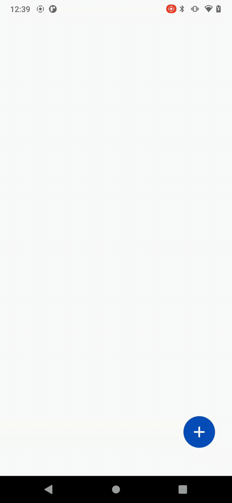
Demo
Features
- 🎨 Customizable colors, sizes, and positions
- 🔄 Smooth animations with spring physics
- 📱 Multiple action buttons support
- 🎯 FontAwesome icons integration
- 📐 Flexible positioning (left/right, up/down)
- 🎭 Theme support with React Navigation
- 📦 TypeScript support
- 🎪 Easy to use and integrate
Installation
npm install react-native-action-fab-buttonPeer Dependencies
Make sure you have these peer dependencies installed:
npm install react react-native @react-navigation/native
npm install @fortawesome/fontawesome-svg-core @fortawesome/free-solid-svg-icons @fortawesome/react-native-fontawesome
Quick Start
Basic Usage
import React from 'react';
import { View } from 'react-native';
import { Fab } from 'react-native-action-fab-button';

const App = () => {
  return (
    <View style={{ flex: 1 }}>
      {/* Your app content */}

      <Fab
        onPress={() => console.log('FAB pressed!')}
        icon="plus"
      />
    </View>
  );
};
With Multiple Actions
import React from 'react';
import { View } from 'react-native';
import { Fab, FabOption } from 'react-native-action-fab-button';

const App = () => {
  const fabOptions: FabOption[] = [
    {
      title: 'Home',
      icon: 'home',
      screen: 'HomeScreen'
    },
    {
      title: 'Profile',
      icon: 'user',
      screen: 'ProfileScreen'
    },
    {
      title: 'Settings',
      icon: 'settings',
      screen: 'SettingsScreen'
    }
  ];

  const handleOptionPress = (screen?: string, option?: FabOption) => {
    console.log('Option pressed:', option?.title);
    // Navigate to screen or handle action
  };

  return (
    <View style={{ flex: 1 }}>
      {/* Your app content */}

      <Fab
        options={fabOptions}
        onOptionPress={handleOptionPress}
        icon="plus"
      />
    </View>
  );
};
API Reference
Fab Props
| Prop | Type | Default | Description |
|------|------|---------|-------------|
| onPress | () => void | - | Callback when FAB is pressed (single action mode) |
| options | FabOption[] | - | Array of action options (multiple actions mode) |
| onOptionPress | (screen?: string, option?: FabOption) => void | - | Callback when an option is pressed |
| icon | string | 'plus' | FontAwesome icon name for the main button |
| buttonColor | string | Theme accent color | Color of the main FAB button |
| position | 'left' \| 'right' | 'right' | Position of the FAB on screen |
| offsetX | number | 30 | Horizontal offset from screen edge |
| offsetY | number | 50 | Vertical offset from bottom |
| size | number | 56 | Size of the FAB button |
| spacing | number | 0 | Spacing between action buttons |
| verticalOrientation | 'up' \| 'down' | 'up' | Direction of action buttons |
| hideShadow | boolean | true | Hide shadow on FAB |
| backgroundTappable | boolean | true | Allow tapping background to close |
| bgColor | string | 'transparent' | Background overlay color |
| bgOpacity | number | 0.6 | Background overlay opacity |
| autoInactive | boolean | true | Auto close when option is pressed |
| iconColors | string[] | Default colors | Colors for action buttons |
FabOption Interface
interface FabOption {
  title: string;        // Display text for the action
  icon: string;         // FontAwesome icon name
  screen?: string;      // Optional screen identifier
  [key: string]: any;   // Additional custom properties
}
Available Icons
The component includes a curated set of FontAwesome icons:
plus,home,user,settings,searchheart,star,edit,trash,saveclose,check,arrow-left,arrow-rightmenu,share,download,uploadcamera,image,file,folderenvelope,phone,map-markercalendar,clock,belllock,unlock,eye,eye-slash
Advanced Usage
Custom Positioning
<Fab
  position="left"
  offsetX={20}
  offsetY={100}
  size={64}
  icon="menu"
/>
Custom Colors
<Fab
  buttonColor="#FF6B6B"
  iconColors={['#4ECDC4', '#45B7D1', '#96CEB4']}
  options={options}
  onOptionPress={handleOptionPress}
/>
Custom Styling
<Fab
  hideShadow={false}
  backgroundTappable={true}
  bgColor="rgba(0,0,0,0.5)"
  bgOpacity={0.8}
  spacing={10}
  verticalOrientation="down"
/>
Theme Integration
The component automatically integrates with React Navigation themes:
import { NavigationContainer } from '@react-navigation/native';
import { useTheme } from '@react-navigation/native';

const App = () => {
  const { colors } = useTheme();

  return (
    <NavigationContainer>
      {/* Your navigation */}
      <Fab
        // Uses colors.accent automatically
        options={options}
        onOptionPress={handleOptionPress}
      />
    </NavigationContainer>
  );
};
TypeScript Support
The package includes full TypeScript support with type definitions:
import { Fab, FabProps, FabOption } from 'react-native-action-fab-button';

const MyComponent: React.FC = () => {
  const options: FabOption[] = [
    {
      title: 'Home',
      icon: 'home',
      screen: 'Home'
    }
  ];

  const handleOptionPress: FabProps['onOptionPress'] = (screen, option) => {
    // TypeScript knows the types here
  };

  return <Fab options={options} onOptionPress={handleOptionPress} />;
};
Contributing
- Fork the repository
- Create your feature branch (
git checkout -b feature/amazing-feature) - Commit your changes (
git commit -m 'Add some amazing feature') - Push to the branch (
git push origin feature/amazing-feature) - Open a Pull Request
License
This project is licensed under the MIT License - see the LICENSE file for details.
Support
If you find this package helpful, please consider giving it a ⭐ on GitHub!
For issues and feature requests, please use the GitHub Issues page.