
react-native-anchored-menu
v0.0.18
Published
Headless anchored context menu / popover for React Native (iOS/Android) with stable measurement (default view host).
Downloads
33
Maintainers
 mahmoud_elfeky
Readme
react-native-anchored-menu
A headless, anchor-based menu / popover system for React Native designed to work reliably across:
- iOS & Android
- FlatList / SectionList
- Complex layouts
- New Architecture (Fabric)
- Modal & non-modal contexts
This library focuses on correct measurement and positioning, not UI.
You fully control how the menu looks and behaves.
🎬 Demo
| View host (normal screens) | View host inside native <Modal> |
| --- | --- |
| 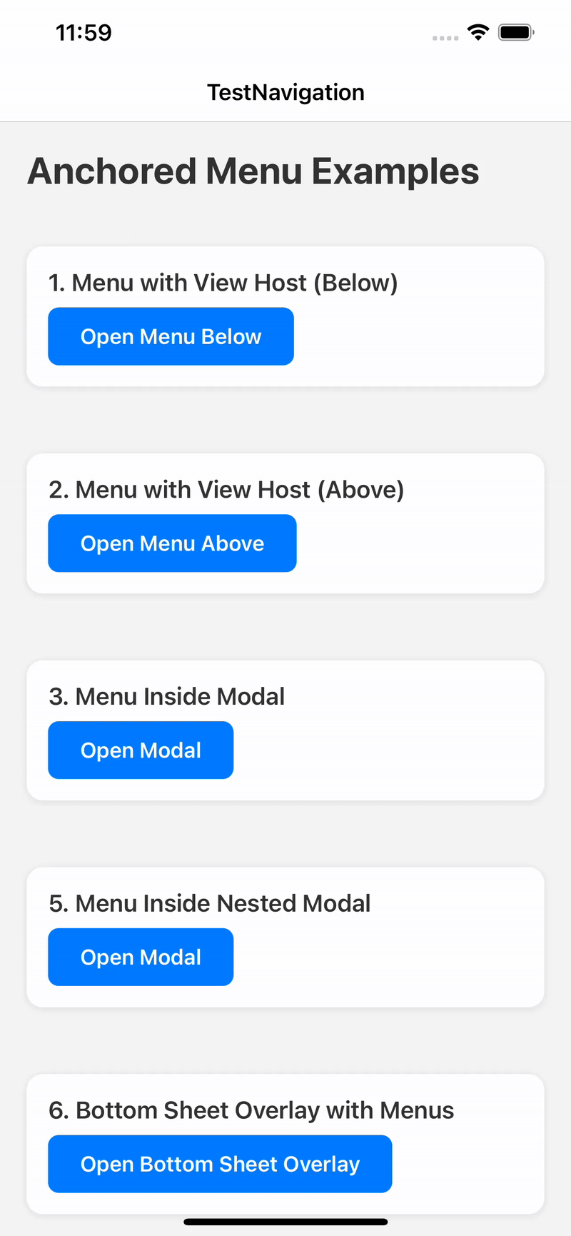 |
| 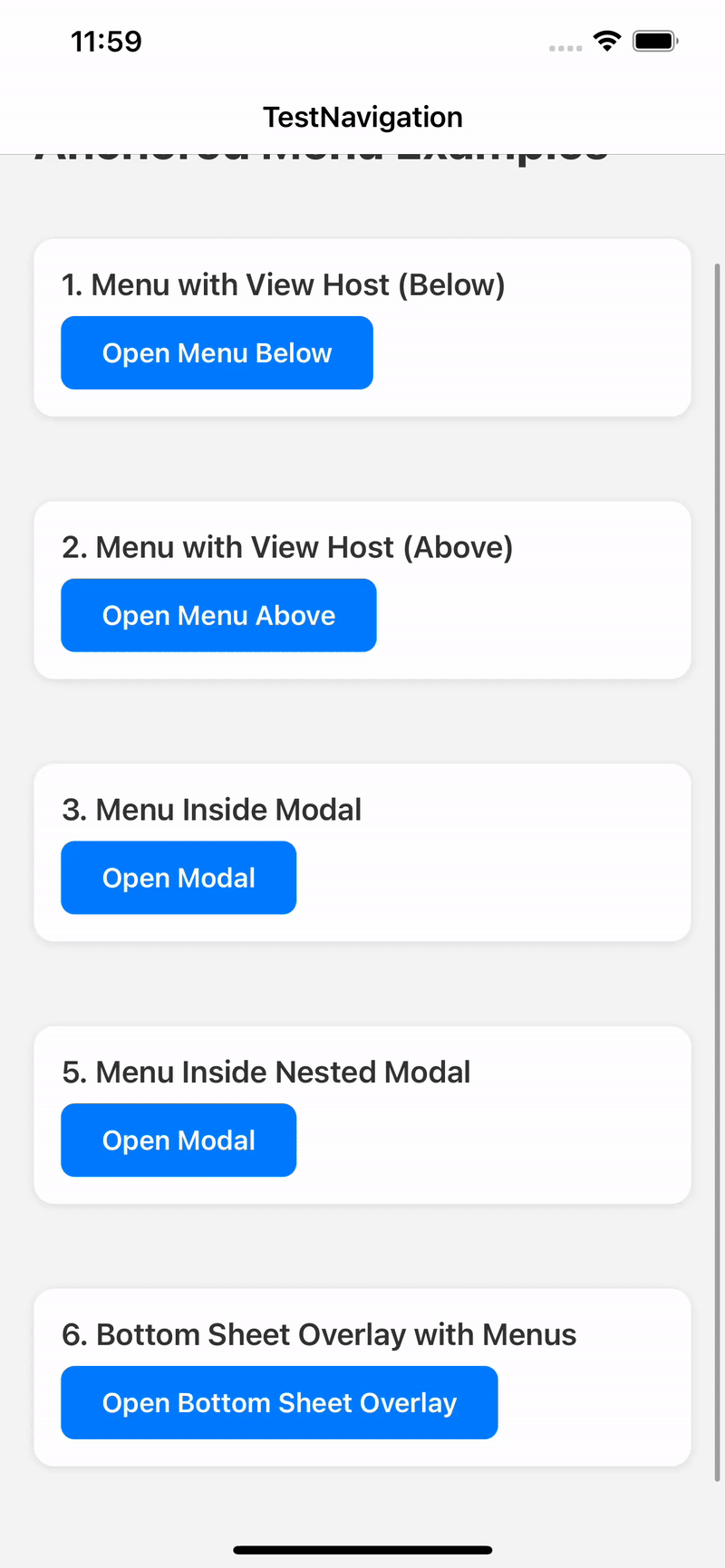 |
|
✨ Why this library exists
Most React Native menu / popover libraries break in at least one of these cases:
- Wrong position on Android
- Unreliable measurement inside FlatList
- Broken behavior with Fabric
- Rendering behind or inside unexpected layers
- Forced UI and styling
react-native-anchored-menu solves these by:
- Using stable anchor measurement
- Separating state (Provider) from rendering (Hosts)
- Supporting multiple rendering strategies (View / Modal)
- Staying 100% headless
✅ Features
- 📍 Anchor menus to any component
- 📐 Accurate positioning (
auto,top,bottom) - 🧠 FlatList-safe measurement
- 🪟 Works inside and outside native
<Modal> - 🧩 Fully headless render API
- 🧹 Tap outside to dismiss
- 🔄 Auto-close on scroll (optional)
- 🌍 RTL-aware positioning
- 🧱 Multiple host strategies
📦 Installation
npm install react-native-anchored-menu
# or
yarn add react-native-anchored-menu
No native linking required.
🚀 Basic Usage
1️⃣ Wrap your app
import { AnchoredMenuProvider } from "react-native-anchored-menu";

export default function Root() {
  return (
    <AnchoredMenuProvider>
      <App />
    </AnchoredMenuProvider>
  );
}
⚠️ You do NOT need to manually mount any host by default.
Hosts are automatically mounted internally.
2️⃣ Add an anchor
import { MenuAnchor } from "react-native-anchored-menu";

<MenuAnchor id="profile-menu">
  <Pressable>
    <Text>Open menu</Text>
  </Pressable>
</MenuAnchor>
3️⃣ Open the menu
import { useAnchoredMenuActions } from "react-native-anchored-menu";

const { open, close } = useAnchoredMenuActions();

open({
  id: "profile-menu",
  render: ({ close }) => (
    <View style={{ backgroundColor: "#111", padding: 12, borderRadius: 8 }}>
      <Pressable onPress={close}>
        <Text style={{ color: "#fff" }}>Logout</Text>
      </Pressable>
    </View>
  ),
});
🪟 Using inside React Native <Modal>
React Native <Modal> is rendered in a separate native layer. To ensure the menu appears above the modal content, mount a provider/layer inside the modal tree.
Sheets & overlays:
- Native-layer overlays (RN
<Modal>,react-native-navigationmodals/overlays, etc.): mountAnchoredMenuProviderinside that overlay’s content tree. - JS-only sheets (rendered as normal React views in the same tree): you can keep a single provider at the app root.
Recommended:
import React, { useState } from "react";
import { Modal, Pressable, Text, View } from "react-native";
import {
  AnchoredMenuProvider,
  MenuAnchor,
  useAnchoredMenuActions,
} from "react-native-anchored-menu";

export function ExampleModalMenu() {
  const [visible, setVisible] = useState(false);
  const { open } = useAnchoredMenuActions();

  return (
    <>
      <Pressable onPress={() => setVisible(true)}>
        <Text>Open modal</Text>
      </Pressable>

      <Modal transparent visible={visible} onRequestClose={() => setVisible(false)}>
        <AnchoredMenuProvider>
          <View style={{ flex: 1, justifyContent: "center", alignItems: "center" }}>
            <MenuAnchor id="modal-menu">
              <Pressable
                onPress={() =>
                  open({
                    id: "modal-menu",
                    host: "view",
                    render: ({ close }) => (
                      <View style={{ backgroundColor: "#111", padding: 12, borderRadius: 8 }}>
                        <Pressable onPress={close}>
                          <Text style={{ color: "#fff" }}>Action</Text>
                        </Pressable>
                      </View>
                    ),
                  })
                }
              >
                <Text>Open menu</Text>
              </Pressable>
            </MenuAnchor>

            <Pressable onPress={() => setVisible(false)}>
              <Text>Close modal</Text>
            </Pressable>
          </View>
        </AnchoredMenuProvider>
      </Modal>
    </>
  );
}
🧠 API
useAnchoredMenuActions()
const { open, close } = useAnchoredMenuActions();useAnchoredMenuState(selector?)
const isOpen = useAnchoredMenuState((s) => s.isOpen);Recommended (performance): prefer split hooks in large trees to reduce re-renders:
const isOpen = useAnchoredMenuState((s) => s.isOpen);
const { open } = useAnchoredMenuActions();
useAnchoredMenu()is still available for backwards compatibility, but the split hooks are recommended to reduce re-renders in large trees.
open(options)
open({
  id: string;

  placement?: "auto" | "top" | "bottom";
  align?: "start" | "center" | "end";
  offset?: number;
  margin?: number;
  rtlAware?: boolean;

  render?: ({ close, anchor }) => ReactNode;
  content?: ReactNode;

  host?: "view" | "modal";

  animationType?: "fade" | "none";
  statusBarTranslucent?: boolean;

  /**
   * Measurement strategy.
   * - "stable" (default): waits for interactions and retries for correctness (best for FlatList/Android)
   * - "fast": one-frame measure (lowest latency, less reliable on complex layouts)
   */
  measurement?: "stable" | "fast";

  /**
   * Only used when `measurement="stable"` (default: 8).
   */
  measurementTries?: number;
});
🧭 Placement Behavior
auto→ below if space allows, otherwise abovetop→ prefer above, fallback belowbottom→ prefer below, fallback above
🧱 Host System
- Default host: view
- Hosts are auto-mounted
modalhost is disabled on Fabric and falls back toview
📄 License
MIT © Mahmoud Elfeky