
react-native-animated-placeholder
v1.0.2
Published
React native animated placeholder for both Android & iOS platforms using react native reanimated.
Maintainers
 gamer.singh
Readme
react-native-animated-placeholder
React native animated placeholder for both Android & iOS platforms using react native reanimated.
Installation
npm install react-native-animated-placeholder --saveOR
yarn add react-native-animated-placeholderDependencies
react-native-animated-placeholder requires following modules need to be installed as well:
react-native-linear-gradient.react-native-reanimated.react-native-gesture-handler.react-native-redash.
So make sure the above listed modules are installed and configured properly as well.
Supported Props
itemStyle: {} // Defines the style for item.
duration: 800 // Defines the duration for animation. Default is 800.
primaryColor: '#E0E0E0' // Specifies the primary color for the linear gradient. Default is '#E0E0E0'.
secondaryColor: '#F5F5F5' // Specifies the secondary color for the linear gradient. Default is '#F5F5F5'.
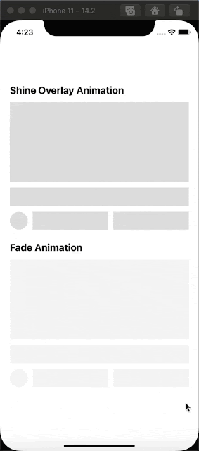
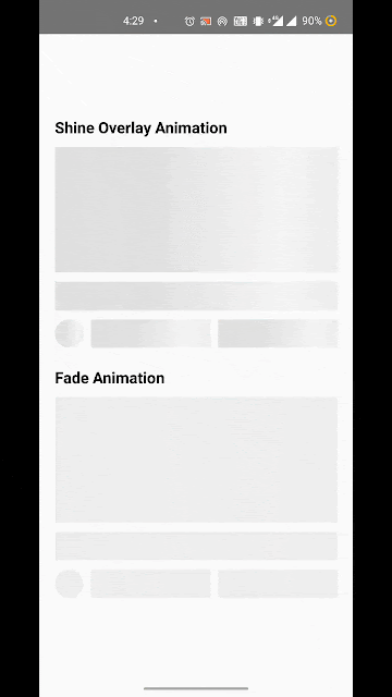
animationType: 'overlay' // Specifies the animation type. Supports 'overlay' and 'fade' animations. Default is 'overlay'.ScreenShots
Usages Example
- First create a new React native project:
react-native init AnimatedPlaceholder
cd AnimatedPlaceholder
yarn add react-native-animated-placeholder- Paste the following code into your
App.jsfile:
import React from 'react';
import {
    StyleSheet,
    View,
    Text,
    Dimensions
} from 'react-native';

import AnimatedPlaceholder from 'react-native-animated-placeholder';

const {
    width
} = Dimensions.get('window');

export default () => {
    return (
        <View style={styles.container}>
            <Text style={styles.title}>Shine Overlay Animation</Text>
            <AnimatedPlaceholder
                itemStyle={styles.imagePlaceholder}
            />

            <AnimatedPlaceholder
                itemStyle={styles.titlePlaceholder}
            />

            <View style={styles.detailsContainer}>
                <AnimatedPlaceholder
                    itemStyle={styles.authorImagePlaceholder}
                />

                <AnimatedPlaceholder
                    itemStyle={[
                        styles.infoPlaceholder,
                        styles.otherStyle
                    ]}
                />

                <AnimatedPlaceholder
                    itemStyle={styles.infoPlaceholder}
                />
            </View>

            <Text style={styles.title}>Fade Animation</Text>
            <AnimatedPlaceholder
                itemStyle={styles.imagePlaceholder}
                animationType='fade'
            />

            <AnimatedPlaceholder
                itemStyle={styles.titlePlaceholder}
                animationType='fade'
            />

            <View style={styles.detailsContainer}>
                <AnimatedPlaceholder
                    itemStyle={styles.authorImagePlaceholder}
                    animationType='fade'
                />

                <AnimatedPlaceholder
                    itemStyle={[
                        styles.infoPlaceholder,
                        styles.otherStyle
                    ]}
                    animationType='fade'
                />

                <AnimatedPlaceholder
                    itemStyle={styles.infoPlaceholder}
                    animationType='fade'
                />
            </View>
        </View>
    )
};

const styles = StyleSheet.create({
    container: {
        flex: 1,
        justifyContent: 'center',
        alignItems: 'center',
        paddingHorizontal: width * 5 / 100
    },

    title: {
        fontWeight: 'bold',
        fontSize: width * 5 / 100,
        alignSelf: 'stretch',
        textAlign: 'left',
        marginVertical: width * 3 / 100
    },

    imagePlaceholder: {
        width: '100%',
        height: width * 40 / 100,
        backgroundColor: '#E0E0E0',
        overflow: 'hidden',
        marginBottom: width * 3 / 100
    },

    titlePlaceholder: {
        width: '100%',
        height: width * 9 / 100,
        backgroundColor: '#E0E0E0',
        overflow: 'hidden'
    },

    detailsContainer: {
        flexDirection: 'row',
        justifyContent: 'space-between',
        alignItems: 'center',
        paddingVertical: width * 3 / 100
    },

    authorImagePlaceholder: {
        height: width * 9 / 100,
        width: width * 9 / 100,
        borderRadius: width * 5 / 100,
        overflow: 'hidden',
        backgroundColor: '#E0E0E0'
    },

    infoPlaceholder: {
        flex: 1,
        height: width * 9 / 100,
        backgroundColor: '#E0E0E0',
        overflow: 'hidden'
    },

    otherStyle: {
        marginHorizontal: width * 2.5 / 100
    }
});