
react-native-calendario
v3.5.2
Published
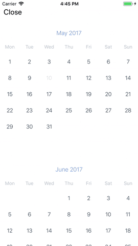
React Native Calendar

Readme
React Native Calendar 📆


Installation
npm install react-native-calendario --saveUsing yarn
yarn add react-native-calendarioUsage
import { Calendar } from 'react-native-calendario';<Calendar
onChange={(range) => console.log(range)}
minDate={new Date(2018, 3, 20)}
startDate={new Date(2018, 3, 30)}
endDate={new Date(2018, 4, 5)}
theme={{
activeDayColor: {},
monthTitleTextStyle: {
color: '#6d95da',
fontWeight: '300',
fontSize: 16,
},
emptyMonthContainerStyle: {},
emptyMonthTextStyle: {
fontWeight: '200',
},
weekColumnsContainerStyle: {},
weekColumnStyle: {
paddingVertical: 10,
},
weekColumnTextStyle: {
color: '#b6c1cd',
fontSize: 13,
},
nonTouchableDayContainerStyle: {},
nonTouchableDayTextStyle: {},
startDateContainerStyle: {},
endDateContainerStyle: {},
dayContainerStyle: {},
dayTextStyle: {
color: '#2d4150',
fontWeight: '200',
fontSize: 15,
},
dayOutOfRangeContainerStyle: {},
dayOutOfRangeTextStyle: {},
todayContainerStyle: {},
todayTextStyle: {
color: '#6d95da',
},
activeDayContainerStyle: {
backgroundColor: '#6d95da',
},
activeDayTextStyle: {
color: 'white',
},
nonTouchableLastMonthDayTextStyle: {},
}}
/>API
| Prop | Description | Required? | Default | Type |
| --------------------------- | -------------------------------------- | -------------------- | ------------- | ---------------- |
| onChange (deprecated) | Callback called when a day is pressed. | no | | Function |
| onPress | Callback called when a day is pressed. | yes | | (Date) => void |
| minDate | Minimum date that can be selected. | no | null | Date |
| maxDate | Maximum date that can be selected. | no | null | Date |
| startDate | Selected start date | no | null | Date |
| endDate | Selected end date | requires startDate | null | Date |
| theme | Calendar StyleSheet | no | null | ThemeType |
| locale | Calendar language | es, en, fr, br | 'en' | LocaleType |
| dayNames | Array of day names | no | [] | string[] |
| monthNames | Array of names of each mo | no | [] | string[] |
| showWeekdays | Show Week columns | no | true | boolean |
| showMonthTitle | Show Month title | no | true | boolean |
| initialListSize | FlatList initialNumToRender | no | 2 | number |
| startingMonth | First month to render | no | current month | 'YYYY-MM-DD' |
| numberOfMonths | Number of months to render | no | 12 | number |
| disableRange | Turn off range date selection | no | false | boolean |
| firstDayMonday | Monday as first day of the week | no | false | boolean |
| monthHeight | Change Month row height | no | 370 | number |
| markedDays | Multi-dot support on Day component | no | undefined | MarkedDays |
| disabledDays | Disabled days | no | null | {[string]: any } |
| renderDayContent | Render custom Day content | no | null | Function |
| renderAllMonths | Use this for web, render all months | no | null | boolean |
| viewableItemsChanged | handleViewableItemsChange callback | no | null | Function |
| disableOffsetDays | Remove offset Days. | no | false | boolean |
License
MIT