
react-native-clip-scale
v1.0.0
Published
React Native video crop (aspect presets + custom resize), trim, FFmpeg export — modal, view, and trim bar

Maintainers
 vidur-joshi
Readme
react-native-clip-scale
Video aspect crop, custom crop, and trim for React Native (CLI). Full-frame preview with a draggable crop box, optional Custom free-resize handles, native FFmpeg export on iOS and Android.
Screenshots (iOS Simulator — flow: test app → crop → trim):
| 1. Test app | 2. Aspect & Zoom | 3. Trim |
| :---: | :---: | :---: |
| 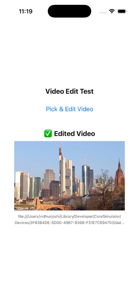 |
| 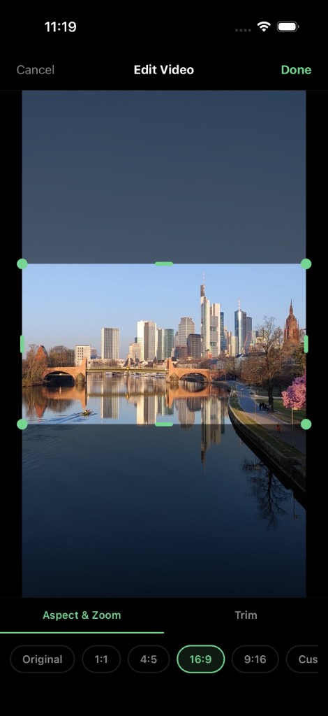 |
| 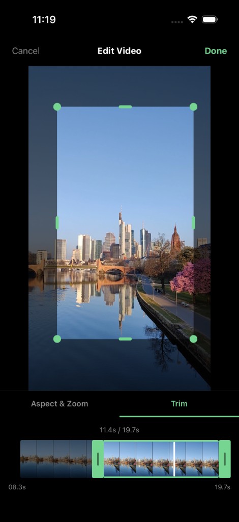 |
|
Images use absolute URLs (via unpkg) so they render on npmjs.com after you publish. The same files ship in the package as docs/screen-1.png … screen-3.png for local/offline docs.
Install
npm
npm install react-native-clip-scaleYarn
yarn add react-native-clip-scalePeer dependencies (required in your app)
This library declares peer dependencies so your app supplies one compatible version of each (avoids duplicate React/RN and keeps native modules aligned). You must install them in your project if they are not already there.
| Package | Version | Why it’s needed |
|---------|---------|-----------------|
| react | ≥ 18 | UI runtime for the modal, views, and trim bar. |
| react-native | ≥ 0.73 | Core native bridge; library targets the RN CLI workflow. |
| react-native-gesture-handler | ≥ 2.14 | Pan gestures for crop drag, trim handles, and modal touch handling. |
| react-native-reanimated | ≥ 3.6 | Animated crop overlay, dim mask, and smooth gesture updates. |
| react-native-video | ≥ 6.0 | Video preview inside ClipScaleView / modal. |
Install peers explicitly (adjust versions to match your app):
# npm
npm install react react-native react-native-gesture-handler react-native-reanimated react-native-video

# Yarn
yarn add react react-native react-native-gesture-handler react-native-reanimated react-native-video- npm 7+ may offer to install missing peers when you add
react-native-clip-scale; accept or run the command above so versions match the rest of your app. - Yarn Classic (v1) often prints peer warnings until those packages are listed in your
package.json— add them as shown. - After adding Reanimated or Gesture Handler, complete their babel / entry setup (e.g.
babel.config.jsplugin, rootGestureHandlerRootViewwhere your app requires it).
Native setup
iOS — CocoaPods (includes FFmpeg via ffmpeg-mobile-min):
cd ios && pod installAndroid — Gradle resolves ffmpeg-kit-min from Maven; rebuild the app after install.
Follow Reanimated and Gesture Handler install steps if you have not already.
Quick start
import { ClipScaleModal } from 'react-native-clip-scale';

<ClipScaleModal
  file={videoUri ? { uri: videoUri } : null}
  isVisible={open}
  onSuccess={(outputUri) => {
    /* cropped/trimmed file */
  }}
  onClose={() => setOpen(false)}
/>
Default ratio chips: Original, 1:1, 4:5, 16:9, 9:16, Custom (free resize with corner/edge handles).
Theming & colors (ClipScaleModal)
The modal uses four color props. Defaults match a dark UI with mint accent #76D691.
| Prop | Default | What it affects |
|------|---------|-----------------|
| backgroundColor | #000000 | Root layout, toolbar, tab bar, bottom controls area, and the outer GestureHandlerRootView when the modal opens. |
| buttonColor | #76D691 | Accent / theme color: Done label, active tab text and underline, selected aspect-ratio chip (border + text), small ActivityIndicator on Done while exporting, and the Trim filmstrip (handles + selection outline via accentColor on TrimBar). |
| textColor | #ffffff | Primary text: toolbar title (“Edit Video”), busy overlay (“Processing…”) and its large spinner color. |
| secondaryTextColor | (optional) | Muted / subtitle text. If omitted, it is derived as 55% opacity of textColor (rgba mix). Used for Cancel, inactive tab labels, unselected aspect chip labels, trim duration line (11.4s / 19.7s), and start/end time labels under the filmstrip. |
Derived (not separate props): subtle borders (e.g. unselected chip outlines, tab separator) use 10% opacity of textColor. The selected chip background is a light tint: 12% opacity of buttonColor.
Example — light toolbar, custom accent and subtitles:
<ClipScaleModal
  file={file}
  isVisible={open}
  onSuccess={onSuccess}
  onClose={onClose}
  backgroundColor="#0d0d0d"
  buttonColor="#7eb87a"
  textColor="#ffffff"
  secondaryTextColor="#9a9a9a"
/>
Crop handle color in the preview: ClipScaleModal does not forward theme to the crop dots/pills; they use ClipScaleView’s default #76D691. For a standalone ClipScaleView, set cropFrameBorderColor to match your accent.
ClipScaleModal props
| Prop | Type | Notes |
|------|------|--------|
| file | { uri: string } \| null | Video to edit; null shows an empty state. |
| isVisible | boolean | Controls Modal visibility. |
| onSuccess | (outputUri: string) => void | Called with the exported file URI after Done (crop ± trim). |
| onClose | () => void | Cancel / dismiss. |
| aspectRatios | ClipScaleRatioPreset[] | Optional list of { label, value } where value is number \| null \| 'custom'. null = Original (full frame). |
| defaultAspectIndex | number | Index into aspectRatios on open (default 0). |
| backgroundColor | string | See theming table above. |
| buttonColor | string | Accent; see theming table. |
| textColor | string | Primary light text. |
| secondaryTextColor | string | Muted text; overrides the auto textColor @ 55% mix. |
ClipScaleView props (embedded editor / custom UI)
| Prop | Type | Default | Notes |
|------|------|---------|--------|
| source | react-native-video source | required | e.g. { uri }. |
| aspectRatio | number \| 'custom' | — | Preset ratio, 'custom' for free resize, omit/undefined with no preset = Original (full frame, no overlay). |
| cropFrameBorderColor | string | #76D691 | Corner dots + edge capsule handles (overlay modes). |
| dimOverlayOpacity | number | 0.55 | Darkness of the mask outside the crop rect. |
| onTransformChange | (t: ClipScaleTransform) => void | — | Fired when crop geometry changes; includes sourcePixelCrop for export. |
| playbackTrim | { startSec, endSec } | — | When set, keeps playback looping inside that window. |
| muted, repeat | boolean | true | Passed through to Video. |
| containerStyle, style | ViewStyle | — | Outer / inner layout. |
| onLoad, onProgress, onError | callbacks | — | Video lifecycle. |
TrimBar (standalone)
| Prop | Type | Default | Notes |
|------|------|---------|--------|
| accentColor | string | #76D691 | Trim handles and selection border. |
API highlights
| Export | Use |
|--------|-----|
| ClipScaleModal | Full-screen editor (crop + trim tabs) |
| ClipScaleView | Preview + overlay only (aspectRatio preset or 'custom') |
| TrimBar | Standalone trim UI |
| cropVideoToFile, trimVideoToFile | Native FFmpeg helpers |
| exportPinchCropToFile | Crop from a ClipScaleTransform |
Publish to npm (maintainers)
Source code can stay in a private Git repo. Consumers only need the package from the registry.
npm login- Set
versioninpackage.json(e.g.1.0.0), commit if you use git. npm publish --access public- First publish: as above.
- Updates: same command after bumping the version (npm rejects republishing the same version).
Optional: add "repository": { "type": "git", "url": "git+ssh://[email protected]:org/private-repo.git" } to package.json if you want npm to show a link to your private GitHub (clone still requires access).
Sanity-check the tarball without publishing:
npm run pack:check
# or
npm pack
Install from a local tarball:
npm install ./react-native-clip-scale-1.0.0.tgz
yarn add ./react-native-clip-scale-1.0.0.tgz
License
MIT