
react-native-dropdownalert-click
v0.0.3
Published
A simple alert to notify users about new chat messages, something went wrong or everything is ok.
Maintainers
 tokinonagare
Readme
react-native-dropdownalert


Table of contents
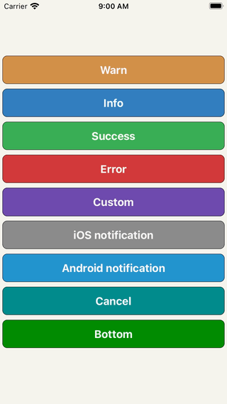
A simple alert to notify users about new chat messages, something went wrong or everything is ok. It can be closed by tap, cancel button, automatically with closeInterval, pan responder up gesture or programmatically.
Support
| react-native version | package version | reason | | ---- | :---: | ---- | | 0.50.0 | >=3.2.0 | Added SafeAreaView (iPhone X) | | 0.44.0 | >=2.12.0 | Added ViewPropTypes |
Installation
npm i react-native-dropdownalert --saveDemo
Usage
// ...
import DropdownAlert from 'react-native-dropdownalert';
export default class App extends Component {
  componentDidMount() {
    this.fetchData();
  }
  fetchData = async () => {
    try {
      await fetch('https://mywebsite.com/endpoint/');
    } catch (error) {
      this.dropdown.alertWithType('error', 'Error', error.message);
    }
  };
  render() {
    return (
      <View>
         // !!! Make sure it is the last component in your document tree.
        <DropdownAlert ref={ref => this.dropdown = ref} />
      </View>
    );
  }
}
Caveats
- Modals can overlap DropdownAlert if it's not inside the modal's document tree.
- It is important you place the
DropdownAlertABOVE theStackNavigator.- DropdownHolder example #1
- DropdownHolder example #2
- Redux + router flux example
- Repo: react-native-dropdownalert-router-sample Thanks @mitsuruog and @articolo
Props
| Name | Type | Description | Default |
| ---- | :---: | --- | --- |
| closeInterval | Number | dismiss alert at a certain time in milliseconds | 4000
| imageSrc | String or Number | local or network source for custom alert type | null
| infoImageSrc | String or Number | local or network source for info alert type | require('./assets/info.png')
| warnImageSrc | String or Number | local or network source for warn alert type | require('./assets/warn.png')
| errorImageSrc | String or Number | local or network source for error alert type | require('./assets/error.png')
| successImageSrc | String or Number | local or network source for success alert type | require('./assets/success.png')
| startDelta | Number | where the container starts (changes based on container height onLayout) | -100
| endDelta | Number | where the container ends | 0
| onClose | Function | Invoked when alert is closed Returns: data = {type, title, message, action} | null
| cancelBtnImageSrc | String or Number | local or network source | require('./assets/cancel.png') |
| titleNumOfLines | Number | number of lines | 1
| messageNumOfLines | Number | number of lines | 3
| onCancel | Function | Cancel button action. Returns: data = {type, title, message, action} | null
| showCancel | Bool | whether or not to show cancel button | false
| tapToCloseEnabled | Bool | enable/disable close with tap | true
| panResponderEnabled | Bool | enable/disable close with pan responder | true
| replaceEnabled | Bool | enables the alert to either state change without dismissal or go to next alert with dismissal | true
| translucent | Bool | StatusBar prop | false
| useNativeDriver | Bool | enable/disable native driver for animations. For android platform, in some older React Native versions, enable useNativeDriver can cause some problems. See #65 | true (iOS) / false (Android)
| updateStatusBar | Bool | whether or not to update status bar styles | true
| activeStatusBarStyle | String | StatusBar barStyle when alert is open | light-content
| activeStatusBarBackgroundColor | String | StatusBar backgroundColor when alert is open | It takes on the backgroundColor of alert if predefined else default or provided prop
| inactiveStatusBarStyle | String | StatusBar barStyle when alert dismisses | StatusBar._defaultProps.barStyle.value
| inactiveStatusBarBackgroundColor | String | StatusBar backgroundColor when alert dismisses | StatusBar._defaultProps.backgroundColor.value
| wrapperStyle | Object | styles for the view that wraps the container. For React Native Web support you might want to set this to { position: 'fixed' } | null
| containerStyle | Object | styles for container for custom type only | { padding: 16, flexDirection: 'row' }
| zIndex | Number | zIndex attribute on outermost container | null
| titleStyle | Object | styles for title for all types | { fontSize: 16, textAlign: 'left', fontWeight: 'bold', color: 'white', backgroundColor: 'transparent' }
| messageStyle | Object | styles for message for all types | { fontSize: 14, textAlign: 'left', fontWeight: 'bold', color: 'white', backgroundColor: 'transparent' }
| imageStyle | Object | styles for image for all types | { padding: 8, width: 36, height: 36, alignSelf: 'center' }
| cancelBtnImageStyle | Object | styles for image for all types | { padding: 8, width: 36, height: 36, alignSelf: 'center' }
| successColor | String | Default background color of success message | #32A54A
| infoColor | String | Default background color of info message | #2B73B6
| warnColor | String | Default background color of warn message | #cd853f
| errorColor | String | Default background color of error message | #cc3232
| elevation | Number | Animated.View elevation | 1
| sensitivity | Number | Sensitivity for the pan responder up gesture | 20
| defaultContainer | Object | Style for inner view container (override paddingTop with this) | { padding: 8, paddingTop: IS_ANDROID ? 0 : 20, flexDirection: 'row' }
| defaultTextContainer | Object | Style for inner text container (holds title and message) | { flex: 1, padding: 8 }
| renderImage | Function | Use to override the left image component | undefined
| renderCancel | Function | Use to override the cancel button component | undefined
| renderTitle | Function | Use to override the title component | undefined
| renderMessage | Function | Use to override the message component | undefined
| testID | String | Top level TouchableOpacity's testID | undefined
| accessibilityLabel | String | Top level TouchableOpacity's accessibilityLabel | undefined
| accessible | Boolean | Top level TouchableOpacity's accessible | false
| titleTextProps | Object | title text props. does not override numOfLines (use titleNumOfLines) | undefined
| messageTextProps | Object | message text props. does not override numOfLines (use messageNumOfLines) | undefined
Inspired by: RKDropdownAlert