
react-native-ez-charts
v0.0.9
Published
A lightweight and customizable React Native chart library for creating stunning visualizations. This library supports Bar Charts, Line Charts, and Pie Charts with various customization options.
Maintainers
 vaibhav.ts
Readme
react-native-ez-charts
A lightweight and customizable React Native chart library for creating stunning visualizations. This library supports Bar Charts, Line Charts, and Pie Charts with various customization options.
Installation
Install the package using npm:
npm install react-native-svg react-native-ez-chartsFeatures
- Bar Charts: Simple and Multi-Bar Charts
- Line Charts: Simple and Stacked Line Charts
- Pie Charts: Inscribed and Offset Pie Charts
- Customizable animations, gradients, tooltips, and more.
Usage Examples
Simple Bar Chart
import React from 'react';
import {BarChart} from 'react-native-ez-charts';

const SimpleBarChart = () => (
  <BarChart
    catergoricalAxis={['Jan', 'Feb', 'March', 'April', 'May']}
    numericalAxes={[
      {
        data: [100, 233, 322, 122, 34],
        strokeColor: 'blue',
      },
    ]}
    barWidth={100}
    chartHeight={500}
    barGap={20}
    categoricalAxisHeight={50}
    dashedLineGap={20}
    dashedLineWidth={20}
    categoricalLabelTilt={0}
    variant="gradient"
    endOpacity={0.5}
    animationType="timing"
    duration={500}
  />
);

export default SimpleBarChart;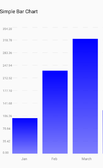
Multi Bar Chart
import React from 'react';
import {BarChart} from 'react-native-ez-charts';

const MultiBarChart = () => (
  <BarChart
    catergoricalAxis={['Jan', 'Feb', 'March', 'April']}
    numericalAxes={[
      {
        data: [100, 233, 322, 122],
        strokeColor: 'orange',
      },
      {
        data: [70, 263, 222, 122],
        strokeColor: 'pink',
      },
      {
        data: [170, 223, 212, 212],
        strokeColor: 'grey',
      },
    ]}
    barWidth={100}
    chartHeight={500}
    barGap={20}
    categoricalAxisHeight={50}
    dashedLineGap={20}
    dashedLineWidth={20}
    categoricalLabelTilt={0}
    variant="gradient"
    endOpacity={0.5}
    animationType="timing"
    duration={500}
  />
);

export default MultiBarChart;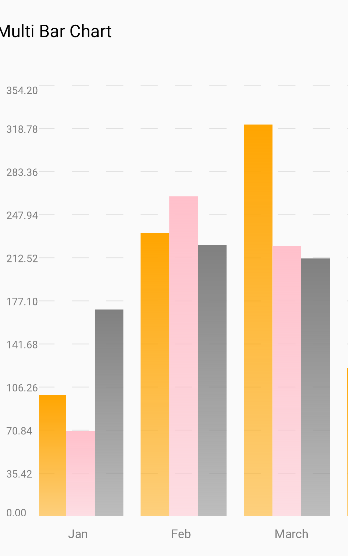
Simple Line Chart
import React from 'react';
import {LineChart} from 'react-native-ez-charts';

const SimpleLineChart = () => (
  <LineChart
    catergoricalAxis={['Jan', 'Feb', 'March', 'April']}
    numericalAxes={[
      {
        data: [100, 133, 122, 122],
        strokeColor: 'red',
        strokeWidth: 2,
      },
    ]}
    xUnit={100}
    chartHeight={300}
    categoricalAxisHeight={50}
    dashedLineGap={20}
    dashedLineWidth={20}
    categoricalLabelTilt={0}
    variant="area"
    showToolTip={true}
    toolTipColor="black"
  />
);

export default SimpleLineChart;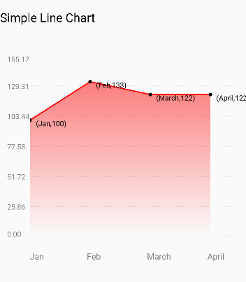
Stacked Line Chart
import React from 'react';
import {LineChart} from 'react-native-ez-charts';

const StackedLineChart = () => (
  <LineChart
    catergoricalAxis={['Jan', 'Feb', 'March', 'April', 'May']}
    numericalAxes={[
      {
        data: [100, 133, 122, 122, 121],
        strokeColor: 'pink',
        strokeWidth: 2,
      },
      {
        data: [90, 73, 82, 92, 90],
        strokeColor: 'red',
        strokeWidth: 2,
      },
      {
        data: [20, 43, 42, 42, 69],
        strokeColor: 'grey',
        strokeWidth: 2,
      },
    ]}
    xUnit={100}
    chartHeight={500}
    categoricalAxisHeight={50}
    dashedLineGap={20}
    dashedLineWidth={20}
    categoricalLabelTilt={0}
    variant="area"
    showToolTip={true}
    toolTipColor="black"
  />
);

export default StackedLineChart;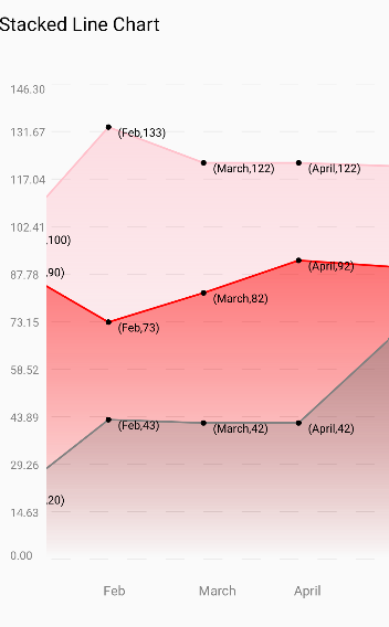
Inscribed Pie Chart
import React from 'react';
import {PieChart} from 'react-native-ez-charts';

const InscribedPieChart = () => (
  <PieChart
    size={180}
    data={[
      {
        value: 30,
        color: '#FF5733',
        label: {value: 'Mango', color: 'black'},
      },
      {
        value: 20,
        color: '#33FF57',
        label: {value: 'Orange', color: 'black'},
      },
      {value: 50, color: '#3357FF', label: {value: 'Peas', color: 'black'}},
      {value: 10, color: 'gray', label: {value: 'Avocado', color: 'black'}},
      {
        value: 20,
        color: '#33FF57',
        label: {value: 'Banana', color: 'black'},
      },
    ]}
    variant="inscribed"
    labelFontSize={15}
  />
);

export default InscribedPieChart;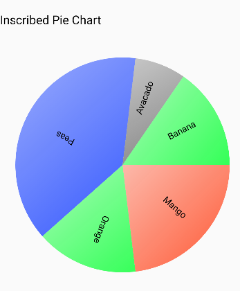
Offset Pie Chart
import React from 'react';
import {PieChart} from 'react-native-ez-charts';

const OffsetPieChart = () => (
  <PieChart
    size={250}
    data={[
      {
        value: 30,
        color: '#FF5733',
        label: {value: 'Mango', color: 'black'},
      },
      {
        value: 20,
        color: '#33FF57',
        label: {value: 'Orange', color: 'black'},
      },
      {value: 50, color: '#3357FF', label: {value: 'Peas', color: 'black'}},
      {value: 10, color: 'gray', label: {value: 'Avocado', color: 'black'}},
      {
        value: 20,
        color: '#33FF57',
        label: {value: 'Banana', color: 'black'},
      },
    ]}
    variant="offset"
    labelFontSize={15}
  />
);

export default OffsetPieChart;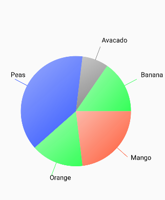
BarChart Props
The BarChart component allows you to render a customizable bar chart. Below is a table describing all the available props:
| Prop Name | Type | Required | Default Value | Description |
| -------------------------- | --------------------------- | -------- | ------------- | ------------------------------------------------------------------------------- |
| numericalAxes | NumericalAxisType[] | Yes | N/A | An array of objects defining the data and stroke color for each numerical axis. |
| catergoricalAxis | string[] | Yes | N/A | An array of strings defining the categorical axis labels. |
| barWidth | number | Yes | N/A | The width of each bar in the chart. |
| barGap | number | Yes | N/A | The gap between bars in the chart. |
| chartHeight | number | No | N/A | The height of the chart. |
| minChartWidth | number | No | N/A | The minimum width of the chart. |
| categoricalAxisHeight | number | No | N/A | The height of the categorical axis. |
| categoricalLabelTilt | TiltAngle | No | N/A | The tilt angle of the categorical labels. |
| dashedLineWidth | number | No | N/A | The width of dashed lines in the chart. |
| dashedLineGap | number | No | N/A | The gap between dashed lines in the chart. |
| dashedLineColor | string | No | N/A | The color of dashed lines in the chart. |
| categoricalLabelColor | string | No | N/A | The color of the categorical labels. |
| numericalLabelColor | string | No | N/A | The color of the numerical labels. |
| categoricalLabelFontSize | number | No | N/A | The font size of the categorical labels. |
| numericalLabelFontSize | number | No | N/A | The font size of the numerical labels. |
| variant | 'gradient' \| 'default' | No | 'default' | The visual variant of the chart. |
| animationType | AnimationType | No | N/A | The type of animation applied to the chart. |
| friction | number | No | N/A | The friction value for the animation (if applicable). |
| tension | number | No | N/A | The tension value for the animation (if applicable). |
| duration | number | No | N/A | The duration of the animation in milliseconds. |
| easing | (value: number) => number | No | N/A | A custom easing function for the animation. |
| endOpacity | number | No | N/A | The ending opacity for the gradient variant of the chart. |
NumericalAxisType Interface
The NumericalAxisType defines the structure of the numericalAxes prop:
export interface NumericalAxisType {
  data: Array<number>;
  strokeColor: string;
}
LineChart Props
Here is a table summarizing the properties and types for the LineChart and CategoricalAxis components:
LineChart Props
| Prop | Type | Description |
|---------------------------|----------------------------------------------|-------------------------------------------------------------------------------------------------------------------------------------------------|
| catergoricalAxis | Array<string> | Labels for the categorical axis. |
| numericalAxes | NumericalAxisType[] | Array of numerical axis configurations, including data and styles. |
| chartHeight | number (optional) | Height of the chart. |
| minChartWidth | number (optional) | Minimum width of the chart. |
| modifyToolTipLabel | (x: string, y: number) => string (optional)| Function to modify the tooltip label. |
| xUnit | number (optional) | Unit spacing for the x-axis. |
| showToolTip | boolean (optional) | Whether to show tooltips on the chart. |
| categoricalAxisHeight | number (optional) | Height of the categorical axis. |
| categoricalLabelTilt | TiltAngle (optional) | Angle for tilting the categorical labels. |
| dashedLineWidth | number (optional) | Width of dashed grid lines. |
| dashedLineGap | number (optional) | Gap between dashed grid lines. |
| dashedLineColor | string (optional) | Color of dashed grid lines. |
| variant | 'area' | 'blank' (optional) | Style variant of the chart. |
| categoricalLabelColor | string (optional) | Color of the categorical axis labels. |
| numericalLabelColor | string (optional) | Color of the numerical axis labels. |
| categoricalLabelFontSize| number (optional) | Font size for categorical labels. |
| numericalLabelFontSize | number (optional) | Font size for numerical labels. |
| toolTipColor | string (optional) | Color of the tooltip. |
NumericalAxisType
| Property | Type | Description |
|---------------|-------------------|----------------------------------------------|
| data | Array<number> | Data points for the numerical axis. |
| strokeColor | string | Color of the line representing the data. |
| strokeWidth | number | Width of the line representing the data. |
CategoricalAxis Props
| Prop | Type | Description |
|-----------------|---------------------|------------------------------------------------------------------|
| categoricalAxis| Array<string> | Labels for the categorical axis. |
| xUnit | number | Unit spacing for the categorical axis. |
| height | number (optional)| Height of the categorical axis. |
| tiltAngle | TiltAngle (optional)| Angle to tilt the labels for better readability. |
| labelColor | string (optional)| Color of the categorical labels. |
| fontSize | number (optional)| Font size of the categorical labels. |
TiltAngle
| Value | Description |
|-----------|---------------------------|
| 0 | No tilt (horizontal). |
| 5-90 | Angle in degrees to tilt labels for readability. |
PieChart Props
| Prop | Type | Description |
|------------------|------------------------|--------------------------------------------------------------------------------------------------------------|
| data | Slice[] | Array of slices representing the pie chart. Each slice contains value, color, and optionally a label. |
| variant | "offset" | "inscribed" (optional) | Style variant of the pie chart. offset places slices with spacing, inscribed keeps slices compact. |
| size | number | Diameter of the pie chart. |
| labelFontSize | number (optional) | Font size for the labels inside the pie chart. |
| gradient | boolean (optional) | Whether to apply a gradient effect to the chart. |
| endOpacity | number (optional) | Opacity at the end of the gradient (if enabled). |
Slice Interface
| Property | Type | Description |
|--------------|-----------------------|---------------------------------------------------|
| value | number | Value of the slice, determines its size proportion in the chart. |
| color | string | Color of the slice. |
| label | { value: string, color: string } (optional) | Optional label for the slice, with text and color. |
License
This library is licensed under the MIT License.