
react-native-floating-labels
v2.1.2
Published
Reusabe floating lable component for react native


Readme
react-native-floating-labels


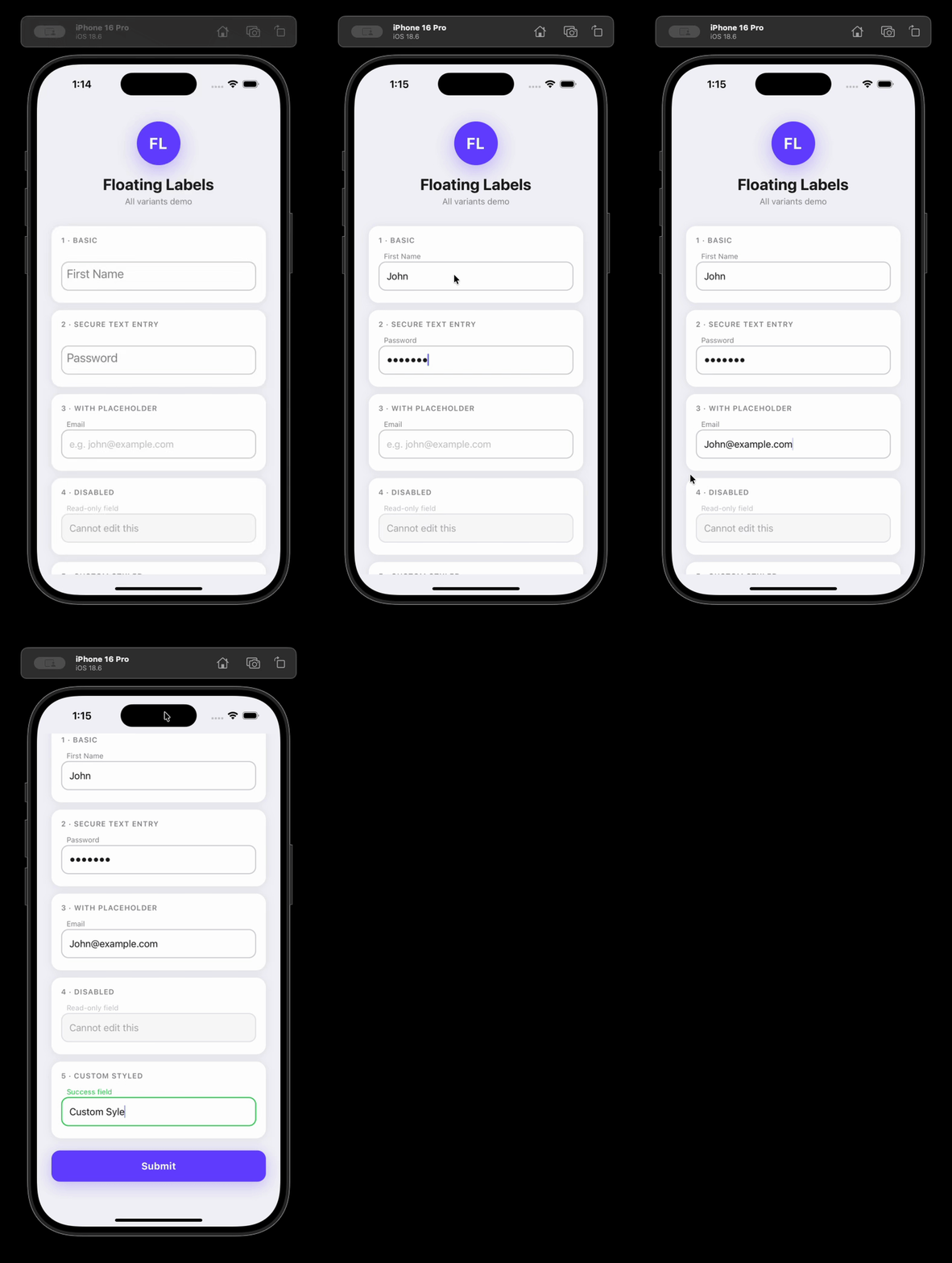
An animated floating label <TextInput> component for React Native (iOS, Android, and web via react-native-web).
Installation
npm install react-native-floating-labelsUsage
import FloatingLabel from 'react-native-floating-labels';

<FloatingLabel>Email</FloatingLabel>;
With custom styles
<FloatingLabel
  labelStyle={{color: '#6200ea'}}
  inputStyle={{borderColor: '#6200ea', borderWidth: 2, borderRadius: 8}}
  style={{marginBottom: 16}}
>
  Email address
</FloatingLabel>
Controlled value
const [email, setEmail] = React.useState('');

<FloatingLabel value={email} onChangeText={setEmail}>
  Email address
</FloatingLabel>;
Imperative ref controls
import FloatingLabel, {FloatingLabelHandle} from 'react-native-floating-labels';

const ref = React.useRef<FloatingLabelHandle>(null);

<FloatingLabel ref={ref}>First Name</FloatingLabel>;

ref.current?.focus();
ref.current?.blur();
ref.current?.clear();
Props
FloatingLabel accepts all standard TextInput props plus the following:
| Prop | Type | Default | Description |
| ----------------- | ------------------------- | ------- | ----------------------------------------------------------------------------------------------- |
| children | ReactNode | — | The floating label text |
| style | ViewStyle | — | Style for the outer container View |
| inputStyle | TextInputProps['style'] | — | Style applied to the inner TextInput |
| labelStyle | TextStyle | — | Style applied to the animated label |
| disabled | boolean | false | Disables the input (editable={false}); also sets accessibilityState.disabled automatically |
| value | string | — | Controlled value; animates the label when changed externally |
| secureTextEntry | boolean | false | Hides input text (password field); also sets textContentType and autoComplete automatically |
| errorMessage | string | — | Error text rendered below the input and announced by screen readers |
| helperText | string | — | Helper text rendered below the input and announced by screen readers |
| password | boolean | — | Deprecated — use secureTextEntry instead |
| myRef | React.Ref<TextInput> | — | Deprecated — use the standard ref prop instead |
FloatingLabelHandle (ref)
| Method | Description |
| --------- | ------------------------------------------------------------------------- |
| focus() | Focuses the input |
| blur() | Blurs the input |
| clear() | Clears the input text and animates the label back to its resting position |
Accessibility
react-native-floating-labels is designed to work correctly with screen readers (VoiceOver on iOS, TalkBack on Android) and meets WCAG 2.1/2.2 AA, Section 508, and the React Native accessibility model out of the box — with no extra configuration required for common cases.
Label association (accessibilityLabel)
The component automatically derives accessibilityLabel from the children string so screen readers announce the label when the input is focused.
// Screen readers announce "Email" when this input receives focus
<FloatingLabel>Email</FloatingLabel>
Override it by passing accessibilityLabel explicitly:
<FloatingLabel accessibilityLabel="Your email address">Email</FloatingLabel>On web (react-native-web), accessibilityLabel is mapped to aria-label automatically.
Disabled state
When disabled={true} is passed, the component automatically sets accessibilityState={{ disabled: true }} on the input so screen readers announce it as unavailable.
<FloatingLabel disabled>Email</FloatingLabel>Override or extend accessibilityState as needed — your values take precedence:
<FloatingLabel disabled accessibilityState={{disabled: false, selected: true}}>
  Email
</FloatingLabel>
Password fields
When secureTextEntry={true} is passed, the component automatically sets:
textContentType="password"(iOS) — enables password autofill and correct VoiceOver announcementautoComplete="password"(Android/web) — enables password autofill
<FloatingLabel secureTextEntry>Password</FloatingLabel>Override when you need a more specific value (e.g. for a new password field):
<FloatingLabel secureTextEntry textContentType="newPassword" autoComplete="new-password">
  New Password
</FloatingLabel>
Add an accessibilityHint to give users extra context:
<FloatingLabel secureTextEntry accessibilityHint="Must be at least 8 characters">
  Password
</FloatingLabel>
Error messages
Pass errorMessage to render error text below the input. It is announced by screen readers whenever the value changes (via accessibilityLiveRegion="polite").
const [error, setError] = React.useState('');

<FloatingLabel value={email} onChangeText={setEmail} errorMessage={error}>
  Email
</FloatingLabel>;
Helper text
Pass helperText to render supplementary guidance below the input. Like errorMessage, it uses accessibilityLiveRegion="polite" for dynamic announcements.
<FloatingLabel helperText="We'll never share your email">Email</FloatingLabel>Focus indicators
The component does not enforce focus styles — this keeps it flexible for any design system. To implement a WCAG 2.2-compliant visible focus indicator, use onFocus/onBlur with inputStyle:
const [focused, setFocused] = React.useState(false);

<FloatingLabel
  inputStyle={focused ? {borderColor: '#0057b8', borderWidth: 2} : undefined}
  onFocus={() => setFocused(true)}
  onBlur={() => setFocused(false)}
>
  Email
</FloatingLabel>;
WCAG 2.2 requires the focus indicator to have a contrast ratio of at least 3:1 against adjacent colors.
Touch target size
Apple and Google both recommend a minimum touch target of 44×44dp. The component's default height is 40dp. To meet the recommendation, set style on the container:
<FloatingLabel style={{minHeight: 44}}>Email</FloatingLabel>Screen reader testing checklist
Before shipping, verify the following manually with screen readers enabled:
iOS — VoiceOver (Settings → Accessibility → VoiceOver):
- [ ] Focusing the input announces the label text
- [ ] A disabled input is announced as "dimmed" or "unavailable"
- [ ] A password input is announced as a "secure text field"
- [ ] Error messages are announced when they appear
- [ ] Helper text is readable when navigating to the input
Android — TalkBack (Settings → Accessibility → TalkBack):
- [ ] Focusing the input announces the label text
- [ ] A disabled input is announced as "disabled"
- [ ] A password input is announced as a password field
- [ ] Error messages are announced when they appear
- [ ] Helper text is readable when navigating to the input
Testing locally with a React Native app
The quickest way to test the library end-to-end against a real device or simulator before publishing.
1. Create a test app
Expo (recommended — no Xcode/Android Studio required for quick tests):
npx create-expo-app@latest FloatingLabelsTest
cd FloatingLabelsTest
Bare React Native:
npx @react-native-community/cli init FloatingLabelsTest
cd FloatingLabelsTest
2. Pack the library
Run this from the library root. It produces a tarball (e.g. react-native-floating-labels-2.0.0.tgz) that mirrors exactly what gets published to npm:
npm run build
npm pack
3. Install the tarball in the test app
npm install /path/to/react-native-floating-labels-2.0.0.tgzFor Expo, no additional linking is required. For bare React Native, run npx pod-install on iOS.
4. Use it in the app
Replace the contents of App.tsx (or App.js) with:
import React, {useRef} from 'react';
import {Button, SafeAreaView, StyleSheet} from 'react-native';
import FloatingLabel, {FloatingLabelHandle} from 'react-native-floating-labels';

export default function App() {
  const ref = useRef<FloatingLabelHandle>(null);

  return (
    <SafeAreaView style={styles.container}>
      <FloatingLabel style={styles.field}>First Name</FloatingLabel>
      <FloatingLabel style={styles.field} secureTextEntry>
        Password
      </FloatingLabel>
      <FloatingLabel ref={ref} style={styles.field}>
        Ref-controlled field
      </FloatingLabel>
      <Button title="Clear via ref" onPress={() => ref.current?.clear()} />
    </SafeAreaView>
  );
}

const styles = StyleSheet.create({
  container: {flex: 1, padding: 24, backgroundColor: '#fff'},
  field: {marginBottom: 16},
});
5. Start the app
# Expo
npx expo start

# Bare React Native — iOS
npx react-native run-ios

# Bare React Native — Android
npx react-native run-android
Testing the beta release from npm
If you want to test the published beta instead of a local tarball:
npm install react-native-floating-labels@betaContributing
See CONTRIBUTING.md for the development workflow, Conventional Commits format, and release process.
MIT Licensed