
react-native-form-sheet
v1.1.1
Published
A native dialog solution for React Native.
Maintainers
 lazaronixon
Readme
React Native Form Sheet
A native dialog solution for React Native (wrapper over and Dialogs).
Getting started
$ yarn add react-native-form-sheet
$ cd ios && pod install && cd .. # CocoaPods on iOS needs this extra step
Warning
This component only applies to projects made with react-native init or to those made with Create React Native App which have since ejected. For more information about ejecting, please see the on the Create React Native App repository.
Basic Usage
App.js
import React, { Component } from 'react';
import { Text, View, StyleSheet, Button } from 'react-native';
import FormSheet from 'react-native-form-sheet';
export default class App extends Component {
presentFormSheet = () => {
FormSheet.present({component: 'ModalView', width: 280, height: 380})
}
render() {
return (
<View style={styles.container}>
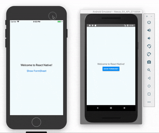
<Text style={styles.welcome}>
Welcome to React Native!
</Text>
<Button onPress={this.presentFormSheet} title='Show FormSheet' />
</View>
);
}
}
const styles = StyleSheet.create({
container: {
flex: 1,
justifyContent: 'center',
alignItems: 'center',
backgroundColor: '#F5FCFF',
},
welcome: {
fontSize: 20,
textAlign: 'center',
margin: 10,
},
});ModalView.js
import React, { Component } from 'react'
import { Button, View, Text, StyleSheet }from 'react-native'
import FormSheet from 'react-native-form-sheet';

export default class ModalView extends Component {

  dismiss = () => {
    FormSheet.dismiss()
  }

  render() {
    return (
      <View style={styles.container}>
        <Text style={styles.h1}>Hello</Text>
        <Text style={styles.p}>This is modal!</Text>
        <Button onPress={this.dismiss} title='Dismiss' />
      </View>
    )
  }
}

const styles = StyleSheet.create({
  container: {
    flex: 1,
    justifyContent: 'center',
    alignItems: 'center',
  },
  h1: {
    fontSize: 28,
    paddingBottom: 10,
  },
  p: {
    fontSize: 18,
    paddingBottom: 10,
    textAlign: 'center',
  }
})
Methods
present(options)
Show a React Native View inside a dialog.
component:Component to visit. (Required)width:Dialog width (Required).height:Dialog height (Required).shouldDismissOnBackgroundViewTap:A boolean to disable dismiss dialog when tap outside. (Default true).passProps: Props to the rendered component.
dismiss()
Dismiss dialog.