
react-native-gifted-chat-txm
v0.1.5
Published
The most complete chat UI for React Native
Downloads
7
Maintainers
 al3xand3r
Readme
Gifted Chat
The most complete chat UI for React Native (formerly known as Gifted Messenger)

Dependency
Use 0.0.10 for RN < 0.40.0
Use 0.1.0 for RN >= 0.40.0
Installation
npm install react-native-gifted-chat --save
Android installation
- Add
android:windowSoftInputMode="adjustResize"to your Android Manifestandroid/app/src/main/AndroidManifest.xml
<!-- ... -->
<activity
  android:name=".MainActivity"
  android:label="@string/app_name"
  android:windowSoftInputMode="adjustResize"
  android:configChanges="keyboard|keyboardHidden|orientation|screenSize">
<!-- ... -->- If you plan to use
GiftedChatinside aModal, see #200
Example
import { GiftedChat } from 'react-native-gifted-chat';
class Example extends React.Component {
constructor(props) {
super(props);
this.state = {messages: []};
this.onSend = this.onSend.bind(this);
}
componentWillMount() {
this.setState({
messages: [
{
_id: 1,
text: 'Hello developer',
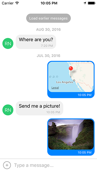
createdAt: new Date(Date.UTC(2016, 7, 30, 17, 20, 0)),
user: {
_id: 2,
name: 'React Native',
avatar: 'https://facebook.github.io/react/img/logo_og.png',
},
},
],
});
}
onSend(messages = []) {
this.setState((previousState) => {
return {
messages: GiftedChat.append(previousState.messages, messages),
};
});
}
render() {
return (
<GiftedChat
messages={this.state.messages}
onSend={this.onSend}
user={{
_id: 1,
}}
/>
);
}
}Advanced example
See example/App.js
Message object
{
  _id: 1,
  text: 'My message',
  createdAt: new Date(Date.UTC(2016, 5, 11, 17, 20, 0)),
  user: {
    _id: 2,
    name: 'React Native',
    avatar: 'https://facebook.github.io/react/img/logo_og.png',
  },
  image: 'https://facebook.github.io/react/img/logo_og.png',
  // additional custom parameters
}
Props
messages(Array) - messages to displaymessageIdGenerator(Function) - generate id for new message. By default is a UUID v4 generated by uuid.user(Object) - user sending the messages{_id, name, avatar}onSend(Function) - function to call when sending a messagelocale(String) - localize the datesisAnimated(Bool) - animates the view when the keyboard appearsloadEarlier(Bool) - enables the load earlier message buttononLoadEarlier(Function) - function to call when loading earlier messagesisLoadingEarlier(Bool) - display an ActivityIndicator when loading earlier messagesrenderLoading(Function) - render a loading view when initializingrenderLoadEarlier(Function) - render the load earlier buttonrenderAvatar(Function) - renders the message avatar. Set tonullto not render any avatar for the messageonPressAvatar(Function(user)) - callback when a message avatar is tappedrenderAvatarOnTop(Bool) - render the message avatar, on top of consecutive messages. The default value isfalse.renderBubble(Function) - render the message bubbleonLongPress(Function(context,message)) - callback when a message bubble is long-pressed (default is to show action sheet with "Copy Text"). See code for example usingcontext.actionSheet().showActionSheetWithOptions().renderMessage(Function) - render the message containerrenderMessageText(Function) - render the message textrenderMessageImage(Function) - render the message imageimageProps(Object) - extra props to be passed to the<Image>component created by the defaultrenderMessageImagelightboxProps(Object) - extra props to be passed to the MessageImage's LightboxrenderCustomView(Function) - render a custom view inside the bubblerenderDay(Function) - render the day above a messagerenderTime(Function) - render the message timerenderFooter(Function) - renders a fixed bottom view. Can be used for 'is typing message', see example/App.jsrenderInputToolbar(Function) - render the composer containerrenderActions(Function) - renders an action button on the left of the message composerrenderComposer(Function) - render the text input message composerrenderSend(Function) - render the send buttonrenderAccessory(Function) - renders a second line of actions below the message composeronPressActionButton(Function) - callback to perform custom logic when the Action button is pressed (the defaultactionSheetwill not be used)bottomOffset(Integer) - distance of the chat from the bottom of the screen, useful if you display a tab barminInputToolbarHeight(Integer) - minimum height of the input toolbar. The default value is44.listViewProps(Object) - extra props to be passed to the<ListView>, some props can not be override, see the code inrendermethod ofMessageContainerfor detailkeyboardShouldPersistTaps(Enum) - determines when the keyboard should stay visible after a tap<ScrollView>onInputTextChanged(Function) - function that will be called when input text changesmaxInputLength(Integer) - max Composer TextInput length
Features
- Custom components
- InputToolbar avoiding keyboard
- Multiline TextInput
- Load earlier messages
- Avatar as initials
- Touchable links using react-native-parsed-text
- Localized dates
- Copy text messages to clipboard
License
Feel free to ask me questions on Twitter @FaridSafi !