
react-native-image-slider-banner
v1.0.3
Published
A simple and fully customizable React Native Component that implements Image and Banner Slider UI with animations.
Maintainers
 mudassirraza
Keywords
Readme
react-native-image-slider-banner


IOS DEMO
ANDROID DEMO
Install
First, install our library | use below npm script
npm i react-native-image-slider-banner
yarn add react-native-image-slider-banner
Well-done.
Usage :
list of available props for customization SliderBox:
| Props | Value Type | Description |
| ---------------------------- | ------------------------------------- | ------------------------------------------------------------------------------------------------------------------------------------------------------- |
| data | Array of image path(or url) as string | Set array of images path- these paths can contain http url link or local images path using require('./pathOfImage') |
| localImg | Boolean default (false) | its define whats type image urls you provide if its true it means you provide local images path |
| showHeader | Boolean default (false) | if its true its shows a header on slider |
| headerRightComponent | React Component default (null) | for displaying right component in header |
| headerLeftComponent | React Component default (null) | for displaying left component in header |
| headerCenterComponent | React Component default (null) | for displaying Center component in header |
| headerStyle | Style object default {} | for change style of header |
| previewImageContainerStyle | Style object | for change style of previewImageContainer
| previewImageStyle | Style object | for change style of previewImage
| caroselImageContainerStyle | Style object | for change style of caroselImageContainer
| caroselImageStyle | Style object | for change style of caroselImage
| autoPlay | Boolean default (false) | for auto scrolling
| timer | Number default 2000 | timeinterval for changing slider
| showIndicator | Boolean default (true) | for Showing indicator
activeIndicatorStyle | Style object | for change style of activeIndicator
| inActiveIndicatorStyle | Style object | for change style of inActiveIndicator
| indicatorContainerStyle | Style object | for change style of indicatorContainer
| onItemChanged | Callback ((itemData) => {},) | when item changed its give item data in parameter
| onClick | Callback ((item, index) => {},) | when click on any item its give item data in parameter
| closeIconColor | colorCode #000 | Image Preview cross icon color
| blurRadius | Number default (50) | Image Preview Background Blur Radius
|preview | Boolean default true | when preivew is false so slider not show IMAGE PREVIEW and then onClick works
1- add below import in your code :
import { ImageSlider } from "react-native-image-slider-banner";2- Show Simple Slider with Image Preview option enable Example

<ImageSlider
    data={[
        {img: 'https://encrypted-tbn0.gstatic.com/images?q=tbn:ANd9GcQ5a5uCP-n4teeW2SApcIqUrcQApev8ZVCJkA&usqp=CAU'},
        {img: 'https://thumbs.dreamstime.com/b/environment-earth-day-hands-trees-growing-seedlings-bokeh-green-background-female-hand-holding-tree-nature-field-gra-130247647.jpg'},
        {img: 'https://cdn.pixabay.com/photo/2015/04/19/08/32/marguerite-729510__340.jpg'}
    ]}
    autoPlay={false}
    onItemChanged={(item) => console.log("item", item)}
    closeIconColor="#fff"
/>
3- Show Slider with Header and onClick Example
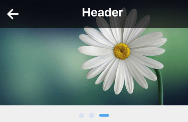
<ImageCarousel
    data={[
        {img: 'https://encrypted-tbn0.gstatic.com/images?q=tbn:ANd9GcQ5a5uCP-n4teeW2SApcIqUrcQApev8ZVCJkA&usqp=CAU'},
        {img: 'https://thumbs.dreamstime.com/b/environment-earth-day-hands-trees-growing-seedlings-bokeh-green-background-female-hand-holding-tree-nature-field-gra-130247647.jpg'},
        {img: 'https://cdn.pixabay.com/photo/2015/04/19/08/32/marguerite-729510__340.jpg'}
    ]}
    showHeader
    preview={false}
    headerLeftComponent={<Icon name="arrow-back" color="#fff" size={34} onPress={() => Alert.alert("alert")} />}
    headerCenterComponent={<Text style={{ color: '#fff', fontSize: 24, fontWeight: 'bold' }}>Header</Text>}
    headerStyle={{ padding: 10, backgroundColor: 'rgba(0,0,0, 0.6)', }}
    onItemChanged={(item) => console.log("item", item)}
    caroselImageStyle={{ resizeMode: 'cover' }}
    onClick={(item, index) => { alert('hello' + index) }}
    />
4- Show Slider with Header, Children and onClick Example

 <ImageCarousel
    data={[
        { img: require('../../assets/images/slider1.png') },
        { img: require('../../assets/images/slider2.png') },
        { img: require('../../assets/images/slider1.png') }
    ]}
    localImg
    showHeader
    preview={false}
    headerLeftComponent={<Icon name="arrow-back" color="#fff" size={34} onPress={() => Alert.alert("alert")} />}
    headerCenterComponent={<Text style={{ color: '#fff', fontSize: 24, fontWeight: 'bold' }}>Header</Text>}
    headerStyle={{ padding: 10, backgroundColor: 'rgba(0,0,0, 0.6)', }}
    onItemChanged={(item) => console.log("item", item)}
    caroselImageStyle={{ resizeMode: 'cover' }}
    onClick={(item, index) => { alert('hello' + index) }}
    >
            <View style={{alignItems: 'center'}}>
                <Text style={{color: '#000', fontSize: 24, fontWeight: 'bold'}}>Title</Text>
            </View>
    </ImageCarousel>