
react-native-input2
v0.3.0
Published
Customizable input for react-native
Maintainers
 anhulife
Readme
Input2
适用于React Native的输入框组件。
特性
- 输入建议
- 清空输入
- 扩展左右两端
- 自定义样式
安装
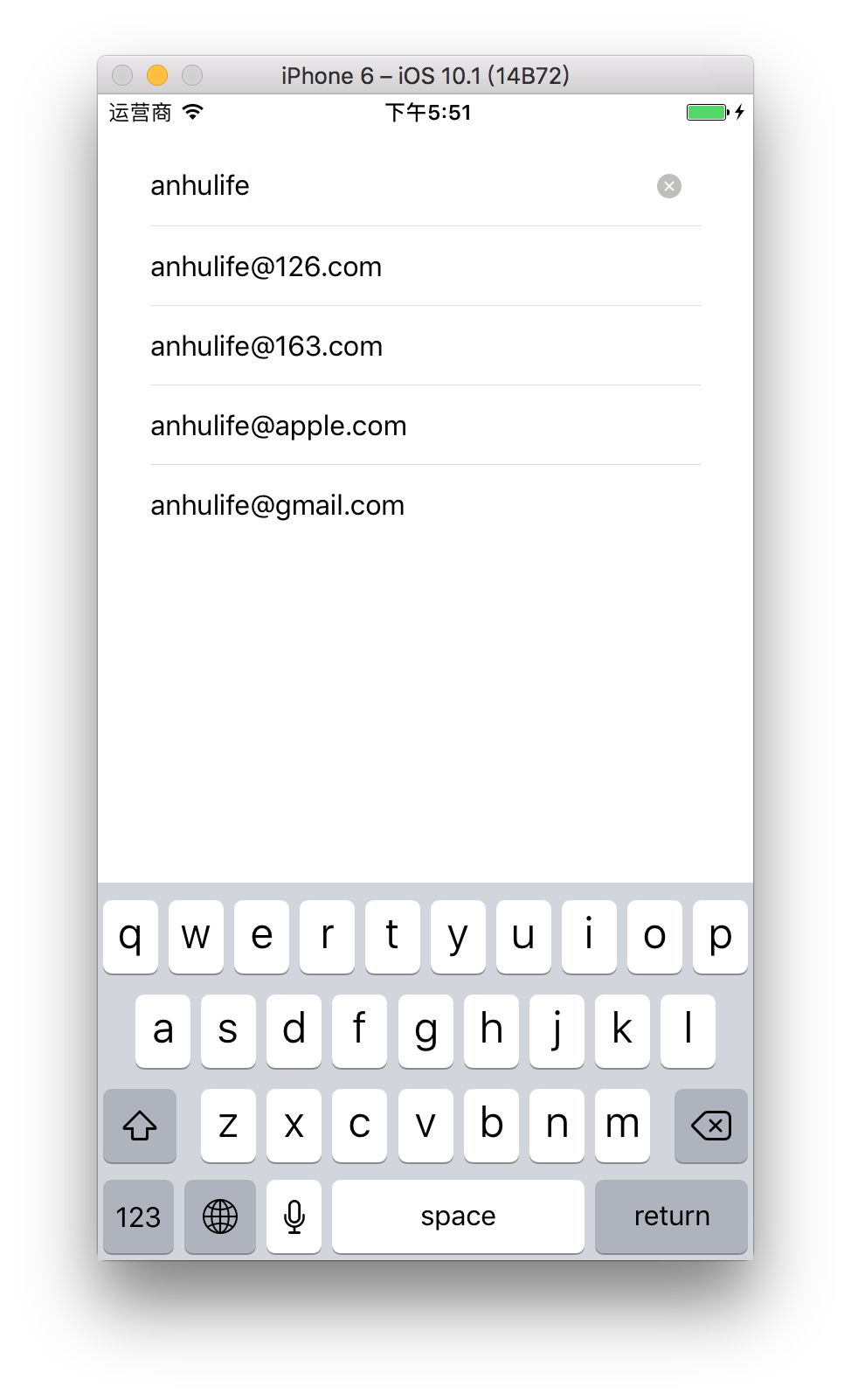
npm install react-native-input2 --save使用实例
import React, { Component } from 'react';
import {
  StyleSheet,
  View,
} from 'react-native';

import Input2 from 'react-native-input2';

const domainList = [
  '126.com',
  '163.com',
  'apple.com',
  'gmail.com',
  'hotmail.com',
];

export default class App extends Component {
  constructor(props) {
    super(props);

    this.state = {
      // 输入框的值
      value: '',
      // 建议列表
      mailSuggestions: [],
    };
  }

  getMailSuggestions(text) {
    const info = text.split('@');
    let mailSuggestions;

    if (!info[0]) {
      mailSuggestions = ['[email protected]'];
    } else {
      const domainSuggestions = domainList.filter(domain => domain.startsWith(info[1] || ''));
      mailSuggestions = domainSuggestions.map(domain => `${info[0]}@${domain}`);
    }

    this.setState(Object.assign({}, this.state, {
      mailSuggestions,
    }));
  }

  changeValue(value) {
    this.setState(Object.assign({}, this.state, { value }));
  }

  handleSelect(selected) {
    this.input.blur();

    this.changeValue(selected);
  }

  render() {
    const { value, mailSuggestions } = this.state;

    return (
      <View style={styles.container}>
        <Input2
          ref={ref => (this.input = ref)}
          placeholder="Email"
          value={value}
          autoCapitalize="none"
          autoCorrect={false}
          suggestions={mailSuggestions}
          onClear={() => this.changeValue('')}
          onChangeText={text => this.changeValue(text)}
          onSuggestionsFetchRequested={text => this.getMailSuggestions(text)}
          onSuggestionSelected={selected => this.handleSelect(selected)}
        />
      </View>
    );
  }
}

const styles = StyleSheet.create({
  container: {
    padding: 30,
  },
});
已知问题
由于React Native在Android中暂时没有实现overflow: visible特性,所以建议列表在Android环境下没有办法展示出来。
属性
| 属性 | 类型 | 描述 |
| --------------------------- | -------- | ----------------------------------- |
| suggestions | Array | 被展示出来的建议数组 |
| onSuggestionsFetchRequested | Function | 需要更新建议列表时会调用该函数 |
| onSuggestionSelected | Function | 用户选择建议列表中的一项时会调用该函数 |
| renderSuggestion | Function | 自定义的建议项渲染函数,可选 |
| showClearButton | Boolean | 是否显示清空按钮,默认为 true |
| onClear | Function | 用户点击清空按钮时会调用该函数 |
| prependSlot | Node | 添加在输入框前面的节点,比如:<Text>Hello</Text> |
| appendSlot | Node | 添加在输入框后面的节点,比如:<Text>world</Text> |
| styles | Object | 自定义的样式 |
| 其他属性 | | 其他属性都会传递给组件内的TextInput组件 |
suggestions
建议数组。目前只要求suggestions是一个数组,至于数组内的内容并不做强制要求。
最简单的情况是suggestions数组里都是字符串,比如:
const suggestions = [
  '[email protected]',
  '[email protected]',
];另外一个情况是suggestions数组里都是简单对象,只需要对象中包含label属性即可,因为在展示建议项时会使用label属性,比如:
const suggestions = [
  {
    domain: '126.com',
    label: '[email protected]',
  },
  {
    domain: '163.com',
    label: '[email protected]',
  },
];
onSuggestionsFetchRequested
目前这个函数会在输入框聚焦和值变化时调用,它的定义如下:
function onSuggestionsFetchRequested(value)参数value是当前输入框的值。
onSuggestionSelected
当用户选择了某一个建议项后会调用该函数,它的定义如下:
function onSuggestionSelected(selected)参数selected是用户选择的建议项,也就是suggestions数组中的一项。
renderSuggestion
用于自定义建议项的渲染函数,它是可选的,默认的如下:
renderSuggestion(item, handleSelect) {
  const { styles: userStyles } = this.props;

  return (
    <TouchableWithoutFeedback onPress={handleSelect}>
      <View style={[styles.suggestion, userStyles.suggestion]}>
        <Text
          ellipsizeMode="middle"
          numberOfLines={1}
          style={[styles.suggestionText, userStyles.suggestionText]}
        >
          {item.label || item}
        </Text>
      </View>
    </TouchableWithoutFeedback>
  );
}
styles
用于覆盖默认样式的,必须是StyleSheet创建的实例,默认的样式如下:
const fontSize = 16;
const itemHeight = 45;
const onePixel = 0.5;
const topOffset = 45.5;
const greyColor = '#dfdfde';

const styles = StyleSheet.create({
  // 容器
  container: {
    flexDirection: 'row',
    alignItems: 'center',
    position: 'relative',
    zIndex: 1,
    overflow: 'visible',
    borderBottomWidth: onePixel,
    borderBottomColor: greyColor,
  },

  // 输入框
  input: {
    fontSize,
    height: itemHeight,
    flex: 1,
  },

  // 清空按钮
  clearButton: {
    width: 16,
    height: 16,
    margin: 10,
  },

  // 建议列表
  suggestions: {
    position: 'absolute',
    top: topOffset,
    left: 0,
    right: 0,
    maxHeight: 4 * itemHeight,
  },

  // 建议项
  suggestion: {
  },

  // 建议项的文本
  suggestionText: {
    fontSize,
    lineHeight: itemHeight,
  },

  // 建议项之间的分隔符
  suggestionSeparator: {
    borderBottomWidth: onePixel,
    borderBottomColor: greyColor,
  }
});