
react-native-keyboard-accessory-forked
v0.2.1
Published
A forked version of React Native Keyboard Accessory with a couple fixes specific to our use.
Downloads
17
Maintainers
 euroclydon37
Readme
react-native-keyboard-accessory


A React Native Keyboard Accessory (View, Navigation) Component. Sticky views on keyboard.
Expo Snack Playground
https://snack.expo.io/@ardaogulcan/react-native-keyboard-accessory-playground
Installation
Via npm:
npm install react-native-keyboard-accessory --saveVia Yarn:
yarn add react-native-keyboard-accessoryUsage
You can use the KeyboardAccessoryView or the KeyboardAccessoryNavigation
components.
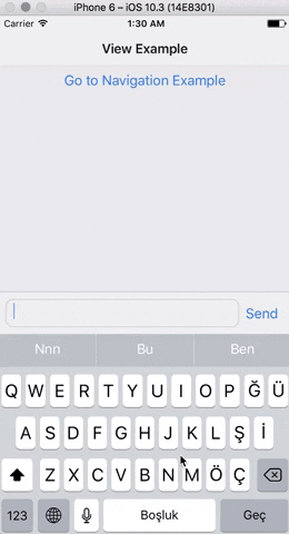
Keyboard Accessory View
Import react-native-keyboard-accessory
import { KeyboardAccessoryView } from 'react-native-keyboard-accessory'
Use it inside your render() function:
<KeyboardAccessoryView>
  <View>
    <TextInput />
  </View>
</KeyboardAccessoryView>
Important: KeyboardAccessoryView should be positioned inside the Root Element which is covering the screen, mostly the top most view styled as { flex: 1 }.
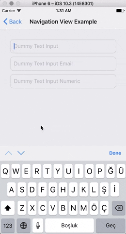
Keyboard Accessory Navigation
Import react-native-keyboard-accessory
import { KeyboardAccessoryNavigation } from 'react-native-keyboard-accessory'
And use it inside your render() function:
<KeyboardAccessoryNavigation />Important: KeyboardAccessoryNavigation should be positioned inside the Root Element which is covering the screen, mostly the top most view styled as { flex: 1 }.
For Ejected Apps
For Android, make sure you have set android:windowSoftInputMode to adjustResize in android/app/src/main/AndroidManifest.xml
And set androidAdjustResize to true. For example,
<KeyboardAccessoryView androidAdjustResize />
// or
<KeyboardAccessoryNavigation androidAdjustResize />
To maintain KeyboardAvoidingView behavior
<KeyboardAccessoryNavigation avoidKeyboard />API
KeyboardAccessoryView
| Prop | Type | Default | Description |
|----------|----------|-------------|-----------------|
| style | object | null | Style object or StyleSheet reference which will be applied to Accessory View |
| animateOn | enum:string | 'ios' | Enables show/hide animation on given platform. Values: ['ios', 'android', 'all', 'none']. |
| animationConfig | function or object | null | For passing custom animations to show/hide. If given prop is function, duration and easing parameters from Keyboard event will be passed to the function, function should return LayoutAnimation compatible animation config. Or you can directly pass animation config object. |
| alwaysVisible | boolean | false | When set to true Accessory View will be always visible at the bottom of the screen. Good for sticky TextInput's |
| bumperHeight | number | 15 | Bumper height to prevent visual glitches if animation couldn't keep up with the keyboard animation. |
| visibleOpacity | number | 1 | Opacity of the Accessory when it is visible. Note: Opacity is used for hiding the accessory to prevent render delays. |
| hiddenOpacity | number | 0 | Opacity of the Accessory when it is hidden. |
| hideBorder | boolean | false | Set true if you want to hide top border of the Accessory |
| inSafeAreaView | boolean | false | Set true if you want to adapt SafeAreaView on iPhone X |
| androidAdjustResize | boolean | false | Set true in ejected apps to adjust resize |
| avoidKeyboard | boolean | false | Set true if you want accessory to maintain KeyboardAvoidingView behavior. You shouldn't use any other Keyboard Avoiding library when you set this to true |
KeyboardAccessoryNavigation
All the KeyboardAccessoryView props will be passed.
| Prop | Type | Default | Description |
|----------|----------|-------------|-----------------|
| doneButtonTitle | string | 'Done' | Title text to show on the right Button of Navigation View |
| tintColor | string | '#007AFF' | Tint color for the arrows and done button |
| doneButton | node | null | Replace default Done Button. Non-Touchable node should be provided. |
| nextButton | node | null | Replace default Next Button. Non-Touchable node should be provided. |
| previousButton | node | null | Replace default Previous Button. Non-Touchable node should be provided. |
| doneDisabled | boolean | false | Disables Done Button |
| nextDisabled | boolean | false | Disables Next Button |
| previousDisabled | boolean | false | Disables Previous Button |
| doneHidden | boolean | false | Hides Done Button |
| nextHidden | boolean | false | Hides Next Button |
| previousHidden | boolean | false | Hides Previous Button |
| accessoryStyle | object | null | Style object or StyleSheet reference which will be applied to Navigation Accessory View. |
| doneButtonStyle | object | null | Style object or StyleSheet reference which will be applied to Done Button View |
| doneButtonTitleStyle | object | null | Style object or StyleSheet reference which will be applied to Done Button Text |
| previousButtonStyle | object | 0 | Style object or StyleSheet reference which will be applied to Previous Button View |
| nextButtonStyle | object | 0 | Style object or StyleSheet reference which will be applied to Next Button View |
| nextButtonDirection | enum:string | 'down' | Arrow direction for the Next Button. Values: ['down', 'up', 'right', 'left']. |
| previousButtonDirection | enum:string | 'up' | Arrow direction for the Previous Button. Values: ['down', 'up', 'right', 'left']. |
| onDone | function | null | Triggered on Done Button press |
| onNext | function | null | Triggered on Next Button press |
| onPrevious | function | null | Triggered on Previous Button press |
KeyboardAwareTabBarComponent
| Prop | Type | Default | Description |
|----------|----------|-------------|-----------------|
| TabBarComponent | node, function | | Provide TabBarComponent to render. Usually from react-navigation |
Known Issues
- Accessory doesn't follow keyboard when closed with drag gesture.