
react-native-modern-shimmer
v1.1.8
Published
A lightweight, zero-dependency shimmer placeholder component for React Native and Expo.

Maintainers
 nobin
nobinReadme
react-native-modern-shimmer
A lightweight, zero-dependency shimmer placeholder component for React Native and Expo.






- ✅ Zero dependencies — uses React Native's core
AnimatedAPI only - ✅ Runs on the native animation driver — 60fps, zero JS thread blocking
- ✅ Auto-detects dark / light mode from the system
- ✅ Full TypeScript support
- ✅ Works with bare React Native, Expo Go, EAS, and complex production apps
- ✅ Compatible with NativeWind, Unistyles, and plain StyleSheet
- ✅ React Native New Architecture (Fabric) ready
- ✅ Smooth opacity pulse animation — battery friendly
- ✅ Fully customizable via props
Preview
| Android | iOS |
|:---:|:---:|
| 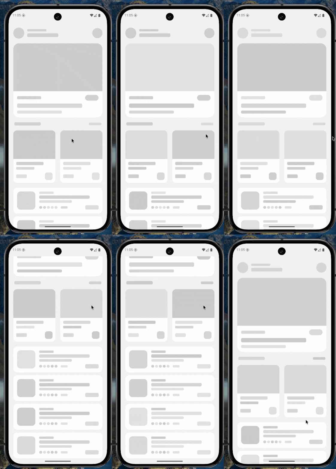 |
| 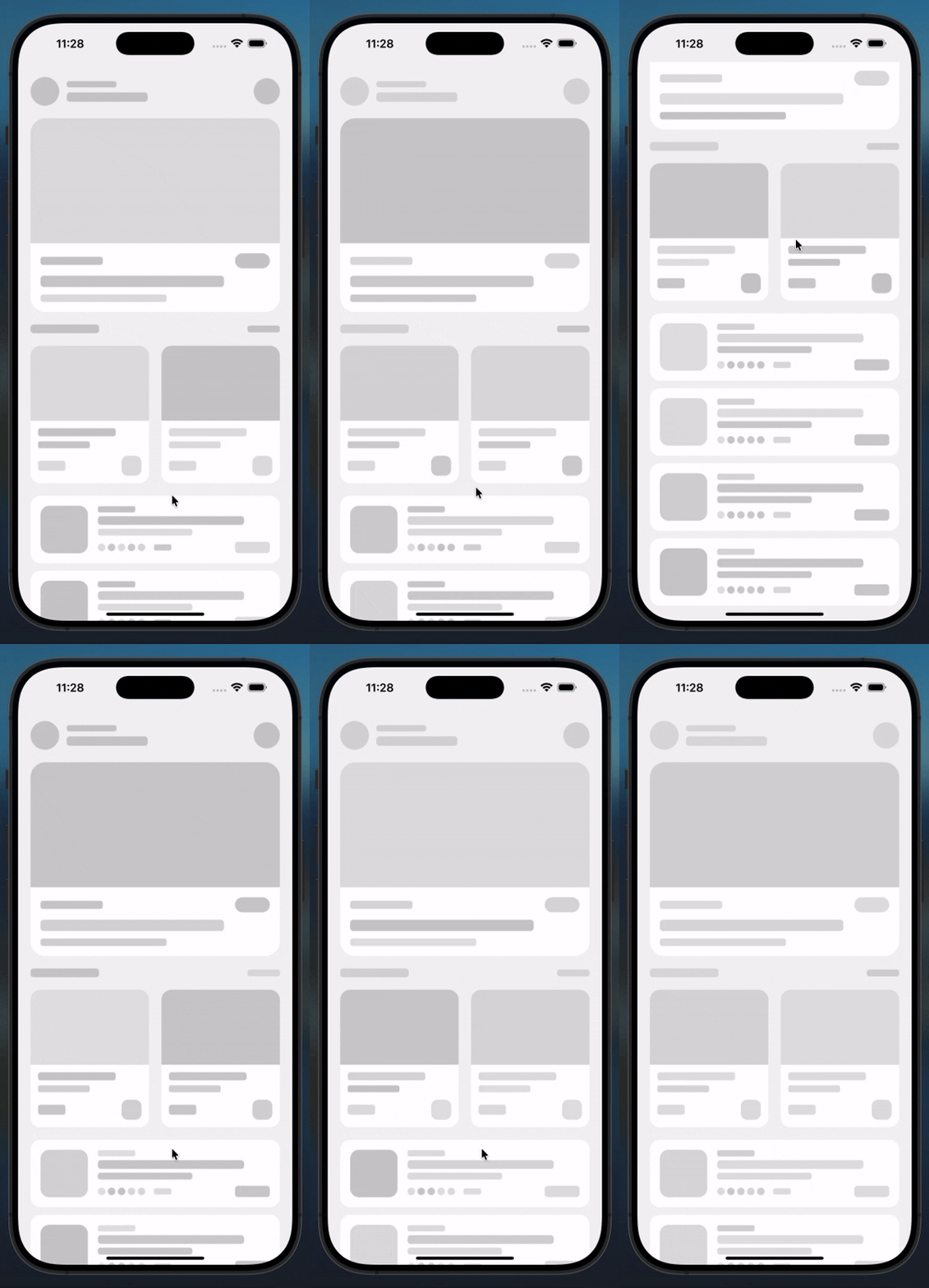 |
|
|
| 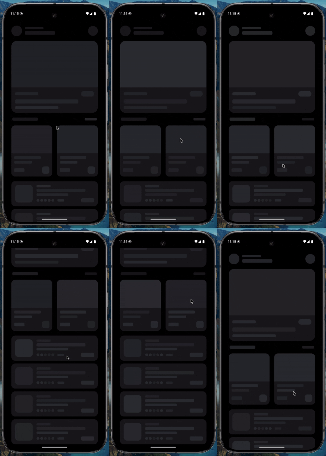 |
| 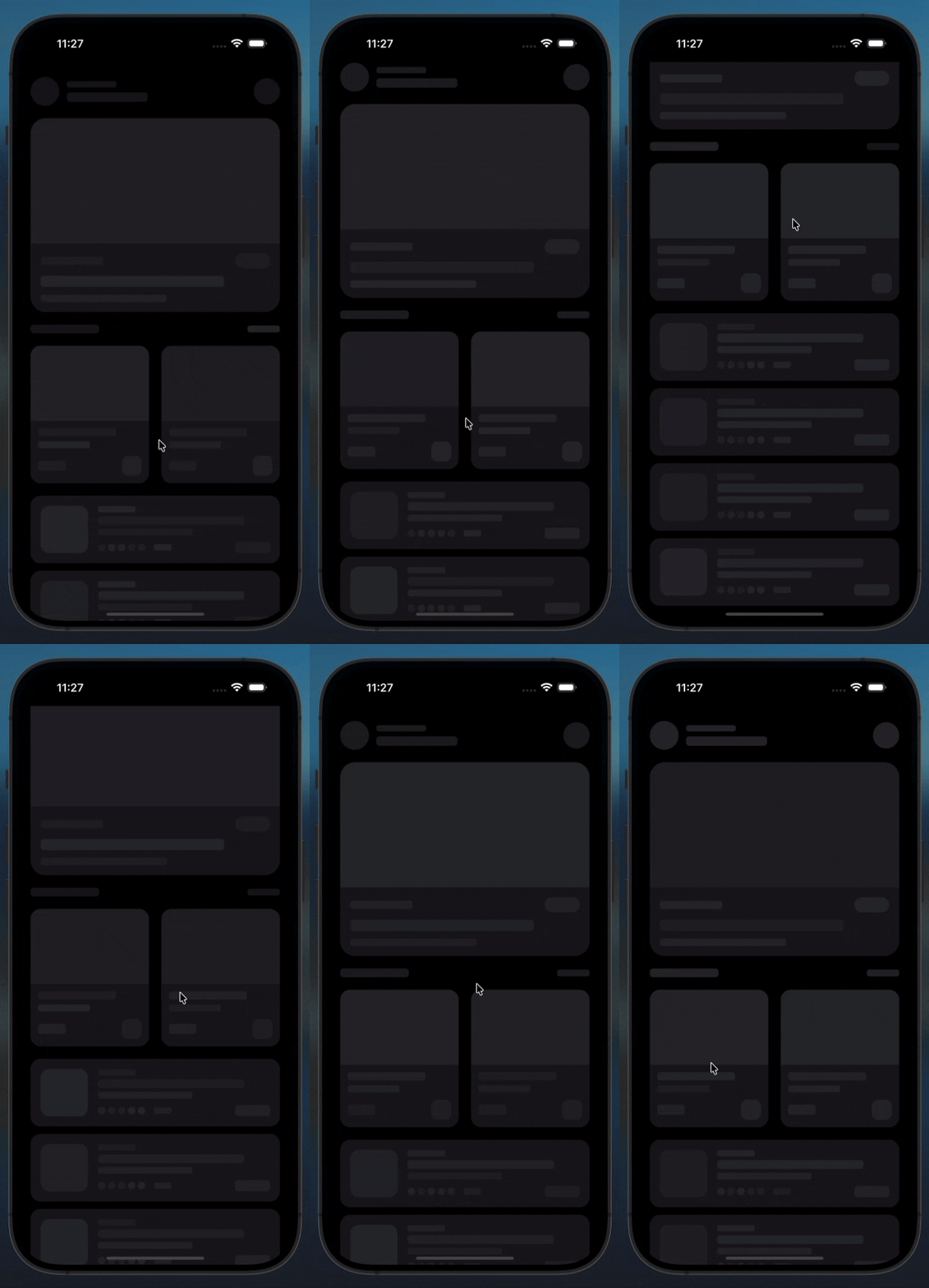 |
|
📦 Installation
# npm
npm install react-native-modern-shimmer

# yarn
yarn add react-native-modern-shimmer

# expo
npx expo install react-native-modern-shimmer
No additional setup required. No native modules, no linking, no extra packages.
Basic Usage
import Shimmer from 'react-native-modern-shimmer';

export default function MyScreen() {
  return (
    <View style={{ padding: 16, gap: 12 }}>
      <Shimmer width={200} height={16} />
      <Shimmer width="80%" height={16} />
      <Shimmer width="60%" height={16} />
    </View>
  );
}
Performance
react-native-modern-shimmer runs entirely on the native animation driver (useNativeDriver: true) — animations execute on the UI thread, completely separate from the JS thread. This means:
- ✅ Zero JS thread blocking — heavy renders and API calls don't affect animation smoothness
- ✅ Smooth 60fps on all devices including low-end Android
- ✅ Production ready — safe for complex, performance-critical apps
- ✅ EAS build compatible — works identically in Expo Go and EAS builds
- ✅ New Architecture (Fabric) ready — fully compatible with React Native's new renderer
This library is not just for quick setups. It is built for production apps where performance matters.
Works with NativeWind & Unistyles
NativeWind (Tailwind CSS for React Native)
<Shimmer> works seamlessly inside NativeWind-styled layouts. NativeWind handles your layout and background, Shimmer handles its own dark/light appearance — completely independent, zero collision:
import { View, ScrollView, SafeAreaView } from 'react-native';
import Shimmer from 'react-native-modern-shimmer';

export default function LoadingScreen() {
  return (
    <SafeAreaView className="flex-1 bg-gray-100 dark:bg-zinc-950">
      <ScrollView contentContainerClassName="px-5 py-6 gap-5">

        {/* Header */}
        <View className="flex-row items-center justify-between">
          <View className="flex-row items-center gap-3">
            <Shimmer width={46} height={46} borderRadius={23} />
            <View className="gap-2">
              <Shimmer width={80}  height={10} borderRadius={4} />
              <Shimmer width={130} height={15} borderRadius={5} />
            </View>
          </View>
          <Shimmer width={42} height={42} borderRadius={21} />
        </View>

        {/* Hero banner */}
        <Shimmer width="100%" height={200} borderRadius={20} speed={1200} />

        {/* 2-col cards */}
        <View className="flex-row gap-4">
          {[1100, 1000].map((spd, i) => (
            <View key={i} className="flex-1 rounded-2xl overflow-hidden bg-white dark:bg-zinc-900">
              <Shimmer width="100%" height={120} borderRadius={0} speed={spd} />
              <View className="p-3 gap-2">
                <Shimmer width="75%" height={13} borderRadius={4} />
                <Shimmer width="50%" height={11} borderRadius={3} />
              </View>
            </View>
          ))}
        </View>

        {/* List items */}
        {[0, 1, 2, 3].map(i => (
          <View key={i} className="flex-row items-center gap-4 p-4 rounded-2xl bg-white dark:bg-zinc-900">
            <Shimmer width={54} height={54} borderRadius={16} speed={1000 + i * 70} />
            <View className="flex-1 gap-2">
              <Shimmer width="65%" height={13} borderRadius={4} />
              <Shimmer width="45%" height={10} borderRadius={3} />
            </View>
            <Shimmer width={40} height={20} borderRadius={5} />
          </View>
        ))}

      </ScrollView>
    </SafeAreaView>
  );
}
react-native-unistyles
Use your useStyles() hook for layout and drop <Shimmer> in as placeholders:
import { View, ScrollView, SafeAreaView } from 'react-native';
import { StyleSheet } from 'react-native-unistyles';
import Shimmer from 'react-native-modern-shimmer';

export default function LoadingScreen() {
  const { styles } = useStyles(stylesheet);

  return (
    <SafeAreaView style={styles.safe}>
      <ScrollView contentContainerStyle={styles.scroll}>

        <Shimmer width="100%" height={200} borderRadius={20} speed={1200} />

        {[0, 1, 2, 3].map(i => (
          <View key={i} style={styles.listItem}>
            <Shimmer width={54} height={54} borderRadius={16} speed={1000 + i * 70} />
            <View style={styles.listBody}>
              <Shimmer width="65%" height={13} borderRadius={4} />
              <Shimmer width="45%" height={10} borderRadius={3} />
            </View>
          </View>
        ))}

      </ScrollView>
    </SafeAreaView>
  );
}

const stylesheet = StyleSheet.create(theme => ({
  safe:     { flex: 1, backgroundColor: theme.colors.background },
  scroll:   { padding: theme.spacing[5], gap: theme.spacing[4] },
  listItem: { flexDirection: 'row', alignItems: 'center', gap: theme.spacing[3],
              padding: theme.spacing[4], borderRadius: 16,
              backgroundColor: theme.colors.surface },
  listBody: { flex: 1, gap: theme.spacing[2] },
}));
Props
| Prop | Type | Default | Description |
|---|---|---|---|
| width | number \| string | "100%" | Width of the shimmer. Accepts px number or "%" string |
| height | number \| string | 16 | Height of the shimmer. Accepts px number or "%" string |
| borderRadius | number | 8 | Corner radius |
| isDark | boolean | undefined | Force dark appearance. If omitted, auto-detects system theme |
| baseColor | string | theme default | Override the background color |
| speed | number | 1000 | Animation cycle duration in ms. Lower = faster |
| style | StyleProp<ViewStyle> | undefined | Extra styles on the container |
| margin | number | undefined | Outer margin on all sides |
| marginTop | number | undefined | Outer margin top |
| marginBottom | number | undefined | Outer margin bottom |
| marginLeft | number | undefined | Outer margin left |
| marginRight | number | undefined | Outer margin right |
| marginHorizontal | number | undefined | Outer margin left and right |
| marginVertical | number | undefined | Outer margin top and bottom |
Use Cases
Text placeholder
<View style={{ gap: 8 }}>
  <Shimmer width="90%" height={14} borderRadius={4} />
  <Shimmer width="75%" height={14} borderRadius={4} />
  <Shimmer width="60%" height={14} borderRadius={4} />
</View>
Avatar + name placeholder
<View style={{ flexDirection: 'row', alignItems: 'center', gap: 12 }}>
  <Shimmer width={48} height={48} borderRadius={24} />
  <View style={{ gap: 8 }}>
    <Shimmer width={140} height={14} borderRadius={4} />
    <Shimmer width={100} height={12} borderRadius={4} />
  </View>
</View>
Card placeholder
<View style={{ gap: 12 }}>
  <Shimmer width="100%" height={180} borderRadius={16} />
  <Shimmer width="70%" height={16} borderRadius={6} />
  <Shimmer width="50%" height={13} borderRadius={6} />
</View>
Full height container
<Shimmer width="100%" height="100%" borderRadius={12} />List rows placeholder
{Array.from({ length: 6 }).map((_, i) => (
  <View key={i} style={{ flexDirection: 'row', alignItems: 'center', gap: 12, marginBottom: 16 }}>
    <Shimmer width={52} height={52} borderRadius={12} />
    <View style={{ flex: 1, gap: 8 }}>
      <Shimmer width="80%" height={13} borderRadius={6} />
      <Shimmer width="55%" height={13} borderRadius={6} />
    </View>
  </View>
))}
Force dark mode (e.g. inside a dark card)
<Shimmer width="100%" height={16} isDark />Force light mode
<Shimmer width="100%" height={16} isDark={false} />Custom color (match your brand)
<Shimmer
  width="100%"
  height={120}
  borderRadius={16}
  baseColor="#1a1a2e"
/>
Faster animation
<Shimmer width={200} height={16} speed={600} />Slower animation
<Shimmer width={200} height={16} speed={2000} />Spacing between shimmer blocks
<View>
  <Shimmer width="100%" height={180} borderRadius={16} marginBottom={12} />
  <Shimmer width="70%"  height={16}  borderRadius={5}  marginBottom={8} />
  <Shimmer width="50%"  height={13}  borderRadius={4}  marginBottom={8} />
  <Shimmer width={120}  height={36}  borderRadius={18} marginTop={4} />
</View>
Theme Defaults
| Mode | Base Color | Description |
|---|---|---|
| Light | #cbcbcb | Neutral cool gray — works on white and light surfaces |
| Dark | #2d2e32 | Dark slate — works on dark surfaces |
Override with baseColor to match your app's exact surface color.
Compatibility
| Environment | Supported | |---|---| | React Native (bare) | ✅ | | Expo Go | ✅ | | Expo (managed) | ✅ | | Expo (bare) | ✅ | | EAS Build | ✅ | | New Architecture (Fabric) | ✅ | | iOS | ✅ | | Android | ✅ | | Web (react-native-web) | ✅ | | NativeWind | ✅ | | react-native-unistyles | ✅ |
Minimum versions:
- React Native
≥ 0.60 - React
≥ 16.8(hooks) - Expo SDK
≥ 44
Why no LinearGradient?
Many shimmer libraries require expo-linear-gradient or react-native-linear-gradient which need native linking or an Expo dev build. This library achieves a professional shimmer effect using only React Native's core Animated API — zero setup, works everywhere including Expo Go, while still running on the native driver for full 60fps performance.
Contributing
Pull requests are welcome. For major changes, please open an issue first to discuss what you would like to change.
- Fork the repository
- Create your feature branch (
git checkout -b feature/amazing-feature) - Commit your changes (
git commit -m 'Add amazing feature') - Push to the branch (
git push origin feature/amazing-feature) - Open a Pull Request
License
MIT © Abu Hasnat Nobin