
react-native-moon-slider
v0.1.5
Published
A circular rotary knob/slider component for React Native with smooth Skia animations and gesture support for selecting or displaying values.


Readme
react-native-moon-slider
A circular rotary knob/slider component for React Native with smooth Skia animations and gesture support for selecting or displaying values.
UI Preview
Add your screenshot and GIF in
.github/assets/and keep these URLs. npm will render them automatically from GitHub.
Demo GIFs
| Preview 1 | Preview 2 | Preview 3 |
| ------------------------------------------------------------------------------------------------------------------------------------ | ------------------------------------------------------------------------------------------------------------------------------------ | ------------------------------------------------------------------------------------------------------------------------------------ |
| 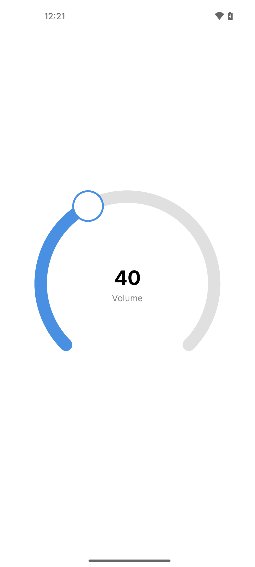 |
| 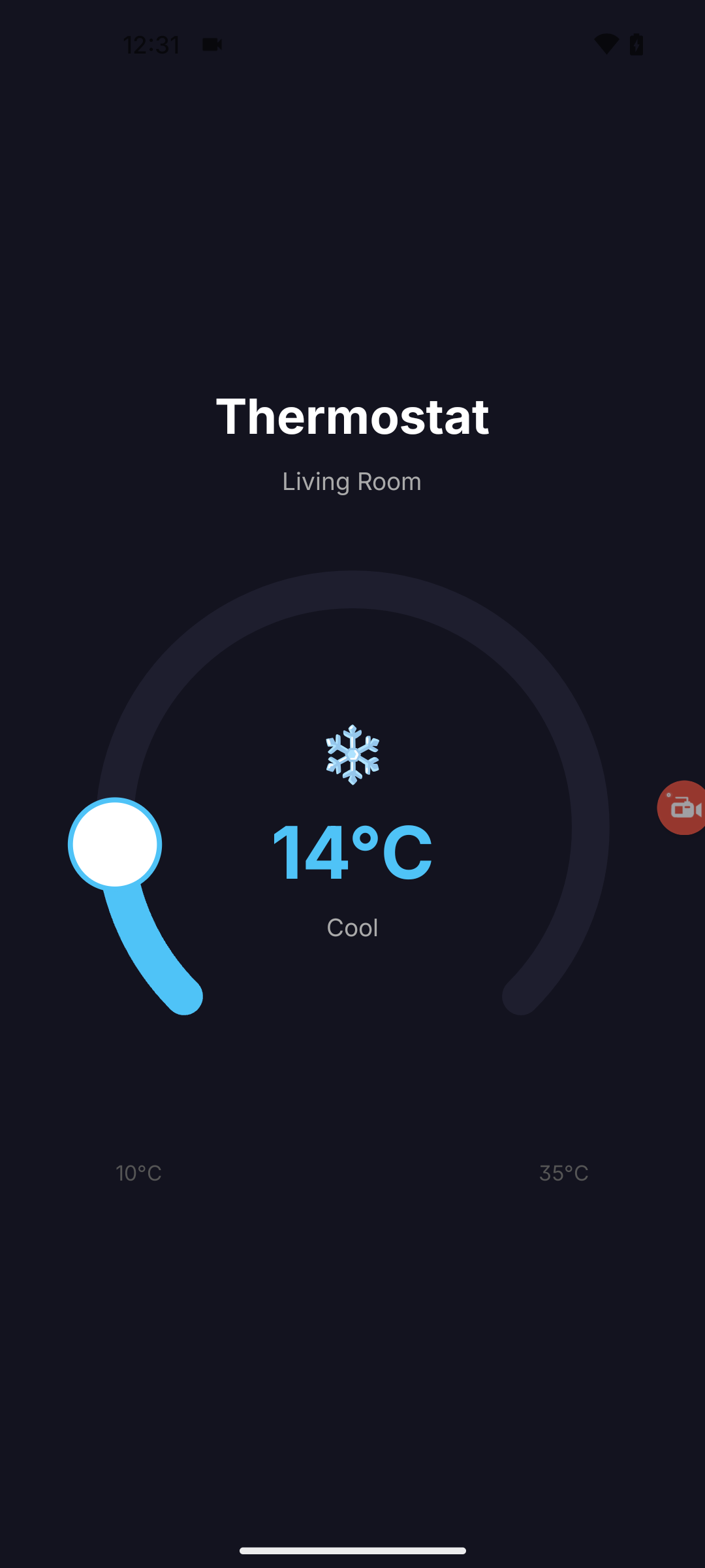 |
| 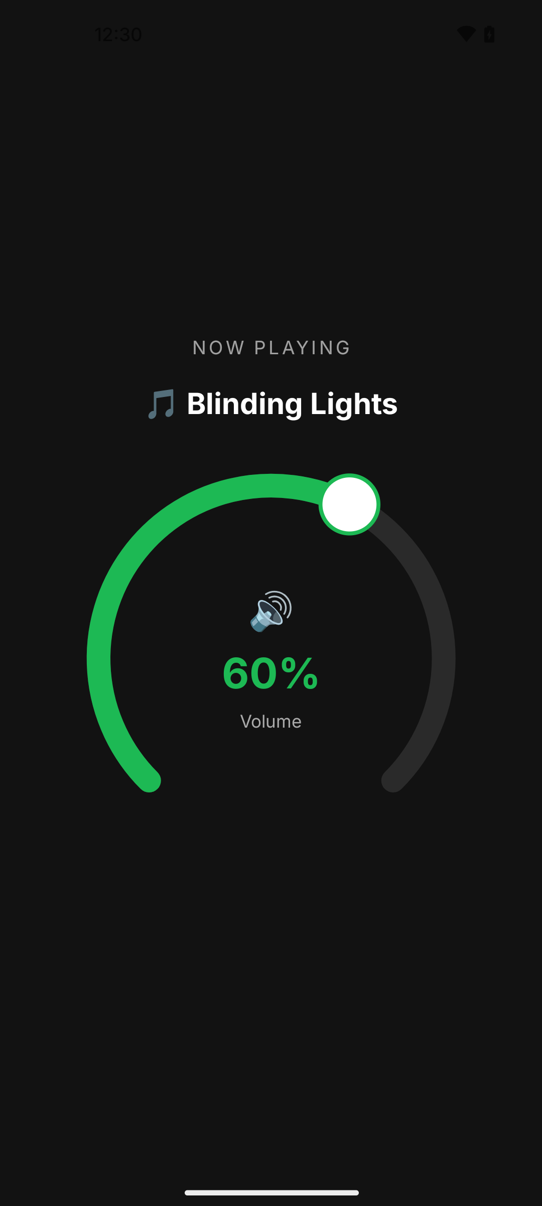 |
|
Features
- Built with
@shopify/react-native-skiafor smooth 60 FPS rendering - Gesture support via
react-native-gesture-handler - Optional haptic feedback
- Customizable colors, size, angles, and thumb
- Custom center content via
renderCenter - Controlled component with
ref.setValue()support - TypeScript support
Installation
npm install react-native-moon-sliderPeer Dependencies
Make sure you have these installed in your project:
npm install @shopify/react-native-skia react-native-gesture-handler react-native-reanimated expo-hapticsUsage
import { useState } from 'react';
import { View, Text } from 'react-native';
import { GestureHandlerRootView } from 'react-native-gesture-handler';
import { CircularSlider } from 'react-native-moon-slider';

export default function App() {
  const [volume, setVolume] = useState(40);

  return (
    <GestureHandlerRootView style={{ flex: 1 }}>
      <CircularSlider
        min={0}
        max={100}
        value={volume}
        onValueChange={setVolume}
        diameter={300}
        sliderWidth={20}
        thumbRadius={24}
        startAngle={135}
        endAngle={45}
        trackColor="#E0E0E0"
        fillColor="#4A90E2"
        thumbColor="#FFFFFF"
        thumbStrokeColor="#4A90E2"
        haptics={true}
        renderCenter={() => (
          <View style={{ alignItems: 'center' }}>
            <Text style={{ fontSize: 32, fontWeight: 'bold' }}>{volume}</Text>
            <Text style={{ color: 'gray' }}>Volume</Text>
          </View>
        )}
      />
    </GestureHandlerRootView>
  );
}
Props
| Prop | Type | Default | Description |
| ------------------ | ------------------------- | --------- | ------------------------------ |
| min | number | 0 | Minimum value |
| max | number | 100 | Maximum value |
| value | number | 0 | Current value |
| onValueChange | (value: number) => void | - | Callback when value changes |
| diameter | number | 300 | Diameter of the slider |
| sliderWidth | number | 20 | Thickness of the arc |
| thumbRadius | number | 24 | Size of the draggable thumb |
| startAngle | number | 135 | Start angle in degrees |
| endAngle | number | 45 | End angle in degrees |
| trackColor | string | #E0E0E0 | Unfilled arc color |
| fillColor | string | #4A90E2 | Filled arc color |
| thumbColor | string | #FFFFFF | Thumb fill color |
| thumbStrokeColor | string | #4A90E2 | Thumb border color |
| haptics | boolean | true | Enable/disable haptic feedback |
| renderCenter | () => ReactNode | - | Custom center content |
Ref Methods
const sliderRef = useRef<CircularSliderRef>(null);

// Programmatically set value
sliderRef.current?.setValue(50);

<CircularSlider ref={sliderRef} ... />
Contributing
License
MIT
Made with create-react-native-library