
react-native-poll-kit
v0.1.3
Published
A React Native UI kit for building WhatsApp-style interactive polls with clean chat-like design and real-time vote visualization.
Maintainers
 mudassar-dev
Readme
react-native-poll-kit
React Native poll component and voting UI in the WhatsApp style: single- or multi-select polls, animated result bars, percent labels, vote counts, and per-option colors for chat, channels, and surveys. Built for iOS and Android with TypeScript types—no extra native modules.
Keywords: react native poll, whatsapp poll ui, vote component, survey widget, multi select poll, poll results bars, react native typescript, mobile chat poll.

Preview
| Animated demo | Still (results + multi-select) |
|---------------|----------------------------------|
| 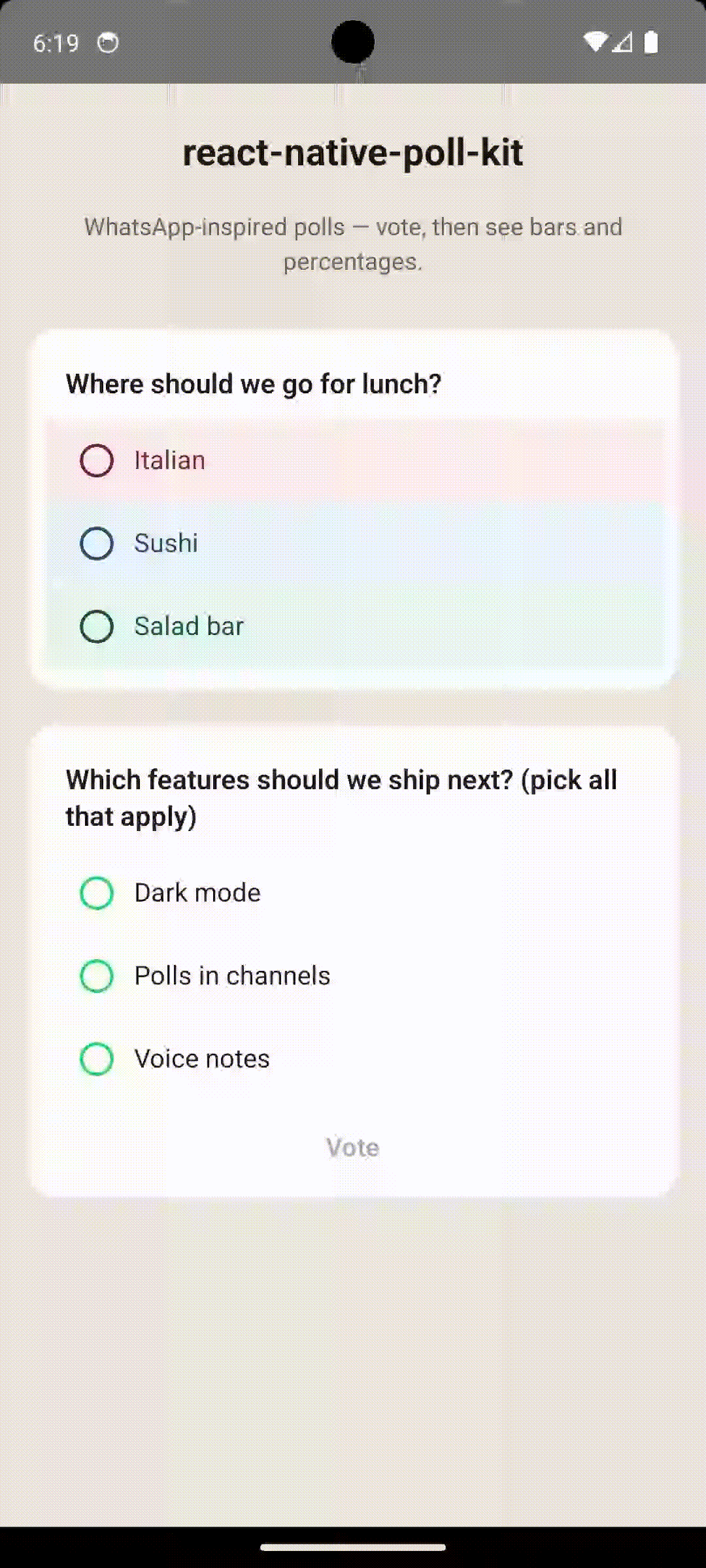 |
| 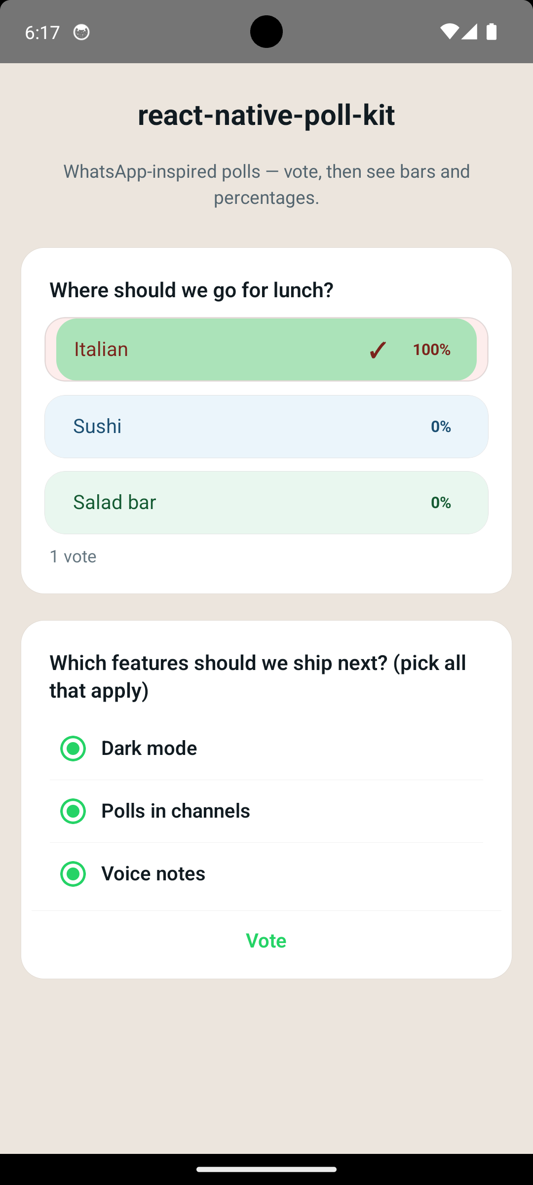 |
|
Same assets in the repo: poll.gif, Screenshot_1778332631.png.
Features
- Single tap vote or multi-select with a Vote button
- Results mode: animated (optional) progress bars, %, checkmark, footer vote count
- Theme-driven colors plus
whatsappChatThemepreset (classic green#25D366) - i18n: override
strings(voteButton,formatVoteCount) or usemergePollStrings - Layout animation when switching to results (
resultLayoutAnimation, defaulttrue; opt out if it clashes with navigation) - Minimal options: only
id,label,votesrequired — text/radio/bars usethemewhen you skiptextColor - Optional per-row
textColor/radioColor/checkmarkColor/percentColor/backgroundColor/ bar overrides - Theme keys
radioColor,checkmarkColor,percentTextColorfor global control without per-option noise theme.optionRowBackgroundColor— shared row tint when options don’t setbackgroundColorallowRevoteto reduce duplicateonVotewhile parent state updates- Layout:
mainContainerStyle,style, and granularStyleProphooks - Helpers:
sumVotes,getProgressColor,formatPollPercent,mergePollTheme
Install
npm install react-native-poll-kit
# or
yarn add react-native-poll-kit
Peer dependencies: react, react-native (no extra native modules beyond core RN).
Public API
import {
  Poll,
  defaultPollStrings,
  defaultPollTheme,
  mergePollStrings,
  mergePollTheme,
  whatsappChatTheme,
  sumVotes,
  getProgressColor,
  formatPollPercent,
  type PollProps,
  type PollOption,
  type PollTheme,
  type PollStrings,
} from 'react-native-poll-kit';
Quick start
You own questions, options, vote counts, when to show results, and selectedOptionIds. After onVote, bump votes, set showResults, and pass the user’s selectedOptionIds.
When updating tallies, use { ...o, votes: next } so any optional fields (e.g. textColor) stay intact. If you pass new object literals for theme or strings every render, wrap them in useMemo so merges stay stable.
import { useCallback, useState } from 'react';
import { View } from 'react-native';
import { Poll, type PollOption, whatsappChatTheme } from 'react-native-poll-kit';

const initialOptions: PollOption[] = [
  { id: '1', label: 'Option A', votes: 0 },
  { id: '2', label: 'Option B', votes: 0 },
];

export function MyPoll() {
  const [options, setOptions] = useState(initialOptions);
  const [showResults, setShowResults] = useState(false);
  const [selected, setSelected] = useState<string[]>([]);

  const onVote = useCallback((ids: string[]) => {
    setSelected(ids);
    setOptions((prev) =>
      prev.map((o) =>
        ids.includes(o.id) ? { ...o, votes: (o.votes ?? 0) + 1 } : o
      )
    );
    setShowResults(true);
  }, []);

  return (
    <View style={{ padding: 16 }}>
      <Poll
        question="What should we build next?"
        options={options}
        allowMultiple={false}
        showResults={showResults}
        selectedOptionIds={selected}
        onVote={onVote}
        theme={whatsappChatTheme}
        allowRevote={false}
        mainContainerStyle={{ alignSelf: 'stretch' }}
        style={{ maxWidth: '100%', borderRadius: 16 }}
      />
    </View>
  );
}
Internationalization (strings)
Override voteButton (multi-select submit) and formatVoteCount(total) (footer under results). Defaults are English; defaultPollStrings and mergePollStrings match the theme pattern.
<Poll
  strings={{
    voteButton: 'Votar',
    formatVoteCount: (n) => (n === 1 ? '1 voto' : `${n} votos`),
  }}
  /* … */
/>
If theme or strings are built from literals, memoize them (same pattern as mergePollTheme):
import { useMemo } from 'react';
import { mergePollStrings, whatsappChatTheme } from 'react-native-poll-kit';

const theme = useMemo(
  () => ({ ...whatsappChatTheme, accentColor: '#128C7E' }),
  []
);
const strings = useMemo(
  () =>
    mergePollStrings({
      voteButton: 'Votar',
      formatVoteCount: (n) => (n === 1 ? '1 voto' : `${n} votos`),
    }),
  []
);
Colors quick reference
Theme (mergePollTheme / Poll theme prop) — set once for the whole poll:
| Key | What it controls |
|-----|------------------|
| cardBackground, cardBorderColor | Poll card surface |
| questionColor | Question title |
| optionTextColor | Option labels when a row has no textColor |
| metaTextColor | Footer “N votes”, dim copy; default % color when nothing else applies |
| accentColor | Multi-select Vote tint, progress fallback, radio when no radioColor / textColor |
| radioColor | All voting circles (border + dot), unless a row sets radioColor or textColor |
| checkmarkColor | All results ✓ marks, unless a row sets checkmarkColor or textColor |
| percentTextColor | All results % numbers when a row omits percentColor / textColor |
| voteButtonTextColor | Enabled Vote label |
| progressTrack* | Result bar fills (see getProgressColor) |
Per option (PollOption) — override a single row:
| Key | What it controls |
|-----|------------------|
| textColor | Label; default source for radio / ✓ / % unless you set the specific keys below |
| radioColor | Voting circle only (label can stay optionTextColor) |
| checkmarkColor | ✓ in results only |
| percentColor | % in results only |
| backgroundColor | Row background |
| progressColor* | Bar colors in results |
Defaults when option colors are omitted
| You skip… | Library uses… |
|-----------|----------------|
| textColor | theme.optionTextColor; % uses theme.percentTextColor ?? theme.metaTextColor |
| radioColor | theme.radioColor ?? textColor ?? theme.accentColor |
| checkmarkColor | theme.checkmarkColor ?? label color |
| percentColor | textColor ?? theme.percentTextColor ?? theme.metaTextColor |
| backgroundColor | Transparent, or theme.optionRowBackgroundColor if set on theme |
| progressColor* | theme.progressTrackSelectedColor / progressTrackUnselectedColor (via getProgressColor) |
Shared row tint without per-option backgroundColor:
<Poll
  theme={{
    ...whatsappChatTheme,
    optionRowBackgroundColor: 'rgba(0, 0, 0, 0.04)',
  }}
  /* … */
/>
Multi-select
Set allowMultiple={true}. User picks options, then Vote; onVote receives all selected ids.
Live / server data
Pass new options (and optional totalVotes) whenever your REST API or WebSocket updates — the UI reflects new counts and percentages. showResults and selectedOptionIds usually come from your app state (after onVote or from a “my vote” endpoint), not from a static poll payload.
Backend / API payload (complete reference)
Use camelCase in JSON if your server matches TypeScript; many stacks use snake_case—map either way into PollOption (see Map API to PollOption).
Poll resource fields (typical GET /polls/:id or realtime message)
| Field | Type | Required | Maps to <Poll /> |
|-------|------|----------|-------------------|
| question | string | yes | question |
| options | array | yes | options (each row → PollOption) |
| allowMultiple / allow_multiple | boolean | no | allowMultiple (default single-select) |
| totalVotes / total_votes | number | no | totalVotes (footer / totals; default = sum of option votes) |
| selectedOptionIds / selected_option_ids | string[] | no | selectedOptionIds (current user’s choices; often from another endpoint) |
| Per-option votes | number | for results | Each option’s tally when showResults |
Per-option color & bar fields (all optional; omit any key and the theme fills in—see Defaults when option colors are omitted):
| API / PollOption field | Purpose |
|--------------------------|---------|
| textColor | Label; default for radio / ✓ / % when specific keys omitted |
| radioColor | Voting-mode circle only |
| checkmarkColor | Results ✓ only |
| percentColor | Results % only |
| backgroundColor | Row background (voting + results track base) |
| progressColor | Single bar color for this option (results) |
| progressColorSelected | Bar fill when this option is in selectedOptionIds |
| progressColorUnselected | Bar fill when the viewer did not pick this option |
Example A — Colored single-choice poll (like “lunch” demo)
Full PollOption styling so each row has its own tint and percent color; tallies match a live poll.
{
  "id": "poll_lunch_001",
  "question": "Where should we go for lunch?",
  "allowMultiple": false,
  "totalVotes": 48,
  "options": [
    {
      "id": "opt_italian",
      "label": "Italian",
      "votes": 18,
      "textColor": "#7B241C",
      "backgroundColor": "#FDEDEC",
      "progressColorSelected": "#C0392B",
      "progressColorUnselected": "#F5B7B1"
    },
    {
      "id": "opt_sushi",
      "label": "Sushi",
      "votes": 22,
      "textColor": "#1B4F72",
      "backgroundColor": "#EBF5FB",
      "progressColorSelected": "#2874A6",
      "progressColorUnselected": "#AED6F1"
    },
    {
      "id": "opt_salad",
      "label": "Salad bar",
      "votes": 8,
      "textColor": "#145A32",
      "backgroundColor": "#E9F7EF",
      "progressColorSelected": "#1E8449",
      "progressColorUnselected": "#A9DFBF"
    }
  ]
}
Example B — Multi-select, theme-driven colors (like “features” demo)
No per-row colors: the app uses whatsappChatTheme (or mergePollTheme) so accent, bars, and Vote match your chat brand.
{
  "id": "poll_features_002",
  "question": "Which features should we ship next? (pick all that apply)",
  "allowMultiple": true,
  "totalVotes": 127,
  "options": [
    { "id": "feat_dark", "label": "Dark mode", "votes": 89 },
    { "id": "feat_polls", "label": "Polls in channels", "votes": 54 },
    { "id": "feat_voice", "label": "Voice notes", "votes": 41 }
  ]
}
Example C — Minimal poll (API only sends ids, labels, votes)
{
  "question": "Ship dark mode?",
  "allowMultiple": false,
  "options": [
    { "id": "1", "label": "Yes", "votes": 41 },
    { "id": "2", "label": "No", "votes": 7 }
  ]
}
Example D — Same as A, snake_case (Rails / Django / Phoenix style)
{
  "question": "Where should we go for lunch?",
  "allow_multiple": false,
  "total_votes": 48,
  "options": [
    {
      "id": "opt_italian",
      "label": "Italian",
      "votes": 18,
      "text_color": "#7B241C",
      "background_color": "#FDEDEC",
      "progress_color_selected": "#C0392B",
      "progress_color_unselected": "#F5B7B1"
    },
    {
      "id": "opt_sushi",
      "label": "Sushi",
      "votes": 22,
      "text_color": "#1B4F72",
      "background_color": "#EBF5FB",
      "progress_color_selected": "#2874A6",
      "progress_color_unselected": "#AED6F1"
    },
    {
      "id": "opt_salad",
      "label": "Salad bar",
      "votes": 8,
      "text_color": "#145A32",
      "background_color": "#E9F7EF",
      "progress_color_selected": "#1E8449",
      "progress_color_unselected": "#A9DFBF"
    }
  ]
}
Map API to PollOption (TypeScript)
import { Poll, whatsappChatTheme, type PollOption } from 'react-native-poll-kit';

/** Supports camelCase or snake_case option rows from your API */
type ApiPollOption = {
  id: string;
  label: string;
  votes: number;
  textColor?: string;
  text_color?: string;
  radioColor?: string;
  radio_color?: string;
  checkmarkColor?: string;
  checkmark_color?: string;
  percentColor?: string;
  percent_color?: string;
  backgroundColor?: string;
  background_color?: string;
  progressColor?: string;
  progress_color?: string;
  progressColorSelected?: string;
  progress_color_selected?: string;
  progressColorUnselected?: string;
  progress_color_unselected?: string;
};

function toPollOption(o: ApiPollOption): PollOption {
  const textColor = o.textColor ?? o.text_color;
  const radioColor = o.radioColor ?? o.radio_color;
  const checkmarkColor = o.checkmarkColor ?? o.checkmark_color;
  const percentColor = o.percentColor ?? o.percent_color;
  const backgroundColor = o.backgroundColor ?? o.background_color;
  const progressColor = o.progressColor ?? o.progress_color;
  const progressColorSelected =
    o.progressColorSelected ?? o.progress_color_selected;
  const progressColorUnselected =
    o.progressColorUnselected ?? o.progress_color_unselected;

  return {
    id: o.id,
    label: o.label,
    votes: o.votes,
    ...(textColor != null && { textColor }),
    ...(radioColor != null && { radioColor }),
    ...(checkmarkColor != null && { checkmarkColor }),
    ...(percentColor != null && { percentColor }),
    ...(backgroundColor != null && { backgroundColor }),
    ...(progressColor != null && { progressColor }),
    ...(progressColorSelected != null && { progressColorSelected }),
    ...(progressColorUnselected != null && { progressColorUnselected }),
  };
}

type ApiPoll = {
  question: string;
  options: ApiPollOption[];
  allowMultiple?: boolean;
  allow_multiple?: boolean;
  totalVotes?: number;
  total_votes?: number;
};

function apiPollToProps(data: ApiPoll) {
  return {
    question: data.question,
    options: data.options.map(toPollOption),
    allowMultiple: data.allowMultiple ?? data.allow_multiple ?? false,
    totalVotes: data.totalVotes ?? data.total_votes,
  };
}

function PollFromPayload({
  apiResponse,
  showResults,
  selected,
  onVote,
}: {
  apiResponse: ApiPoll;
  showResults: boolean;
  selected: string[];
  onVote: (ids: string[]) => void;
}) {
  const pollProps = apiPollToProps(apiResponse);

  return (
    <Poll
      {...pollProps}
      showResults={showResults}
      selectedOptionIds={selected}
      onVote={onVote}
      theme={whatsappChatTheme}
    />
  );
}
For results math, each option should include votes when showResults is true. id and label are always required for each option.
Theming
| Export | Use |
|--------|-----|
| defaultPollTheme | Full default palette |
| mergePollTheme(partial) | Build custom presets from partial overrides |
| whatsappChatTheme | Drop-in green accent (partial PollTheme) |
<Poll theme={whatsappChatTheme} /* … */ />
<Poll theme={{ accentColor: '#128C7E' }} /* … */ />
Per-option styling (optional)
Use textColor, radioColor, checkmarkColor, percentColor, backgroundColor, and progressColor* when rows need different styles. Example: dark label text with a brand-colored ring — set radioColor: '#25D366' and textColor: '#111B21' on the same option.
Poll props (overview)
| Prop | Description |
|------|-------------|
| question | Title string |
| options | PollOption[] — needs votes for result math when showResults |
| showResults | Show bars, %, footer, results layout |
| selectedOptionIds | Viewer’s choice(s) for highlight / checkmark |
| allowMultiple | Multi-select + Vote vs single-tap |
| onVote | (ids: string[]) => void |
| allowRevote | false locks after submit until you reset (default true) |
| totalVotes | Optional footer override (default: sum of option votes) |
| theme | Partial<PollTheme> — includes optional optionRowBackgroundColor |
| strings | Partial<PollStrings> — voteButton, formatVoteCount (i18n) |
| resultLayoutAnimation | LayoutAnimation when showResults becomes true (default true) |
| animateProgress | Bar animation (default true) |
| progressAnimationDuration | ms (default 1250) |
| showSelectedCheckmark | ✓ next to % in results (default true) |
| mainContainerStyle / containerStyle | Outermost wrapper (e.g. width) |
| style | Card surface |
| … | questionStyle, optionPressableStyle, separatorStyle, etc. — see PollProps in your IDE |
Utilities
import { sumVotes, getProgressColor, formatPollPercent, defaultPollTheme } from 'react-native-poll-kit';Testing (this repo)
yarn testComponent tests use @testing-library/react-native (fireEvent, screen). When adding coverage, prefer querying by role or accessible text where Poll sets them.
Example app (this repo)
yarn install
yarn example ios
# or
yarn example android
Requirements
Match react / react-native to your app; the library targets standard RN without extra native SDKs.