
react-native-realistic-deck-swiper
v0.1.3
Published
Deck swiper with realistic physics.
Downloads
183
Maintainers
 novahgoose
Readme
React-Native-Realistic-Deck-Swiper
Swipeable deck with realistic physics, based on NYer Today app's cartoons swipe deck. See a write up of how this library works!
Change Log
v0.1.3 Allow touchables composed within cards, fix android undefined rotation transform
Getting Started
These instructions will get you a copy of the project up and running on your local machine for development and testing purposes. See deployment for notes on how to deploy the project on a live system.
Installation and Usage
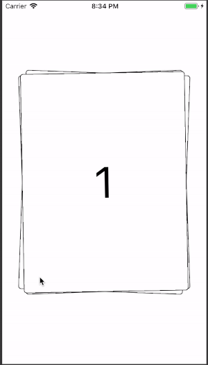
npm i react-native-realistic-deck-swiperimport React from 'react'
import { View, Text } from 'react-native'
import Swiper from 'react-native-realistic-deck-swiper'
const Data = [
{ id: "1" },
{ id: "2" },
{ id: "3" },
{ id: "4" },
{ id: "5" },
]
export default class App extends React.Component {
_renderCard = (item) => {
return <View style={{
width: 300,
height: 400,
borderRadius: 5,
display: 'flex',
alignItems: 'center',
justifyContent: 'center'
}}>
<Text style={{ fontSize: 80 }}>{item.id}</Text>
</View>
}
render() {
return (
<View style={{ flex: 1 }}>
<Swiper
cardsData={Data}
renderCard={this._renderCard}
containerStyle={{
flex: 1,
alignItems: 'center',
justifyContent: 'center',
}}
style={{
margin: 20,
backgroundColor: 'white',
borderColor: 'black',
borderWidth: 1,
borderRadius: 5,
}}
/>
</View>
);
}
}Deck and Card Props
|Props | required | type| description | default |:---|:---|:---| :---|:---: | cardsData | required| array | data array | | renderCard | required | function | render function, receives cardsData element | | |deckSize| optional | integer | number of cards rendered and visible at a time | 3| |offsetAngleMin | optional| integer| minimum vertical angle offset of cards in degrees| -4| |offsetAngleMax| optional | integer | maximum vertical angle offset of cards in degrees | 4| |infiniteSwipe|optional|boolean|renderCard cycles through cardsData infinitely | true| |startIndex| optional | integer | cardsData index for first card | 0| |velocityThreshold| optional | positive number | velocity magnitude - compared to gesture velocity magnitude at release to determine successful or unsuccessful swipe | 0.4|
Animation Props
|Props | required | type| description | default |:---|:---|:---| :---|:---: |rotationMultiplier| optional | positive number | multiplier to rotational animation input range, > 1 will slow down rotation animation, < 1 will speed up | 1 | |topCardAnimationDuration|optional| positive number | milisecond duration of top card animation after successful swipe (flying away)| 1000 | |bottomCardAnimationDuration|optional| positive number | milisecond duration of bottom card animation | 500 |springConstants|optional| object | control reset animation on unsuccessful swipe, object signature: { stiffness, damping, mass } | {stiffness: 50, damping: 30, mass: 0.5} |
Callbacks Props
|Props | required | type| description | default |:---|:---|:---| :---|:---: |onSwipeStart| optional | function | callback function to be called on successful card swipe, with current index| | |onSwiped| optional | function | callback function to be called after successful card swipe, with velocity vector object {vx, vy}| | |onSwipedAll| optional | function | callback function to be called after successful last card swipe regardless of infiniteSwipe prop| | |onReset|optional|function|callback function to be called on unsuccessful card swipe, with velocity vector object {vx, vy} ||
Card Style Props
*style objects can be modified but default properties cannot be changed
|Props | required | type| description | default |:---|:---|:---| :---|:---: |style|optional|object|card style object|| |containerStyle|optional|object| Swiper container view style object |{position: absolute*, transform: []*, zIndex: number*}|
Author
Anh Vo
License
This project is licensed under the MIT License.