
react-native-rheostat
v1.0.2
Published
inspired by Airbnb's rheostat, a powerful slider with assorted data visualized charts
Maintainers
 dr_chai
Readme
react-native-rheostat
inspired by Airbnb's rheostat, a powerful slider with assorted data visualized charts
Features
- Followed original repo rheostat to provide similar usage, includes algorithm and custom React component overrides for handles and progress bar.
- Pure Javascript but optimized with Animated API, reduced times of re-render and data pass over the bridge.
- Provide HOC wrapper
withRheostatto allow you fully customize. - Built with styled-components, easily add your theme and styles.
Dependencies
This library uses react-native-svg and react-native-svg-charts
for optional charts display. If you develop with native code,you need to run react-native link react-native-svg
to link your native code, please see the Installation below
Installation
npm install --save react-native-rheostat
link native code, with Expo or create-react-native-app, just skip this:
react-native link react-native-svg
Usage
classic slider
ranged slider with snap points
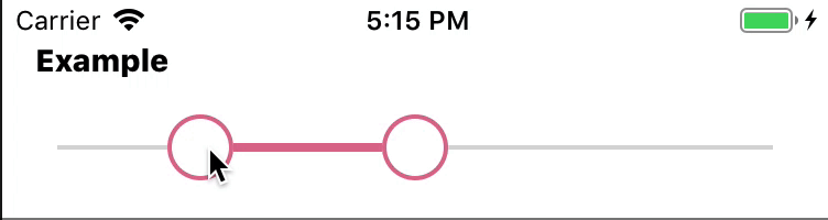
const demoTwoValues = [20,50]
const demoSnaps = [0,20,30,40,50,60,70,80,100];
<Rheostat values={demoTwoValues} min={0} max={100}
          snap snapPoints={demoSnaps}/>
single handle slider
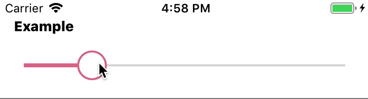
const singleValues = [33];
<Rheostat values={singleValues} min={0} max={100} />
x-like slider with areaChart or barChart
rheostat with areaChart
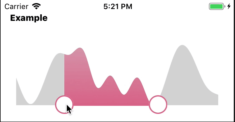
const areaSvgData = [ 50, 10, 40, 85, 85, 91, 35,  53, 24]
const demoTwoValues = [480, 1040]
<AreaRheostat values={values} min={0} max={1440} svgData={areaSvgData}/>
rheostat with barChart
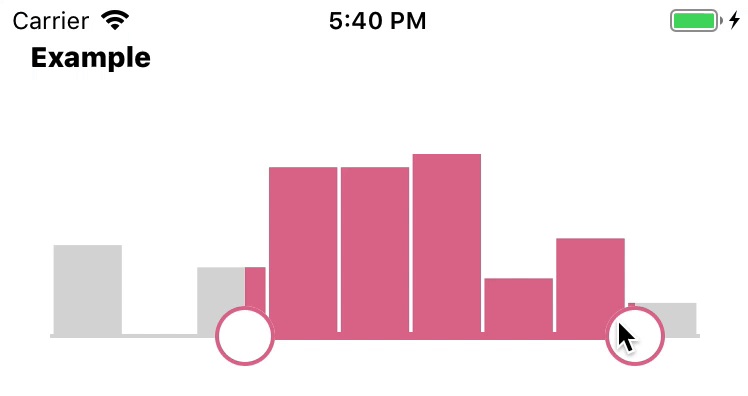
const demoTwoValues = [3, 9]
const barSvgData = [  50, 10, 40, 85, 85, 91, 35,  53, 24]
<BarRheostat values={values} min={0} max={1440} svgData={areaSvgData}/>
full component and event listeners binding
import React, {Component} from 'react';
import {Text, View, ScrollView} from 'react-native';
import Moment from 'moment';
import Rheostat, {AreaRheostat, BarRheostat} from "react-native-rheostat";
const areaSvgData = [ 50, 10, 40, 85, 85, 91, 35, 53, 24,
50, 10, 40, 95, 85, 40,
24]
const defaultProps = {
snapPoints: [0,60,120,180,240,300,330,360,420,480,540,570,600,630,660,690,
720,750,780,810,840,870,900,930,960,990,1020,1050,1080,1110,1140,1170,1200,
1260,1320,1380,
1440],
values: [
480, 1040
],
svgData: [ 50, 50, 10, 10, 40, 40, 95,95, 85, 85, 91, 35, 53, 53, 24, 50,
50, 10, 40, 95, 85, 91, 35, 53, 24, 50,
50, 10, 40, 95, 85, 91, 35, 53, 50, 50,
50, 10, 40, 95, 91, 91, 24, 24, 50, 50,
10, 10, ]
};
export default class RheostatExample extends Component {
constructor(props) {
super(props);
this.state = {
scrollEnabled: true,
timeRange:{
values: [10, 80]
}
}
}
onRheostatValUpdated = (payload) => {
this.setState({
timeRange: payload
})
}
onSliderDragStart = () => {
this.setState({scrollEnabled:false})
}
onSliderDragEnd = () => {
this.setState({scrollEnabled:true})
}
render() {
return (
<ScrollView contentContainerStyle={{paddingTop: 20, paddingHorizontal:15}} scrollEnabled={this.state.scrollEnabled}>
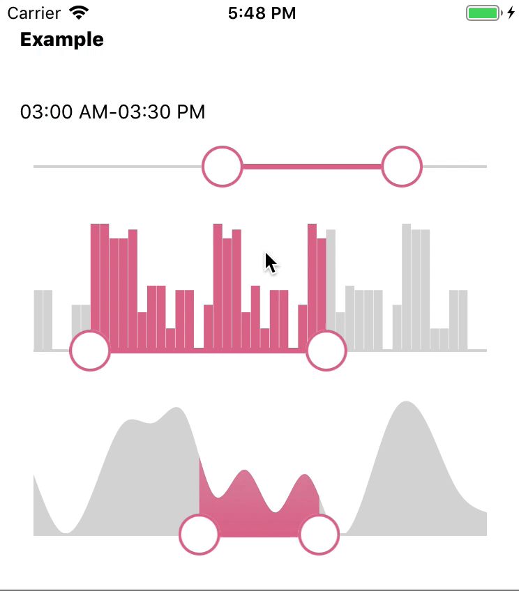
<Text style={{fontWeight:'800'}}>Example</Text>
<View style={{flex:1, paddingTop: 20, paddingBottom: 80}}>
<Text style={{marginTop: 15}}>
{Moment.utc().startOf('day').add(this.state.timeRange.values[0], 'minutes').format('hh:mm A')}
-
{Moment.utc().startOf('day').add(this.state.timeRange.values[1], 'minutes').format('hh:mm A')}
</Text>
<Rheostat values={this.props.values} min={0} max={1440}
snapPoints={this.props.snapPoints}
snap={true}
onValuesUpdated={this.onRheostatValUpdated}
onSliderDragStart={this.onSliderDragStart}
onSliderDragEnd={this.onSliderDragEnd}
/>
<BarRheostat values={this.props.values} min={0} max={1440}
snap={true} snapPoints={this.props.snapPoints}
svgData = {this.props.svgData}
onValuesUpdated={this.onRheostatValUpdated}/>
<AreaRheostat values={this.props.values} min={0} max={1440}
svgData = {areaSvgData}
/>
</View>
</ScrollView>
)
}
}
RheostatExample.defaultProps = defaultProps;change appearance with styled-components
Option 1) You can wrap Rheostat by ThemeProvider from styled-component:
import { ThemeProvider } from 'styled-components/native';
const theme = {
    rheostat: {
        themeColor: 'blue',
        grey: '#fafafa',
    }
    //... other theme objects
};
<ThemeProvider theme={theme}>
        <BarRheostat
            values={this.props.values}
            min={0}
            max={1440}
            svgData={areaSvgData}
        />
</ThemeProvider>
Option 2) Or just pass theme as a prop to Rheostat without import ThemeProvider from styled-component:
  <AreaRheostat values={this.props.values} min={0} max={1440}
                theme={{ rheostat: { themeColor: 'black', grey: '#fafafa' } }}
                svgData = {areaSvgData}
/>[Recommended] Option 3) As recommended by Shared Component Libraries, import the custom themeProvider
RheostatThemeProvider for namespacing and avoid theme variables name clashes.
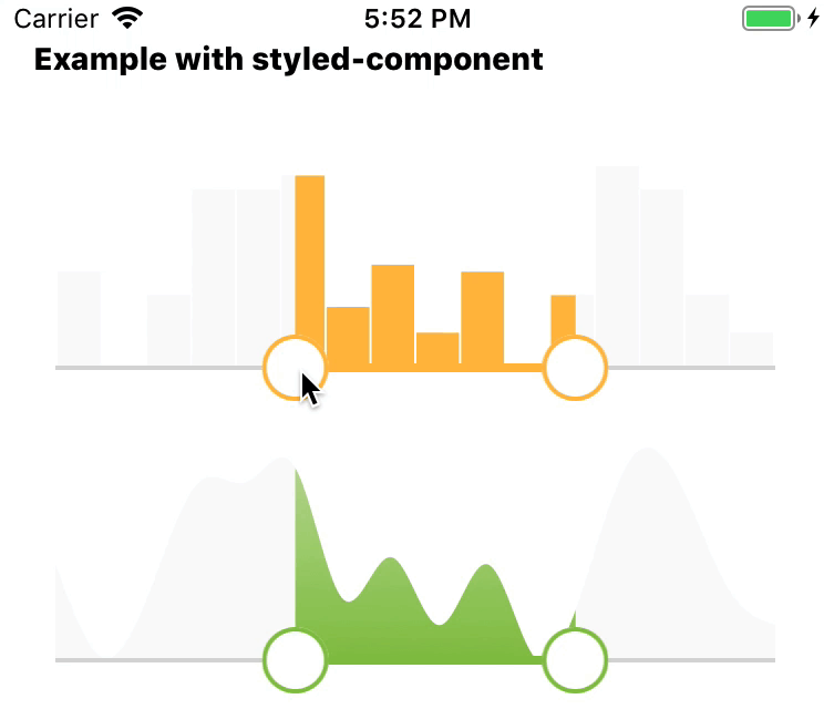
import { AreaRheostat, BarRheostat, RheostatThemeProvider } from 'react-native-rheostat';
const theme = {
    // No namespacing needed
    themeColor: '#ffbd45',
    grey: '#fafafa'
    // ...
}

<View>
        <Text style={{fontWeight:'800'}}>Example with styled-component</Text>
        <RheostatThemeProvider theme={theme}>
            <View>
                <BarRheostat values={this.props.values} min={0} max={1440}
                             svgData = {areaSvgData}
                />
                <AreaRheostat values={this.props.values} min={0} max={1440}
                              theme={{ rheostat: { themeColor: '#8bc34a', grey: '#fafafa' } }}
                              svgData = {areaSvgData}
                />
            </View>
        </RheostatThemeProvider>
</View>
Examples
cd example
npm i
react-native link react-native-svg
react-native run-ios
Advances
You can pass your own customized chart component to the withRheostat higher order component.
import { withRheostat } from 'react-native-rheostat';
import AreaChart from 'react-native-rheostat/src/charts/AreaChart'
import {
    Defs, LinearGradient, Stop,
} from 'react-native-svg';

const CustomAreaChart = (props) => (<AreaChart chartColor='url(#gradient)' {...props} >
    <Defs key='gredient-refs'>
        <LinearGradient id="gradient" x1="0%" y="0%" x2="0%" y2="100%">
            <Stop offset="50%" stopColor='green' stopOpacity={0.5} />
            <Stop offset="100%" stopColor='green' stopOpacity={1} />
        </LinearGradient>
    </Defs>
</AreaChart>)
const CustomAreaRheostat= withRheostat(CustomAreaChart)