
react-native-smart-dropdown
v0.1.3
Published
Production-ready, reusable React Native dropdown/select with smart positioning, search, and multi-select. Zero runtime dependencies.

Maintainers
 bhavesh2706
Readme
react-native-smart-dropdown

Production-ready React Native dropdown / select with smart positioning, search, multi-select, and a full theming system. Zero runtime dependencies. TypeScript-first.
npm · GitHub · Issues · Interactive demo · Full video tour
Preview
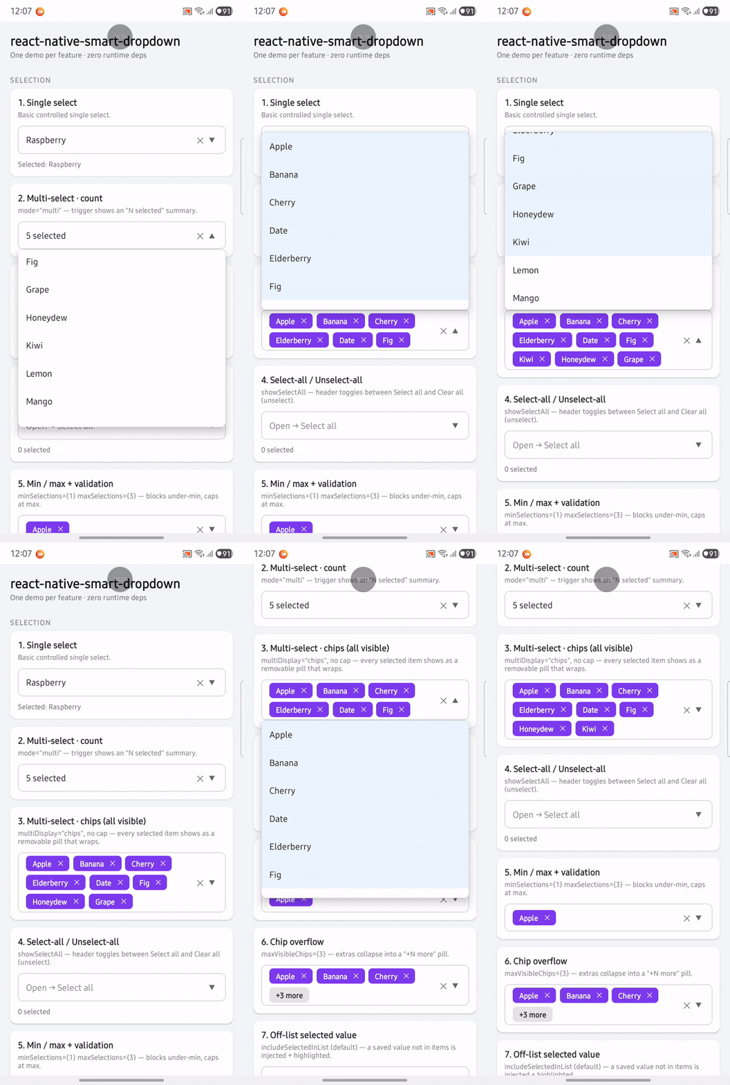
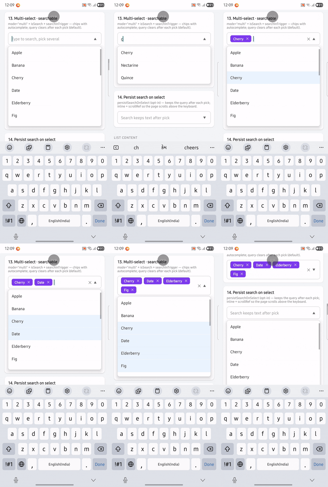
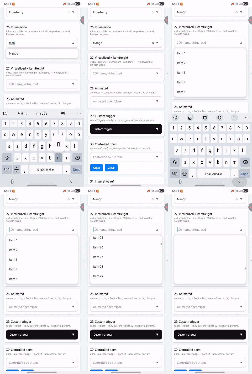
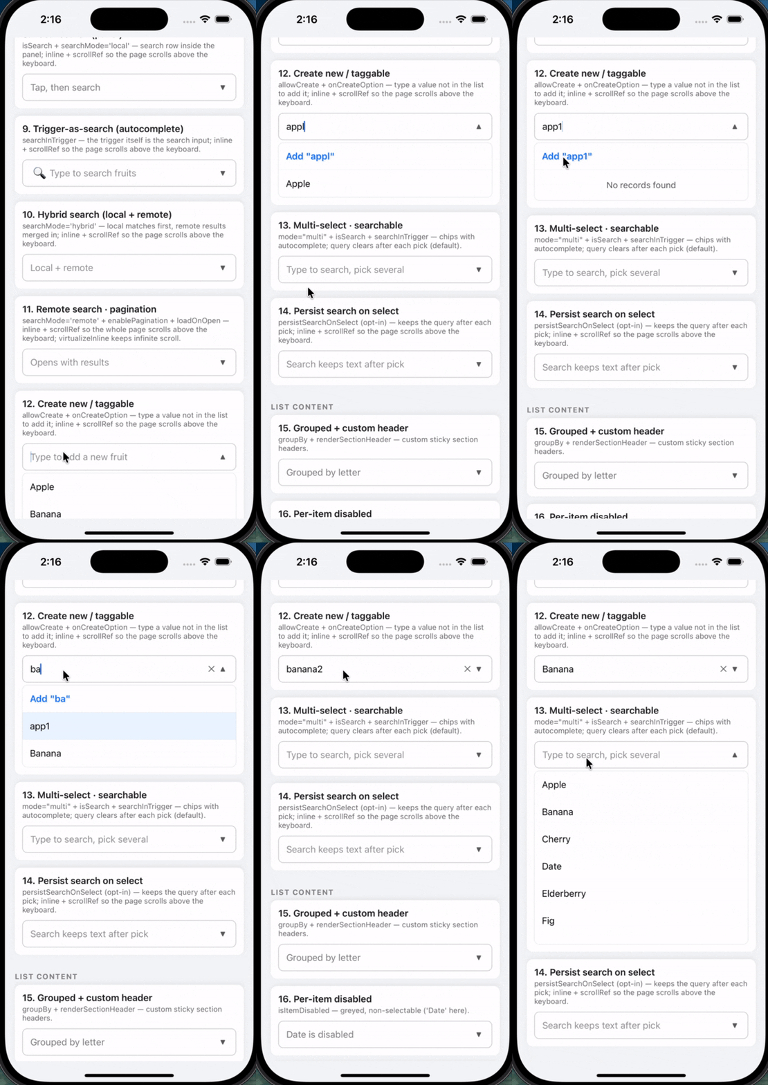
Highlights from the interactive demo on Android and iOS:
Android
| Selection (single + multi) | Multi-select · searchable | Inline + keyboard-aware |
|:---:|:---:|:---:|
|  |
|  |
|  |
|
iOS
| Create new / taggable | Multi-select · searchable |
|:---:|:---:|
|  |
| 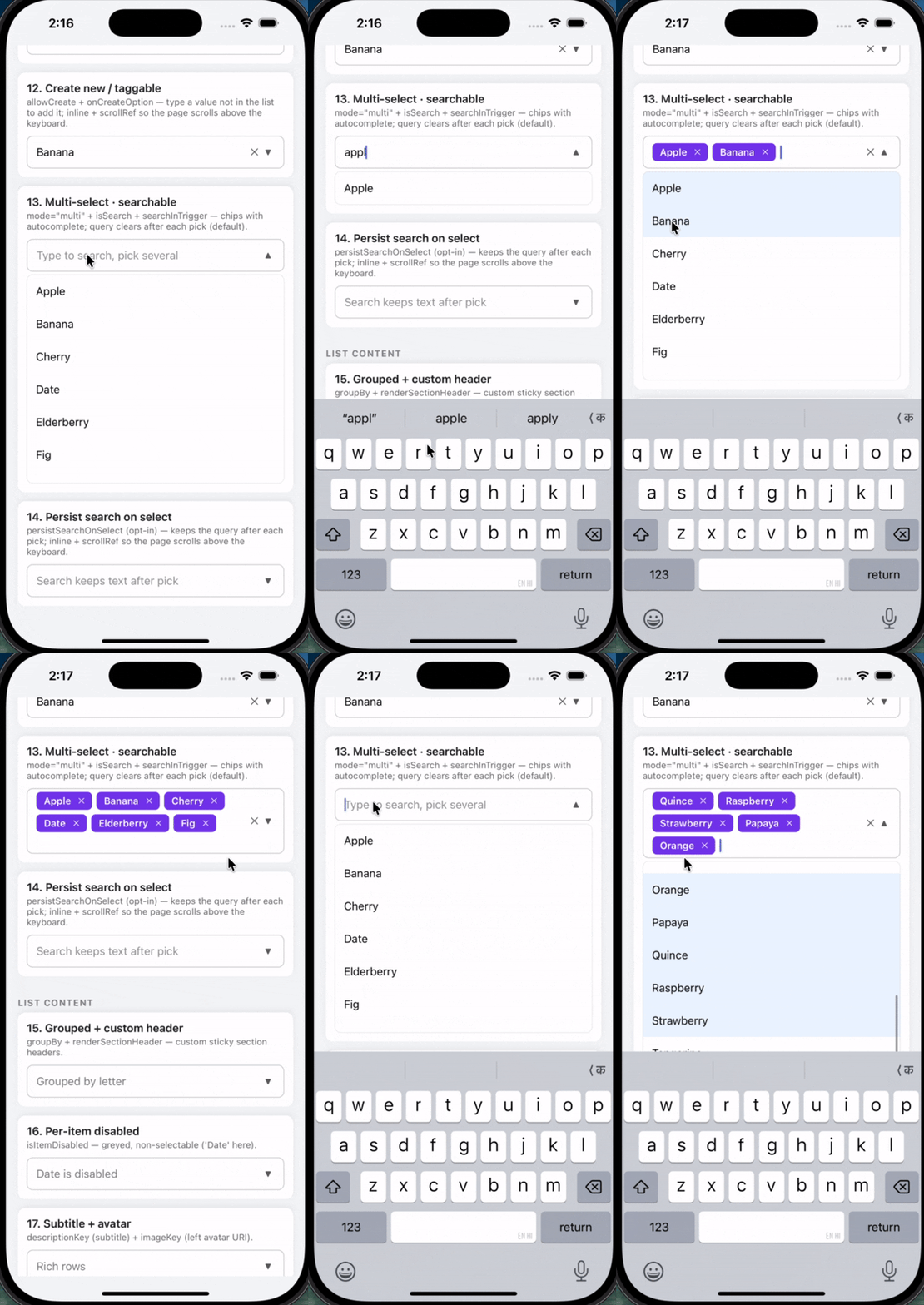 |
|
Watch all 32 demos on YouTube — full walkthrough of every feature in the demo app.
Features
- Single & multi-select — controlled or uncontrolled; multi shows a count or removable chips (with
+N moreoverflow). - Search —
local,remote(debounced + race-safe), orhybrid; optional pagination (infinite scroll) and load-on-open. - Autocomplete — trigger-as-search combobox; create-new / taggable items.
- Smart positioning — auto up/down, keyboard-aware, edge-clamped; floating Modal or inline (in-flow) render.
- Rich rows — section grouping, disabled items, subtitle + avatar, fully custom
renderItem. - Forms —
label/required/helperText/error(reddens the border);minSelections/maxSelections+ validity callback. - Theming — partial
themeoverride, light/dark (colorScheme), custom fonts (iOS-safe, family-based), RTL, custom icons. - Control —
renderTrigger, controlledopen, imperative ref,animatedopen/close. - Scale & web — virtualized inline lists,
getItemLayout, keyboard navigation (↑/↓/Enter/Esc) + hover.
Install
npm install react-native-smart-dropdown
# or
yarn add react-native-smart-dropdown
Peer deps: react >= 18, react-native >= 0.72. MIT license · 90 tests · ~75 kB packed · zero runtime dependencies.
Interactive demo (32 cards)
The repo includes DropdownDemo — 32 runnable cards, one feature per card:
| Category | Demos | |----------|------:| | SELECTION | 7 | | SEARCH | 7 | | LIST CONTENT | 4 | | FORM FIELD | 1 | | THEMING & ICONS | 5 | | POSITIONING & RENDER | 7 | | STATES | 1 | | Total | 32 |
Run locally from example/DropdownDemo, or watch the full video tour on YouTube.
Quick start
import React from 'react';
import { DropdownSelect } from 'react-native-smart-dropdown';

type Fruit = { id: number; label: string };
const FRUITS: Fruit[] = [
  { id: 1, label: 'Apple' },
  { id: 2, label: 'Banana' },
];

function Example() {
  const [value, setValue] = React.useState<Fruit | null>(null);
  return (
    <DropdownSelect<Fruit>
      items={FRUITS}
      labelKey="label"
      valueKey="id"
      value={value}
      onChange={setValue}
      placeholder="Pick a fruit"
    />
  );
}
Recipes
Multi-select · chips + search
<DropdownSelect<Fruit>
  mode="multi"
  multiDisplay="chips"
  isSearch
  searchInTrigger
  searchMode="local"
  items={FRUITS}
  labelKey="label"
  valueKey="id"
  selectedValues={selected}
  onChangeMulti={setSelected}
  placeholder="Type to search, pick several"
/>
Search query clears after each pick by default. Pass
persistSearchOnSelectto keep it.
Multi-select · chips + search (with cap)
<DropdownSelect<Fruit>
  mode="multi"
  multiDisplay="chips"
  maxVisibleChips={3}        // extras collapse into "+N more"
  isSearch
  searchInTrigger
  searchMode="local"
  items={FRUITS}
  labelKey="label"
  valueKey="id"
  selectedValues={selected}
  onChangeMulti={setSelected}
  placeholder="Pick several"
/>
Select-all · min/max validation
<DropdownSelect<Fruit>
  mode="multi"
  multiDisplay="chips"
  showSelectAll               // header toggles Select all ↔ Clear all
  minSelections={1}
  maxSelections={3}
  onValidityChange={setValid}
  items={FRUITS} labelKey="label" valueKey="id"
  selectedValues={sel} onChangeMulti={setSel}
/>
Remote search · pagination · load on open
<DropdownSelect<Item>
  isSearch
  searchInTrigger
  searchMode="remote"
  loadOnOpen                  // fetch first page when opened
  minSearchLength={0}
  enablePagination
  pageSize={20}
  fetchData={(text, page) => api.search(text, page)}
  renderLoading={() => <MySkeleton />}
  items={[]} labelKey="label" valueKey="id"
/>
Hybrid search (local + remote)
<DropdownSelect<Item>
  isSearch
  searchInTrigger
  searchMode="hybrid"           // local matches first, remote merged in
  minSearchLength={1}
  fetchData={(text, page) => api.search(text, page)}
  items={LOCAL_ITEMS}             // seed list for instant local matches
  labelKey="label" valueKey="id"
/>
Create new / taggable
<DropdownSelect<Item>
  isSearch searchInTrigger searchMode="local"
  allowCreate
  onCreateOption={(text) => ({ id: Date.now(), label: text })}
  items={items} labelKey="label" valueKey="id"
  value={value} onChange={setValue}
/>
Grouped · disabled · subtitle + avatar
<DropdownSelect<User>
  items={users} labelKey="name" valueKey="id"
  groupBy={(u) => u.team}
  isItemDisabled={(u) => !u.active}
  descriptionKey={(u) => u.email}
  imageKey={(u) => u.avatarUrl}
/>
Form field (label / required / error)
<DropdownSelect<Fruit>
  label="Favorite fruit"
  required
  error={value ? undefined : 'This field is required'}
  items={FRUITS} labelKey="label" valueKey="id"
  value={value} onChange={setValue}
/>
Theming · dark · custom font · RTL
<DropdownSelect<Fruit>
  theme={{ colors: { accent: '#0a7', chipBg: '#0a7' }, radii: { md: 14 } }}
  colorScheme="dark"                          // 'system' | 'light' | 'dark'
  // iOS-safe: family-only per weight (NO fontWeight when a custom family is set)
  // theme={{ fonts: { regular: 'Inter-Regular', bold: 'Inter-Bold' } }}
  rtl                                         // mirror layout + right-align (Arabic/Hebrew)
  items={FRUITS} labelKey="label" valueKey="id"
/>
Fonts on iOS: iOS ignores
fontWeighton a customfontFamily— the weight is baked into the font file. So set per-weight families (Inter-Regular/Inter-Medium/Inter-Bold) viatheme.fonts; the library never emitsfontWeightalongside a custom family.
Custom trigger · controlled open
import { Pressable, Text } from 'react-native';

<DropdownSelect<Fruit>
  open={open}
  onOpenChange={setOpen}
  renderTrigger={({ toggle, label, placeholder, isOpen }) => (
    <Pressable onPress={toggle}>
      <Text>{label || placeholder} {isOpen ? '▲' : '▼'}</Text>
    </Pressable>
  )}
  items={FRUITS} labelKey="label" valueKey="id"
/>
Inline · virtualized (large lists)
<DropdownSelect<Item>
  inline
  scrollRef={scrollRef}        // the host ScrollView ref
  virtualizeInline             // windowed FlatList for big inline lists
  itemHeight={44}              // enables getItemLayout (uniform rows)
  items={bigList} labelKey="label" valueKey="id"
/>
Full prop reference
Every prop on <DropdownSelect<T>>, grouped. Optional unless marked required. See the
DropdownDemo app for 32 runnable demos (one per feature).
Data
| Prop | Type | Default | Notes |
|------|------|---------|-------|
| items | T[] | — | required. Option list. |
| labelKey | keyof T \| (item: T) => string | tries label/name | how to read the display label |
| valueKey | keyof T \| (item: T) => string \| number | tries value/id | how to read the unique id |
| keyExtractor | (item, index) => string | from valueKey | list key override |
| descriptionKey | keyof T \| (item: T) => string | — | secondary line (subtitle) per row |
| imageKey | keyof T \| (item: T) => string | — | left avatar image URI per row |
| renderRowLeft | (item) => ReactNode | — | custom left accessory per row (overrides imageKey) |
Selection
| Prop | Type | Default | Notes |
|------|------|---------|-------|
| mode | 'single' \| 'multi' | 'single' | |
| value / onChange | T \| null / (item\|null) => void | — | single, controlled |
| defaultValue | T \| null | — | single, uncontrolled |
| selectedValues / onChangeMulti | T[] / (items) => void | — | multi, controlled |
| defaultSelectedValues | T[] | — | multi, uncontrolled |
| multiDisplay | 'count' \| 'chips' | 'count' | multi trigger display |
| maxVisibleChips | number | — | cap chips → "+N more" pill |
| maxSelections | number | — | cap multi selections |
| minSelections | number | — | block deselect below this |
| onValidityChange | (valid: boolean) => void | — | fires when min/max/required validity changes |
| includeSelectedInList | boolean | true | inject selected value not present in items |
| closeOnSelect | boolean | single true / multi false | close after a pick |
Search
| Prop | Type | Default | Notes |
|------|------|---------|-------|
| isSearch | boolean | false | enable search |
| searchMode | 'none' \| 'local' \| 'remote' \| 'hybrid' | 'none' | |
| searchInTrigger | boolean | false | trigger itself is the search input (autocomplete) |
| searchPlaceholder | string | 'Search…' | |
| autoFocusSearch | boolean | false | focus search on open |
| minSearchLength | number | 0 | min chars before remote fetch |
| searchDebounceMs | number | 400 | remote debounce |
| filterFunction | (item, text) => boolean | substring on label | local filter override |
| onSearchTextChange | (text) => void | — | observe query |
| fetchData | (text, page?) => Promise<T[]> | — | remote/hybrid fetch |
| enablePagination | boolean | false | infinite scroll (remote/hybrid) |
| pageSize | number | — | page size for last-page detection |
| loadOnOpen | boolean | false | fetch first page on open |
| persistSearchOnSelect | boolean | false | keep query after a pick |
List content
| Prop | Type | Default | Notes |
|------|------|---------|-------|
| groupBy | (item) => string | — | section grouping |
| renderSectionHeader | (group) => ReactNode | styled label | custom section header |
| isItemDisabled | (item) => boolean | — | greyed, non-selectable rows |
| allowCreate | boolean | false | show "Add …" for unmatched query |
| onCreateOption | (text) => T | — | build a new item (required for allowCreate) |
| createOptionLabel | (text) => string | Add "<text>" | create-row label |
| showSelectAll | boolean | false | select-all / clear-all header (multi) |
| selectAllText / clearAllText | string | 'Select all' / 'Clear all' | |
| highlightSelected | boolean | true | highlight selected rows |
| autoScrollToSelected | boolean | true | scroll to selection on open |
Form field
| Prop | Type | Default | Notes |
|------|------|---------|-------|
| label | string | — | label above the trigger |
| required | boolean | false | adds a * |
| helperText | string | — | helper below (hidden when error set) |
| error | string | — | error text + reddens the trigger border |
| labelStyle / helperTextStyle | StyleProp<TextStyle> | — | |
Trigger appearance & icons
| Prop | Type | Default | Notes |
|------|------|---------|-------|
| placeholder | string | 'Select…' | |
| disabled | boolean | false | |
| triggerStyle / triggerTextStyle / placeholderStyle | StyleProp | — | |
| chipStyle / chipTextStyle | StyleProp | — | multi chips |
| caretUpIcon / caretDownIcon / clearIcon / leftIcon | ReactNode | ▲ ▼ ✕ | any node (svg/Image/vector/text) |
| leftIconStyle | StyleProp<ViewStyle> | — | left-icon slot |
| showRightAccessory | boolean | true | show the caret |
| isClearable | boolean | true | show the clear ✕ |
| showClearOnlyWhenHasValue | boolean | true | hide clear when empty |
| openOnClear | boolean | false | reopen after clearing |
Theming
| Prop | Type | Default | Notes |
|------|------|---------|-------|
| theme | DeepPartial<DropdownTheme> | — | partial token override (see below) |
| colorScheme | 'system' \| 'light' \| 'dark' | 'system' | base palette |
| rtl | boolean | I18nManager.isRTL | mirror layout + right-align text |
Positioning & sizing
| Prop | Type | Default | Notes |
|------|------|---------|-------|
| direction | 'up' \| 'down' \| 'auto' | 'auto' | open direction |
| allowDirectionFallback | boolean | true | flip if the chosen side lacks space |
| listHeight | number | 280 | requested panel height |
| minListHeight / maxListHeight | number | 0 / — | clamp |
| autoAdjustHeight | boolean | true | shrink/grow to available space |
| shrinkToContent | boolean | true | fit to actual content height |
| edgeMargin | number | 8 | min gap from screen edges |
Render mode & behavior
| Prop | Type | Default | Notes |
|------|------|---------|-------|
| inline | boolean | false | in-flow panel instead of floating Modal |
| scrollRef | RefObject | — | host ScrollView ref (inline keyboard-reveal) |
| virtualizeInline | boolean | false | windowed FlatList for big inline lists |
| itemHeight | number | — | fixed row height → getItemLayout |
| animated | boolean | false | LayoutAnimation on open/close + chips |
| open / onOpenChange | boolean / (open: boolean) => void | — | controlled open state |
| showOverlay | boolean | false | dim backdrop when true (Modal mode) |
| overlayColor | string | theme overlay | backdrop color |
| closeOnOutsidePress | boolean | true | tap-outside closes |
| initialNumToRender | number | 10 | FlatList perf |
| listProps | Partial<FlatListProps<T>> | — | passthrough to the list |
States & render slots
| Prop | Type | Default | Notes |
|------|------|---------|-------|
| loading | boolean | false | parent-controlled loading |
| emptyText / searchEmptyText / errorText / minSearchText | string | see defaults | empty/error copy |
| showEmptyAction / emptyActionLabel / onEmptyActionPress | boolean / string / () => void | — | empty-state action button |
| emptyContainerStyle / emptyTextStyle / emptyActionStyle / emptyActionTextStyle | StyleProp | — | |
| renderEmptyState | (params: EmptyStateParams) => ReactNode | — | fully custom empty state |
| renderLoading | () => ReactNode | spinner | custom loader |
| renderTrigger | (params: RenderTriggerParams<T>) => ReactNode | — | fully custom trigger |
| renderItem | (params: RenderItemParams<T>) => ReactNode | — | fully custom row |
| renderLeftAccessory / renderRightAccessory / renderClearAccessory | (params: AccessoryParams<T>) => ReactNode | — | accessory slots (win over icon props) |
Accessibility / test
| Prop | Type | Notes |
|------|------|-------|
| accessibilityLabel | string | trigger a11y label |
| testID | string | base testID (children derive <testID>-row-N, -search, -chip-N-remove, …) |
Theme tokens (DropdownTheme)
Override any subset via the theme prop.
{
  colors: { surface, text, textMuted, placeholder, inputPlaceholder, border, divider,
            chipBg, onChip, accent, error, overlay, triggerPressed, rowSelected,
            rowPressed, ripple, shadow },
  radii:     { sm, md },
  spacing:   { xs, sm, md, lg },
  fontSizes: { xs, sm, chip, body, input },
  fonts:     { regular?, medium?, bold? },   // family-only; iOS-safe (no fontWeight when set)
  sizes:     { control, row, input },        // auto-scaled 1.2× on tablets/iPad
  rtl: boolean,
}
Public exports
// Component
DropdownSelect

// Types
DropdownSelectProps, DropdownRef, Direction, ResolvedDirection,
SelectionMode, SearchMode, DataStatus,
RenderTriggerParams, RenderItemParams, AccessoryParams, EmptyStateParams

// Theming
lightTheme, darkTheme, mergeTheme, fontFor, textDir, rowDir
DropdownTheme, DropdownColors, DropdownFonts, DeepPartial

// Host integration (ScrollView / outside-tap coordination)
closeOpenDropdowns, markUserTap, subscribeOpen
Host integration (inline + ScrollView)
When using inline mode inside a host ScrollView, wire these helpers so outside taps
close the dropdown and you can react to open/close (e.g. lock page scroll while open):
import React from 'react';
import { ScrollView } from 'react-native';
import {
  DropdownSelect,
  markUserTap,
  subscribeOpen,
  closeOpenDropdowns,
} from 'react-native-smart-dropdown';

function FormScreen() {
  const scrollRef = React.useRef<ScrollView>(null);
  const [dropdownOpen, setDropdownOpen] = React.useState(false);

  React.useEffect(() => subscribeOpen(setDropdownOpen), []);

  return (
    <ScrollView
      ref={scrollRef}
      scrollEnabled={!dropdownOpen}
      onScrollBeginDrag={closeOpenDropdowns}
      onTouchStart={markUserTap}
      keyboardShouldPersistTaps="handled">
      <DropdownSelect<Fruit>
        inline
        scrollRef={scrollRef}
        items={FRUITS}
        labelKey="label"
        valueKey="id"
      />
    </ScrollView>
  );
}markUserTap— call on the host rootonTouchStart; closes inline dropdowns on outside tap (Modal dropdowns use their own backdrop).subscribeOpen— fires(open: boolean)whenever any dropdown opens or closes.closeOpenDropdowns— imperatively close the open dropdown (e.g. on host scroll).
Only one dropdown stays open at a time — opening another closes the previous one automatically.
Render-prop params
RenderTriggerParams<T> = { isOpen, disabled, hasValue, value, selectedValues,
                           label, placeholder, open, close, toggle, clear }
RenderItemParams<T>    = { item, index, isSelected, onPress }
AccessoryParams<T>     = { hasValue, isOpen, disabled, value, selectedValues }
EmptyStateParams       = { status, searchText, onActionPress? }
Imperative API (ref)
const ref = useRef<DropdownRef>(null);
ref.current?.open();
// DropdownRef: open · close · toggle · clear · focusSearch · blurSearch · remeasure · scrollToSelected
Keyboard & accessibility
Arrow ↑/↓ move the active row, Enter selects, Esc closes (while a search input is focused).
Rows expose accessibilityRole / accessibilityState; web gets hover highlighting.
License
MIT · Bhavesh Barot · npm