
react-native-switch-component
v2.3.0
Published
A customizable switch component for React Native
Maintainers
 dogukanyasar
Readme
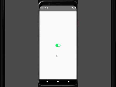
Switch Component
The Switch component is compatible with both iOS and Android. The steps to include it in your React Native project are outlined below.
Dependencies
To use the Switch component, you need to install the following dependencies:
react-native-reanimated: For animations and transitions in the Switch.react-native: The core library for building your React Native app.
You can install these dependencies using npm or yarn.
UI and Using
Get Started
Follow these steps to include the Switch component in your project:
- Install the necessary dependency:
First, you need to add the react-native-switch-component package to your project. This package helps you manage animations.
npm i react-native-switch-componentor
yarn add react-native-switch-component- Usage with Default Values:
const App = () => {
  return (
    <Switch />
  );
};
export default App;- Usage with Customized Values:
const App = () => {
  return (
    <Switch
      activeIconColor="white"
      activeBgColor="#02D95A"
      passiveIconColor="white"
      passiveBgColor="lightgray"
      dumping={20}
      startPosition={0}
      endPosition={20}
    />
  );
};
export default App;
Customizable Switch Component
This Switch component allows for extensive customization, including the ability to modify icon colors, background colors, animations, and more. You can also personalize its appearance with additional styling properties for the Switch, container, and inner box.
Props
| Property | Type | Default | Description |
|------------------------|-------------------------------|------------|-----------------------------------------------------------------------------|
| activeIconColor | string | white | Defines the color of the icon when the Switch is active. |
| activeBgColor | string | #02D95A | Defines the background color when the Switch is active. |
| passiveIconColor | string | white | Defines the color of the icon when the Switch is passive. |
| passiveBgColor | string | lightgray| Defines the background color when the Switch is passive. |
| dumping | number | 20 | Controls the speed (slowing down) of the animation. |
| startPosition | number | 0 | Defines the starting position of the Switch's movement. |
| endPosition | number | 20 | Defines the ending position of the Switch's movement. |
| style | StyleProp<ViewStyle> | undefined| Allows customization of the Switch component's overall style. |
| styleBoxContainer | StyleProp<ViewStyle> | undefined| Enables customization of the container's style surrounding the Switch. |
| styleBox | StyleProp<ViewStyle> | undefined| Allows you to style the inner box or the toggle itself within the Switch. |
Customization
With the new style, styleBoxContainer, and styleBox properties, you can fully customize the appearance of the Switch component, its container, and the inner box, allowing it to fit seamlessly into your app's design.
Example
<Switch
  activeIconColor="blue"
  activeBgColor="green"
  passiveIconColor="gray"
  passiveBgColor="lightgray"
  dumping={20}
  startPosition={0}
  endPosition={20}
  style={{ flex:1, justifyContent: 'center', alignItems: 'center' }}
  styleBoxContainer={{ width: 20, height: 20 }}
  styleBox={{ borderRadius: 10 }}
/>