
react-native-tcharts
v1.8.0
Published
基于ART的react native图表组件库
Downloads
56
Maintainers
 lexiao
Readme
简介
react-native-tcharts是基于react native ART的图表组件库,完全跨平台,无依赖
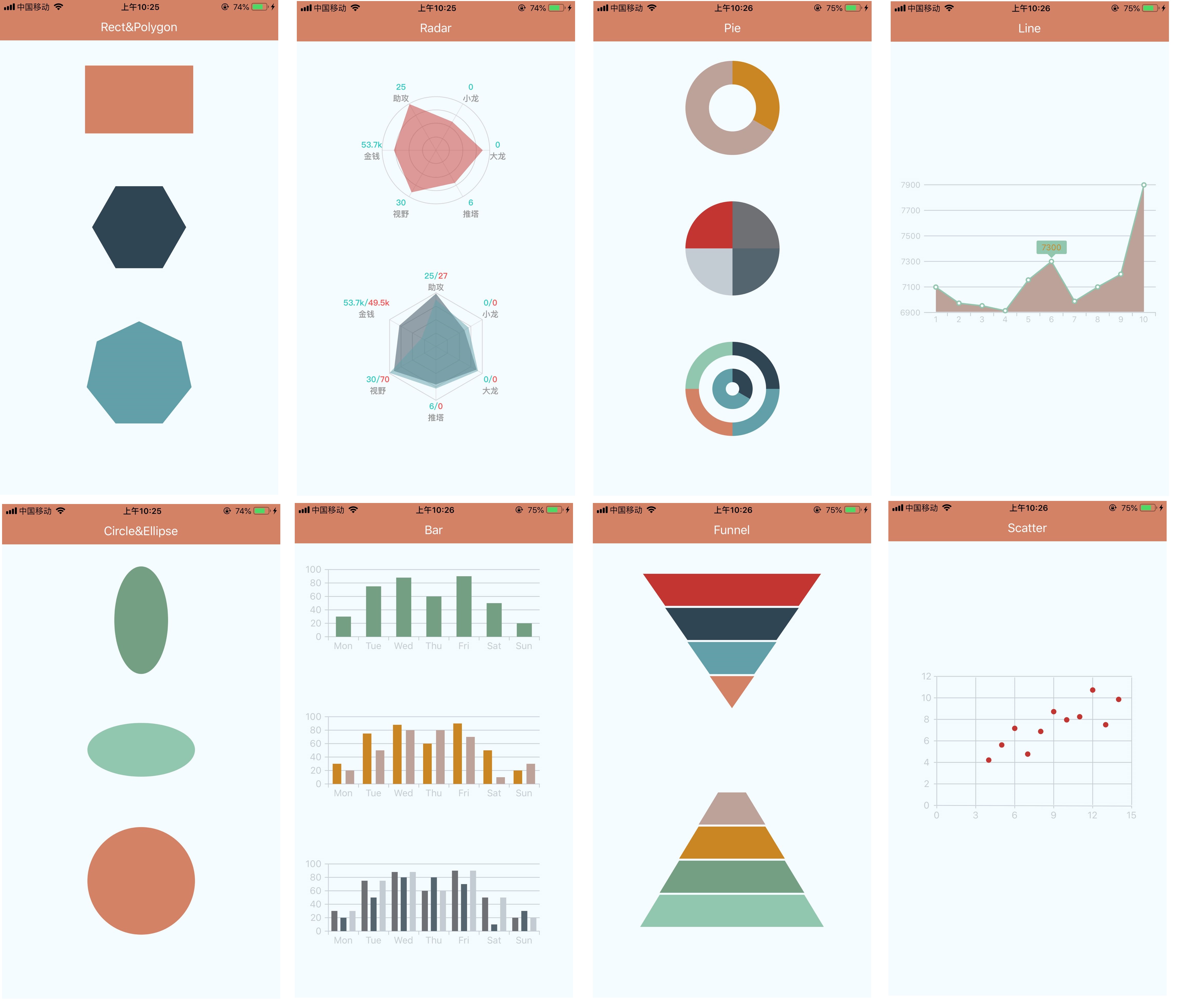
组件列表
安装
$ npm install react-native-tcharts --save
使用
import {Rect, Polygon, Circle, Ellipse, Radar, Pie, Line, Bar, Scatter, Funnel} from 'react-native-tcharts'
Class Demo extends Component{
    render{
        return (<View>
            <Rect style={} width={} height={} option={} />
            <Polygon style={} width={} height={} option={} />
            <Circle style={} width={} height={} option={} />
            <Ellipse style={} width={} height={} option={} />
            <Radar style={} width={} height={} option={} />
            <Pie style={} width={} height={} option={} />
            <Line style={} width={} height={} option={} />
            <Bar style={} width={} height={} option={} />
            <Scatter style={} width={} height={} option={} />
            <Funnel style={} width={} height={} option={} />
        </View>)
    }
}
图例
通用属性
- style(object):同react native 组件style,会直接透传到组件容器元素上.
- width (number): 组件宽度,不传默认手机屏幕宽度.
- height (number): 组件高度,不传默认200
- option (object): 组件配置项,详情请点击各组件查看文档或直接查看example目录下对应的示例.
组件参数
1.Rect
- option
| Props | Type | Required | Description | | :- | :- | :- | :- | | width | Number | No |正方形/长方形宽度| | height | Number | No |正方形/长方形高度| | strokeWidth| Number | No |边框宽度| |stroke|Color|No|边框色值| |fill|Color|No|填充色|
- demo
const option = {
    strokeWidth: 0,
    stroke: '#fff',
    fill: '#000',
    width: 160,
    height: 100
};
2.Polygon
- option
|Props|Type|Required|Description| | :- | :- | :- | :- | |width|Number|No|多边形宽| |height|Number|No|多边形高| |strokeWidth|Number|No|边框宽度| |stroke|Color|No|边框颜色| |fill|Color|No|填充色| |lineNumber|Number|No|多边形边的个数| |startAngle|Number|No|起始角度,默认x轴正向,正值为逆时针方向|
- demo
const option = {
    radius: 70,
    startAngle: 0,
    lineNumber: 6,
    fill: '#fff',
    strokeWidth: 0,
    stroke: '#000'
};
3.Circle
- option
|Props|Type|Required|Description| | :- | :- | :- | :- | |strokeWidth|Number|No|边框宽度| |stroke|Color|No|边框颜色| |fill|Color|No|填充色| |r|Number|No|半径|
- demo
const option = {
    r: 80,
    fill: '#fff',
    strokeWidth: 2,
    stroke: '#000'
}
4.Ellipse
- option
|Props|Type|Required|Description| | :- | :- | :- | :- | |strokeWidth|Number|No|边框宽度| |stroke|Color|No|边框颜色| |fill|Color|No|填充色| |rx|Number|No|短边半径| |ry|Number|No|长边半径|
- demo
const option = {
    rx: 40,
    ry: 80,
    fill: '#fff',
    strokeWidth: 2,
    stroke: '#000'
}
5.Radar
- option
|Props|Type|Required|Description| | :- | :- | :- | :- | |r|Number|No|雷达图半径| |splitNumber|Number|No|雷达图轴线数量| |shape|String|No|雷达图形状[polygon/circle],默认polygon| |startAngle|Number|No|雷达图起始角度,默认x轴正向,正值为逆时针旋转| |indicator|Array|No|轴线文案,最大值,文案颜色,数组长度即为轴线数量| |axisLine|Object|No|轴线配置,是否显示以及轴线样式| |rich|Object|No|轴线文案定制化设置,包括多颜色以及换行| |series|Array|No|雷达图数据|
- demo
const option = {
    r: 80,
    splitNumber: 5,
	shape: 'polygon',
	startAngle: 0,
	indicator: [{
		text: '{a:v1}{b:v2}{c:v3}',
		max: 100,
        min: 0,
		color: '#000'
	}, {
		text: '{a:v1}{b:v2}{c:v3}',
		max: 100,
        min: 0,
		color: '#000'
	}, {
		text: '{a:v1}{b:v2}{c:v3}',
		max: 100,
        min: 0,
		color: '#000'
	}, {
		text: '{a:v1}{b:v2}{c:v3}',
		max: 100,
        min: 0,
		color: '#000'
	}],
	axisLine: {
		show: true,
		lineStyle: {
			color: '#000'
		}
	},
	rich: {
        a: {
            color: '#2dcbc3',
            fontSize: 12,
            textAlign: 'center',
            textAlignVertical: 'center',
            fontFamily: "PingFangSC-Medium",
            fontWeight: 'bold'
        },
        b: {
            color: '#f55353',
            fontSize: 12,
            textAlign: 'center',
            textAlignVertical: 'center',
            fontFamily: "PingFangSC-Medium",
            fontWeight: 'bold'
        },
        c: {
            color: "#999999",
            fontSize: 12,
            textAlign: 'center',
            textAlignVertical: 'center',
            fontFamily: "PingFangSC-Medium",
            fontWeight: 'bold'
        }
	},
	series: [{
		data: [20, 50, 80, 100],
		itemStyle: {
            color: '#000'
        },
		lineStyle: {
            color: '#000'
        },
		areaStyle: {
            color: '#000'
        }
	}]
}
6.Pie
- option
|Props|Type|Required|Description| | :- | :- | :- | :- | |color|Array|No|饼图颜色| |series|Array|No|饼图数据|
- demo
const option2 = {
    title: {},
    legend: {},
    color: ['#000', '#001', '#002', '#003'],
    series:[{
        name: '',
        type: 'pie',
        radius: [60,80], //饼图半径暂支持数字
        data: [10,10, 10, 10], //饼图占用数据
    },{
        name: '',
        type: 'pie',
        radius: [20,40],
        data: [10,20],
    }]
}
7.Line
- option
|Props|Type|Required|Description| | :- | :- | :- | :- | |xAxis|Object|No|x轴信息| |yAxis|Object|No|y轴信息| |series|Array|No|折线图数据|
- demo
const option = {
    xAxis: {
        name: 'test',
        nameStyle: {
            color: '#000',
            fontSize: 12
        },
        lineStyle: {
            color: '#999'
        },
        textStyle: {
            color: '#999',
            fontSize: 12
        },
        gridLine: {
            lineStyle: {
                color: '#999'
            }
        },
        axisTick: {
            show: true,
            lineStyle: {
                color: '#999'
            }
        },
        min: 0,
        max: 100,
        interval: 20,
        data: [1, 2, 3, 4, 5, 6, 7, 8, 9, 10]
    },
    yAxis: {
        name: '',
        nameStyle: {
            color: '#aaa',
            fontSize: 12
        },
        lineStyle: {
            color: '#999'
        },
        textStyle: {
            color: '#999',
            fontSize: 12
        },
        gridLine: {
            lineStyle: {
                color: '#999'
            }
        },
        axisTick: {
            show: true,
            lineStyle: {
                color: '#aaa'
            }
        },
        interval: 200,
        min: 6900,
        max: 7900,
        data: []
    },
    series: [{
        data: [7099, 6973, 6953, 6914, 7155, 7300, 6988, 7100, 7200, 7899],
        pointer: {
            itemStyle: {
                color: '#aaa',
                fill: '#fff'
            },
            radius: 3
        },
        tip: {
            itemStyle: {
                backgroundColor: '#aaa',
                color: '#aaa',
                fontSize: 12
            }
        },
        lineStyle: {
            color: '#aaa',
            fill: '#aaa'
        }
    }]
}
8.Bar
- option
|Props|Type|Required|Description| | :- | :- | :- | :- | |xAxis|Object|No|x轴信息| |yAxis|Object|No|y轴信息| |series|Array|No|柱状图数据|
- demo
const option = {
    xAxis: {
        name: '',
        lineStyle: {//轴线相关配置
            color: '#000'
        },
        axisTick: {//刻度相关配置
            show: true,
            lineStyle: {
                color: '#000'
            }
        },
        textStyle: {
            color: '#000'
        },
        min: 0,
        max: 100,
        interval: 20,
        data: ['Mon', 'Tue', 'Wed', 'Thu', 'Fri', 'Sat', 'Sun']
    },
    yAxis: {
        name: '',
        lineStyle: {
            color: '#000'
        },
        axisTick: {
            show: true,
            lineStyle: {
                color: '#000'
            }
        },
        textStyle: {
            color: '#000'
        },
        gridLine: {
            show: true,
            lineStyle: {
                color: '#000'
            }
        },
        min: 0,
        max: 100,
        interval: 20
    },
    series: [{
        data: [30, 75, 88, 60, 90, 50, 20],
        itemStyle: {
            color: '#666',
            opacity: 1
        }
    }, {
        data: [20, 50, 80, 80, 70, 10, 30],
        itemStyle: {
            color: '#666',
            opacity: 1
        }
    }]
};
9.Scatter
- option
|Props|Type|Required|Description| | :- | :- | :- | :- | |xAxis|Object|No|x轴信息| |yAxis|Object|No|y轴信息| |series|Array|No|散点图数据|
- demo
const option = {
    xAxis: {
        lineStyle: {
            color: '#222'
        },
        textStyle: {
            color: '#222',
            font: 10
        },
        gridLine: {
            isShow: true,
            lineStyle: {
                color: '#222'
            }
        },
        min: 0,
        max: 100,
        interval: 20,
        data: [0,3,6,9,12,15]
    },
    yAxis: {
        lineStyle: {
            color: '#222'
        },
        textStyle: {
            color: '#222',
            font: 10
        },
        gridLine: {
            isShow: true,
            lineStyle: {
                color: '#222'
            }
        },
        min: 0,
        max: 100,
        interval: 20,
        data: [0,2,4,6,8,10,12]
    },
    series: [{
        data: [
            [10.0, 8.04],
            [8.0, 6.95],
            [13.0, 7.58],
            [9.0, 8.81],
            [11.0, 8.33],
            [14.0, 9.96],
            [6.0, 7.24],
            [4.0, 4.26],
            [12.0, 10.84],
            [7.0, 4.82],
            [5.0, 5.68]
        ],
        radius: 4,
        itemStyle: {
            color: '#333',
            opacity: 1
        }
    }]
};
10.Funnel
- option
|Props|Type|Required|Description| | :- | :- | :- | :- | |color|Array|No|漏斗图颜色数组| |series|Array|No|漏斗图数据|
- demo
const option = {
    title: '漏斗图',
    legend: {},
    color: ['#000', '#111', '#222', '#333'],
    series: [{
        name: '漏斗图',
        type: 'funnel',
        min: 0,
        max: 100, //设置漏斗的最小和最大值
        minSize: '0%', //漏斗的最小和最大尺寸
        maxSize: '80%',
        height: 200,
        gap: 3, //漏斗间隔
        funnelAlign: 'center', //对齐方式
        sort: 'descending',//漏斗顺序[descending|ascending]
        label: {
            show: true,
            fontSize: 12,
            color: '#fff'//用来显示标注字体样式的
        },
        data: [{
            value: 20,
            name: '一季度'
        }, {
            value: 40,
            name: '一季度'
        }, {
            value: 60,
            name: '二季度'
        }, {
            value: 80,
            name: '三季度'
        }]
    }]
}
License
react-native-tcharts is released under the MIT license.