
react-number-format-datagrid-stable-version
v4.9.4
Published
React component to format number in an input or as a text.
Maintainers
 srikanthagrya
Readme
react-number-format
React component to format number in an input or as a text
Features
- Prefix, suffix and thousand separator.
- Custom format pattern.
- Masking.
- Custom formatting handler.
- Format number in an input or format as a simple text.
Install

Through npm
npm install react-number-format --save
Or get compiled development and production version from ./dist
Usage
ES6
import NumberFormat from 'react-number-format';ES5
const NumberFormat = require('react-number-format');Typescript
import NumberFormat from 'react-number-format';
//or
import { default as NumberFormat } from 'react-number-format';
In typescript you also have to enable "esModuleInterop": true in your tsconfig.json (https://www.typescriptlang.org/docs/handbook/compiler-options.html).
Props
| Props | Options | Default | Description |
| ------------------------ | --------------------------------------------------------------------- | -------- | ---------------------------------------------------------------------------------------------------------------------------------------------------------------------------------------------------------------------------------- |
| thousandSeparator | mixed: single character string or boolean true (true is default to ,) | none | Add thousand separators on number. |
| decimalSeparator | single character string | . | Support decimal point on a number. |
| thousandsGroupStyle | One of ['thousand', 'lakh', 'wan'] | thousand | Define the thousand grouping style, It support three types. thousand style (thousand) : 123,456,789, indian style (lakh) : 12,34,56,789, chinese style (wan) : 1,2345,6789. |
| decimalScale | number | none | If defined it limits to given decimal scale. |
| fixedDecimalScale | boolean | false | If true it add 0s to match given decimalScale. |
| allowNegative | boolean | true | allow negative numbers (Only when format option is not provided). |
| allowEmptyFormatting | boolean | false | Apply formatting to empty inputs. |
| allowLeadingZeros | boolean | false | Allow leading zeros at beginning of number. |
| prefix | String (ex : $) | none | Add a prefix before the number. |
| suffix | String (ex : /-) | none | Add a suffix after the number. |
| value | Number or String | null | Value to the number format. It can be a float number, or formatted string. If value is string representation of number (unformatted), isNumericString props should be passed as true. |
| defaultValue | Number or String | null | Value to be used as default value if value is not provided. The format of defaultValue should be similar as defined for the value. |
| isNumericString | boolean | false | If value is passed as string representation of numbers (unformatted) then this should be passed as true. |
| displayType | String: text / input | input | If input it renders a input element where formatting happens as you input characters. If text it renders it as a normal text in a span formatting the given value. |
| type | One of ['text', 'tel', 'password'] | text | Input type attribute. |
| format | String : Hash based ex (#### #### #### ####) Or Function | none | If format given as hash string allow number input inplace of hash. If format given as function, component calls the function with unformatted number and expects formatted number. |
| removeFormatting | (formattedValue) => numericString | none | If you are providing custom format method and it add numbers as format you will need to add custom removeFormatting logic. |
| mask | String (ex : _) | ' ' | If mask defined, component will show non entered placed with masked value. |
| customInput | Component Reference | input | This allow supporting custom inputs with number format. |
| onValueChange | (values, sourceInfo) => {} | none | onValueChange handler accepts values object. |
| isAllowed | (values) => true or false | none | A checker function to check if input value is valid or not. If this function returns false, the onChange method will not get triggered. |
| renderText | (formattedValue, customProps) => React Element | null | A renderText method useful if you want to render formattedValue in different element other than span. It also returns the custom props that are added to the component which can allow passing down props to the rendered element. |
| getInputRef | (elm) => void | null | Method to get reference of input, span (based on displayType prop) or the customInput's reference. See Getting reference. |
| allowedDecimalSeparators | array of char | none | Characters which when pressed result in a decimal separator. When missing, decimal separator and '.' are used. |
| customNumerals | array of string | none | an array of 10 single-character strings with represent numerals in different locales. ranging from 0 - 9. the result will be converted to english numeral and treated as number |
Other than this it accepts all the props which can be given to a input or span based on displayType you selected.
values object
values object is on following format
{
  formattedValue: '$23,234,235.56', //value after applying formatting
  value: '23234235.56', //non formatted value as numeric string 23234235.56, if you are setting this value to state make sure to pass isNumericString prop to true
  floatValue: 23234235.56 //floating point representation. For big numbers it can have exponential syntax
}
Its recommended to use formattedValue / value / floatValue based on the initial state (it should be same as the initial state format) which you are passing as value prop. If you are saving the value key on state make sure to pass isNumericString prop to true.
Notes and quirks
Value can be passed as string or number, but if it is passed as string it should be either formatted value or if it is a numeric string, you have to set isNumericString props to true.
Value as prop will be rounded to given decimal scale if format option is not provided.
If you want to block floating number set decimalScale to 0.
Use type as tel when you are providing format prop. This will change the mobile keyboard layout to have only numbers. In other case use type as text, so user can type decimal separator.
onChange no longer gets values object. You need to use onValueChange instead. onChange/onFocus/onBlur and other input events will be directly passed to the input.
Its recommended to use formattedValue / value / floatValue based on the initial state (it should be same as the initial state format) which you are passing as value prop. If you are saving the
valuekey on state make sure to pass isNumericString prop to true.onValueChange is not same as onChange. It gets called on whenever there is change in value which can be caused by any event like change or blur event or by a prop change. It also provides a second argument which contains the event object and the reason for this function trigger.
Examples
Prefix and thousand separator : Format currency as text.
var NumberFormat = require('react-number-format');

<NumberFormat value={2456981} displayType={'text'} thousandSeparator={true} prefix={'$'} />;
Output : $2,456,981
Custom renderText method.
var NumberFormat = require('react-number-format');

<NumberFormat
  value={2456981}
  className="foo"
  displayType={'text'}
  thousandSeparator={true}
  prefix={'$'}
  renderText={(value, props) => <div {...props}>{value}</div>}
/>;
Output : <div class="foo"> $2,456,981 </div>
Format with pattern : Format credit card as text.
<NumberFormat value={4111111111111111} displayType={'text'} format="#### #### #### ####" />Output : 4111 1111 1111 1111
Prefix and thousand separator : Format currency in input.
<NumberFormat thousandSeparator={true} prefix={'$'} />
Indian(lakh) style and chinese(wan) style number grouping.
Indian (lakh) style grouping
<NumberFormat thousandSeparator={true} thousandsGroupStyle="lakh" prefix={'₹'} value={123456789} />Output: ₹12,34,56,789
Chinese (wan) style grouping.
<NumberFormat thousandSeparator={true} thousandsGroupStyle="wan" prefix={'¥'} value={123456789} />Output: ¥1,2345,6789
Maintaining change value on state
<NumberFormat
  value={this.state.profit}
  thousandSeparator={true}
  prefix={'$'}
  onValueChange={(values) => {
    const { formattedValue, value } = values;
    // formattedValue = $2,223
    // value ie, 2223
    this.setState({ profit: formattedValue });
  }}
/>
Accessing event and the source for onValueChangeTrigger
<NumberFormat
  value={this.state.profit}
  thousandSeparator={true}
  prefix={'$'}
  onValueChange={(values, sourceInfo) => {
    const { formattedValue, value } = values;
    // Event is a Synthetic Event wrapper which holds target and other information. Source tells whether the reason for this function being triggered was an 'event' or due to a 'prop' change
    const { event, source } = sourceInfo;
  }}
/>
Format with pattern : Format credit card in an input.
<NumberFormat format="#### #### #### ####" />
Format with mask : Format credit card in an input
<NumberFormat format="#### #### #### ####" mask="_" />
Format with mask as array
Mask can also be a array of string. Each item corresponds to the same index #.
<NumberFormat format="##/##" placeholder="MM/YY" mask={['M', 'M', 'Y', 'Y']} />
Custom format method : Format credit card expiry time
function limit(val, max) {
  if (val.length === 1 && val[0] > max[0]) {
    val = '0' + val;
  }

  if (val.length === 2) {
    if (Number(val) === 0) {
      val = '01';

      //this can happen when user paste number
    } else if (val > max) {
      val = max;
    }
  }

  return val;
}

function cardExpiry(val) {
  let month = limit(val.substring(0, 2), '12');
  let year = val.substring(2, 4);

  return month + (year.length ? '/' + year : '');
}

<NumberFormat format={cardExpiry} />;
Format phone number
<NumberFormat format="+1 (###) ###-####" mask="_" />
Custom Numeral
const persianNumeral = ['۰', '۱', '۲', '۳', '۴', '۵', '۶', '۷', '۸', '۹']
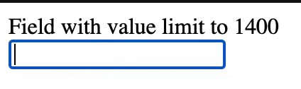
<NumberFormat customNumerals={persianNumeral} />;Limit input value to a maximum limit
const MAX_VAL = 1400;
const withValueLimit = ({ floatValue }) => floatValue <= MAX_VAL;
<NumberFormat value={12} isAllowed={withValueLimit} />;
It is sensible to use floatValue in the withValueLimit check because it provides the exact value (see values object). value is rounded to your configured decimalScale; hence it may omit a part of the precision of the actual value. Given an entered value of 1400.4 and the default decimalScale, value would be transferred as 1400 in the values object and pass the above withValueLimit check. In this case, it is a false positive that can be prevented using floatValue. However, you might want to use value to automatically get the rounded number according to your decimalScale.
Visit this link for Demo: Field with value limit
Show mask on empty input
<NumberFormat format="+1 (###) ###-####" allowEmptyFormatting mask="_" />
Custom Inputs
You can easily extend your custom input with number format. But custom input should have all input props.
import TextField from 'material-ui/TextField';<NumberFormat customInput={TextField} format="#### #### #### ####" />
Passing custom input props All custom input props and number input props are passed together.
<NumberFormat
  hintText="Some placeholder"
  value={this.state.card}
  customInput={TextField}
  format="#### #### #### ####"
/>
Getting reference
As ref is a special property in react, its not passed as props. If you add ref property it will give you the reference of NumberFormat instance. In case you need input reference. You can use getInputRef prop instead.
<NumberFormat
  getInputRef={(el) => (this.inputElem = el)}
  customInput={TextField}
  format="#### #### #### ####"
/>
Or using React.createRef()
const inputRef = React.createRef();
<NumberFormat getInputRef={inputRef} customInput={TextField} format="#### #### #### ####" />;
In case you have provided custom input you can pass there props to get the input reference (getInputRef will not work in that case). For ex in material-ui component.
<NumberFormat
  inputRef={(el) => (this.inputElem = el)}
  customInput={TextField}
  format="#### #### #### ####"
/>
If you can't get in both way you can try ReactDOM.findDOMNode. You may need to traverse if input is not the top level element.
<NumberFormat
  ref={(inst) => (this.inputElem = ReactDOM.findDOMNode(inst))}
  format="#### #### #### ####"
/>
Live Demo
http://codepen.io/s-yadav/pen/bpKNMa
Show your support
Migrate v2 to v3
Updates
For regular updates follow me on _syadav
Major updates
v4.0.0
Breaking Changes
- onValueChange no longer receives event object as second parameter, so if you accessing it, it will break.
Feature Addition
- Support defaultValue prop.
- Trigger onValueChange if the value is formatted due to prop change.
- Allow password as type prop.
- Support indian (lakh) and chinese (wan) style thousand grouping.
- Always allow . to be typed as decimal separator, even when decimal separator is defined differently
v3.0.0
- onChange no longer gets values object. You need to use onValueChange instead. This is done because formatted value may change on onBlur event. calling onChange on onBlur doesn't feel right.
- decimalPrecision is changed to decimalScale. Precision is the number of digits in a number. Scale is the number of digits to the right of the decimal point in a number.
- decimalScale by default will not add 0s to match provided decimalScale value like decimalPrecision. You have to set fixedDecimalScale to true.
- mask can be now array of string in which case mask at specific index will be mapped with the # of the pattern.
- Value can be passed as string or number, but if it is passed as string it should be either formatted value or if it is a numeric string, you have to set isNumericString props to true.
- Added support for numbers in prefix / suffix / pattern.
- Fixed caret position and formatting issues.
- Lot of bugs and stability fixes (See release notes)
v2.0.0
- Added isAllowed prop to validate custom input and reject input based on it.
- onChange api been changed. Now it receives values object as second parameter.
- decimalSeparator no longer support boolean values
- thousandSeparator accepts only true as boolean (which defaults to ,) or thousandSeparator string
- decimalPrecision only accepts number now
- Value can be passed as string or number but if it is passed as string you should maintain the same decimal separator on the string what you provided as decimalSeparator prop.
- Added back the type prop for the input type attribute (Only text or tel is supported)
- Enforce cursor to be between prefix and suffix in focus, click or arrow navigation.
- Lot of bugs and stability fixes (See release notes)
Development
- Clone the repository or download the zip
npm i -g yarnto download Yarnyarnto install dependenciesyarn startto run example server (http://localhost:8084/)yarn testto test changesyarn bundleto bundle files
Testing
Test cases are written in jasmine and run by karma
Test file : /test/test_input.js
To run test : yarn test