
react-number-pin-keypad
v1.0.12
Published
A customizable React keypad component

Readme
React Number Pin Keypad
A customizable React keypad component styled with Tailwind CSS. This package provides a simple and flexible keypad that can be easily integrated into your React applications.
Features
- Responsive design
- Customizable styling with Tailwind CSS
- Support for numbers and decimal point
- Backspace functionality
- Pin input mode with a hidden input display
- Easy to integrate and use
Demo
Keypad demo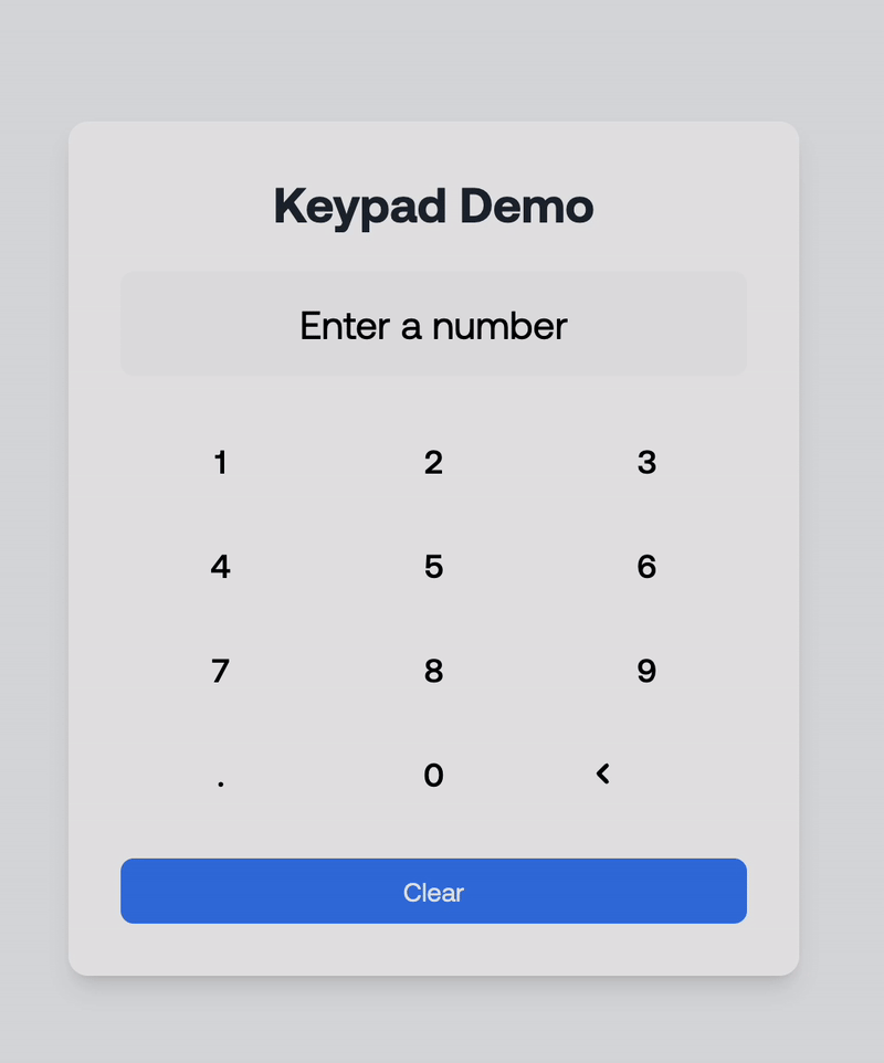
Pin demo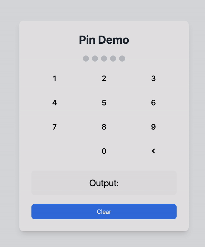
You can find a demo in the example folder of the GitHub repository. A redirect link is provided at the bottom of this README.
Here's a quick demonstration of how the React Number Pin Keypad works:
Installation
To install the package, run the following command in your project directory:
npm install react-number-pin-keypadUsage
Here's an example of how to use the react-number-pin-keypad in a React application:
Example Code
import React, { useState } from 'react';
import { Keypad } from 'react-number-pin-keypad';

const KeypadDemo: React.FC = () => {
  const [input, setInput] = useState<string>('');

  const handleKeyPress = (key: string) => {
    setInput((prevInput) => prevInput + key);
  };

  const handleBackspace = () => {
    setInput((prevInput) => prevInput.slice(0, -1));
  };

  return (
    <div>
      <div className="mb-4 text-center">
        <input
          type="text"
          value={input}
          readOnly
          className="border px-4 py-2 text-center"
        />
      </div>
      <Keypad
        onKeyPress={handleKeyPress}
        onBackspace={handleBackspace}
        className="mx-auto"
      />
    </div>
  );
};

export default KeypadDemo;
Explanation of Props
onKeyPress: A callback function triggered when a numeric or decimal key is pressed. Receives the pressed key as an argument.onBackspace: A callback function triggered when the backspace key is pressed.className: Optional. Additional CSS classes for custom styling.type: Determines the mode of the keypad.'default': Standard keypad with numbers and a decimal point.'pin': Pin input mode with a hidden input display. The decimal point is hidden in this mode.
maxLength: (Optional) The maximum number of characters for pin input. Default is 4.hiddenInputClassName: (Optional) Additional CSS classes for customizing the hidden input container in pin mode.hiddenInputDotClassName: (Optional) Additional CSS classes for customizing the dots displayed in the hidden input for pin mode.
Customization
You can use Tailwind CSS classes to customize the appearance of the keypad. Add your own classes to the Keypad component using the className prop for flexibility. You can also style the hidden input and its dots when using the pin type by leveraging the hiddenInputClassName and hiddenInputDotClassName props.
GitHub Repository
Find the source code and contribute to this project on GitHub: