
react-number-rating
v0.1.10
Published
Lightweight and customizable rating component for React apps. Supports numeric and color-coded scales from 1 to 10.
Maintainers
 rajkumar4221
Readme
🔢 Priority Numeric Rating
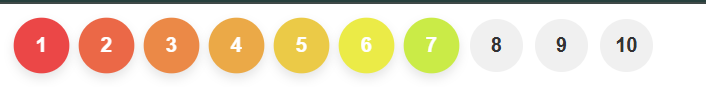
A flexible, colorful, and customizable React numeric rating component. Ideal for rating task priority, level difficulty, or anything that needs a numbered scale from 1 to 100 — with vibrant color transitions from 🔴 Red (High Priority) to 🟢 Green (Low Priority).
🚀 Live Demo
Try it now on CodeSandbox
🚀 Features
- 🔢 Numeric rating from 1 to 100+
- 🎨 Automatic red → green color gradient
- 🌈 Custom background colors per level
- 🎯 Optional text color override
- 📱 Mobile-friendly with optional scrolling
- 🧩 Customizable styling for buttons and container
- 🛑 Read-only mode for view-only usage
📦 Installation
npm install react-number-rating🧪 Basic Usage
import React, { useState } from "react";
import PriorityRating from "react-number-rating";

export default function App() {
  const [priority, setPriority] = useState(5);

  return (
    <PriorityRating
      max={10}
      value={priority}
      name="priority"
      onChange={(val) => setPriority(val)}
    />
  );
}
🎛️ Props
| Prop | Type | Default | Description |
| -------------- | ---------- | ---------- | ------------------------------------------ |
| max | number | 10 | Total rating steps (up to 200) |
| value | number | 0 | Selected rating value |
| name | string | "rating" | Field name identifier |
| onChange | function | - | Callback (value, name) on change |
| readonly | boolean | false | Disables button clicks |
| colors | array | [] | Override background colors |
| textColor | string | "#fff" | Text color for selected buttons |
| buttonStyle | object | {} | Custom CSS for each button |
| wrapperStyle | object | {} | Custom CSS for wrapper container |
| scrollable | boolean | true | Enables horizontal scroll for large scales |
🎨 Examples
- 🔧 Custom Styles + Colors
<PriorityRating
  max={15}
  value={priority}
  name="taskPriority"
  onChange={(val) => setPriority(val)}
  colors={["#ff0000", "#ff6600", "#ffcc00", "#ccff33", "#66ff66"]}
  textColor="#000"
  buttonStyle={{ borderRadius: "8px", fontSize: "14px" }}
  wrapperStyle={{ justifyContent: "flex-start" }}
/>
- 📱 Scrollable UI (50+ Buttons)
<PriorityRating max={75} value={32} scrollable={true} />
- 👀 Read-only Mode
<PriorityRating value={8} readonly={true} />
✅ Conclusion
priority-numeric-rating is a simple yet powerful numeric rating component tailored for task priority, difficulty scaling, or feedback systems. With built-in support for color gradients, full customization, and high scalability (1–100+ values), it helps developers quickly add a clean and user-friendly experience to their React apps.
Whether you're building a project manager, feedback form, quiz app, or gamified tool, this component lets users visually rank items with ease.
🔧 Lightweight. 🎨 Beautiful. ⚙️ Flexible.
👨💻 Author
Rajkumar — Software Engineer- Full Stack Developer
💖 Sponsor This Project
If you find my work helpful or want to support my efforts, consider sponsoring me. Your support helps me stay motivated and continue building open-source tools that benefit the developer community.
🙌 Ways to Sponsor
💜 GitHub Sponsor
Become a Sponsor on GitHub☕ Buy Me a Coffee
Support via Buy Me a Coffee
Every contribution, big or small, makes a difference. Thank you for your support! 🚀