
react-overflow-tabs
v1.1.3
Published
Headless React hook for responsive tabs that collapse into a "More" dropdown when space runs out. Under 1 kB, works with Tailwind, Bootstrap, MUI or any CSS.

Maintainers
 bawerbozdag
Keywords
Readme
react-overflow-tabs
Responsive React tabs that collapse into a "More" dropdown when space runs out.
react-overflow-tabs is a tiny, headless React hook that tells you which tabs fit in their container and which ones don't. You render the tabs however you like. The hook watches their visibility, and you move the hidden ones into an overflow menu. It works with Tailwind, Bootstrap, MUI, shadcn/ui, or plain CSS, and adds no styles or markup of its own.





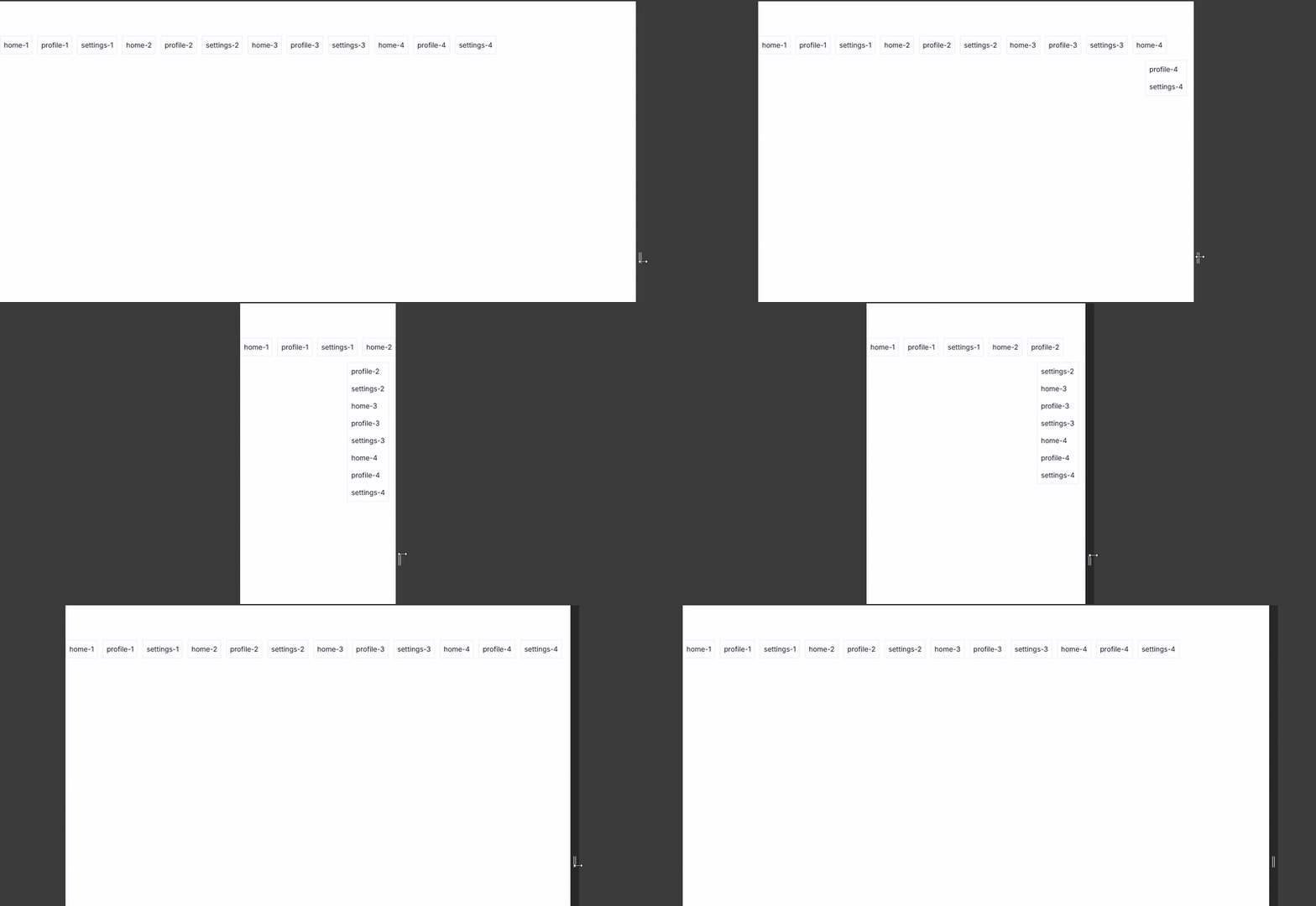
Table of contents
- Why react-overflow-tabs?
- Features
- Installation
- Quick start
- How it works
- Examples
- API reference
- FAQ
- Contributing
- License
Why react-overflow-tabs?
A tab bar looks great on a wide screen. Then someone opens your app on a laptop, drags the sidebar open, or adds a tenth tab, and the row either wraps onto two lines or runs off the edge.
The usual fix is the "priority+" navigation pattern: show as many tabs as fit and move the rest into a "More" menu. It sounds simple, but doing it by hand means measuring widths, listening to resize events, handling fonts that load late, and recalculating whenever tabs change.
This hook does the measuring for you and hands back two lists: visibleKeys and overflowKeys. Rendering, styling and accessibility stay in your hands, so it fits into any design system instead of fighting it.
Good fits:
- Tab bars and segmented controls in dashboards and admin panels
- Horizontal navigation menus and navbars
- Toolbars with many actions
- Breadcrumbs, filter chips and step indicators
Features
- Headless. No CSS, no components, no opinions about markup. You render everything.
- Automatically responsive. Uses
IntersectionObserverto detect overflow, so there are no resize listeners or width math. - Works with dynamic tabs. Tabs added, removed, reordered or renamed after mount are picked up automatically.
- Tiny. Under 1 kB gzipped, zero dependencies, tree-shakeable.
- Fits any UI library. Tailwind CSS, Bootstrap, Material UI (MUI), Chakra, shadcn/ui, CSS Modules, styled-components.
- TypeScript first. Fully typed and ships ESM and CommonJS builds.
- SSR safe. Works with Next.js, Remix and other server-rendering setups.
- RTL ready. It only tracks visibility, so right-to-left layouts work without extra config.
Installation
npm install react-overflow-tabsyarn add react-overflow-tabspnpm add react-overflow-tabsRequires React 18 or 19 as a peer dependency.
Quick start
- Put a
refon the element that holds your tabs and give itoverflow: hidden. - Add a
data-overflow-keyattribute with a unique value to each tab. - Hide overflowing tabs with
visibility: hiddenand list them in your "More" menu.
import { useRef } from "react";
import { useOverflowTabs } from "react-overflow-tabs";

const TABS = ["Overview", "Analytics", "Reports", "Customers", "Products", "Orders", "Invoices", "Settings"];

export function TabBar() {
    const containerRef = useRef<HTMLDivElement>(null);
    const { overflowKeys, isOverflowing } = useOverflowTabs({ container: containerRef });

    return (
        <nav style={{ display: "flex", alignItems: "center", gap: 8 }}>
            {/* the observed container: tabs that don't fully fit here are reported as overflowing */}
            <div ref={containerRef} style={{ display: "flex", gap: 8, overflow: "hidden", flex: 1, minWidth: 0 }}>
                {TABS.map((tab) => (
                    <button
                        key={tab}
                        data-overflow-key={tab}
                        style={{
                            whiteSpace: "nowrap",
                            visibility: overflowKeys.includes(tab) ? "hidden" : "visible",
                        }}
                    >
                        {tab}
                    </button>
                ))}
            </div>

            {/* the "More" menu lives outside the container so it is never clipped */}
            {isOverflowing && (
                <details style={{ position: "relative" }}>
                    <summary>More ({overflowKeys.length})</summary>
                    <ul style={{ position: "absolute", right: 0, margin: 0, padding: 8, listStyle: "none" }}>
                        {overflowKeys.map((tab) => (
                            <li key={tab}>
                                <button style={{ whiteSpace: "nowrap" }}>{tab}</button>
                            </li>
                        ))}
                    </ul>
                </details>
            )}
        </nav>
    );
}
Resize the window and tabs move into the "More" menu one by one, then come back as space frees up.
[!IMPORTANT] Hide overflowing tabs with
visibility: hidden, notdisplay: noneorposition: absolute. The hook needs the tab to stay in the layout so it can tell when it fits again. A tab removed from the flow can never "come back".
How it works
- The hook finds every element inside your container that has the tab attribute (
data-overflow-keyby default). - An
IntersectionObserverwith the container as its root checks each tab. A tab counts as visible only when it is fully inside the container. The threshold is0.999, which tolerates sub-pixel rounding. - A
MutationObserverkeeps the list of tabs in sync when they are added, removed, reordered or re-keyed. - The result is published as
visibleKeysandoverflowKeys, always in DOM order. The component only re-renders when those keys actually change.
Because everything is driven by the browser's own observers, there is no polling, no resize listener and no layout thrashing.
Examples
Tailwind CSS
import { useRef } from "react";
import { useOverflowTabs } from "react-overflow-tabs";

const TABS = ["Overview", "Analytics", "Reports", "Customers", "Products", "Orders", "Invoices", "Settings"];

export function TabBar() {
    const containerRef = useRef<HTMLDivElement>(null);
    const { overflowKeys, isOverflowing } = useOverflowTabs({ container: containerRef });

    return (
        <nav className="flex items-center gap-2 border-b">
            <div ref={containerRef} className="flex min-w-0 flex-1 gap-2 overflow-hidden">
                {TABS.map((tab) => (
                    <button
                        key={tab}
                        data-overflow-key={tab}
                        className={`whitespace-nowrap px-3 py-2 ${overflowKeys.includes(tab) ? "invisible" : ""}`}
                    >
                        {tab}
                    </button>
                ))}
            </div>

            {isOverflowing && (
                <details className="relative">
                    <summary className="cursor-pointer px-3 py-2">More ({overflowKeys.length})</summary>
                    <ul className="absolute right-0 z-10 mt-1 rounded border bg-white py-1 shadow">
                        {overflowKeys.map((tab) => (
                            <li key={tab}>
                                <button className="w-full whitespace-nowrap px-4 py-2 text-left hover:bg-gray-100">
                                    {tab}
                                </button>
                            </li>
                        ))}
                    </ul>
                </details>
            )}
        </nav>
    );
}
Tailwind's invisible class sets visibility: hidden, which is exactly what the hook needs.
Custom tab attribute
Already using a data attribute on your tabs? Point the hook at it with tabSelector. Brackets are optional.
const { overflowKeys } = useOverflowTabs({
    container: containerRef,
    tabSelector: "data-tab", // or "[data-tab]"
});

// ...
<button data-tab="settings">Settings</button>;
tabSelector must be an attribute name. CSS selectors such as .tab or [data-x="1"] throw a descriptive error.
Turning tracking off
Pass disabled to pause overflow detection, for example on mobile where you'd rather let the tab bar scroll horizontally. While disabled, every tab is reported as visible.
const isMobile = useMediaQuery("(max-width: 640px)");

const { overflowKeys } = useOverflowTabs({
    container: containerRef,
    disabled: isMobile,
});
Passing an element instead of a ref
container also accepts an HTMLElement directly, which is handy when you are integrating with non-React code.
const { overflowKeys } = useOverflowTabs({
    container: document.getElementById("tabs")!,
});
API reference
useOverflowTabs(options): IOverflowState
Options (IOverflowTabsOptions)
| Option | Type | Default | Description |
| ------------- | ----------------------------------------- | --------------------- | ----------------------------------------------------------------------------------------------------- |
| container | RefObject<HTMLElement> | HTMLElement | required | The element that holds the tabs. Overflow is measured relative to it. |
| tabSelector | string | "data-overflow-key" | Attribute that marks a tab ("data-tab" or "[data-tab]"). Its value must be unique and is the key. |
| disabled | boolean | false | Pauses overflow tracking. All tabs are reported as visible. |
Return value (IOverflowState)
| Key | Type | Description |
| --------------- | ---------- | ------------------------------------------------------------------ |
| visibleKeys | string[] | Keys of tabs that fully fit in the container, in DOM order. |
| overflowKeys | string[] | Keys of tabs that don't fit, in DOM order. Render these in a menu. |
| isOverflowing | boolean | true when at least one tab is overflowing. |
Types are exported for your own components:
import type { IOverflowState, IOverflowTabsOptions } from "react-overflow-tabs";FAQ
How do I make React tabs collapse into a "More" dropdown?
Wrap your tabs in a container with overflow: hidden, give each tab a data-overflow-key, and call useOverflowTabs with a ref to that container. Hide the tabs listed in overflowKeys with visibility: hidden and render them inside your dropdown. The Quick start shows the full pattern.
Does it work with Next.js and server-side rendering?
Yes. The hook only touches the DOM inside effects, so it is safe to render on the server. On the server, and in any environment without IntersectionObserver, all tabs are reported as visible. In the Next.js App Router, use it inside a Client Component ("use client").
Can I use it with MUI, Bootstrap, Chakra or shadcn/ui?
Yes. The hook doesn't render anything, so it works with any component library. Add the data-overflow-key attribute to whatever element represents a tab and toggle visibility with your library's own utility or style prop.
Why not just use display: none for hidden tabs?
An element with display: none has no size or position, so the browser can't say whether it would fit again. visibility: hidden keeps the tab's space in the layout while hiding it, which lets the hook bring it back as soon as there is room.
Why is my "More" button getting cut off?
Put the dropdown trigger outside the observed container, as in the examples. The container has overflow: hidden, so anything inside it that doesn't fit gets clipped. Giving the container flex: 1; min-width: 0 lets it shrink to make room for the button.
Does it handle tabs that change at runtime?
Yes. Adding, removing, reordering or renaming tabs is detected automatically through a MutationObserver. You don't need to re-run or reset anything.
Which browsers are supported?
All modern browsers, meaning any browser with IntersectionObserver and MutationObserver (Chrome, Edge, Firefox, Safari, and their mobile versions).
Contributing
Bug reports, ideas and pull requests are all welcome. If something doesn't work the way you expect, please open an issue with a small reproduction.
- Fork the repository
- Create a branch:
git checkout -b feat/my-feature - Make your changes and run
npm test,npm run lintandnpm run typecheck - Commit using Conventional Commits (e.g.
feat: add something) - Open a pull request
If this package saves you some time, a ⭐ on GitHub helps other people find it.
License
MIT © Baver Bozdağ