
react-perfect-zoom
v1.1.0
Published
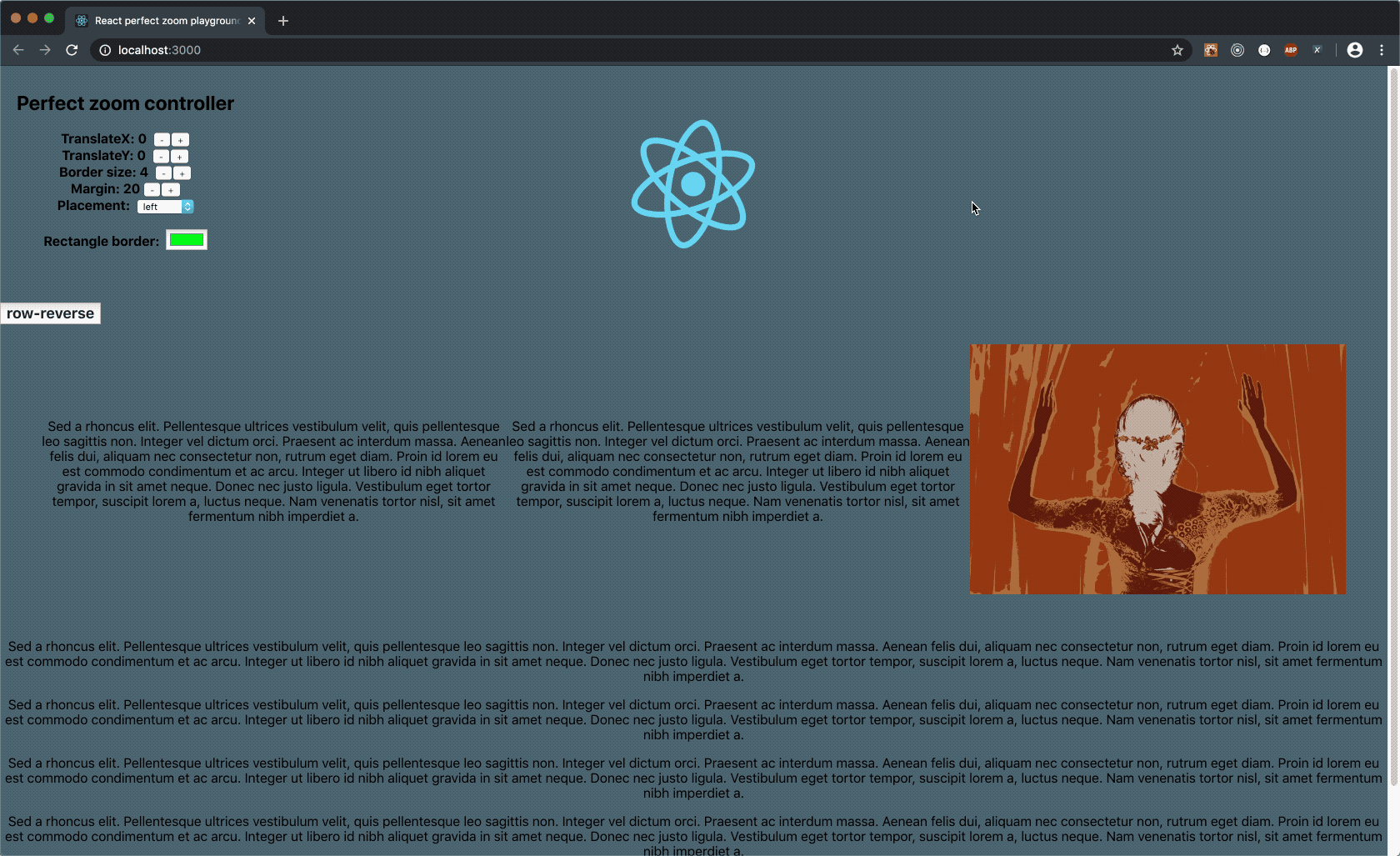
React component which allow you to see exact part of image thumbnail in real dimensions next to it. Works also on mobile devices.
Downloads
51
Maintainers
 jedluk
Readme
React-perfect-zoom 


React component which allow you to see exact part of image thumbnail in real dimensions next to it. Works also on mobile devices.
Documentation for versions < 1.0.0 can be found here v0.5.1
Demo available here: playground
Component is built in pure React without additional npm dependencies. From version 1.0.0 it's possible to use component in polymorfic way:
- by providing single image source. In this case thumbnail takes dimensions required by you and real image is cutted from its original dimensions. This behaviour is illustrated in Controller tab on demo page
- by distinguishing between thumbnail and real image source. In this approach real image can be really large and zooming in is really impressive. It's worth to mention that page is not absorbed by fetching big assets on initial load - real image is loaded on demand, when user start zooming. Mentioned behavior can be viewed in Two Sources tab on demo page
Wide range of props let you display image exactly where you want it. It works with either mouse or touch events. On desktop it's even possible to download zoomed image (use allowDownload props and simply press 'D' key while zooming).
Installation
To install component run command in root of your project
npm install react-perfect-zoomor
yarn add react-perfect-zoomUsage
import React from 'react';
import thumbnail from './assets/sample.jpg';
import largeImg from './assets/huge.png';
import PerfectZoom from 'react-perfect-zoom';

const Loader = ({ mousePosition }) =>
    <div className="custom-loader" style={{ position: 'absolute', ...mousePosition }} />

const SomeComponent = (props) => (
  <div style={{ display: 'flex', margin: 20 }}>
    <PerfectZoom
        source={{
          thumbnailURL: sample,
          thumbnailSize: [300, 500],
          imageURL: largeImg
        }}
        allowDownload
        loader={Loader}
        placement="right"
        align="center"
        margin={10}
        rectangleStyles={{
            color: '#cc00cc'
            size: 3
        }}
        translate={{
            x: 200,
            y: 100
        }}
    />
    <p> lorem ipsum (...) Cras et maximus lectus. </p>
  </div>
);
Props
//
// Basic props
//

// essential props for component;
// passing thumbnailURL value ensures minimal configuration for the component.
// thumbnailSize determine dimensions of thumbnail (fallback value is set to [300, 500]),
// imageURL is source of orignal image, if no imageURL is provided then thumbnailURL will be treated as imageURL
source: {
    thumbnailURL: string,
    thumbnailSize: ?[number, number],
    imageURL: ?string
}

// placement of real image
placement: ?('left' | 'right' | 'top' | 'bottom') = 'right'

// margin between thumbnail and real image
margin: ?number = 20

// translation of real from its original position
translate: ?{ x: number, y: number }

// styles applied to rectangle
rectangleStyles: ?{ color: string, size: number }

// allow download cropped image
allowDownload: ?boolean = false

// alignment of real image relative to thumbnail
align: ?('start' | 'center' | 'end') = 'center'

// render props (current mouse position relative to thumbnail is returned back)
loader? func
Contribute
Any kind of help is highly appreciated. Feel free to add any kind of issue and create feature request.
TODO LIST
- [x] allow to show real image in any postion
- [ ] allow to use React Portal when showing original image
- [x] distinguish between thumbnail source and real image source (+ load 'on demand')
- [x] allow to use custom classes (rectangle)
- [x] support for mobile devices (touch events)
- [x] remove scrollbars from body when zooming image
- [x] allow to download cropped image
- [x] add new props called 'align' (alignment relative to thumbnail)
- [x] allow to use custom loader
- [ ] add props 'constraints' (determine maximum possible dimensions for real image)
- [ ] add possibility to rescale thumbnail without passing second source