
react-pop-notifier
v1.2.6
Published
A responsive customizable react toaster library that can be used to display success and error messages in react app.
Maintainers
 rhydhur
Readme
React-Pop-Notifier
This is a customizable react toaster library that can be used to display success and error messages in react app.
Installation:
The easiest way to use react-pop-notifier is to install it from npm and build it into your app with Webpack.
npm install react-pop-notifier
Or with yarn:
yarn add react-pop-notifier
Usage:
import { NotifierProvider } from 'react-pop-notifier';

<NotifierProvider>
    <App />
</NotifierProvider>
Add the above in your root file (index.tsx)
import { useNotifier, Notifier } from 'react-pop-notifier';

export const App = () => {
    const {notifier} = useNotifier()

    function handleNotif () {
        notifier.show("Message Text", "Message Title", "success")
    }

    return (
        <>
            <Notifier/>
            <button
                onClick={handleNotif}
            >
                Show Notifier
            </button>
        </>
    )
}
As seen above, the Notifier component is added in the parent component of the application. Whenever you want to trigger the notifier/toaster, you just need to call the notifier.show function and pass the necessary parameters.
The notifier.show function takes in 3 parameters which are;
- Message content
- Message title
- Message type (success, error)
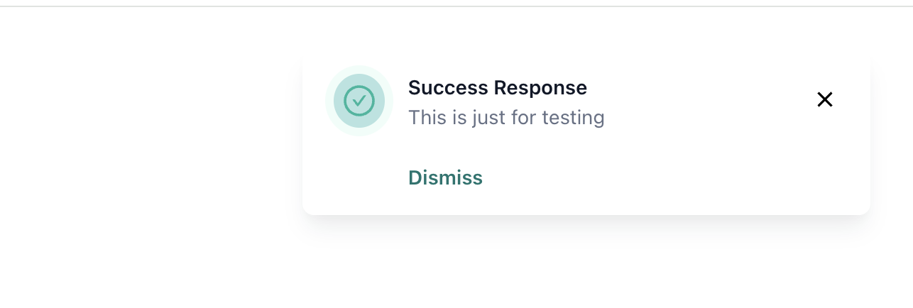
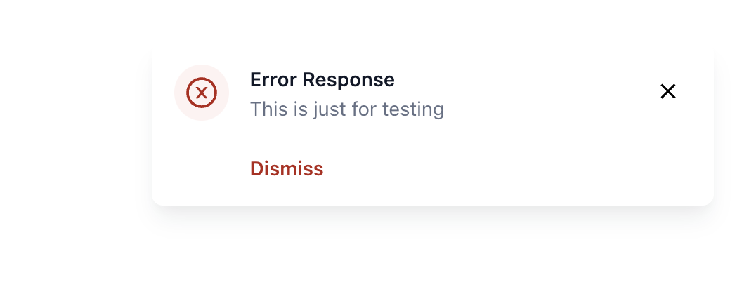
The title is defaulted to null if not passed and "Success Response" will be used as title for type success while "Error Response" will be used as title for type error. The type parameter is optional and error is used as type by default if not type is not passed.
Below is sample of how the Notifier look like for type success and error
Controllable Props:
You can control the following props by providing values for them. If you don't, react-pop-notifier will manage them for you.
$bgColor: This is the background color of the Notifier. The default is #fffffftitleColor: This is the title text color. The default is #101828contentColor: This is content text color. The default is #667085closeBtnColor: This is the color of the close icon. The default is #000000closeBtnBgColor: This is the background color of the close icon. The defaut is whitecloseBtnHoverBgColor: This is the background color of the close icon when it is being hovered oncloseBtnHoverColor: This is the color of the close icon when it is hovered onshowDismissText: This is a boolean value which determines whether to show the dismiss text or not. It is set to true by defaultdismissText: This is the dismiss text. Dismiss is used by defaultdismissTextColor: This is the color of the dismiss textdismissTextHoverColor: This is the color of the dismiss text when it is hovered onshowTypeIcon: This is a boolean value which determines whether icon for each notifier type should be shown or not
Github Repo:
To learn more, check out the Library Source Code.