
react-progressive-picture
v0.1.0
Published
Responsive <picture> with format negotiation and a blur-up placeholder. Pairs with vite-imagetools ?as=metadata.

Maintainers
 vuongvu01
Readme
react-progressive-picture
A responsive <picture> for React that negotiates image formats, holds its own aspect
ratio, and fades a blurred low-quality placeholder into the full image once it loads.
One component, one stylesheet, no runtime dependencies.
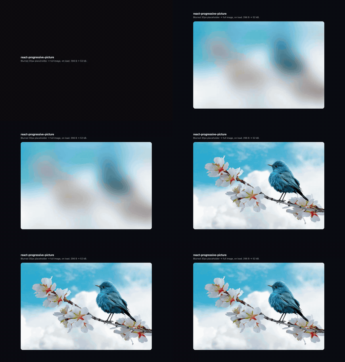
The box never reflows: the aspect ratio is held from first paint and a 296-byte
placeholder covers the gap while the 52 kB image arrives. Recorded from pnpm dev with
the full-size request delayed 1.7s.
npm install react-progressive-pictureImport the stylesheet once, anywhere in your app. Forgetting it is the most common way this package appears broken:
import 'react-progressive-picture/style.css';Quickstart with vite-imagetools
The sources prop takes exactly what vite-imagetools
returns for as=metadata:
import { ProgressivePicture } from 'react-progressive-picture';
import hero from './hero.jpg?w=30;480;768;1440;1920&format=avif;webp&as=metadata';

<ProgressivePicture
  sources={hero}
  alt="Cyclist on a mountain road"
  ratio={{ mobile: '4 / 3', desktop: '21 / 9' }}
  loading="eager"
  fetchPriority="high"
/>;
Without vite-imagetools
There is no dependency on that plugin — sources is a plain data contract any build tool
or hand-written array can satisfy:
interface ImageSource {
  src: string;
  width: number;
  height: number;
  format: string;
}
<ProgressivePicture
sources={[
{ src: '/hero-30.webp', width: 30, height: 20, format: 'webp' },
{ src: '/hero-960.webp', width: 960, height: 640, format: 'webp' },
{ src: '/hero-960.avif', width: 960, height: 640, format: 'avif' },
]}
alt="Cyclist on a mountain road"
/>Variants are grouped by format and one <source> is emitted per group. Because
<picture> picks the first source the browser supports, group order is preference
order — it is fixed at avif, webp, png, jpeg, jpg, gif, with unrecognised formats
appended, so the output never depends on the order of your query string. Within a group,
widths are sorted ascending. The <img> fallback is the widest entry of the last group,
and the placeholder is its narrowest entry.
Props
| Prop | Type | Default | Notes |
|---|---|---|---|
| sources | ImageSource[] | — | Required. Any format/width mix; grouped and sorted internally. Empty renders nothing. |
| alt | string | — | Required. Pass "" for decorative images. |
| ratio | string \| { mobile, desktop } | auto | A string applies at all widths; the object form switches at 768px. |
| blur | string | 2rem | Placeholder blur radius. |
| objectFit | CSSProperties['objectFit'] | cover | |
| sizes | string | 100vw | Must be a valid source-size list — percentages are not. |
| loading | 'lazy' \| 'eager' | lazy | Use eager for an LCP image. |
| fetchPriority | 'high' \| 'low' \| 'auto' | — | Pair with loading="eager" for a hero. |
| placeholder | string \| false | narrowest source | A URL (including a data URI) used verbatim, or false to disable blur-up. |
| imgProps | ComponentPropsWithoutRef<'img'> | — | Escape hatch onto the underlying <img>. |
Everything else — className, style, id, data-*, ARIA attributes — passes through
to the container <div>.
ProgressivePictureProps and ImageSource are exported as types.
Theming
The stylesheet ships stable class names (.rpp-root, .rpp-picture, .rpp-img, and the
state class .rpp-loaded) and is configured entirely through custom properties, so
overrides need neither !important nor wrapper selectors:
| Property | Default | Purpose |
|---|---|---|
| --rpp-ratio | auto | Aspect ratio below the breakpoint |
| --rpp-ratio-desktop | auto | Aspect ratio at/above the breakpoint |
| --rpp-blur | 2rem | Placeholder blur radius |
| --rpp-object-fit | cover | Image fit |
| --rpp-fade-duration | 250ms | Load-in transition |
| --rpp-shimmer-color | rgb(255 255 255 / 0.1) | Pulse overlay colour |
| --rpp-shimmer-duration | 2.5s | Pulse period |
A different breakpoint
Custom properties cannot be used in @media conditions, so there is no breakpoint
prop — the stylesheet ships a fixed min-width: 768px. To use another one, leave ratio
unset (an inline style would outrank your rule) and drive the property yourself:
.my-hero { --rpp-ratio: 16 / 9; }
@media (min-width: 900px) { .my-hero { --rpp-ratio: 21 / 9; } }
<ProgressivePicture sources={hero} alt="…" className="my-hero" />Notes
- ESM only, React 18+ as a peer dependency.
react-domis not required. - A failed image is treated as loaded, so the blur clears and the alt text surfaces instead of the image sitting blurred forever.
- The fade and the shimmer both respect
prefers-reduced-motion.
Development
pnpm install
pnpm dev        # demo/ — the page the README GIF was recorded from
pnpm test
Licence
MIT