
react-reactive-nav
v1.1.1
Published
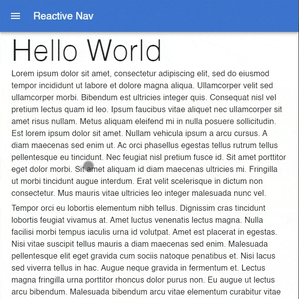
React navbar component that mimics Android-like toolbar scrolling behavior.
Maintainers
 franzdc
Readme
React Reactive Nav
React navbar component that mimics Android-like toolbar scrolling behavior.
Installation
yarn add react-reactive-navor
npm i react-reactive-navBasic Usage
import { ReactiveNav } from 'react-reactive-nav';

const MyComponent = () => (
  <ReactiveNav height={64}>
    {/* navbar / appbar content goes here */}
  </ReactiveNav>
);
Props
| Name | Type | Default | Description |
| --------------------- | -------------------------------- | ------- | ------------------------------------------------------------------------------------------------ |
| children | ReactNode | | The content of the navbar. |
| height* | number | | Height of the navbar. |
| snap | boolean | false | Snap to the closest state of the navbar based on the scroll amount. |
| snapDelay | number | 200 | Set the delay of snap checking after scrolling (in ms). Only applies if snap is set to true. |
| snapDuration | number | 200 | Specify how long the snap animation should run (in ms). Only applies if snap is set to true. |
| paddingElementProps | HTMLAttributes<HTMLDivElement> | | Props passed to the padding element (blank div with a set height). |
* Required
Examples
MUI (Material-UI)
import {
  AppBar,
  Toolbar,
  IconButton,
  Typography,
  useTheme,
  useMediaQuery,
} from '@mui/core';
import { Menu as MenuIcon } from '@mui/icons-material';
import { ReactiveNav } from 'react-reactive-nav';

const MyComponent = () => {
  const theme = useTheme();
  const smUp = useMediaQuery(theme.breakpoints.up('sm'));

  return (
    <ReactiveNav height={smUp ? 64 : 56}>
      <AppBar>
        <Toolbar>
          <IconButton
            edge='start'
            color='inherit'
            aria-label='menu'
            sx={{ mr: 2 }}
          >
            <MenuIcon />
          </IconButton>
          <Typography variant='h6' color='inherit' component='div'>
            App Bar
          </Typography>
        </Toolbar>
      </AppBar>
    </ReactiveNav>
  );
};